
PROJECT
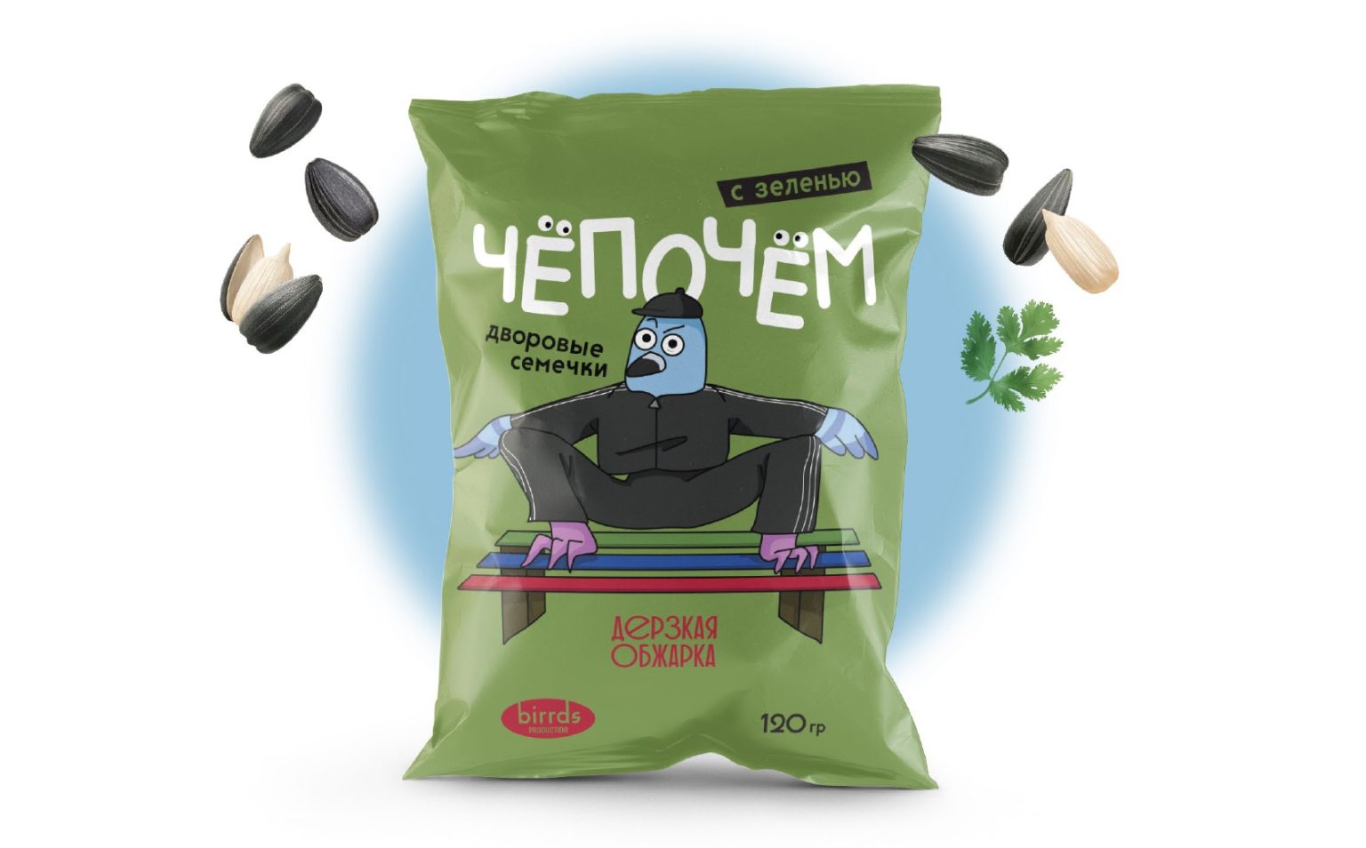
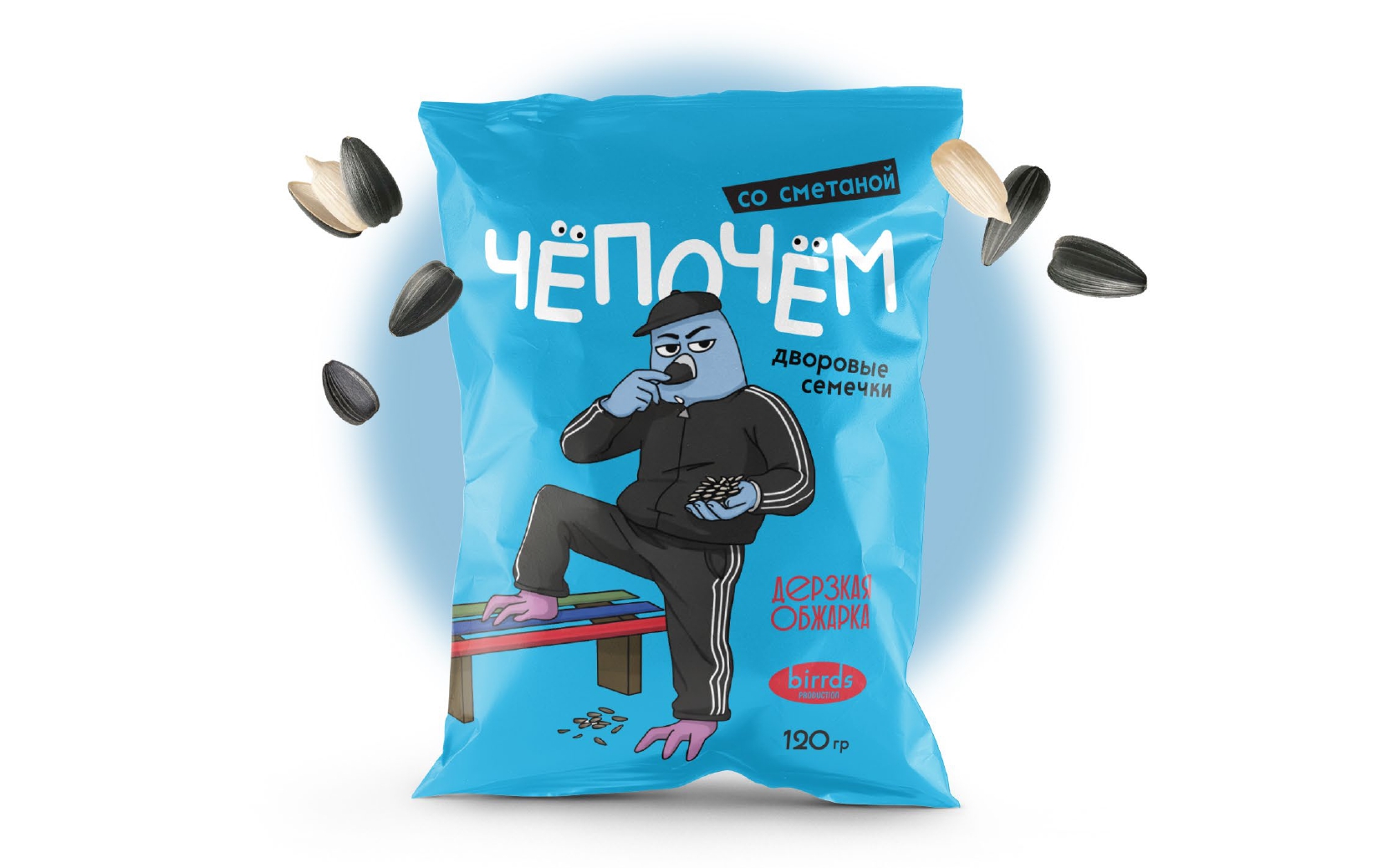
“Chepochyom” (“Чёпочём”) is a conceptual student packaging project for sunflower seeds inspired by post-Soviet courtyard culture. The project combines naming, a hand-written typographic logo, illustration, and packaging design into one expressive visual system. The main idea was to show sunflower seeds not just as a snack, but as a small everyday ritual deeply connected to street life and shared moments.
The packaging comes in three flavors:
- Herbs (зелень)
- Sour cream (сметана)
- Paprika (паприка)
Each flavor has its own color accent while keeping a consistent brand style.
MASCOT CHARACTER & CULTURE
The main mascot is a pigeon – one of the most iconic residents of urban courtyards. In post-Soviet cities, pigeons are part of the everyday street landscape, just like benches, playgrounds, and old apartment blocks. The pigeon dressed in a tracksuit is an ironic, exaggerated character, referencing the aesthetics of 1990s–2000s courtyard culture. It’s not a real person, but a playful cultural archetype that feels instantly familiar. The bench is a key visual symbol — a place where people sit, talk, observe life, and crack sunflower seeds. It visually anchors the product in its natural cultural environment.
NAMING & INSCRIPTIONS
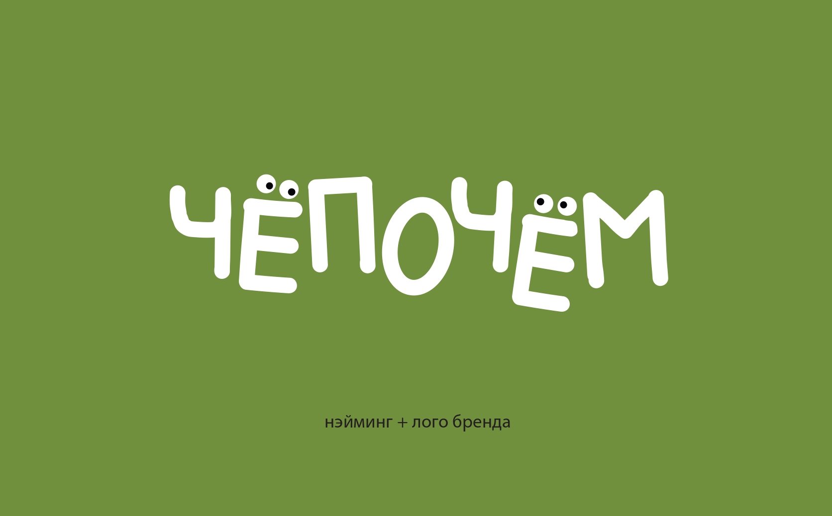
The name “Chepochyom” (“Чёпочём”) comes from informal spoken language and sounds deliberately casual and playful. It feels like something you’d hear in a conversation, not in advertising. The logo is hand-written, reinforcing the idea of authenticity, imperfection, and a human touch – just like the culture it references.
Phrases like:
“Courtyard sunflower seeds” (“Дворовые семечки”)
“Bold roast” (“Дерзкая обжарка”)
add humor and personality, using street-style language to shape the brand’s voice.
RESULTS
The final result is a packaging concept where character, typography, naming, and visuals work together to tell a cohesive story. “Chepochyom” is about nostalgia, humor, and shared cultural memories – turning a simple snack into an emotional and recognizable experience.




 Ayanna
 Flow Creative
 jonathanag90
 Creative Platform
 alchimistestudioParis
 Eman AlGhasra
 andreamarinnn
 ccc
ccc Natasha Alimova
 Heramb Arora
 Denis Ulianov
 monther al omari
 BFS Studio
 Oksana
 Nadya Chunikhina
 Maruf Nishat
 Valérie Colace
 nemethhanna
 Logoclub99
 wd branding
 Palashcc
 Loseou
 dulicy