

ABOUT
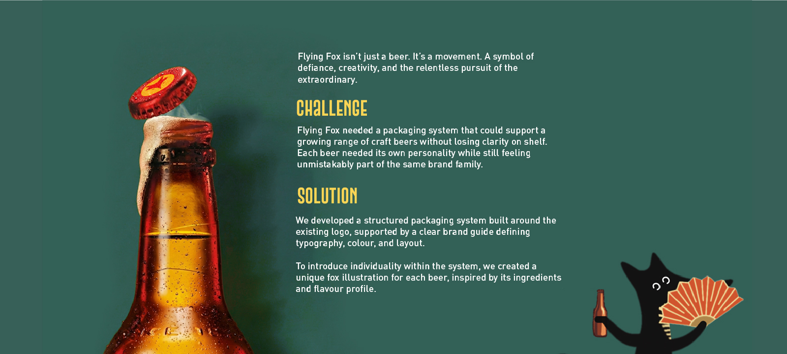
Flying Fox is a craft beer brand built on experimentation, curiosity, and a lighthearted irreverence toward convention. The brand produces a growing range of beer styles, each with its own flavour profile, attitude, and intended drinking experience.
CONCEPT
The core concept behind the packaging is individuality within structure.
Instead of designing isolated labels for each beer, the idea was to build a unified visual language that could adapt and evolve. This led to the creation of a recurring fox character that acts as the brand’s central visual anchor.
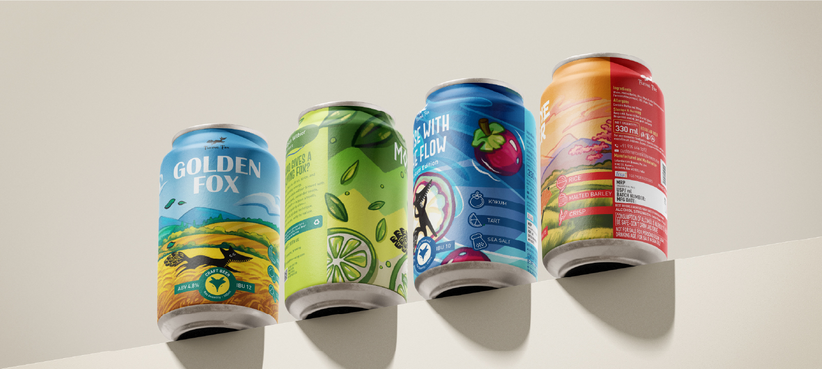
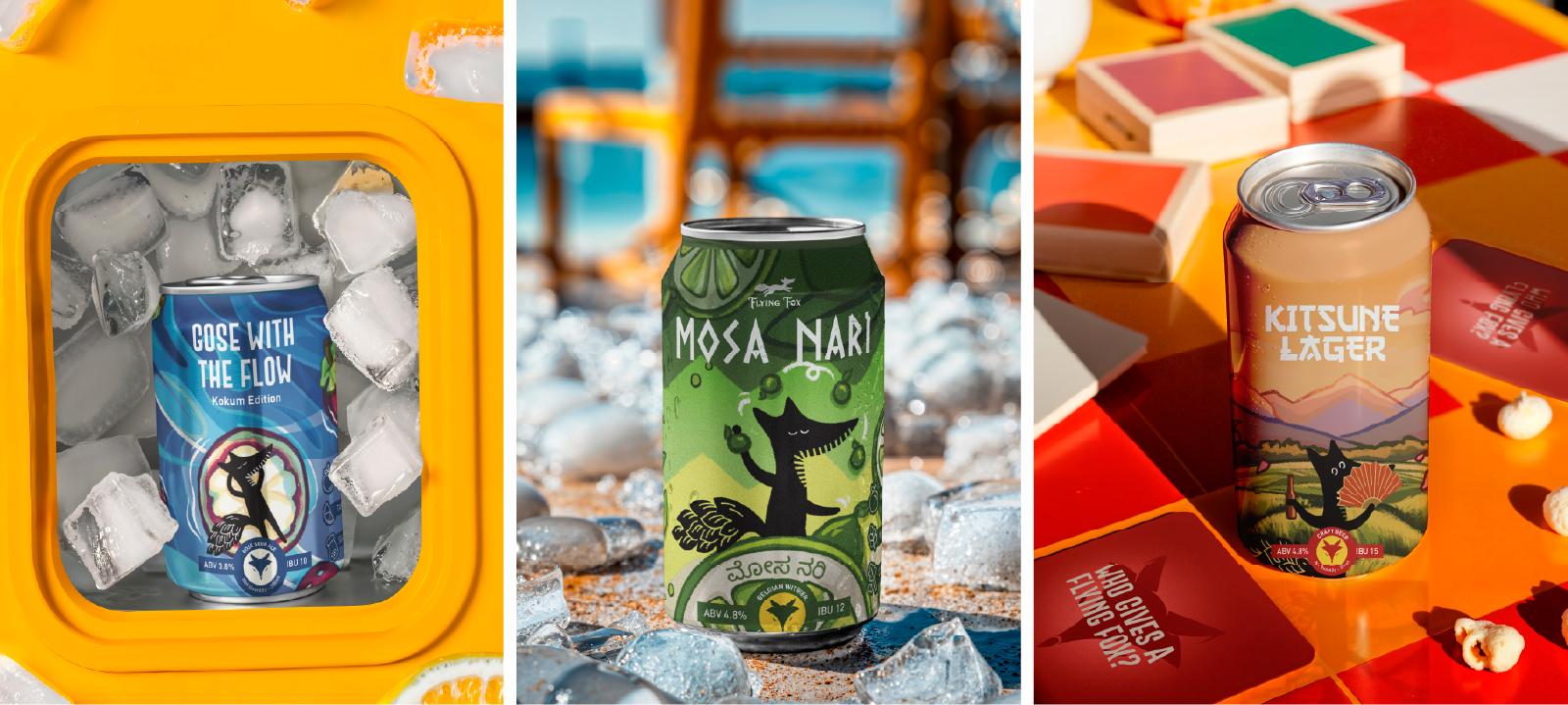
Each fox illustration is designed to reflect the personality, flavour notes, or mood of the beer it represents. While the characters change, their underlying silhouette, illustration style, and placement remain consistent, ensuring that every variant feels distinct yet unmistakably part of the Flying Fox family.
The concept allows storytelling, humour, and expression to coexist within a clearly defined system.
SOLUTION
The solution was a structured packaging system built around a fixed hierarchy of elements. Core components such as logo placement, typography structure, illustration positioning, and overall label composition remain constant across the range.
Within this framework, flexibility is introduced through colour palettes, illustrated scenes, and character expressions that are tailored to each beer. This balance ensures strong shelf recognition while allowing every SKU to communicate its own identity.
The fox character functions not only as a mascot, but as a modular storytelling device, giving the brand a recognisable face while enabling endless variation.
TECHNIQUE
The packaging design combines hand drawn style illustrations with bold, highly legible typography. The illustrations were digitally developed to maintain consistency in line weight, form, and proportion across all variants and formats.
A curated colour system was established to differentiate flavours while maintaining harmony across the range. Each palette was chosen to reflect the mood and taste profile of the beer, while still sitting comfortably alongside the rest of the lineup.
Typography was kept intentionally strong and condensed to ensure clarity and impact at shelf distance, balancing the expressive illustration work without overwhelming it.
UNIQUENESS
What makes the Flying Fox packaging distinctive is its character led approach combined with a disciplined system. Rather than relying on purely decorative graphics, illustration is used as a functional element within the packaging architecture.
The result is a brand that feels playful and approachable, yet controlled and scalable. The system allows new beers to be introduced seamlessly, without the need to reinvent the visual language each time.
RESULT
The final outcome is a confident, shelf forward packaging system that allows Flying Fox to grow while maintaining a strong and recognisable identity.
Each beer stands out individually, while the range as a whole reads as a cohesive visual family. The packaging successfully communicates the brand’s experimental spirit and provides a flexible foundation for future expansion across products, formats, and markets



 Derrick Lin
 Biaa
Biaa Petitmoulin Studio
 White Bear Studio
 Eva Chistyakova
 monther al omari
 Atipus
 alchimistestudioParis
 oneandother
 bloomburo
 helocrene
 Shapers Studio
 Denver Design
 Aidearte
 andrew.huerta
 softmachine
 airobtq
 Buzz & Co.
 Ruby
Ruby themythographer
 IDNB Inc.
 viktorflr
 Zenpack