

ABOUT
Tusker Tea is a contemporary Australian tea brand focused on premium Ceylon teas and botanical infusions. Each blend is crafted with a distinct flavour profile, aroma, and intended ritual experience.
As the range expanded across multiple SKUs and formats including cylindrical tubes and resealable pouches, the brand required a packaging system that could clearly differentiate blends while maintaining a cohesive and elevated shelf presence.
CONCEPT
The core concept behind the packaging is botanical individuality within structure.
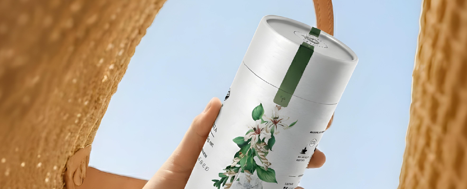
Rather than designing unrelated labels for each blend, the idea was to create a unified visual language built around watercolour floral illustrations inspired by the ingredients and character of each tea.
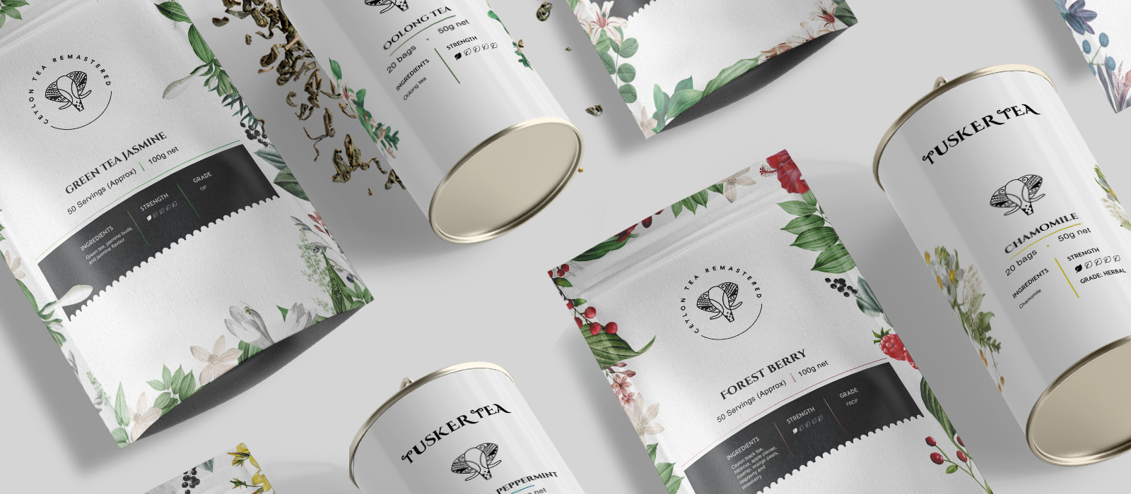
Every blend features a unique botanical composition that reflects its flavour notes and mood. While the illustrations change, their placement, scale, and interaction with the layout remain consistent. This ensures that each SKU feels distinct yet unmistakably part of the Tusker Tea family.
SOLUTION
The solution was a structured packaging architecture applied across both tube and pouch formats.
Core elements such as logo positioning, typography hierarchy, product information, and strength indicators remain fixed throughout the range. Within this framework, flexibility is introduced through curated colour accents and bespoke botanical artwork tailored to each blend.
This balance creates strong shelf harmony while allowing every variant to communicate its own personality. The cylindrical format further enhances the premium perception, transforming the packaging into a display worthy object.
TECHNIQUE
The design combines hand rendered style watercolour illustrations with refined serif typography.
The botanical artworks were digitally refined to ensure consistency in tone, proportion, and print application across formats. A controlled colour system differentiates blends while maintaining overall harmony.
Typography was kept clean and structured to balance the fluidity of the illustrations, ensuring clarity at shelf distance without overpowering the visual storytelling.
UNIQUENESS
What distinguishes the Tusker Tea packaging is its integration of fine art inspired illustration within a disciplined brand framework.
Rather than serving as decoration, the botanicals function as flavour identifiers embedded into the packaging architecture. The system allows new blends to be introduced seamlessly without redefining the visual language.
The result is a brand that feels natural, refined, and scalable.
RESULT
The final outcome is an elegant, shelf distinctive packaging system that communicates quality and botanical richness with quiet confidence.
Each blend stands confidently on its own, while the full range reads as a cohesive visual family. The packaging supports growth across formats and future extensions while preserving a clear and recognisable identity


 Derrick Lin
 Biaa
Biaa Petitmoulin Studio
 White Bear Studio
 Eva Chistyakova
 monther al omari
 Atipus
 alchimistestudioParis
 oneandother
 bloomburo
 helocrene
 Shapers Studio
 Denver Design
 Aidearte
 andrew.huerta
 softmachine
 airobtq
 Buzz & Co.
 Ruby
Ruby themythographer
 IDNB Inc.
 viktorflr
 Zenpack