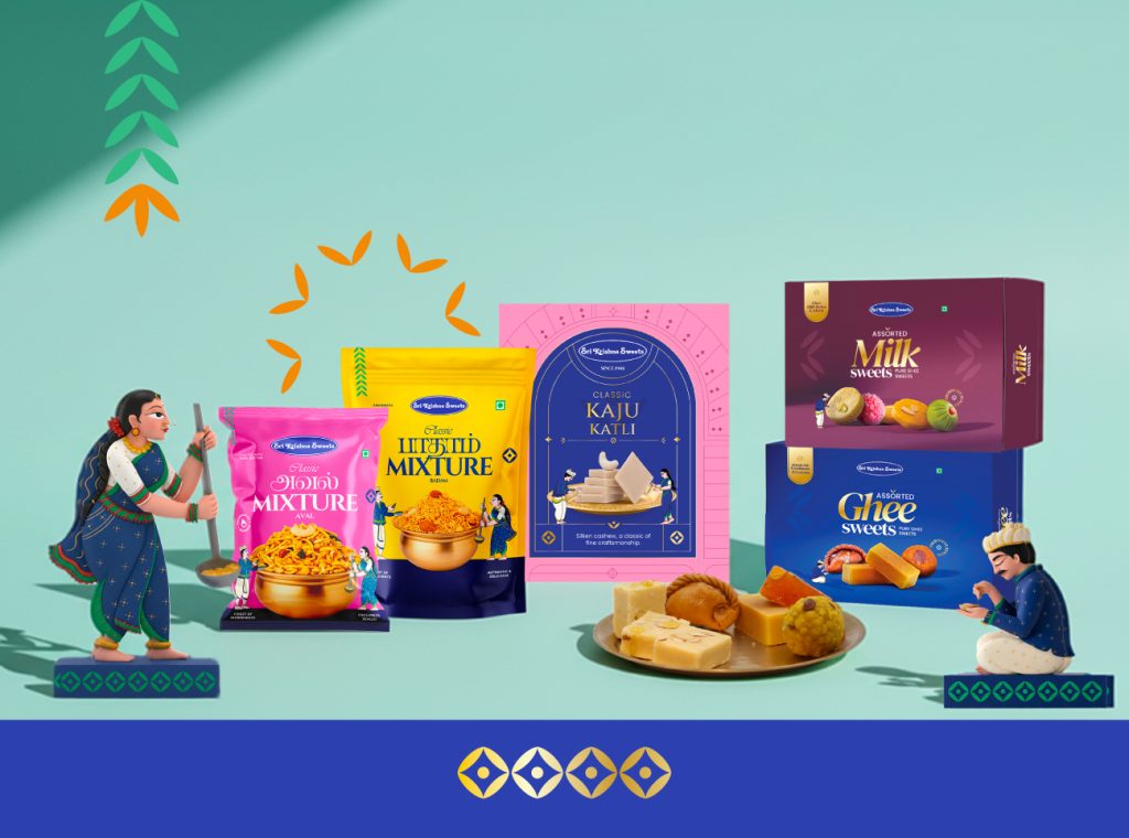

Sri Krishna Sweets — A Legacy, Packaged
For over seven decades, Sri Krishna Sweets has been part of South India’s cultural fabric — a name tied to devotion, celebration, and the unmistakable taste of ghee.
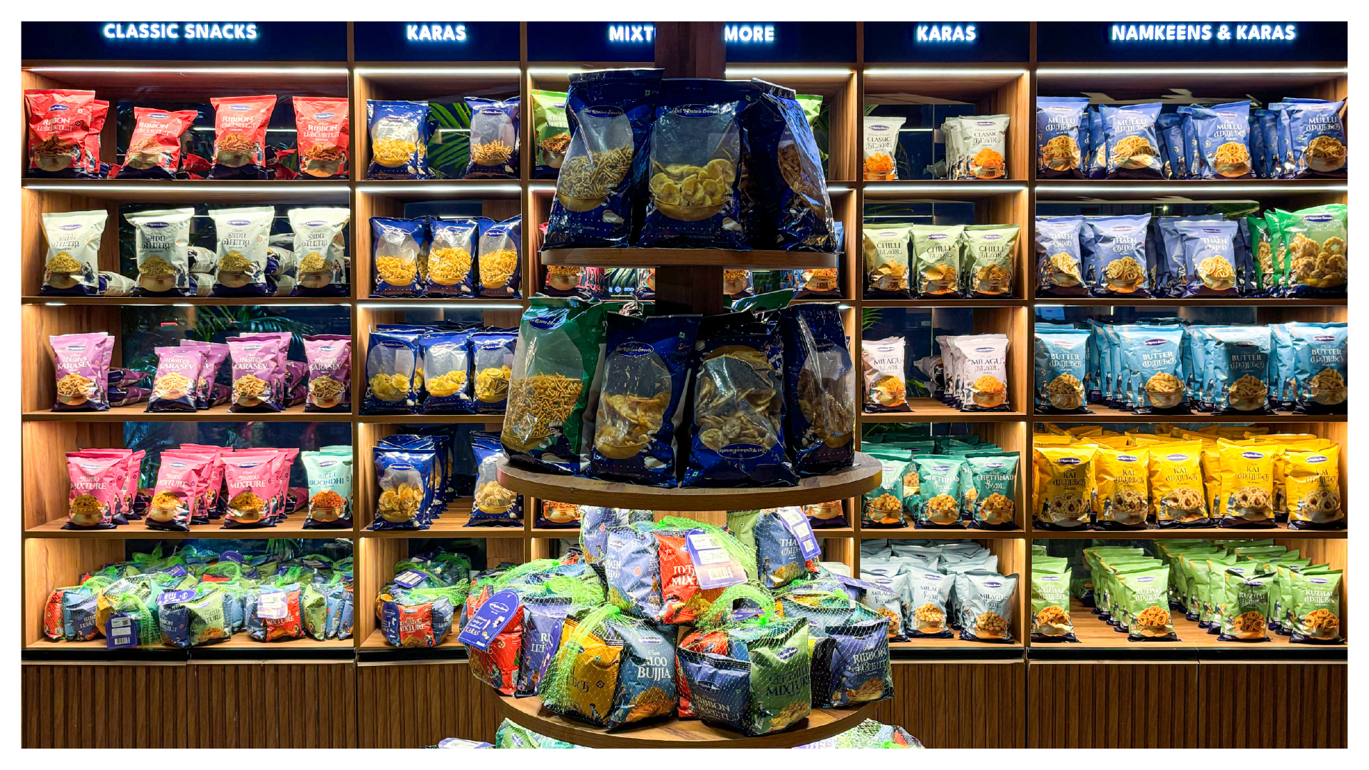
As the range expanded, the packaging started speaking in many voices. And in a market full of “Krishna Sweets,” the bigger need was clarity: how do you spot the original Sri Krishna Sweets instantly?
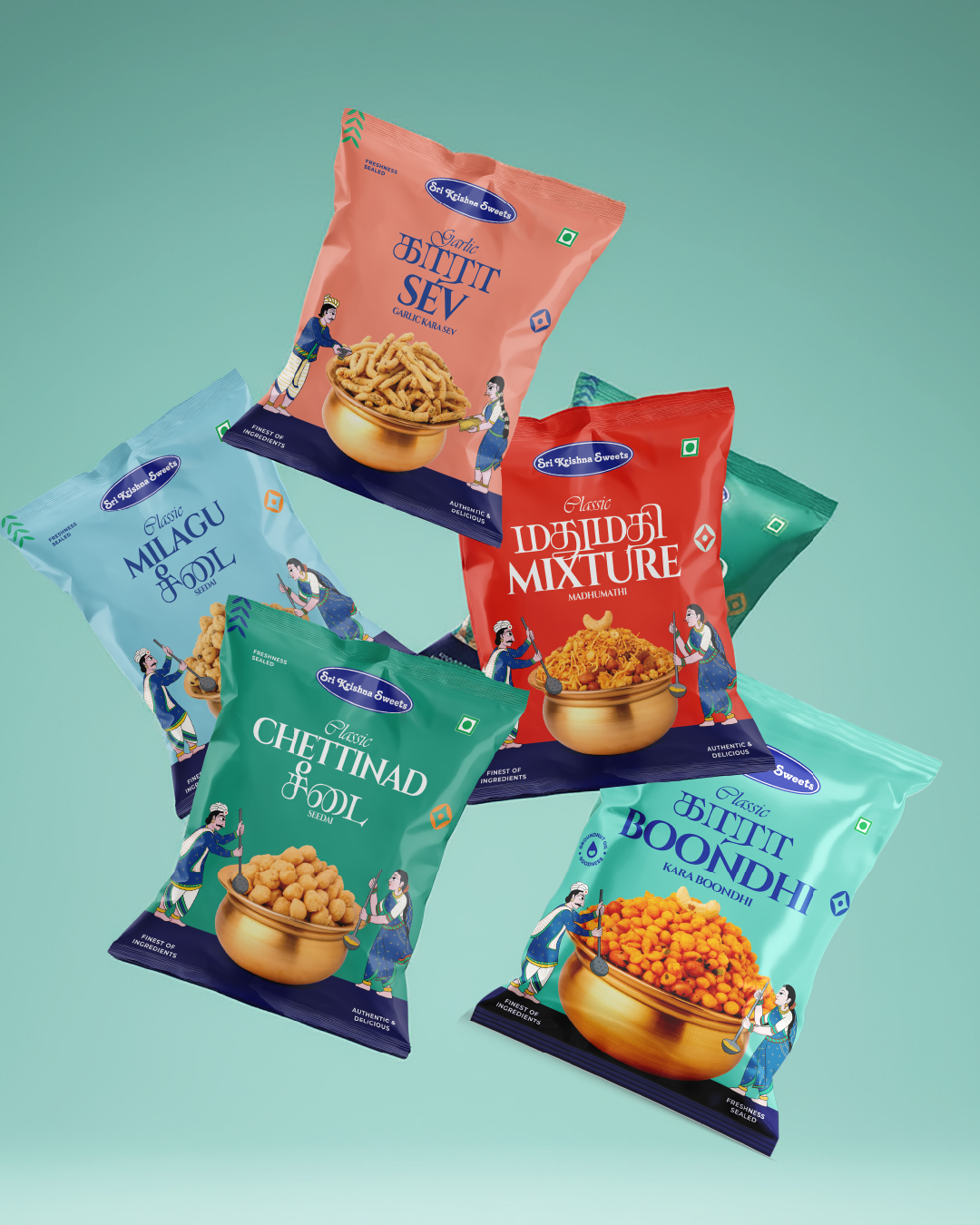
That’s where we began — building a packaging system that protects legacy, sharpens shelf presence, and scales across Kaaras, Sweets, and Gifting.
The Idea — Tradition, Illustrated
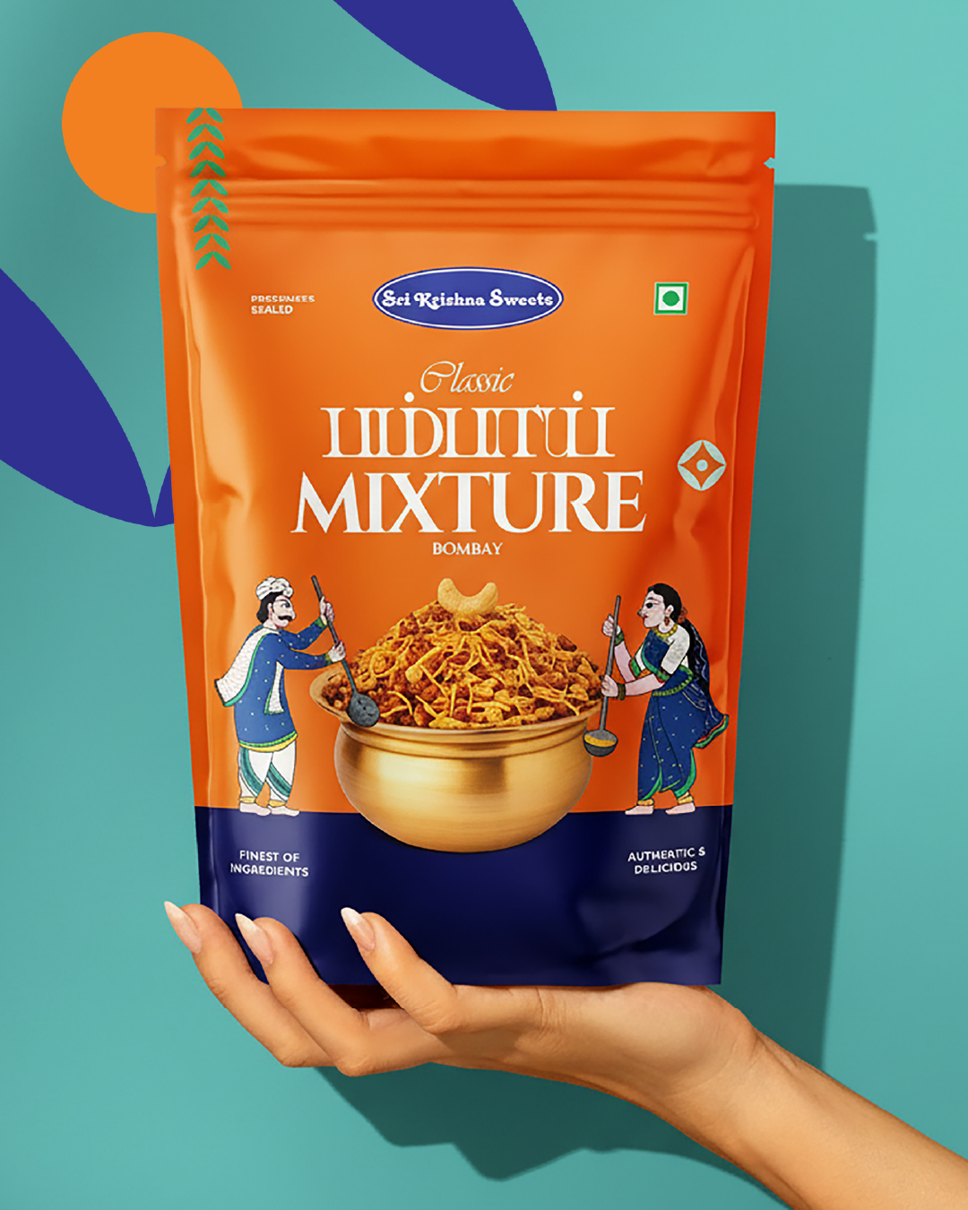
We drew from Pattachitra, known for devotion-filled storytelling, and reinterpreted it into a modern packaging language — rooted, yet clean and contemporary.
The Packaging Language
1) The Window Frame
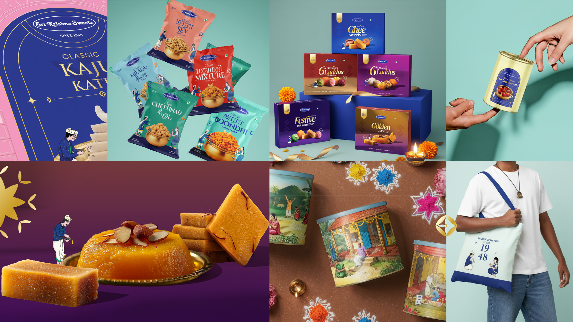
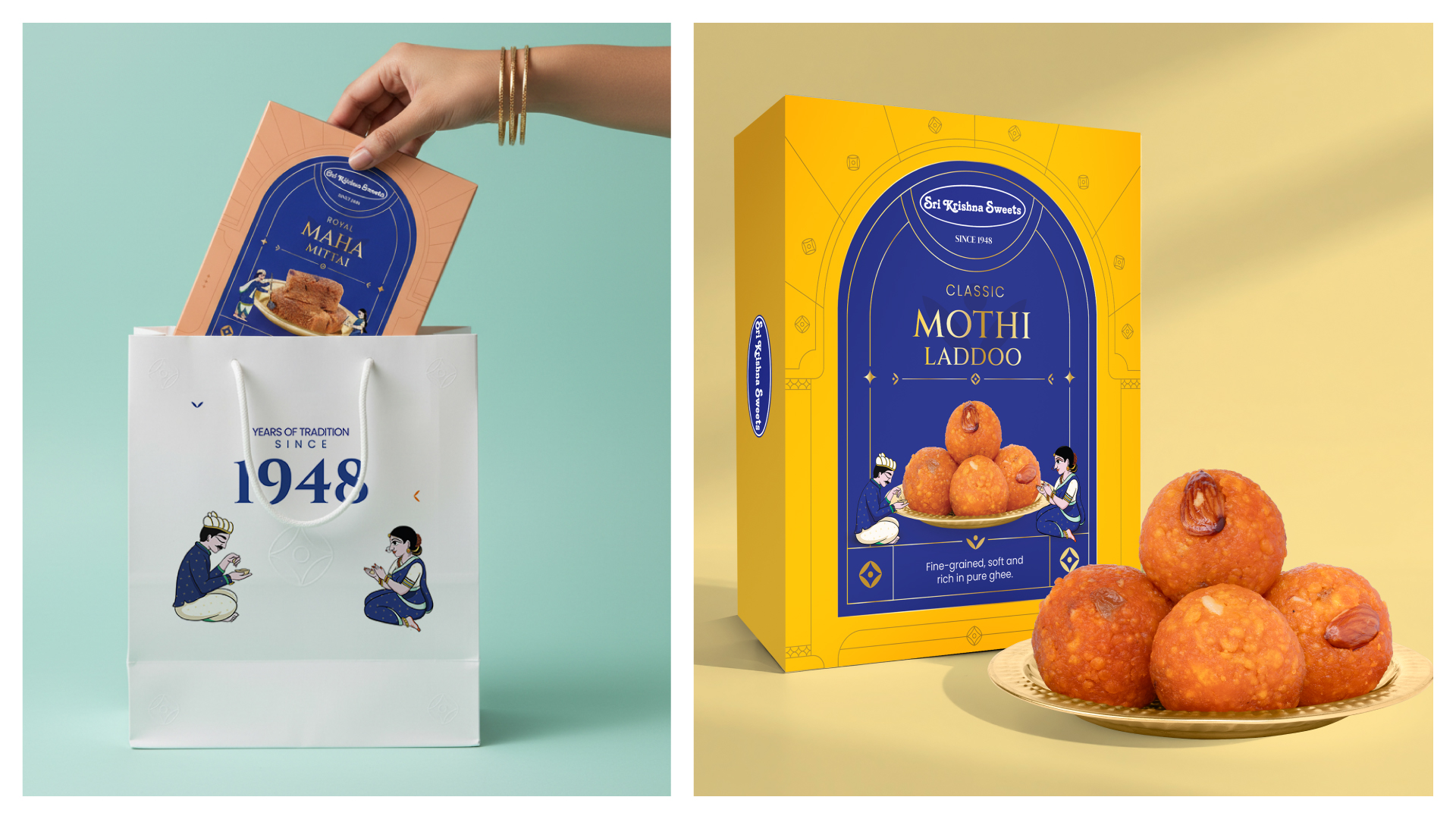
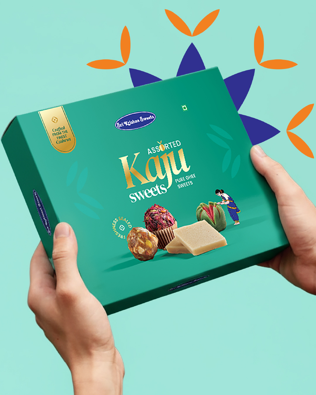
A signature arched window for sweet packs — inspired by heritage architecture, built for recognition, and used as a neat product-view window where needed.
2) Characters that Interact
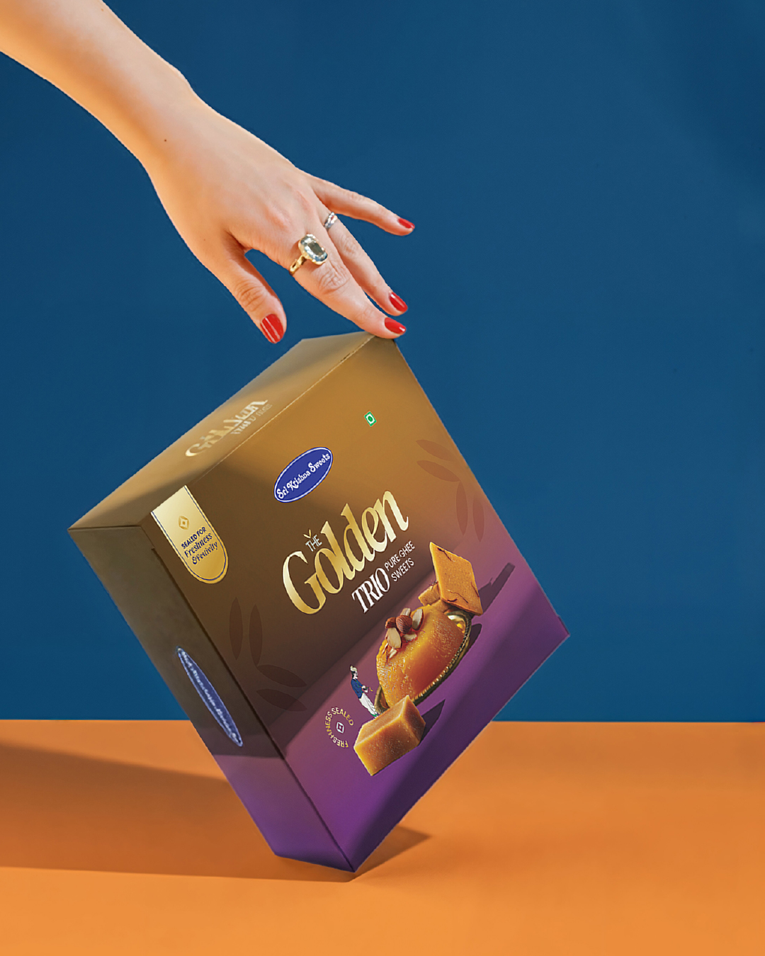
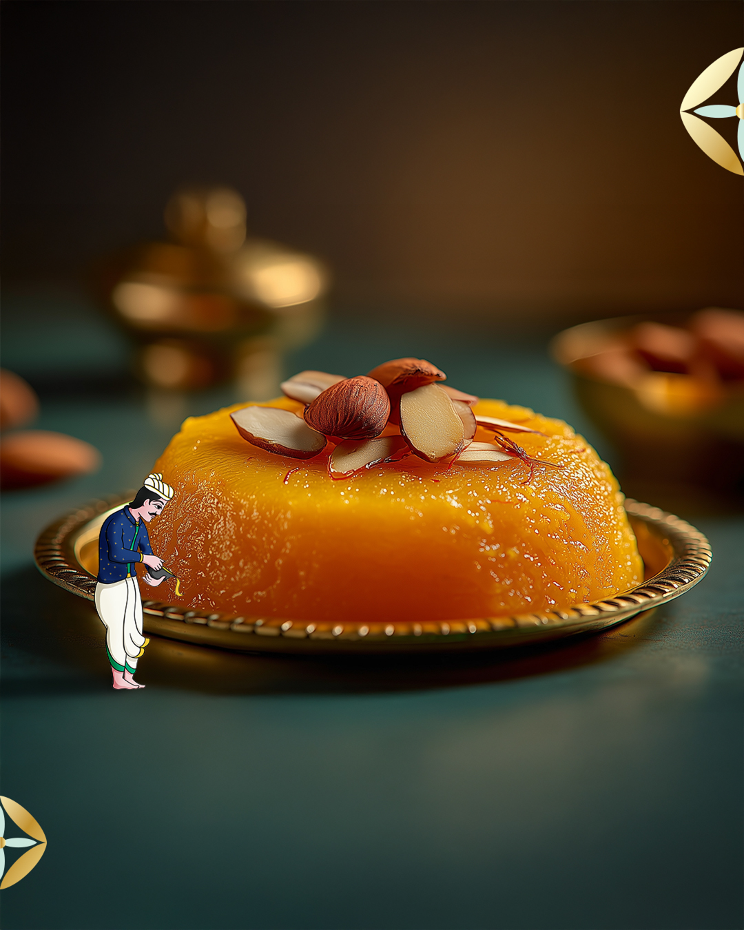
Pattachitra-inspired sevakas engage with the product — holding, serving, presenting — making the packs feel warm, alive, and distinctly SKS.
3) Premium Craft & Finish
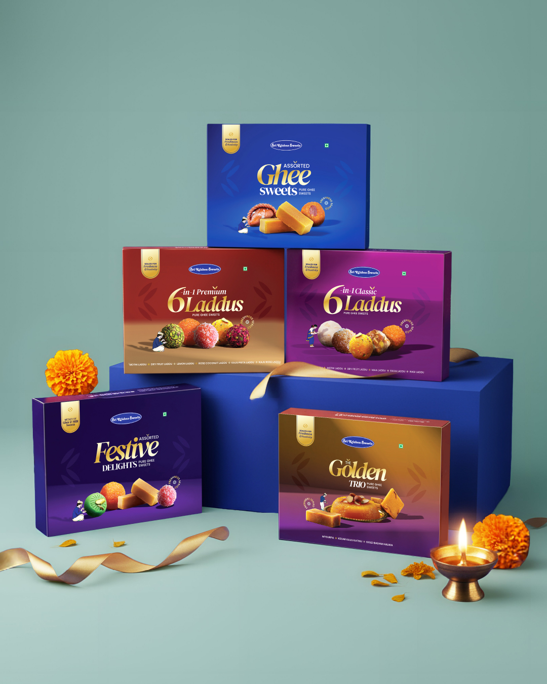
Controlled metallic-foil detailing across select borders, titles, and accents — designed to catch light like real metal.
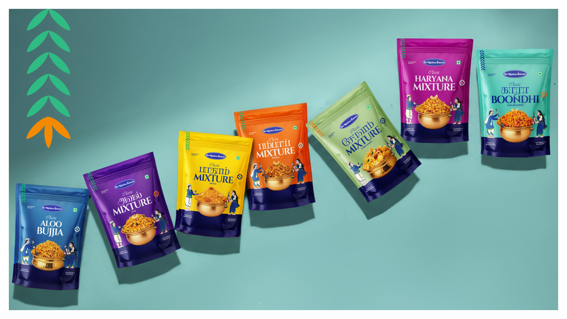
Anchored by Royal Blue, supported by festive hues and a consistent structure, the system stays unified across formats.
The Outcome
A packaging family with stronger recall, shelf interaction, and clearer ownership. In a cluttered market, it helps people instantly recognise the original Sri Krishna Sweets.
One recognisable SKS world — timeless, scalable, proudly OG.
 NEV
 Stefano Bracci
 Alina
 monther al omari
 Lizakjx
 JOAOMARCOSDESIGN
 alchimistestudioParis
 Harriet Neild
 octavio rojo
 宏洛图品牌设计HONGLT
 DESIGN CONCEPTS
 Alexander Skurihin
 Studio K95
 ARMBRAND
 Richa Rai
 houseoferas by Miti
 Agence des Coteaux
 Kushi Eaknath
 Ann Treasa
 Xiao Ning
 krrrrrllii
 babyage
 Deep