

Kirukal Gives Nithya Amirtham a Brand Identity Rooted in Neighbourhood Warmth.
Nithya Amirtham is a neighbourhood food brand in Chennai with over a million loyal customers. The food was trusted. The community devoted. What was missing was a brand that finally sounded like it.
Studio Kirukal — a Chennai creative agency rooted in Tamil cultural design — started by listening. Everyone said the same thing: Nithya Amirtham feels like home.
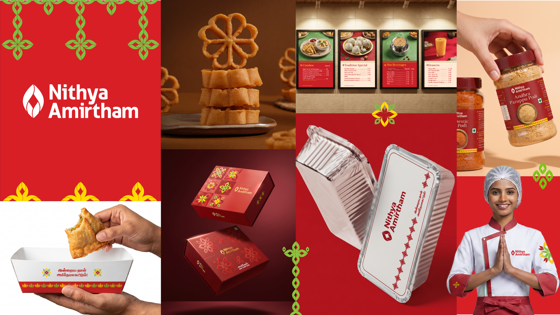
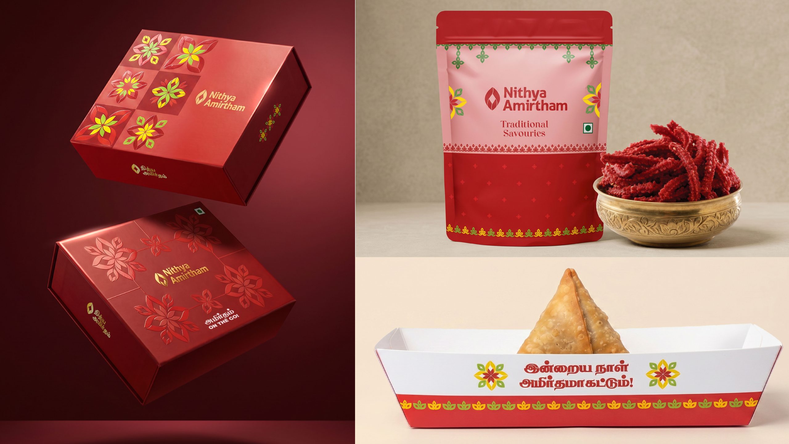
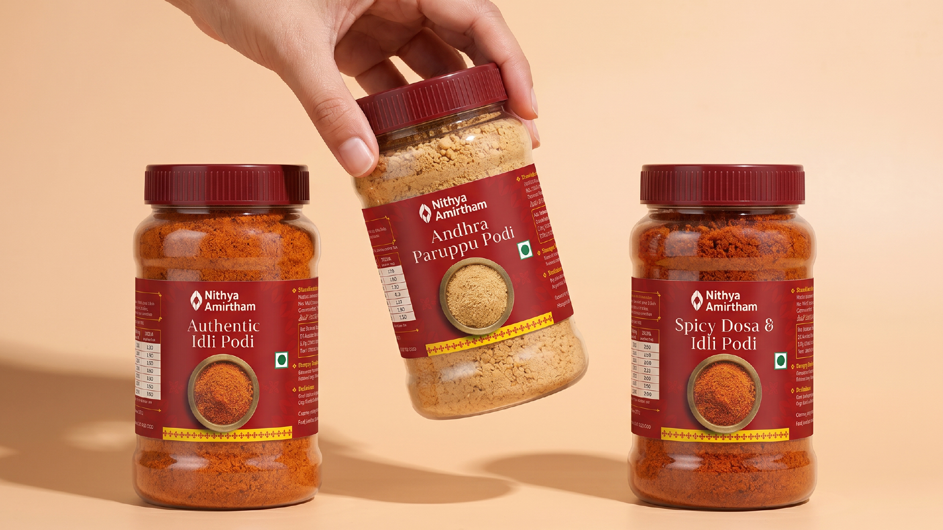
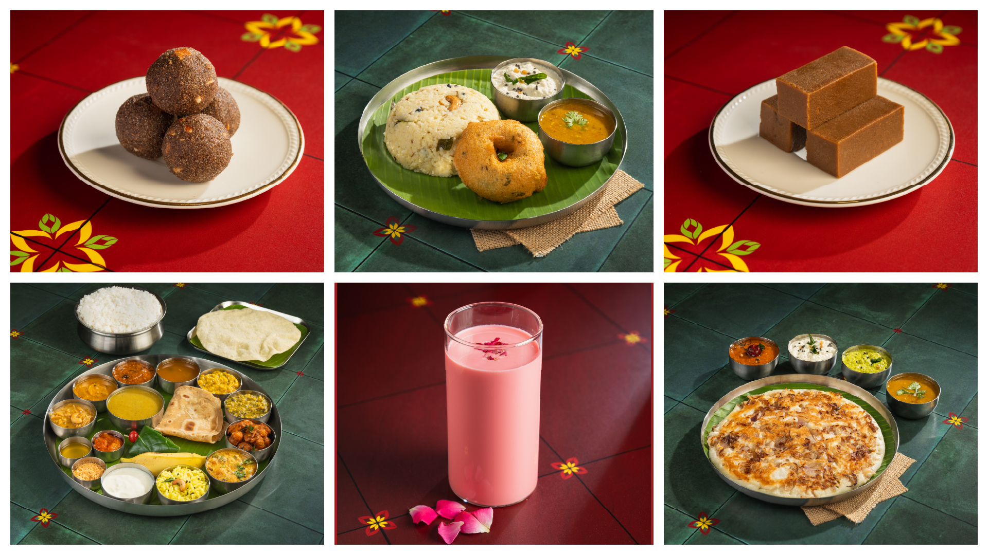
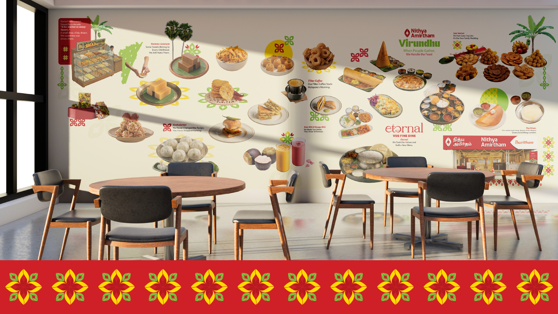
The brand’s existing leaf motif became the foundation of a new visual system drawn from three South Indian traditions — kolam (geometric floor patterns symbolising welcome), thoranam (leaf garlands hung at Tamil doorways during celebrations), and saree border geometry. Turmeric yellow and banana leaf green joined the signature red — colours present at every Tamil celebration.
The verbal identity was the most significant shift. Built around one human truth — the way a staff member actually speaks to a customer.
“Shall we pack a laddu for you?”
“Feeling snacky? Shall I pack a Madras Mixture?”
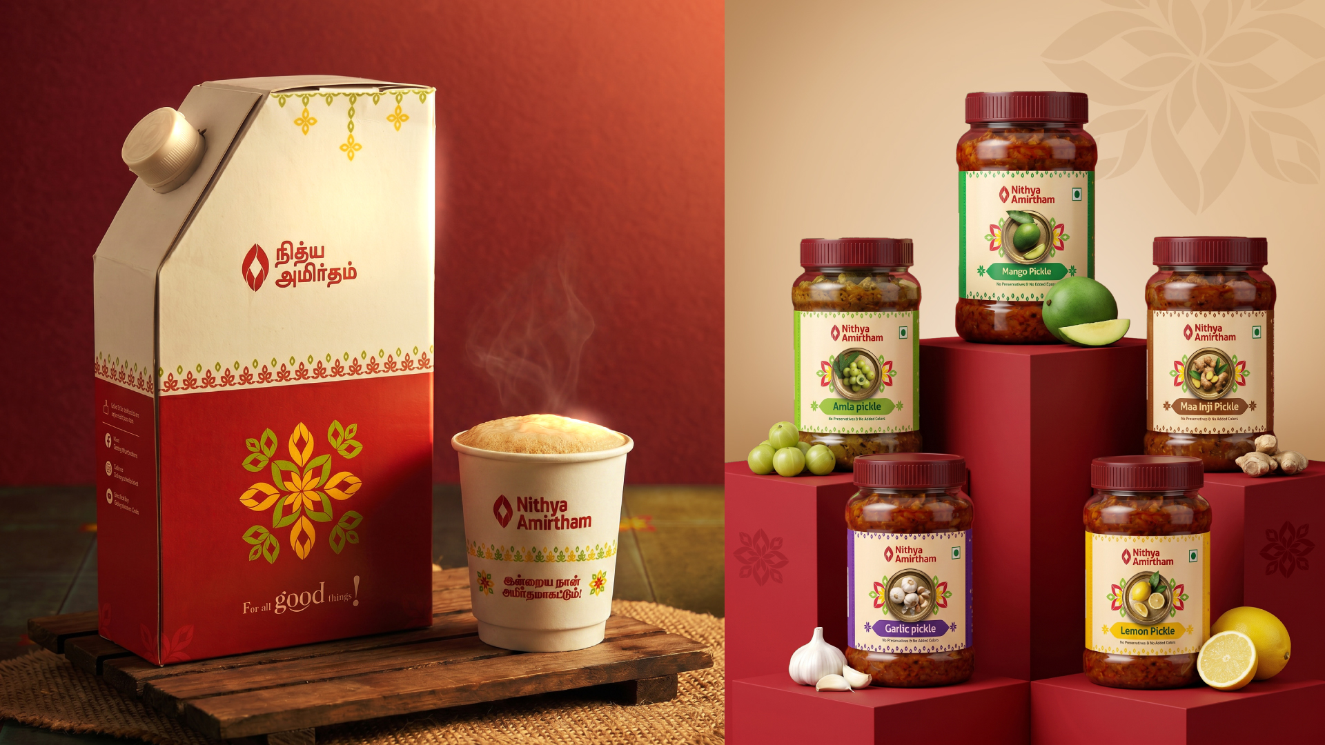
That “shall I.” That “shall we.” One sentence. The entire brand voice. Applied in Tamil and English across packaging, signage, uniforms, door stickers, and a food delivery catalogue.
இன்றைய நாள் அமிர்தமாகட்டும் — Amirtham means nectar in Tamil. May today be nectar. On every cup, every box, every card that leaves the store. Not a slogan. A blessing.

 Derrick Lin
 Biaa
Biaa Petitmoulin Studio
 White Bear Studio
 Eva Chistyakova
 monther al omari
 Atipus
 alchimistestudioParis
 oneandother
 bloomburo
 helocrene
 Shapers Studio
 Denver Design
 Aidearte
 andrew.huerta
 softmachine
 airobtq
 Buzz & Co.
 Ruby
Ruby themythographer
 IDNB Inc.
 viktorflr
 Zenpack