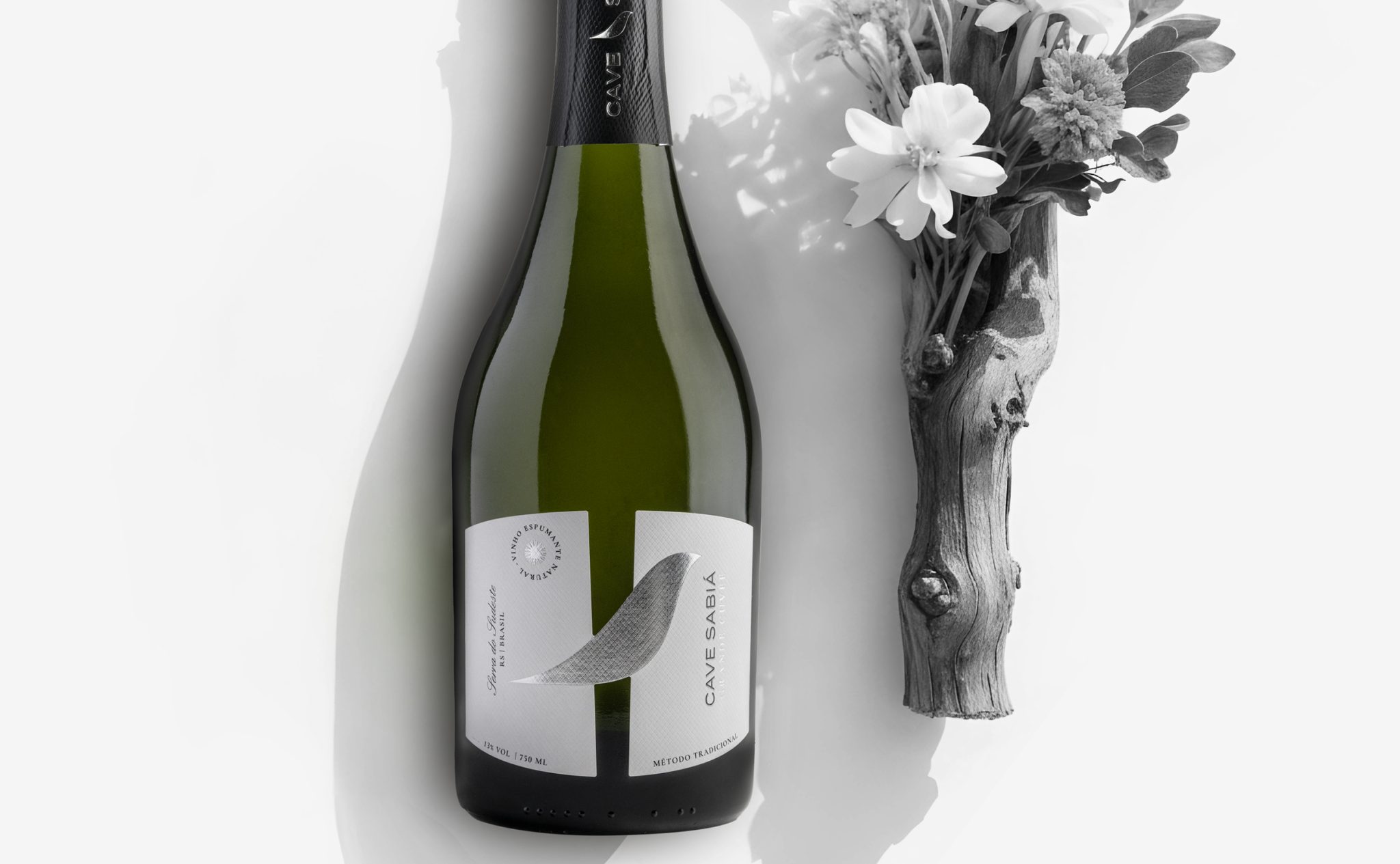

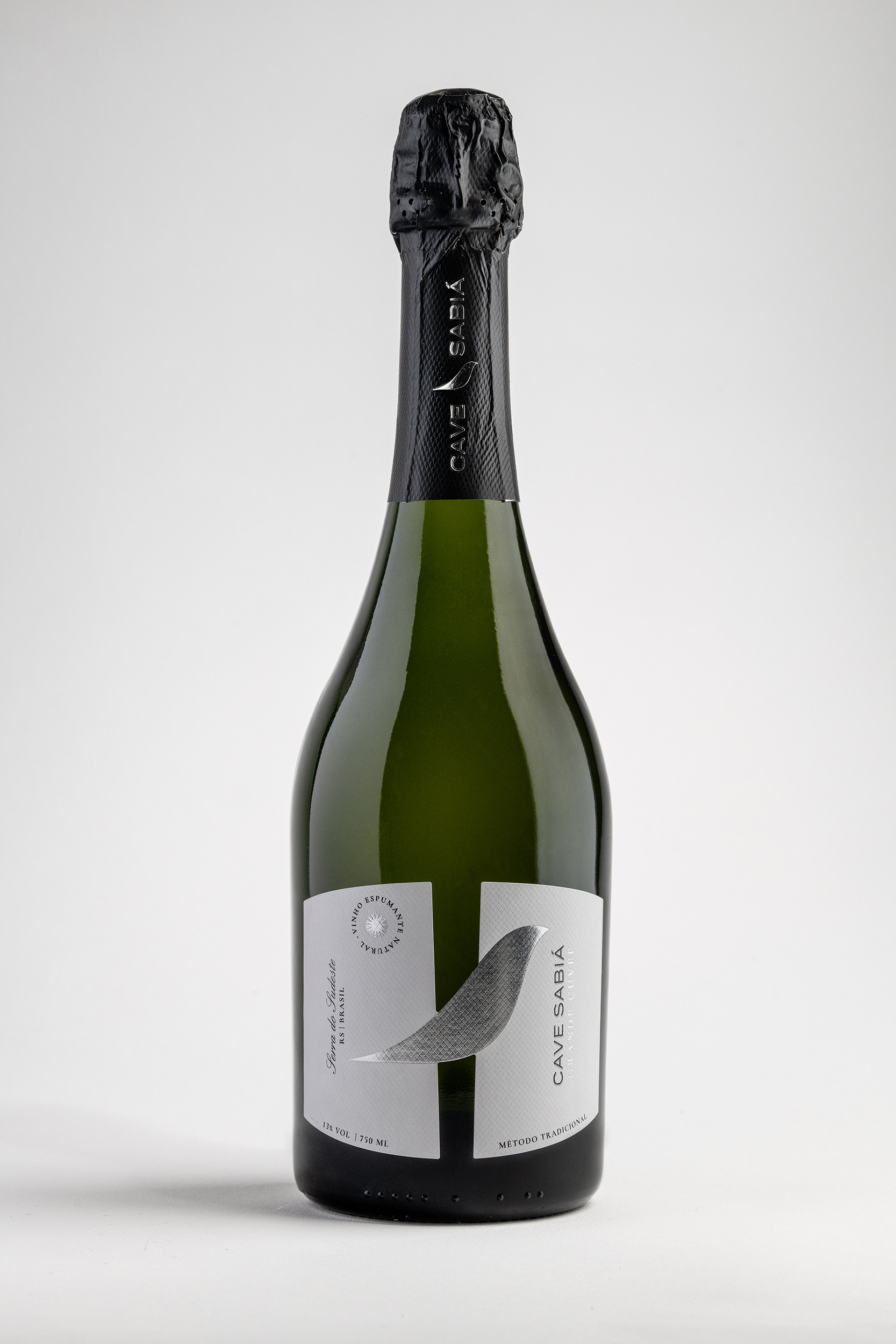
This label was created from the desire to express the identity of Cave Sabià in an essential and contemporary way.
The central mark is not an abstract element, but a graphic reinterpretation of the sabià, a bird symbolic of Brazil and the company’s logo. A recognizable sign, reduced to its essence and transformed into a gesture. The shape of the sabià crosses the label as a continuous movement, creating a dialogue between the two surfaces. The vertical division of the label reinforces this balance: two distinct parts that meet through the symbol, like the wine and its process, like origin and transformation. The mark thus becomes a point of connection between identity, territory, and vision.
The neutral color palette and the paper’s texture contribute to a clean, mineral tactile experience, consistent with Cave Sabià’s approach: precision, respect for time, and attention to detail.


 Derrick Lin
 salutifg
 ADStudio
 WeAreDepot
 Manuvila
 Yellow Umbrella Creative
 Toka
Toka Studio Zak
 Atiq Alam
 monther al omari
 Modern Theory
 Sirka Agency
 DESIGN CONCEPTS
 Eva Chistyakova
 Puigdemont Roca
 marianaaworks
 bloomburo
 andreamarinnn
 Alina
Alina Saadmost
 Bruhken
 Maruf Nishat
 Richest Branding Pvt. Ltd.
 Sophiagdotcom
 saifullahmaslool
 Up-Brands