

BIC Cello is India’s largest stationery manufacturer and a brand synonymous with knowledge, learning, and everyday innovation. Cello Butterflow, one of its most iconic ranges, is celebrated for its advanced Lubriflow ink system, 0.7 mm fine tip, and ergonomic Elasto grip, which together deliver a consistently smooth writing experience.
As a design agency, our objective was to build a stronger, more distinctive identity system for the Butterflow portfolio while ensuring clarity across its expanding variants. We began by crafting a unique visual mnemonic using the letter ‘B’ from Butterflow. This bold, fluid ‘B’ became the core design device across the packaging-symbolizing the seamless flow of ink while creating an ownable and recognizable brand asset. The form was integrated into the layout architecture to add dynamism and strong shelf presence.
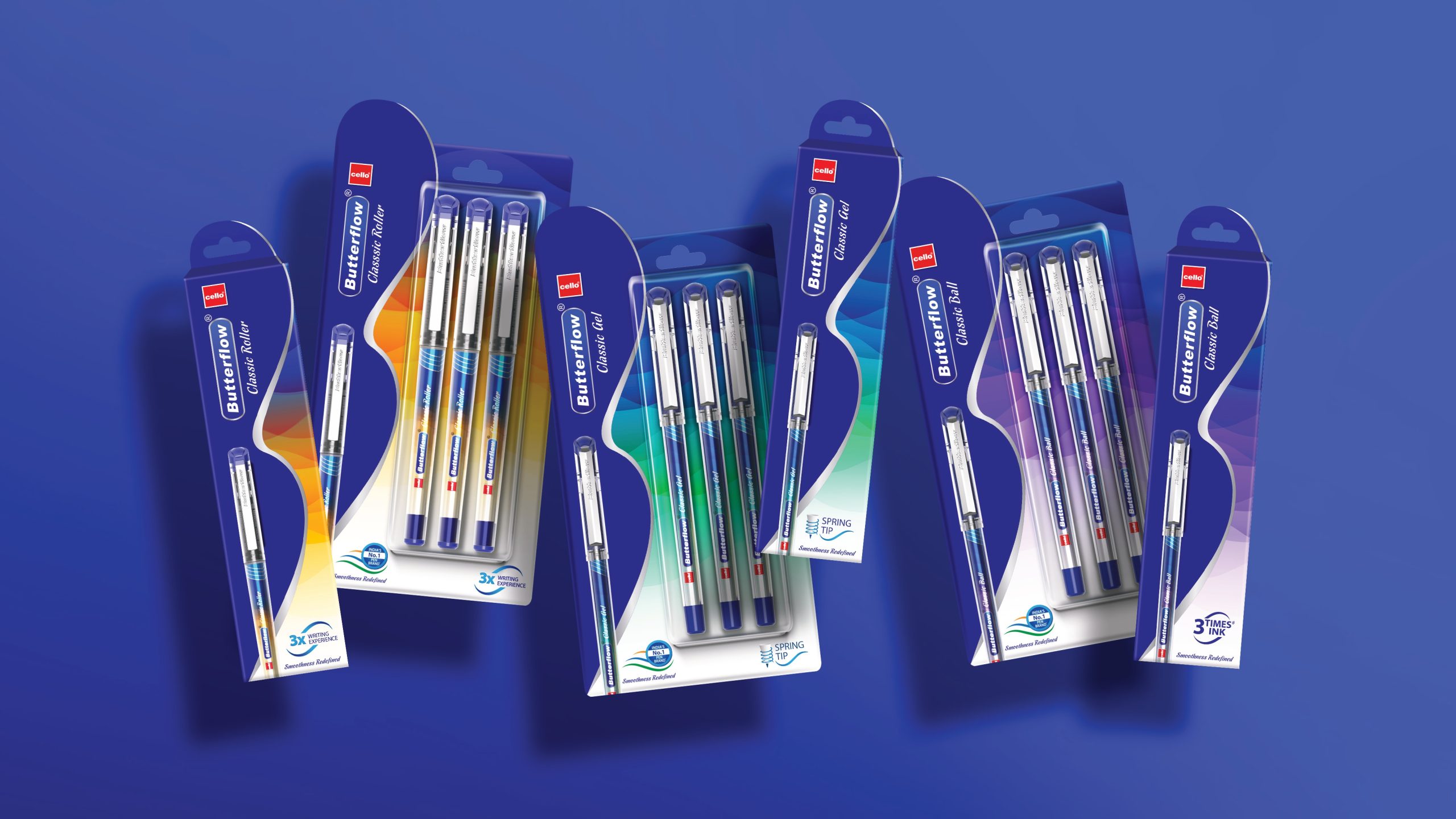
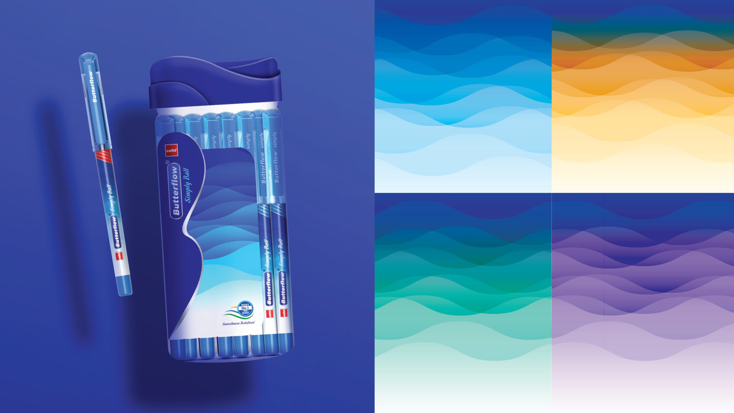
We structured the packaging system to cohesively accommodate variants such as Cello Butterflow Simply Ball, Cello Butterflow Classic Roller, Cello Butterflow Classic Gel, and Cello Butterflow Classic Ball. Each variant retained the master design language while using differentiated colour cues and hierarchy to clearly define its category. For the Butterflow Simply range, we highlighted the core portfolio with a confident range shot anchored by the bold ‘B’, reinforcing smoothness and reliability.
To enhance communication, we developed bold, minimal, and persuasive iconography that translated product benefits-Lubriflow ink system, 0.7 mm precision tip, and Elasto grip-into clear visual cues. Individual pen sleeve designs featured bright colours to distinguish ink types and classifications, enabling easy consumer navigation. The result is a cohesive and modern packaging ecosystem that reinforces Butterflow’s promise of performance, comfort, and everyday excellence.






 TheDesignPeople
 monther al omari
 Ximena Ureta Design Studio.
 vitoramockup
 Up-Brands
 Sophiagdotcom
 Peter said
 ayeidadezigns
 Tancybox
 宏洛图品牌设计HONGLT
 Modern Theory
 Dozen Agency
 Atiq Alam
 Olio Studio
 Ruchi S. Joshi
 mmdesign
 awaiskhadim
 Octasoft
 United Creatives Studio
 Kingdom & Sparrow
 Anastasia Bakhmatskaya
 CreativeWise
 Great and Golden