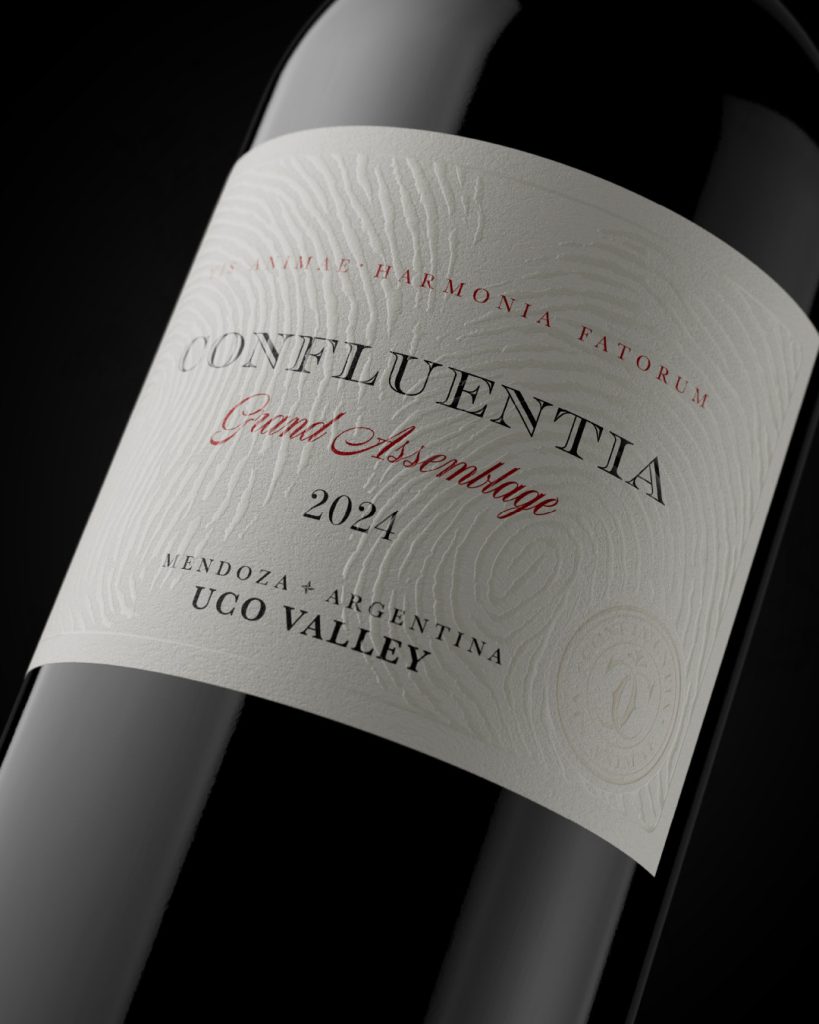

Confluentia is born at a crossroads where different histories, cultures, and worlds converge to shape a singular expression. The project emerges from the friendship and shared vision of two founders—one Brazilian, one Argentine—whose personal and professional paths found a common language through wine. This encounter is not anecdotal; it is structural. The brand’s identity is built upon convergence.
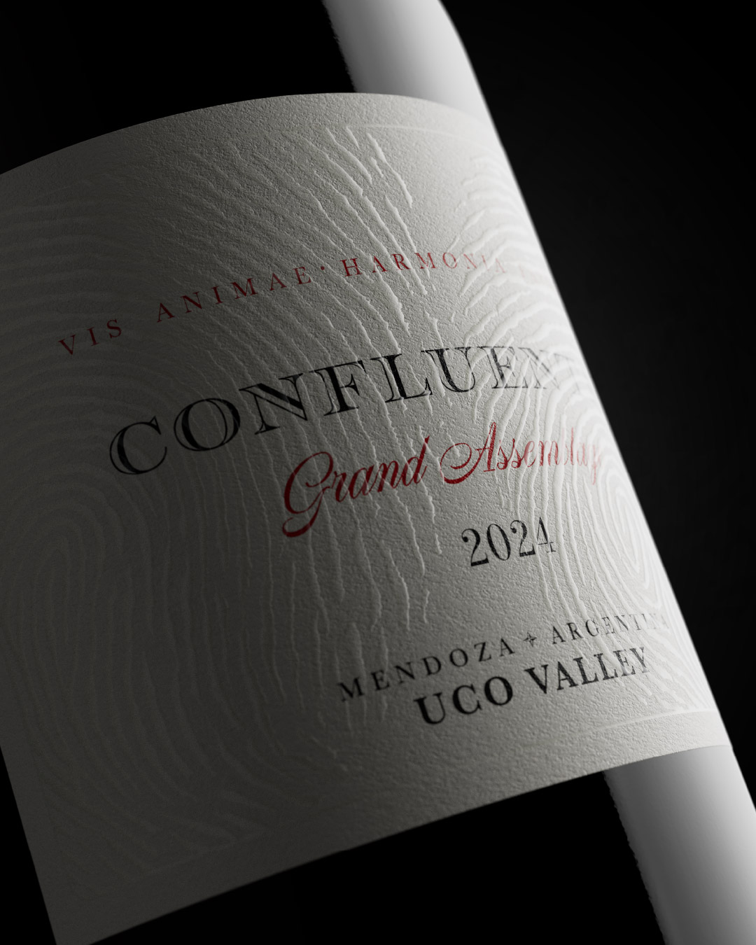
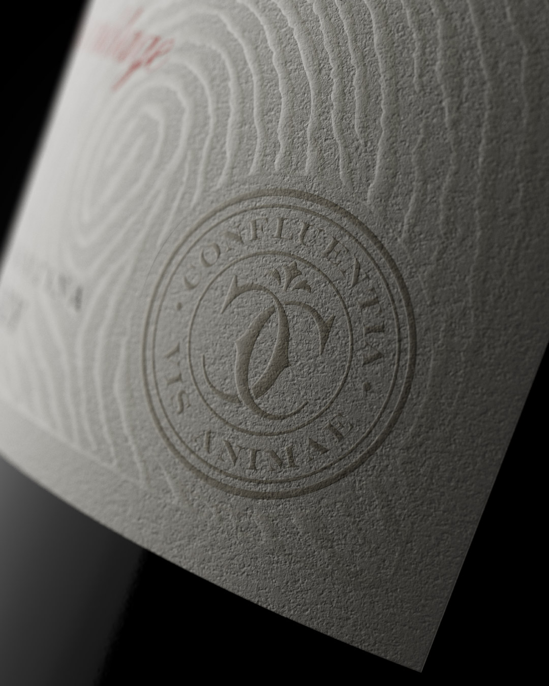
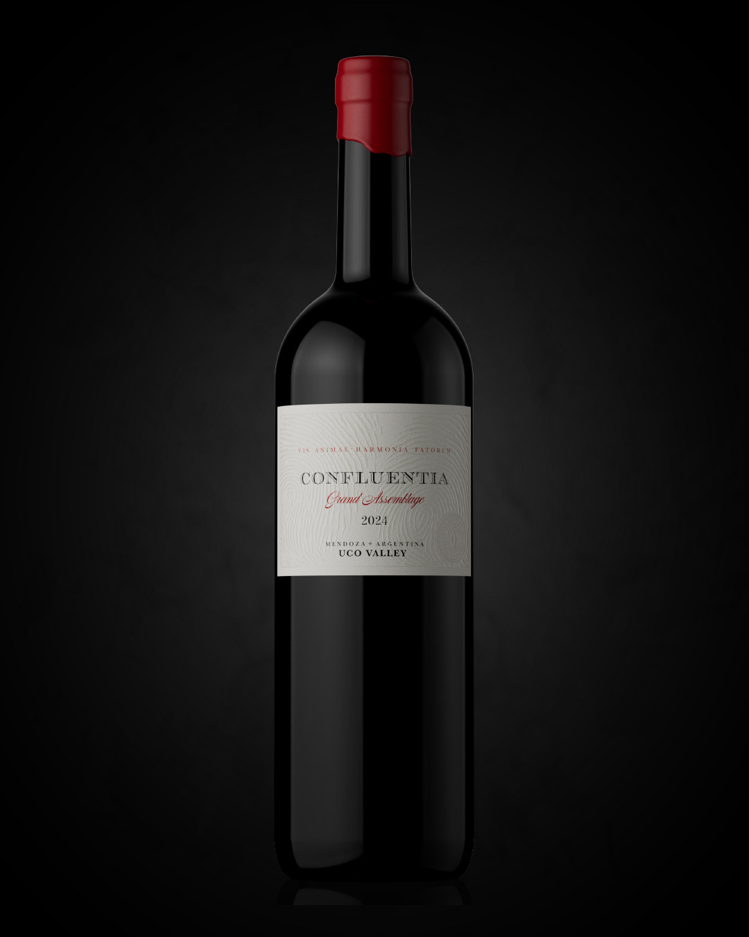
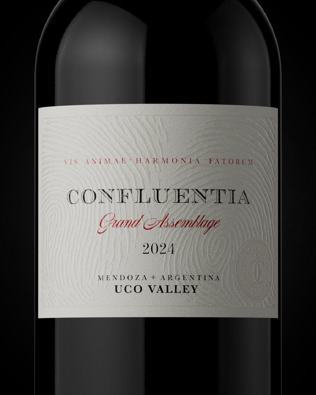
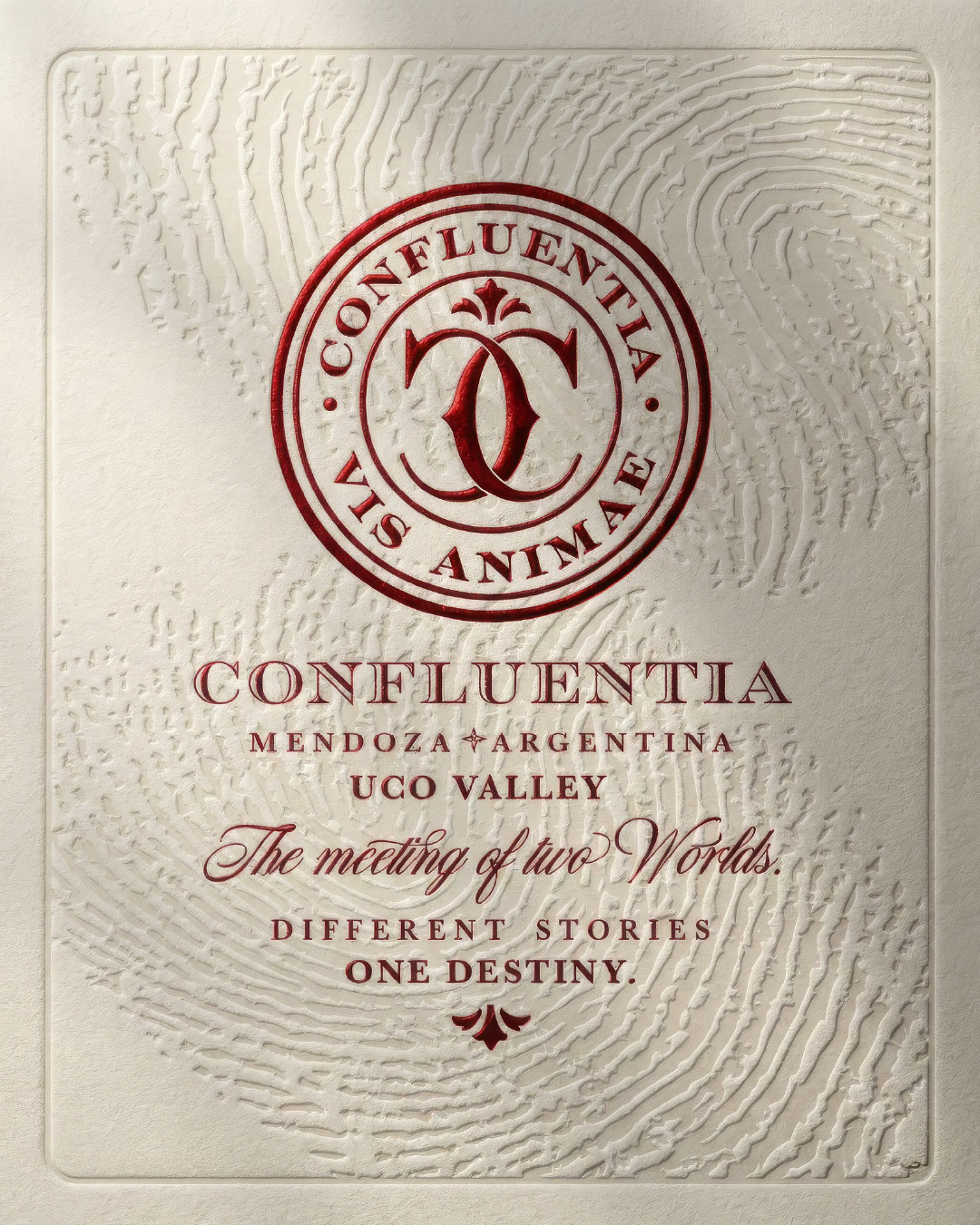
The label design translates this concept into form and texture. Its aesthetic is sober, elegant, and timeless, grounded in a restrained, classical composition where every element is deliberate. The true narrative reveals itself through the surface: a subtle pattern of fingerprints runs across the label, belonging to the founders themselves. This is not decoration, but a symbolic act. Two identities, two histories, two countries, imprinted onto a single skin. The label becomes a tangible record of the crossing that gave birth to Confluentia, where encounter turns into memory and design becomes storytelling.
Packaging design by Vantablack Studio.



 Studio Zak
 Ander Sanchez
 Atipus
 Widarto Impact
 hovski
 Ohmybrand
 CreativeWise
 Rauf Karaev
 Hooperstudio
 La Nube de Ideas
 Modern Theory
 Akim Melnik Design Studio
 preflightcreative
 Seyf El Haq Menouer
 Badraddine Attik
 Samriddhi Ravi
 Alessandro Ammaturo
 Amblr Studio
 vladlenalevit
 Sis Tsarukyan
 monther al omari
 alchimistestudioParis
 designsbysukaina
 About House of Ta
 Amjad Battal