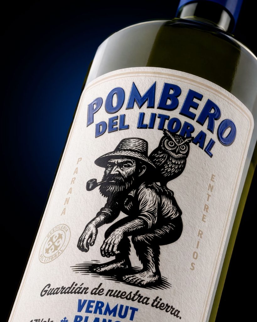

Pombero del Litoral
Vermouth — Paraná, Entre Ríos, Argentina
Guardian of our land.
Deep in the forests of the Argentine Litoral, where light barely finds its way through the trees, stories speak of El Pombero — an ancient spirit rooted in Guaraní mythology, guardian of animals, the forest and its natural balance.
To those who respect the land, he may offer silent protection: a path that suddenly opens, a danger that disappears. But those who harm the forest may find his footprints leading somewhere they cannot return from.
Invisible, elusive and as real as the wind moving through the leaves, El Pombero exists somewhere between myth and truth — a reminder that nature is always listening.
Pombero del Litoral is a vermouth created in Paraná, Entre Ríos, and part of the visual universe of Destilería del Litoral. Each product developed for the distillery takes a myth, character or legend from the Argentine Litoral and transforms it into its own packaging narrative.
For this edition, the Pombero becomes the central figure of the label: portrayed alongside the owl, surrounded by a visual language inspired by traditional printed labels, old regional ephemera and vernacular illustration.
The identity is built around a restrained palette of black, warm ivory and a single identifying color for each variety — blue for Blanco and red for Rojo. Strong typography, ornamental framing and the detailed central engraving give the packaging a character that feels both historical and contemporary.
Rather than simply decorating the bottle, the label works as a small piece of folklore: an object that carries a story from the Litoral and gives it a new place in the present.
Pombero del Litoral. Guardian of our land.
Curator’s Insight
Most spirits labels borrow folklore as decoration, a motif dropped onto a bottle to suggest heritage without doing the work of earning it. This one does something harder. It asks an engraving to carry the actual logic of the myth.
The Pombero is described as invisible, a presence felt rather than seen. That is a strange brief for a label, since a label’s entire job is to be looked at. The solution is in how the figure is drawn rather than whether he appears at all. Dense crosshatching, a hunched and half formed posture, an owl doing the watching his own eyes seem to avoid. The linework has the texture of something glimpsed at dusk rather than photographed in daylight. You are not looking at a mascot. You are catching sight of something that would rather you hadn’t.
The typography earns its place the same way. Bold, slightly worn letterforms sit closer to a general store sign than a premium spirits category, and that mismatch is the point. Nothing here is polished toward luxury. It is polished toward believability, the kind of object that could plausibly have existed in a Litoral village fifty years before this vermouth did.


 Natasha Spitsyna
 babyage
 GruppoSaida
 ahmedraoudgfx
 Hi estudio
 Nadezhda Gorelikova
 Studio Garces
 Brandsbylufo
 Rewot
Rewot alchimistestudioParis
 Asprey Creative
 kat bres
 Valérie Colace
 Atiq Alam
 Sara Communications
 David Hakobyan
 monther al omari
 Innovāt - Empowering Creative Innovation
 mmdesign
 Amjad Battal
 Hollóka Grafikai Műhely / Graphic Design Studio
 Palashcc
 ABC Design Communication
 ChrisSkarlatos
 Hedayat Hadavi
 Tia Nguyen