
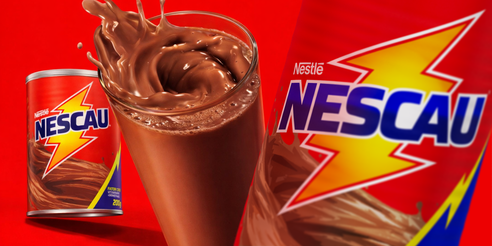
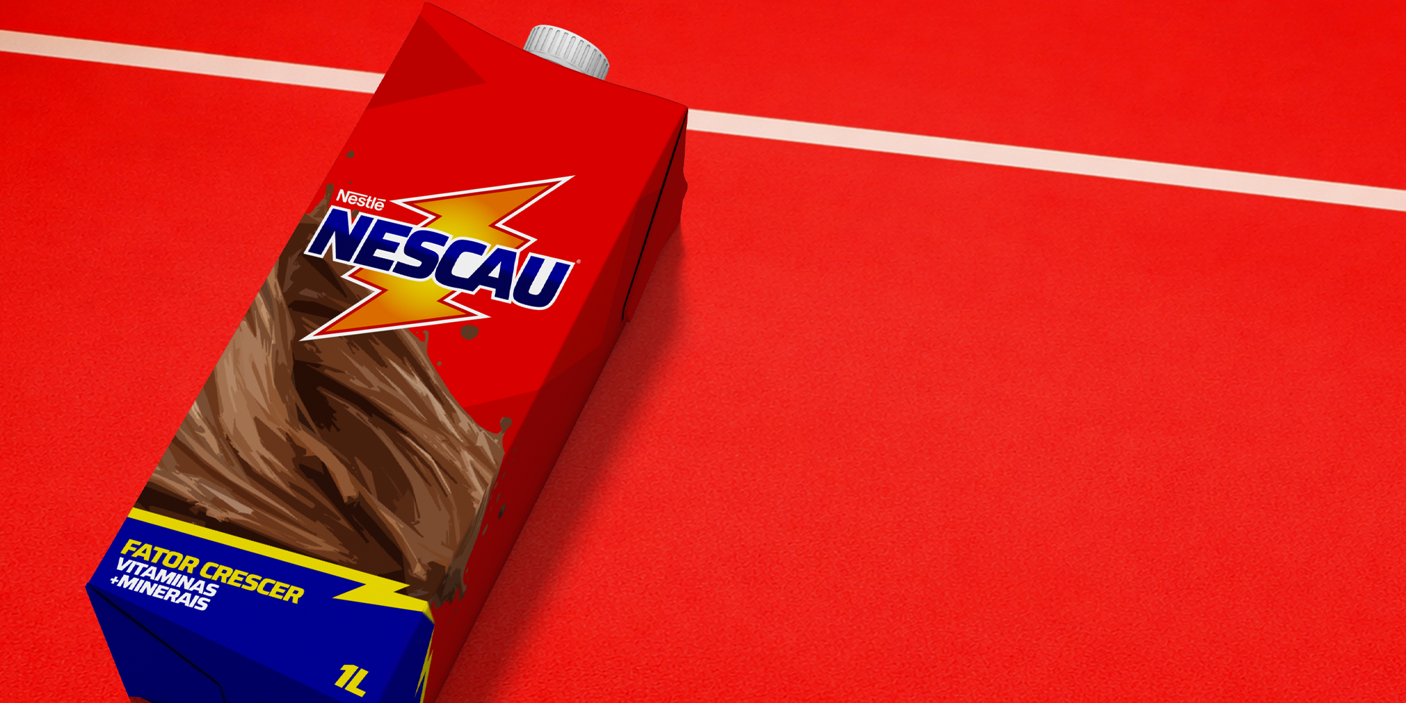
The new NESCAU® visual identity was created to feel energetic and bold, moving away from minimalism. The lightning bolt, with its gradient, becomes a more striking visual element and also works as a secondary brand icon. It represents energy and movement. Strong, vibrant colors reinforce the brand’s presence and create greater visual impact. The typography was designed to be clear, bold, and easy to read. Its robust, well-defined letterforms, combined with the gradient and slanted angle, enhance the sense of motion.
 Derrick Lin
 VincoStudio
 lisakaplina
 CreativeWise
 alchimistestudioParis
 Adriana Adamo
 tauqueer
 MAISON D'IDÉE Prague
 Pixels Studio
 Atchayaa
 DESIGN CONCEPTS
 hello ocean
 monther al omari
 the Labelmaker
 alamgirbrands
 kat bres
 Vantablack Studio
 GruppoSaida
 studiorevv
 grafisercreative
 Kate Reichel
 UPRISE