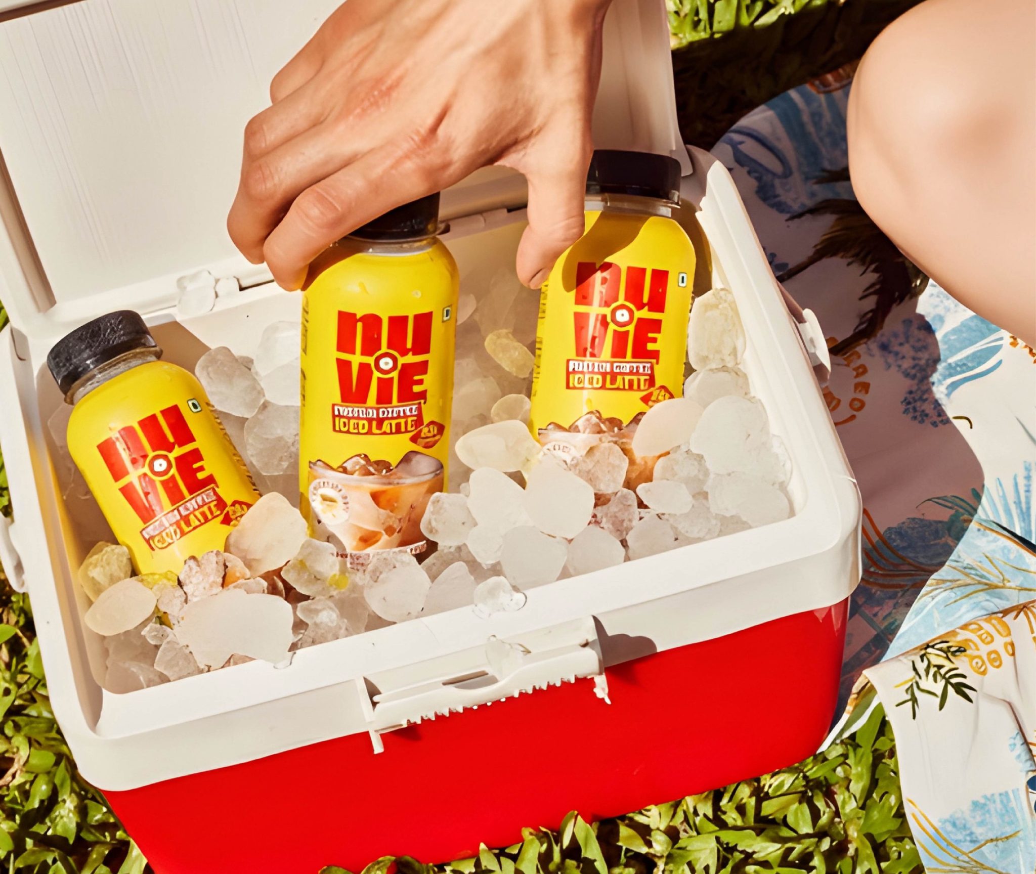

In a category flooded with loud claims, hyper-masculine aesthetics, and rainbow-coded flavours, the founders of Nuvie approached us to rethink how it shows up in culture.
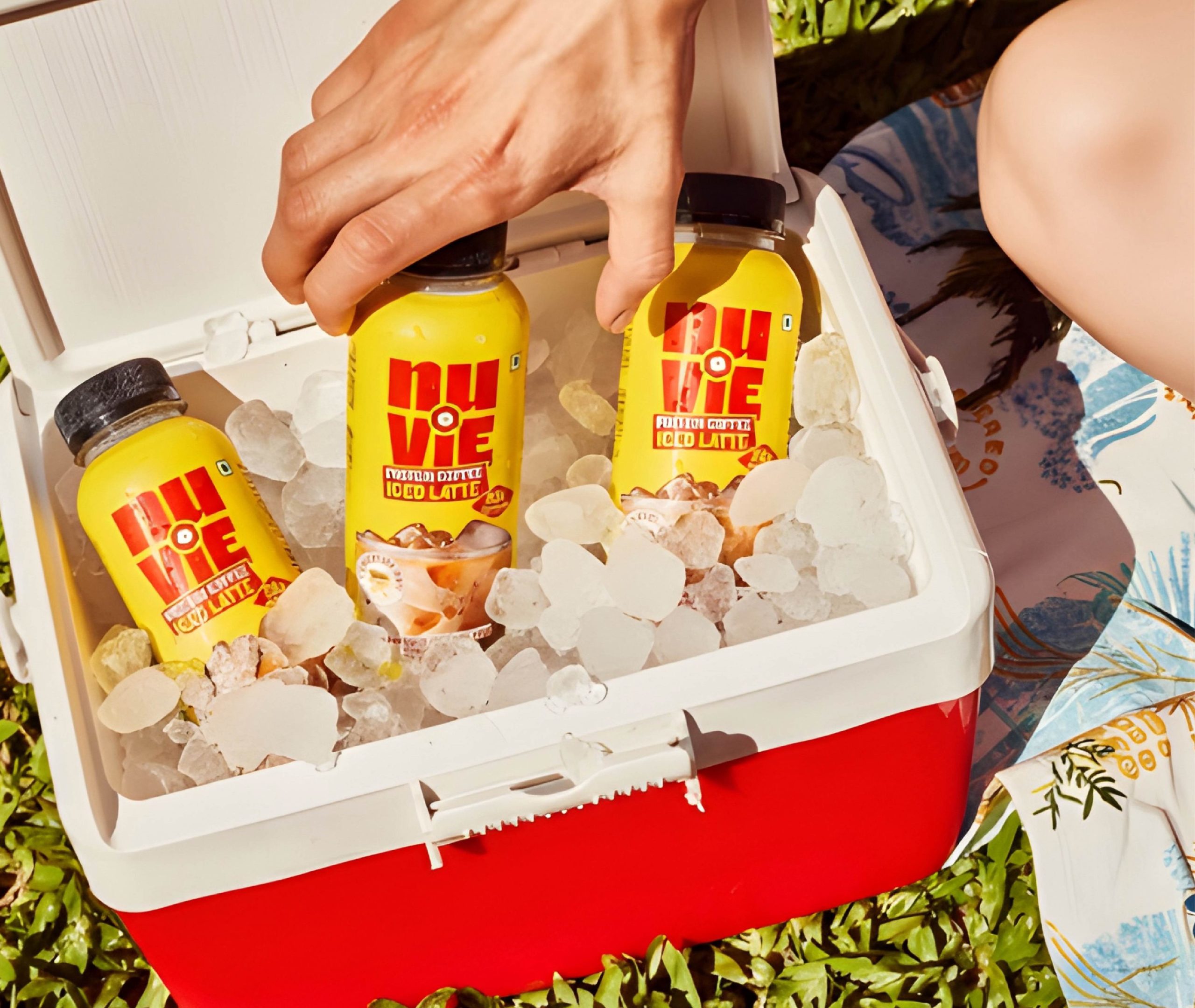
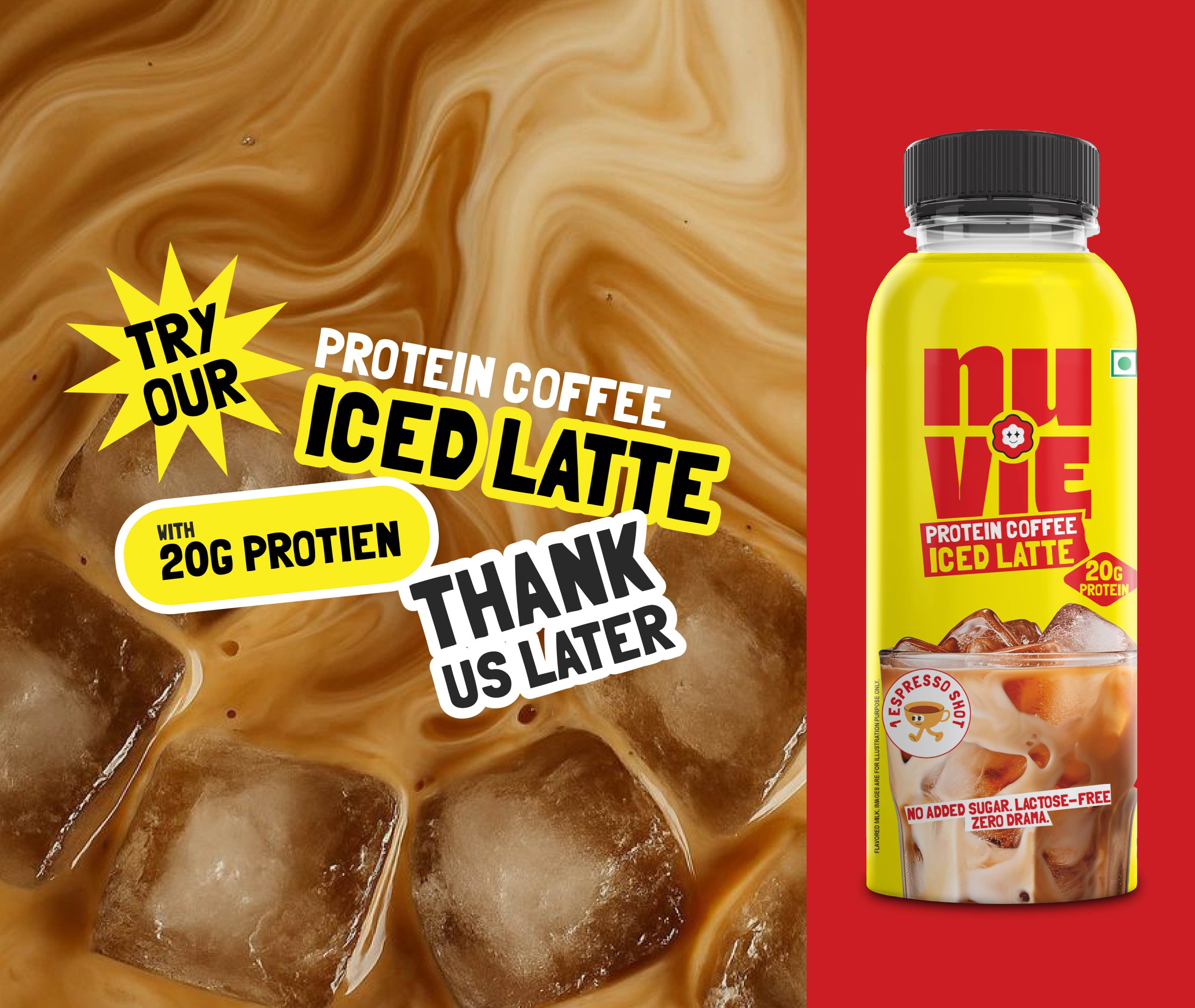
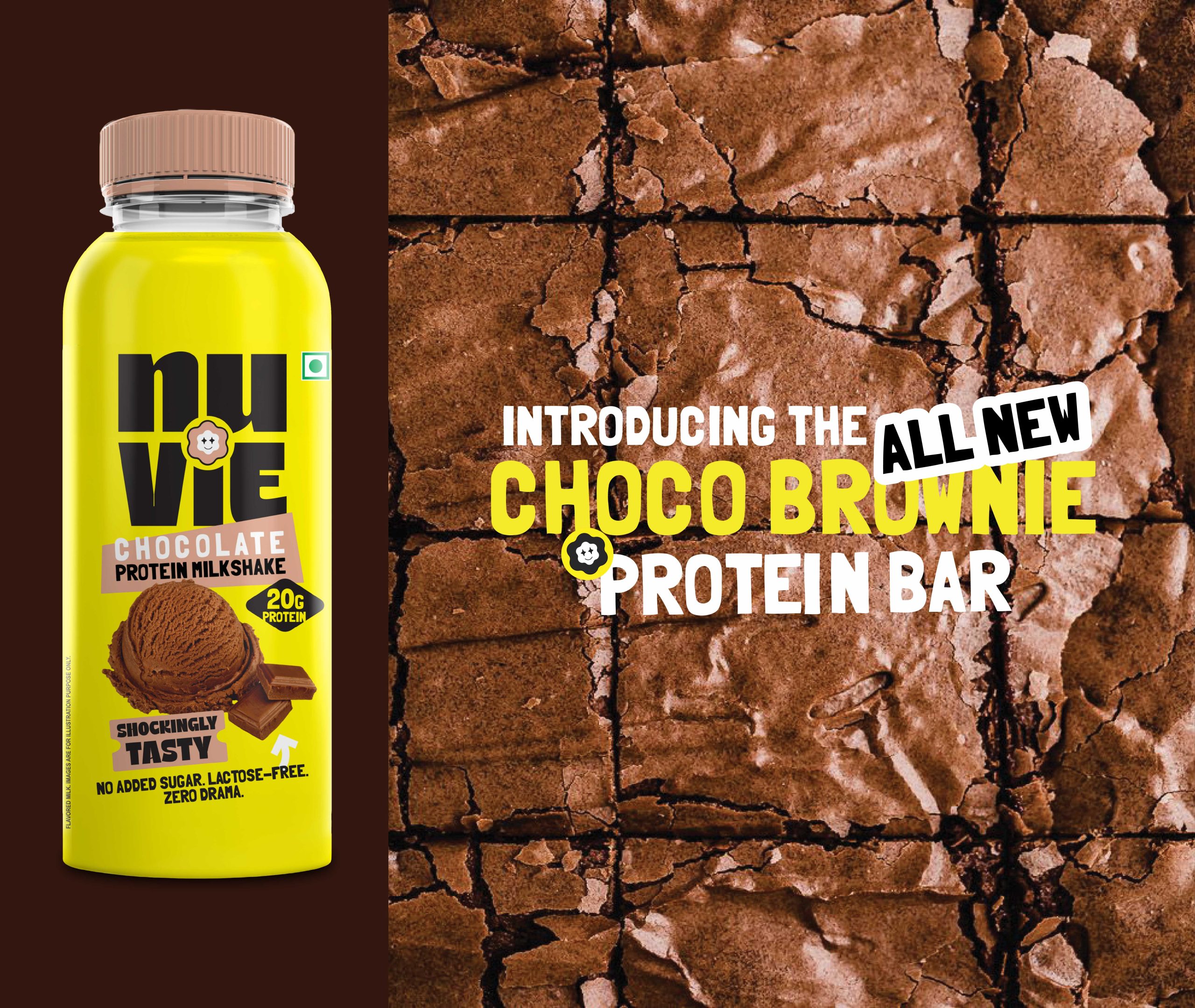
With a portfolio spanning protein bars, protein shakes, and a breakout best-seller — protein coffee, the brand wanted to move beyond functional fitness and become a lifestyle choice for India’s Gen Z consumers.
Our challenge:
Create a distinctive brand and packaging system that cuts through clutter while building recall across formats and shelves.
The Brand Idea: Owning One Colour
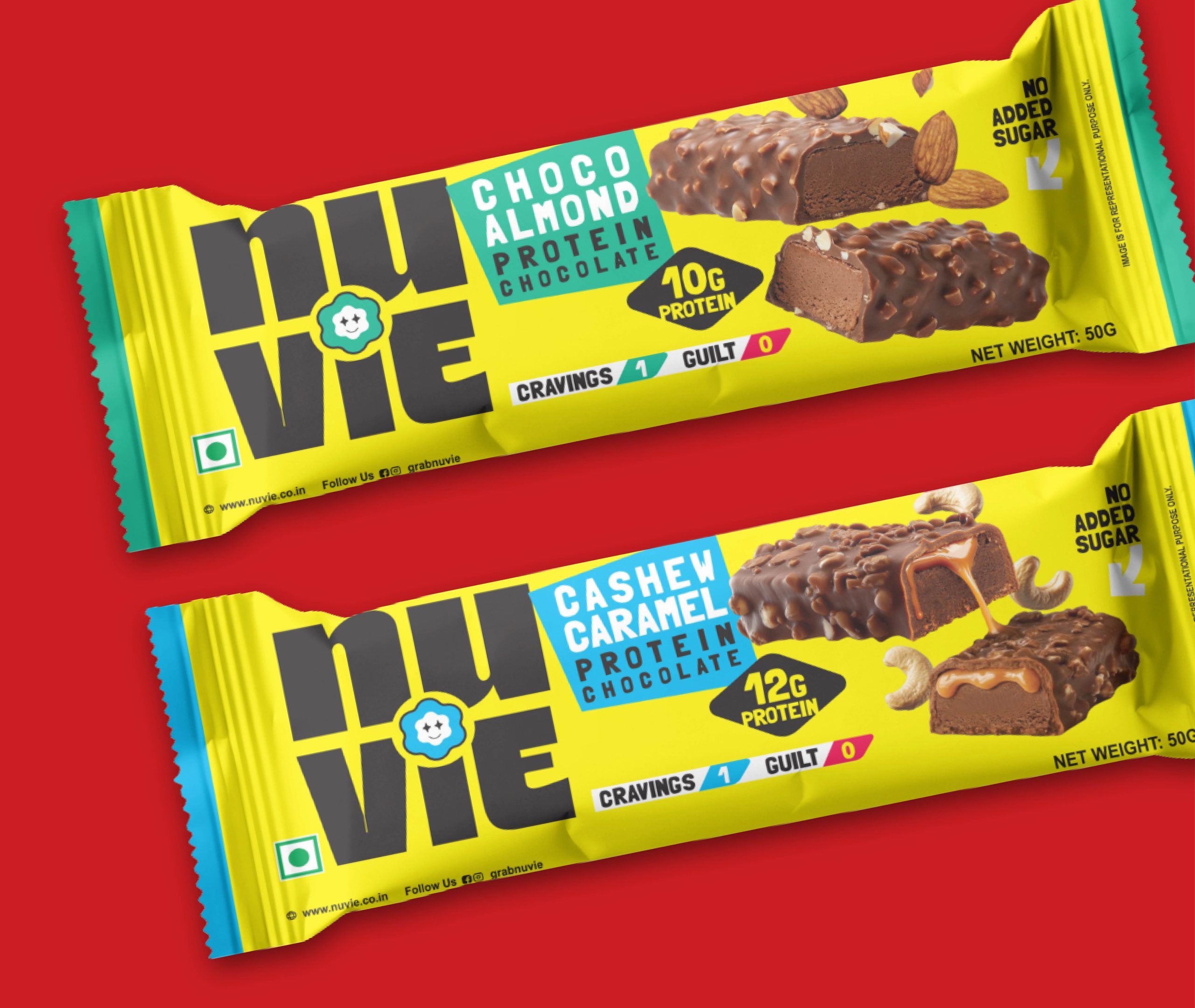
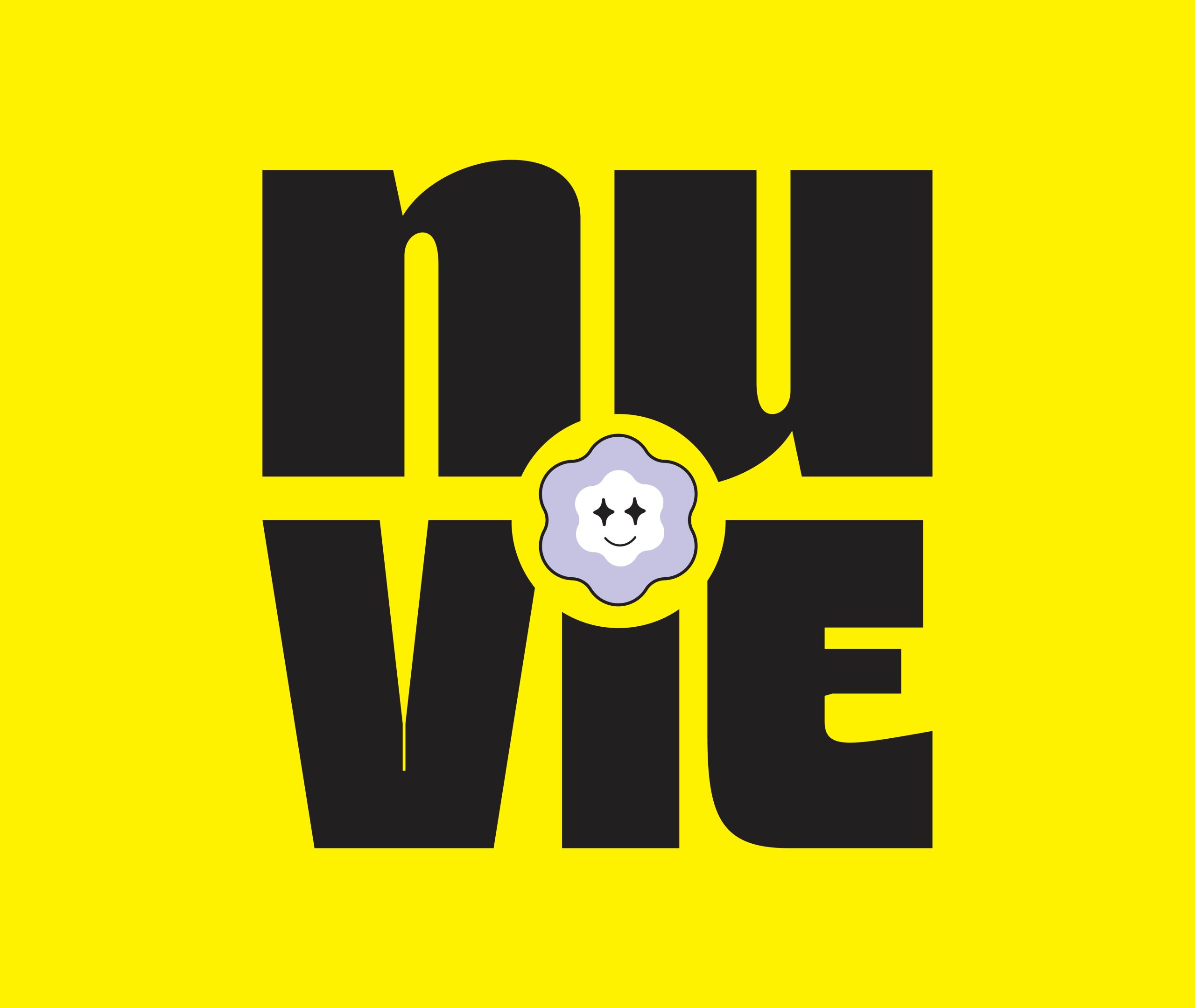
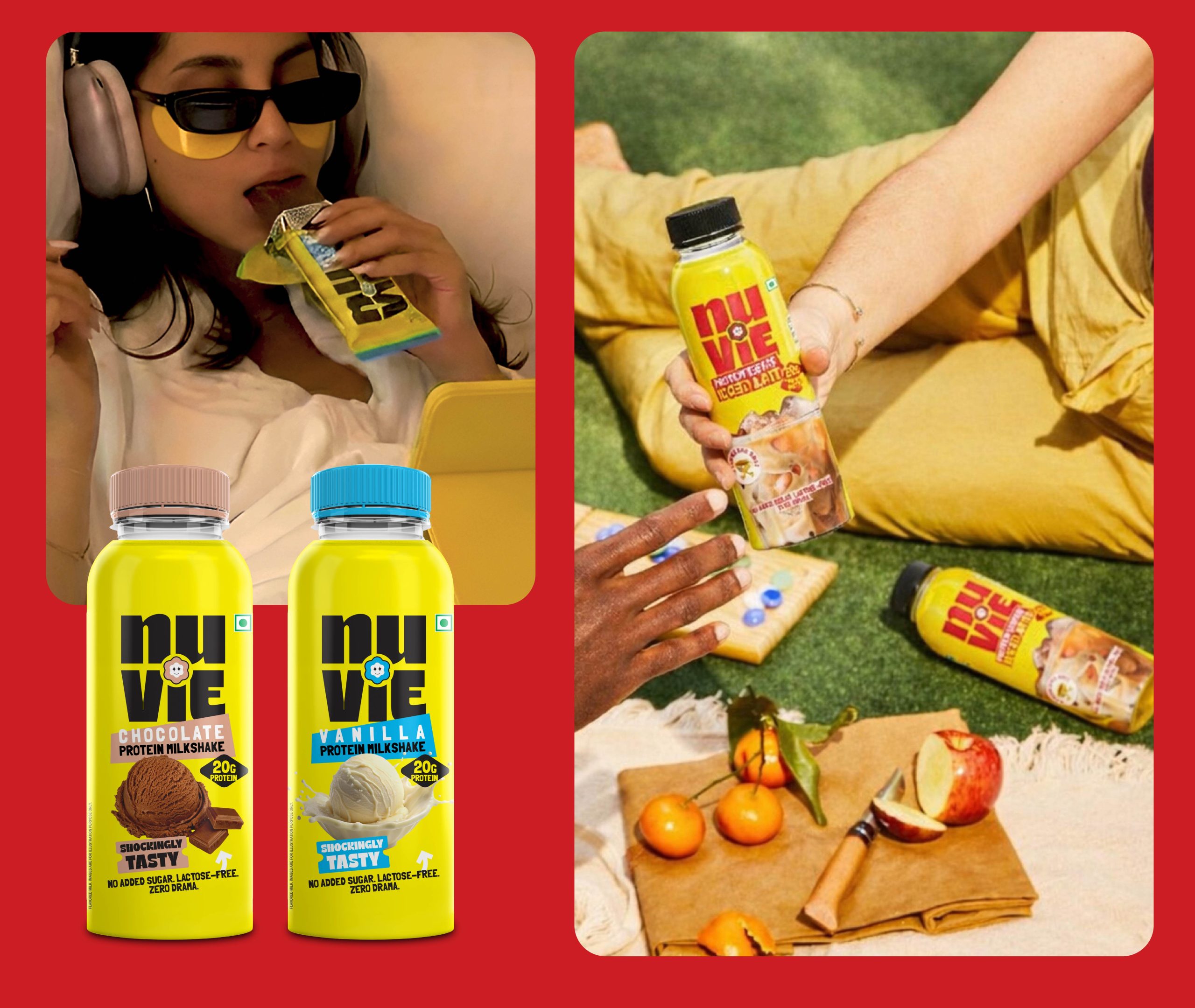
We moved away from the category’s rainbow logic and built a single-colour brand world — a deliberate move to create instant recall and visual authority.
The approach:
- One hero colour as the primary brand asset
- Minimalist layouts to reduce cognitive load
- Strong typographic hierarchy for clarity
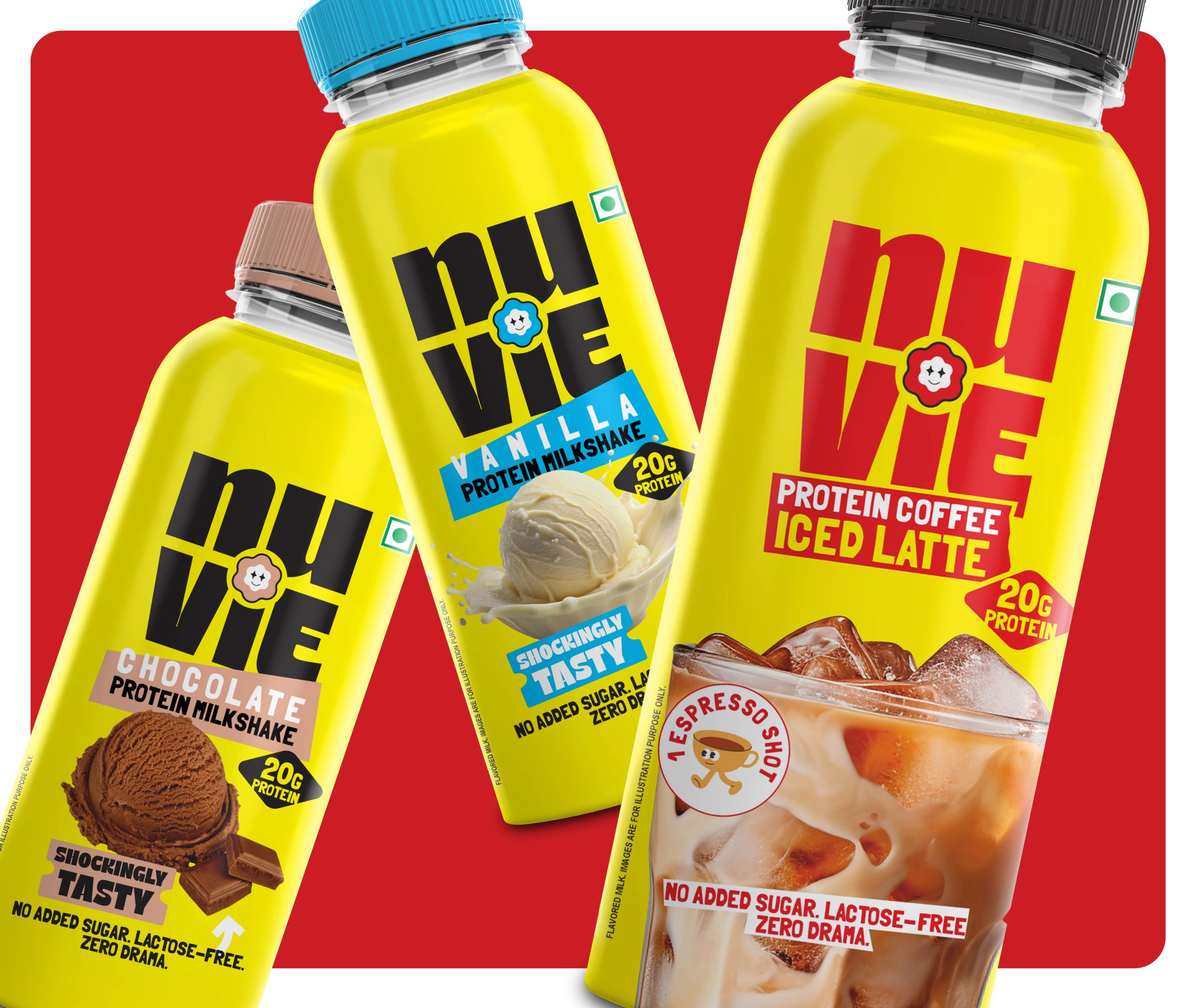
- Subtle flavour cues without fragmenting the brand
This created a packaging system that feels confident, modern, and unmistakably ownable.
This strategic shift helped the brand achieve instant recognition, stronger recall, and a more premium, lifestyle-led perception across retail and e-commerce environments.
The result is a scalable brand identity and packaging design system that unifies bars, shakes, and the hero protein coffee while positioning the brand as culturally relevant and future-ready. This project demonstrates how thoughtful branding for FMCG and nutrition brands can cut through visual noise, build memory structures, and drive differentiation in a crowded category.
 DesignAnswers
 alchimistestudioParis
 Estudio Argo
 Modern Theory
 monther al omari
 Ohmybrand
 Affogato Brand Design
 Tancybox
 waanrong
 nazystudio
 Daria Fox
 g.apolly
 sahildoesartt
 Stiandco
 BREAK DESIGN
 ShreyaDighe
 Sameh Elnahas
 Minim Brand Design
 Ebbi
 Shabouk Printing & Packaging (Shabouk Carton Boxes – شعبوق)
 Brandegree
 Abbydraw Designs Unique Conceptual Branding & Packaging Designing Ideas
 bilel tkouri
 NEV
 Stefano Bracci
 Alina