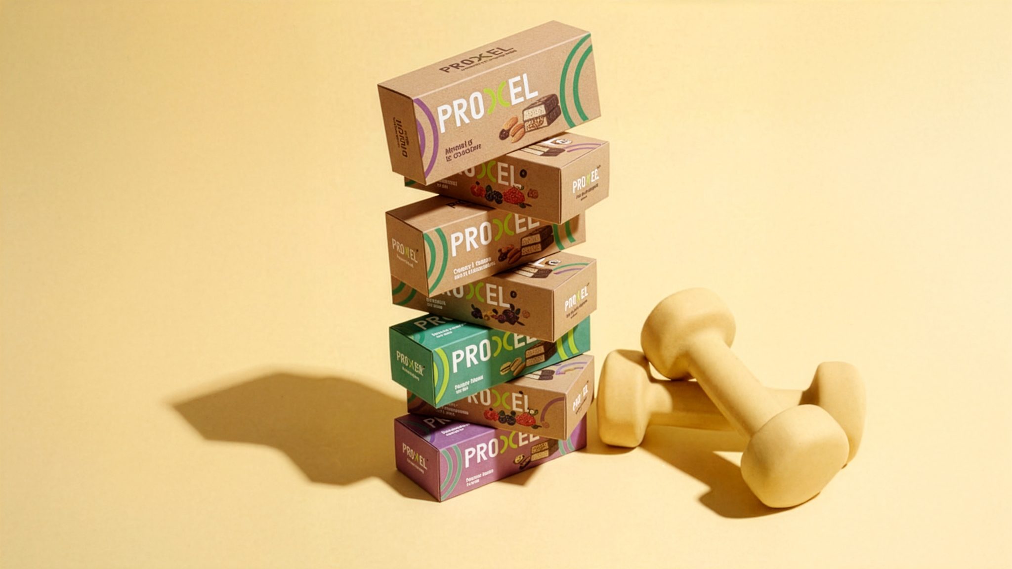

PROXEL – Structured Power in Motion
PROXEL is a performance driven sports nutrition brand built around precision strength and controlled energy.
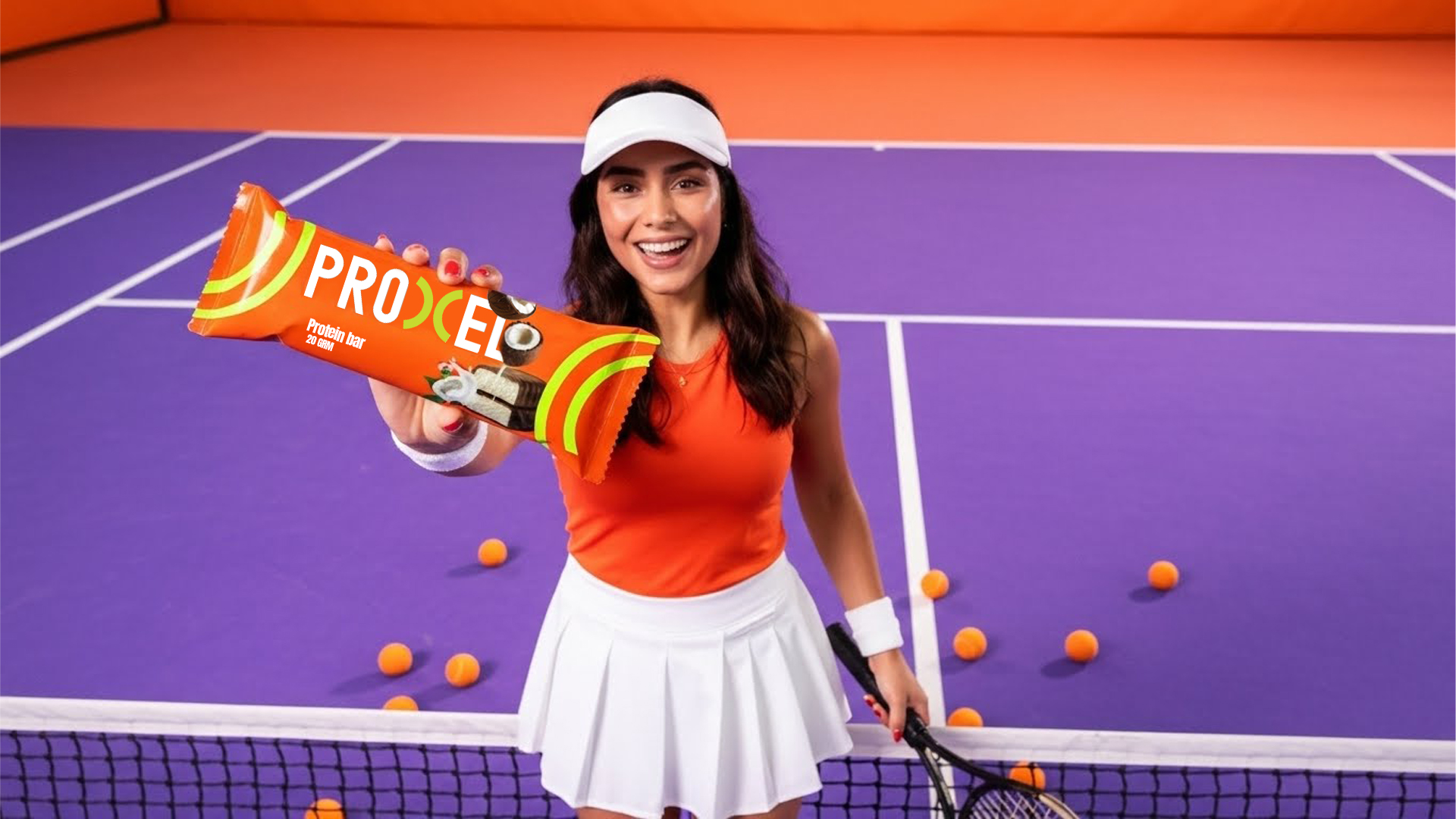
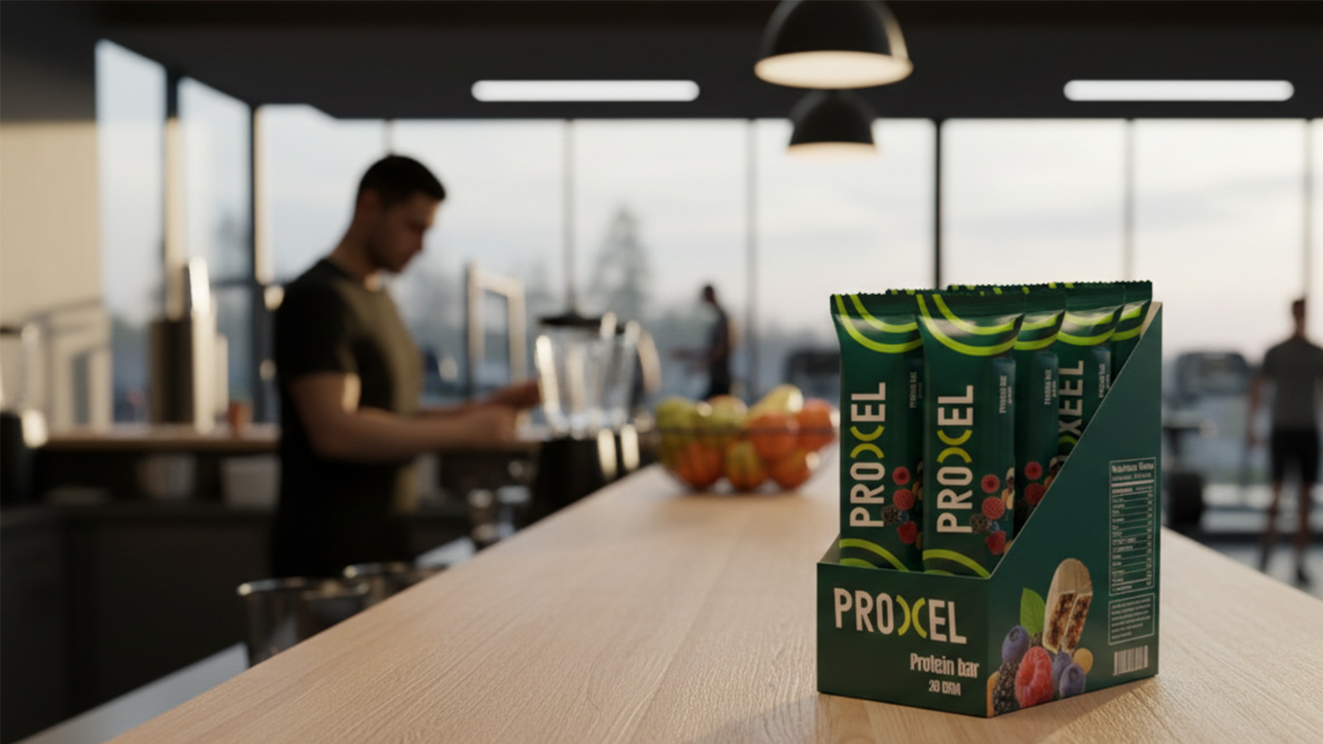
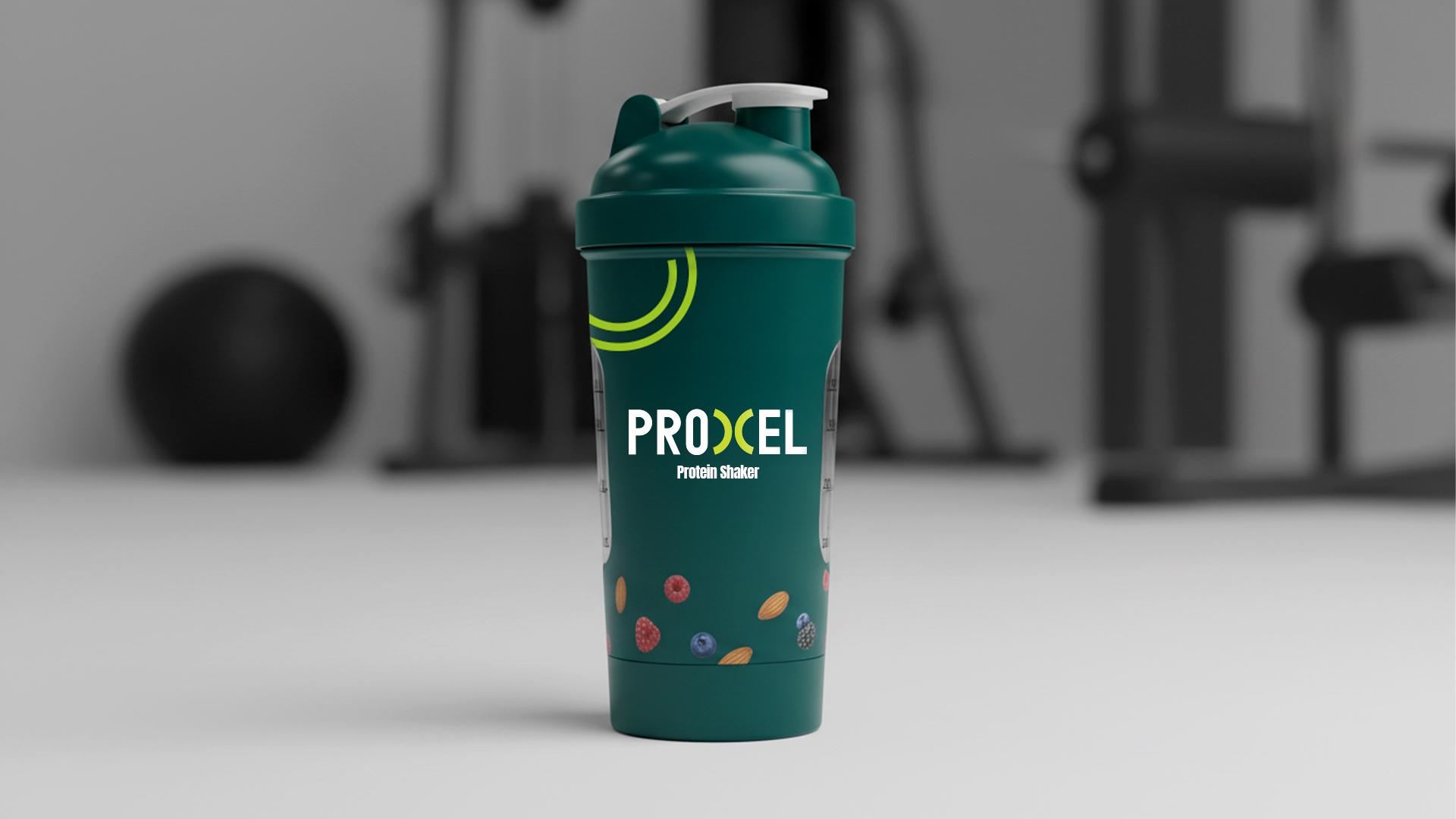
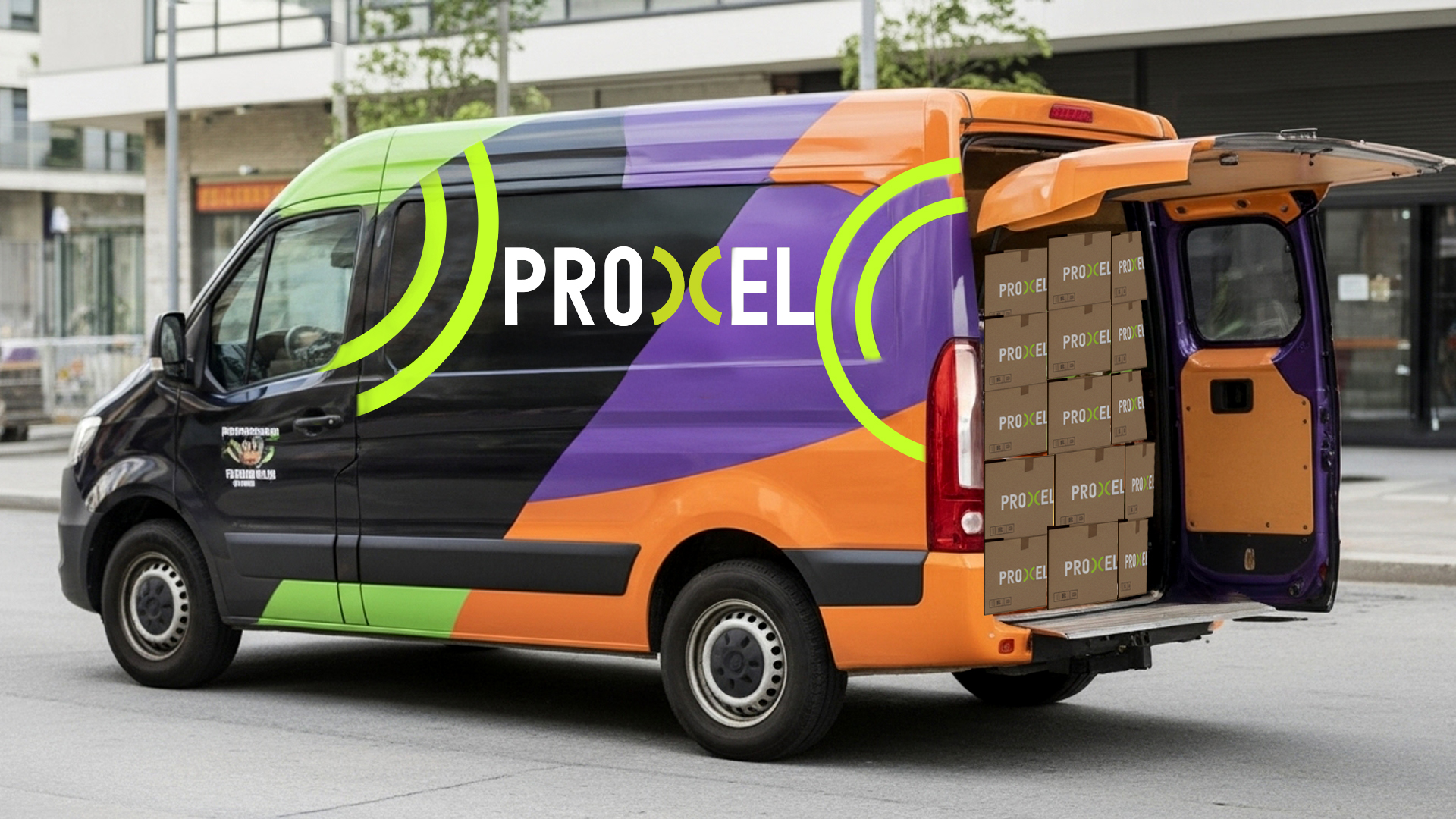
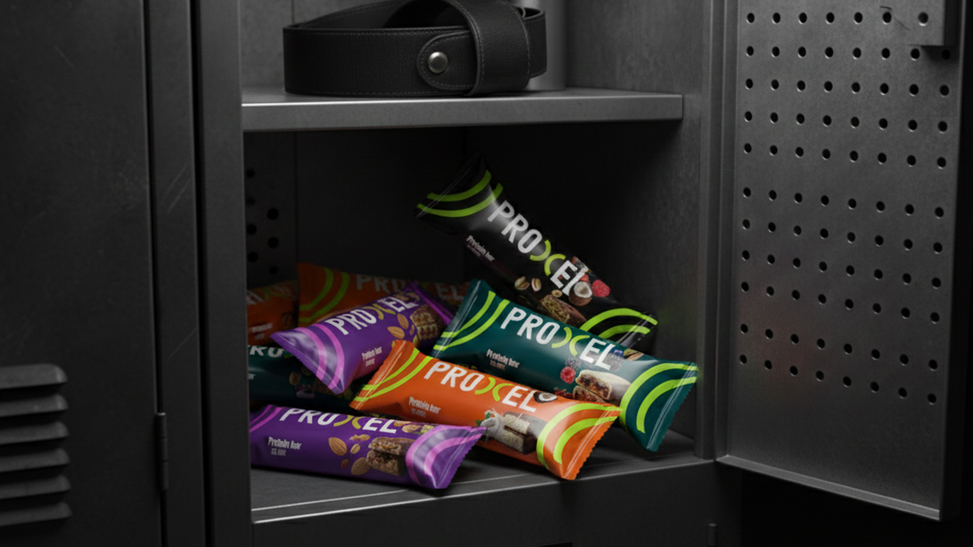
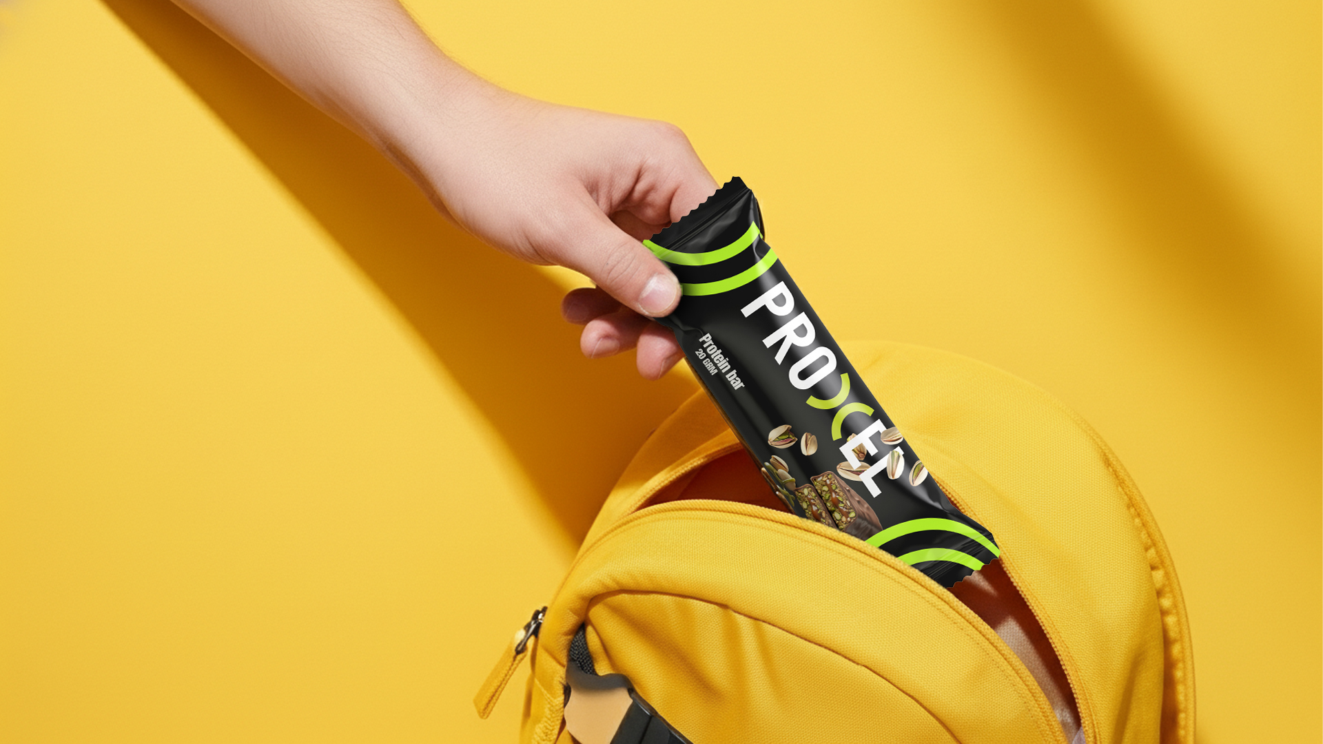
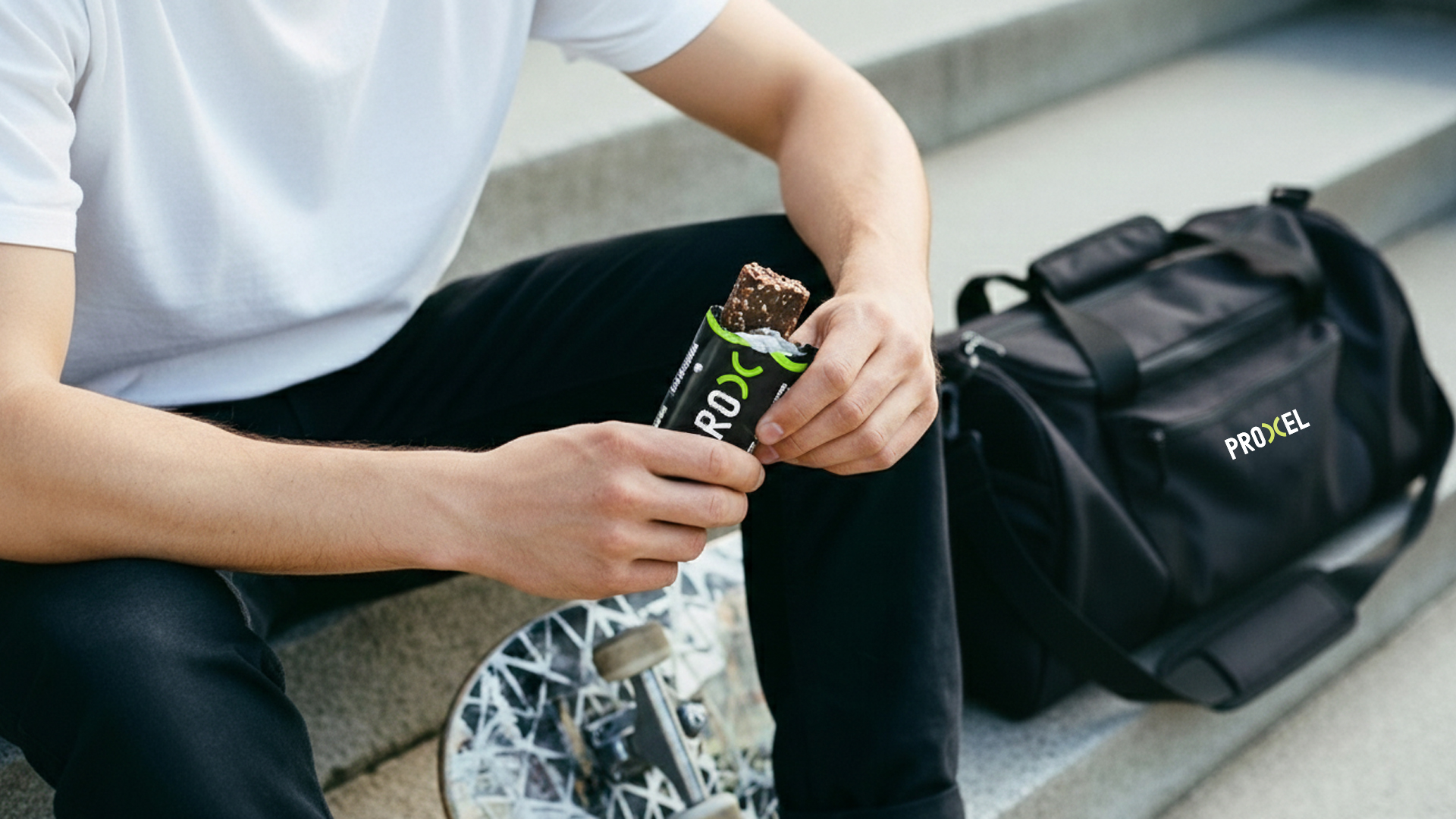
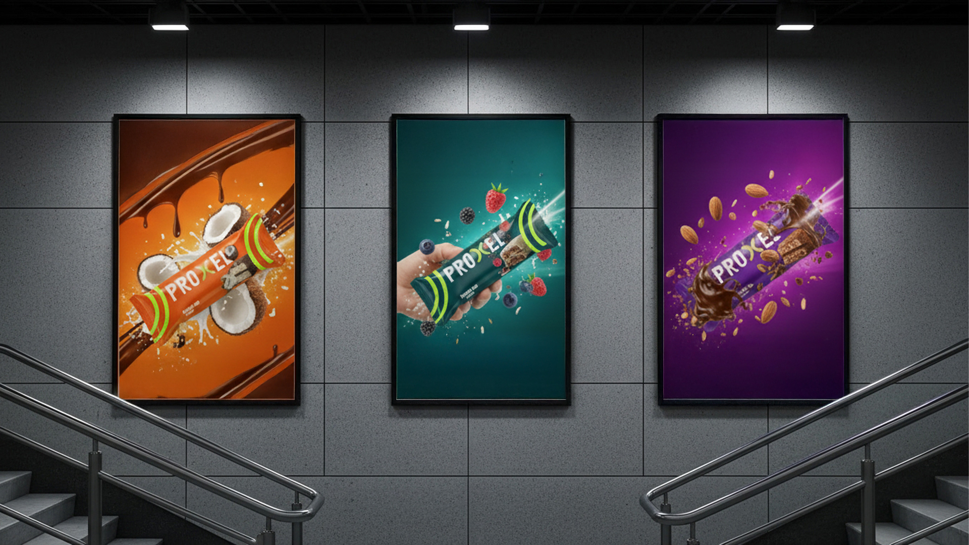
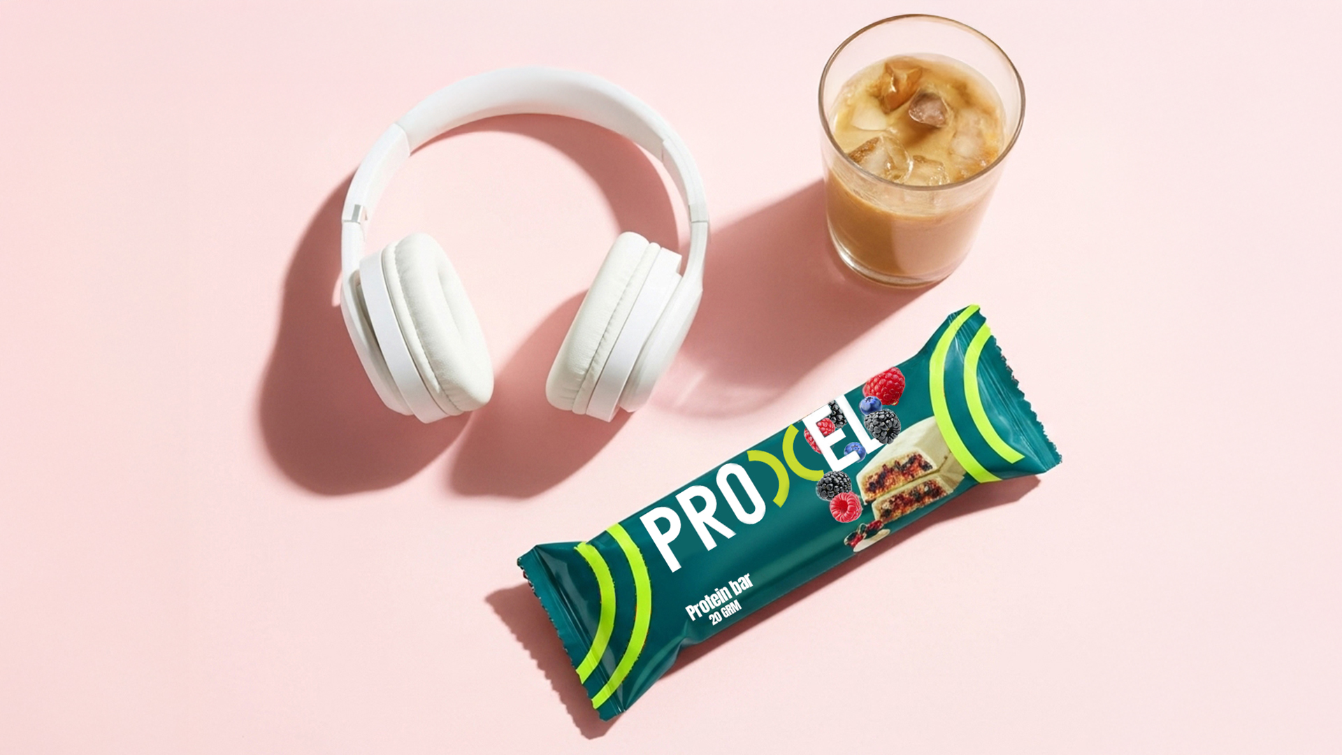
The packaging system is designed using a rigid typographic structure combined with dynamic directional elements to visually express movement and impact. High-contrast color accents differentiate product variants while preserving a unified brand architecture.
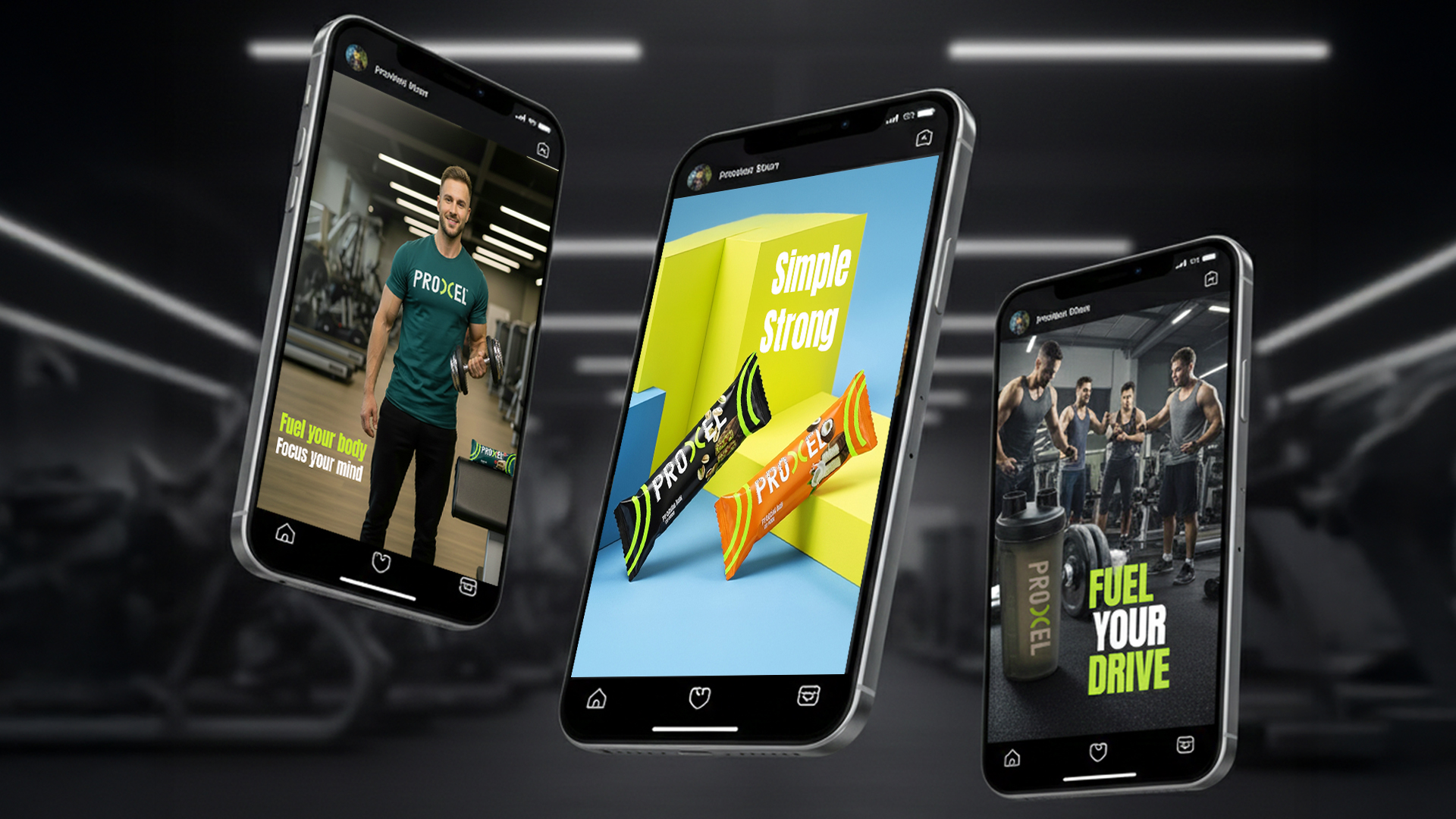
The visual language is intentionally bold minimal and systematic allowing strong shelf presence while maintaining clarity and discipline.
This project explores how structured design can translate athletic performance into a cohesive and powerful packaging identity.
Packaging Design
Brand Identity
Sports Packaging
Protein Packaging
Fitness Branding
Minimal Packaging
Bold Typography
Modern Packaging
Supplement Design
Visual Identity
 Derrick Lin
 monther al omari
 43oz
43oz lilyz design23
 Modern Theory
 Eighteen Brand Studio
 Bhumika Singh
 MohamedMashaly
 Pixels Studio
 Gulya
Gulya UPRISE
 Lizaveta Kharitonyuk
 Bonsanco Creative Studio
 DesignRepublic
 GIRAFA STUDIO
 PiotrWisniewski
 Sophiagdotcom
 CreativeWise
 SoreThumbStudio®
 Modern World Studio
 Palashcc
 Valérie Colace