

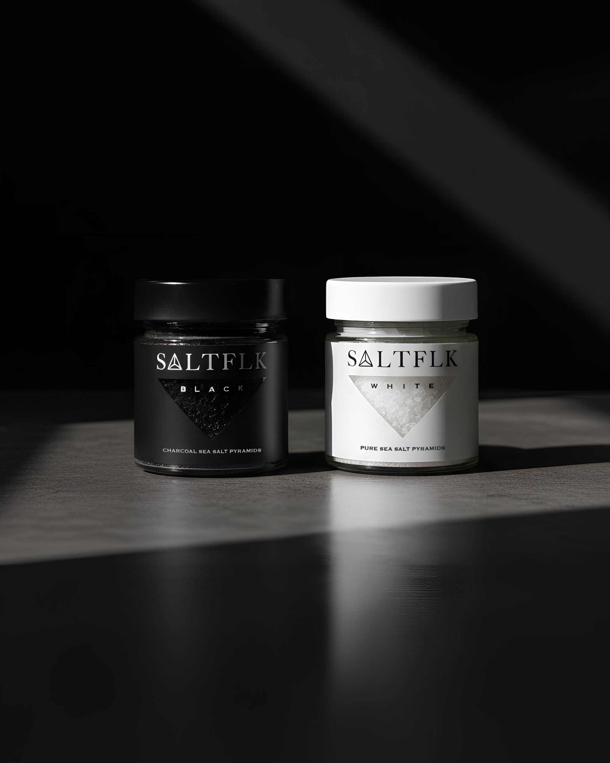
Introducing SALTFLK—a Swiss Brand*
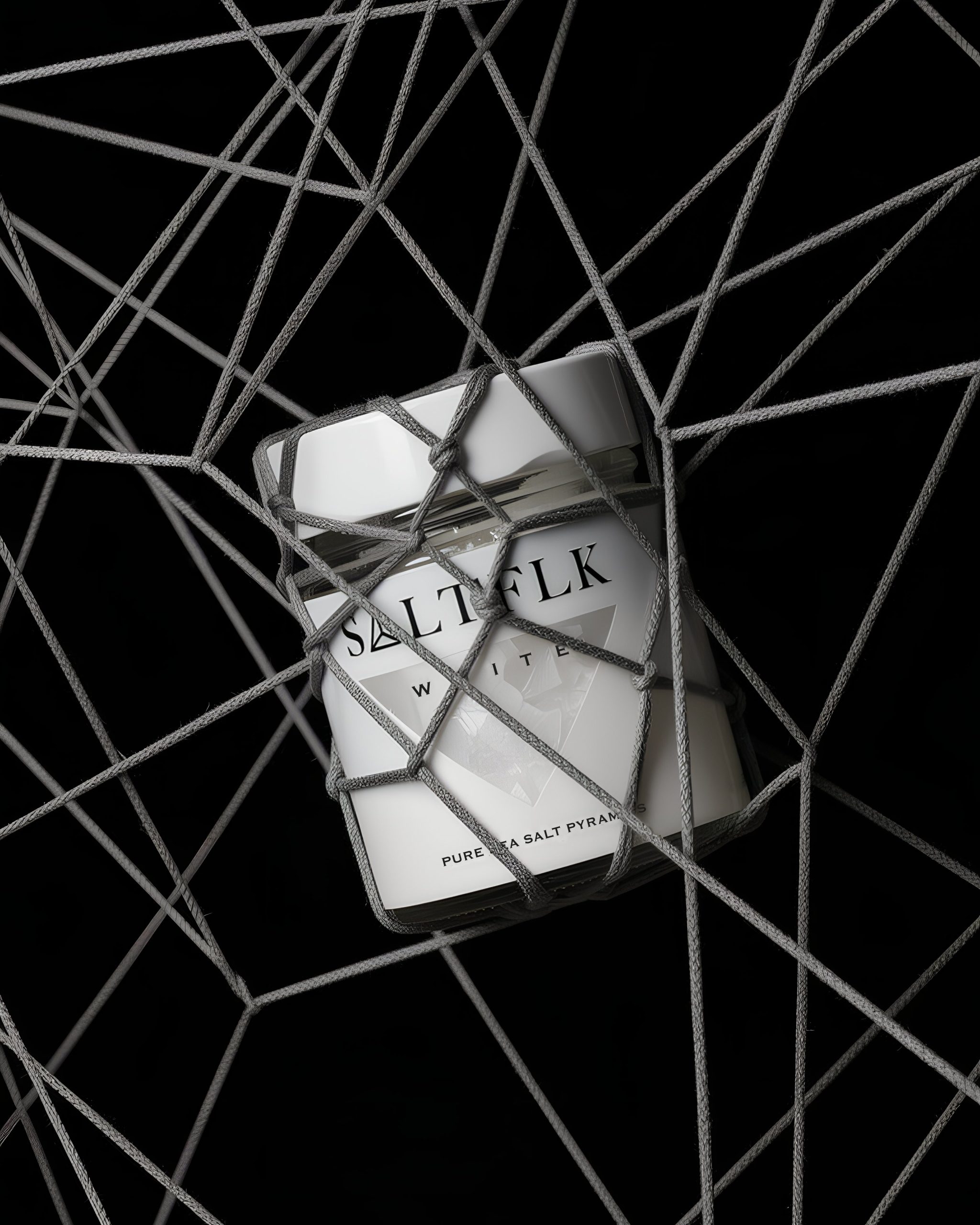
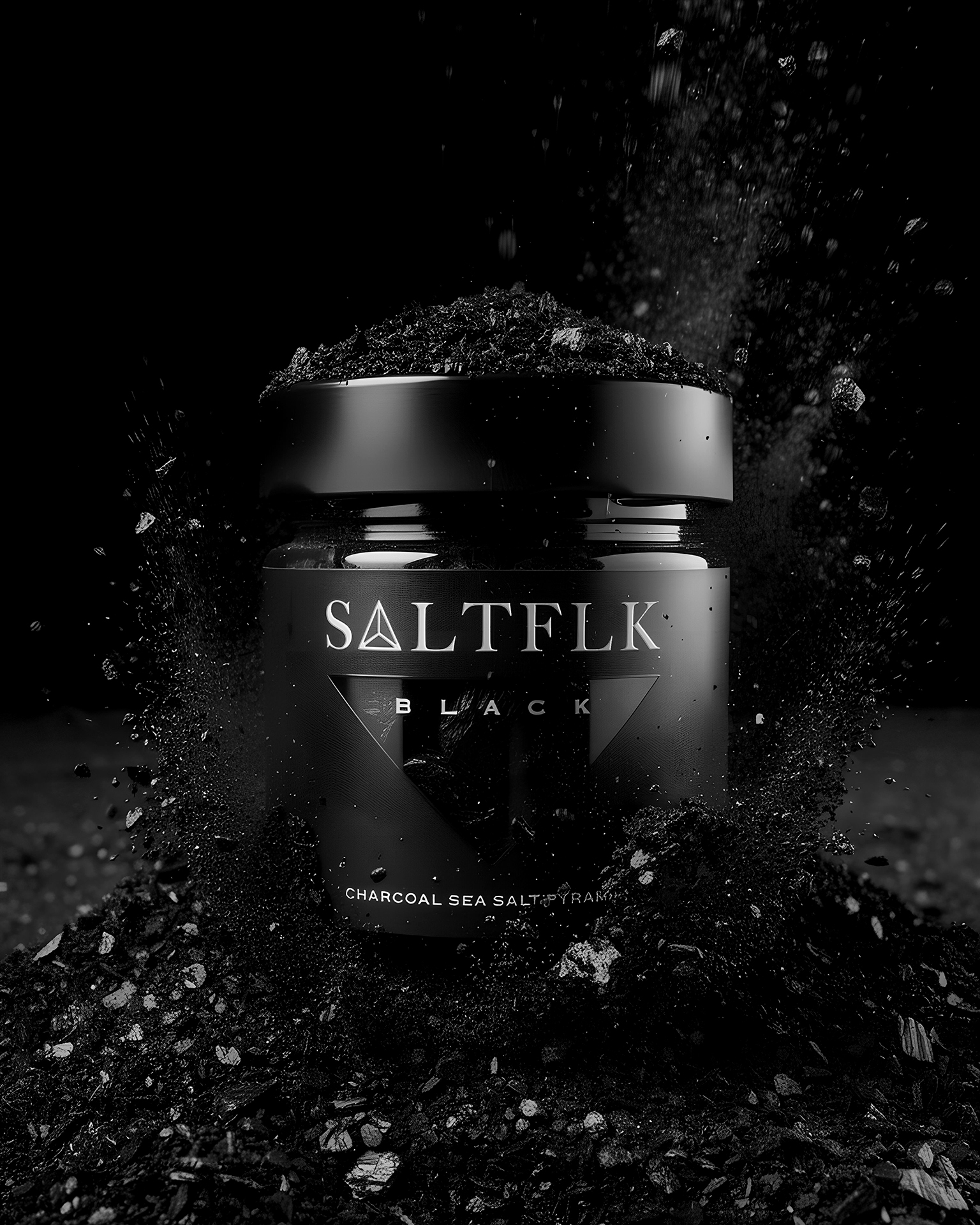
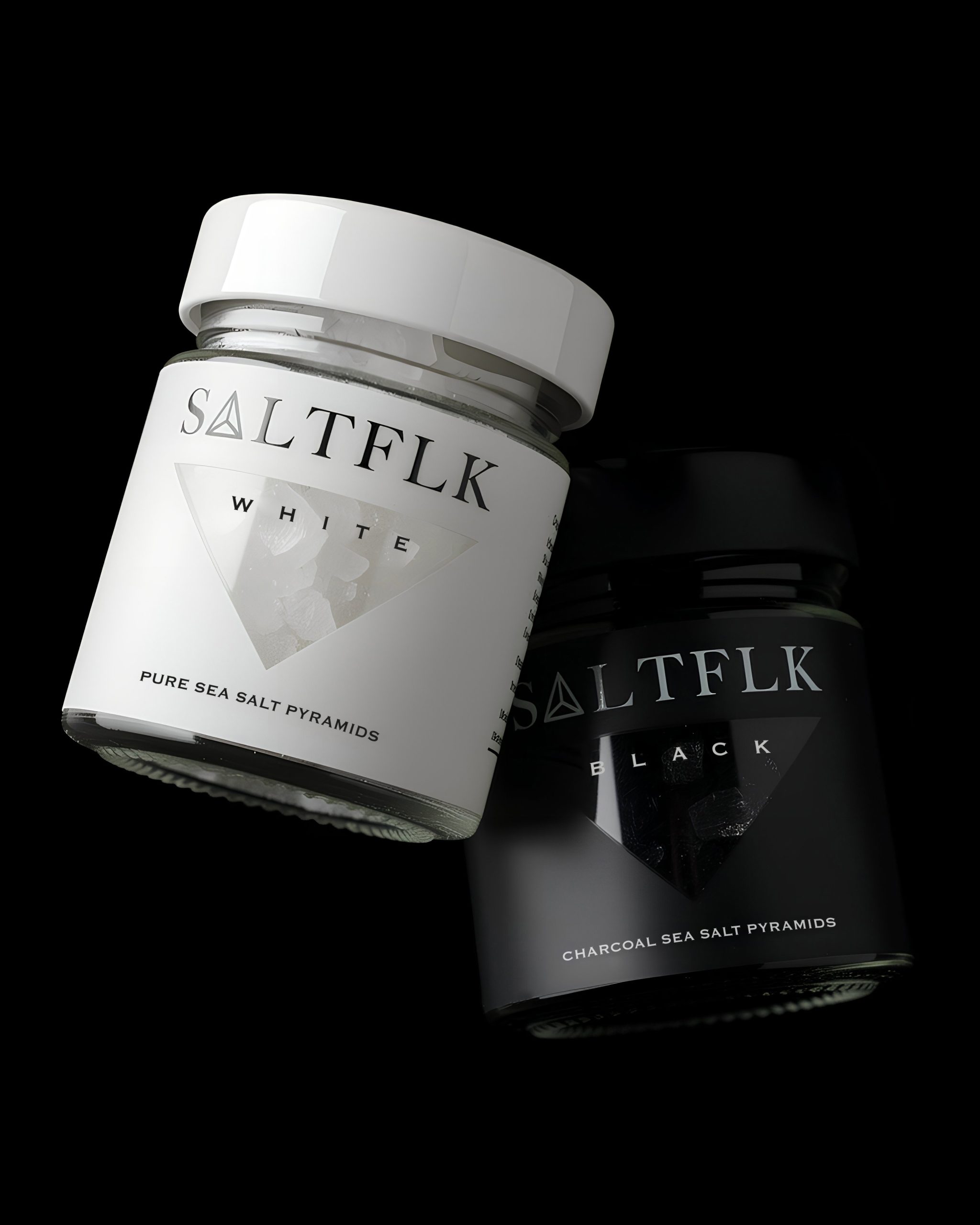
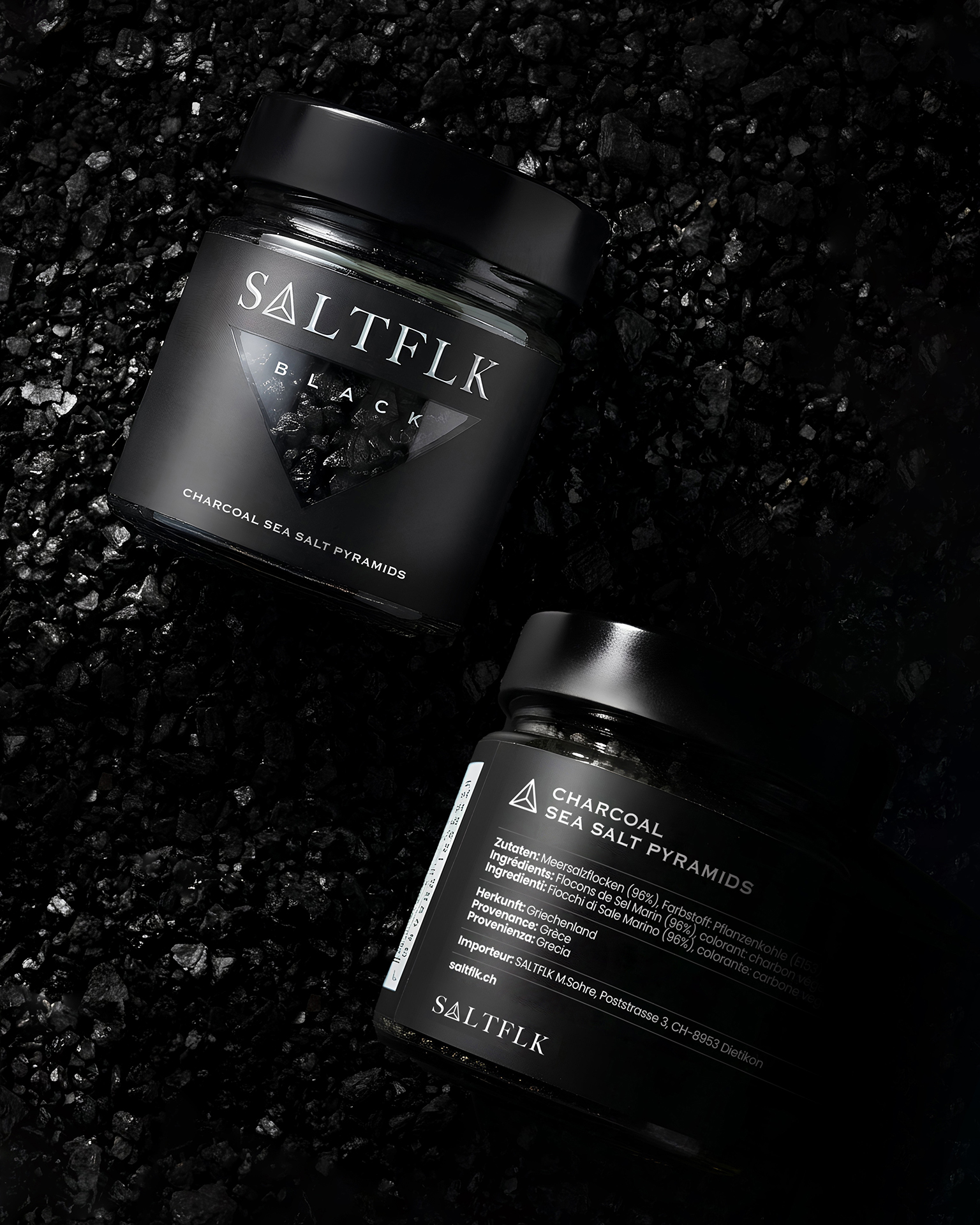
A minimal label system built around contrast, clarity, and shelf impact.
Typography-led, premium, and unapologetically clean.
Which one are you: Black or White?
Brand Design: AGrafix Design Studio
AGD © 2026
Curator’s Insight



 lunapanda
 Tridimage
 Analoguecreative
 lettera7
 alchimistestudioParis
 Lana B
 Colossal
 Pivot Studio
 M&A CREATIVE AGENCY
 monther al omari
 Anastasia Cherepanova | xtramez
 Hollóka Grafikai Műhely / Graphic Design Studio
 BOLD branding
 Antonia Skaraki
 Pâmella Lorrany
 Z9BKAdsgn
 Francesco Paternoster
 b1studio.ro
 Chris Creative Works
 Boordon
 Dmitriy Kuzovlev
 Brand Society
 yasharpic