

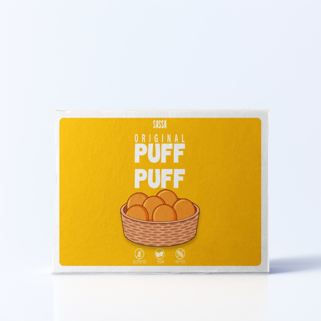
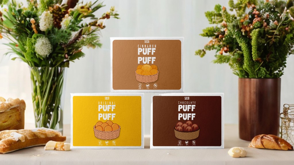
This packaging concept was developed to feel warm, approachable, and instantly familiar — reflecting the comfort and everyday appeal of a snack product.
The objective was to build a clear and cohesive visual system across multiple flavors while ensuring strong shelf presence and immediate flavor recognition. Each variant maintains a unified brand structure, supported by distinct color cues and carefully balanced layout elements to guide the eye with clarity and confidence.
Every design decision focused on:
- Visual warmth
- Product clarity
- Brand consistency
- Shelf impact
The result is a structured yet inviting packaging system that communicates trust, flavor differentiation, and retail readiness within a competitive FMCG environment.
Design is not decoration. It is communication.


 Natasha Spitsyna
 babyage
 GruppoSaida
 ahmedraoudgfx
 Hi estudio
 Nadezhda Gorelikova
 Studio Garces
 Brandsbylufo
 Rewot
Rewot alchimistestudioParis
 Asprey Creative
 kat bres
 Valérie Colace
 Atiq Alam
 Sara Communications
 David Hakobyan
 monther al omari
 Innovāt - Empowering Creative Innovation
 mmdesign
 Amjad Battal
 Hollóka Grafikai Műhely / Graphic Design Studio
 Palashcc
 ABC Design Communication
 ChrisSkarlatos
 Hedayat Hadavi
 Tia Nguyen