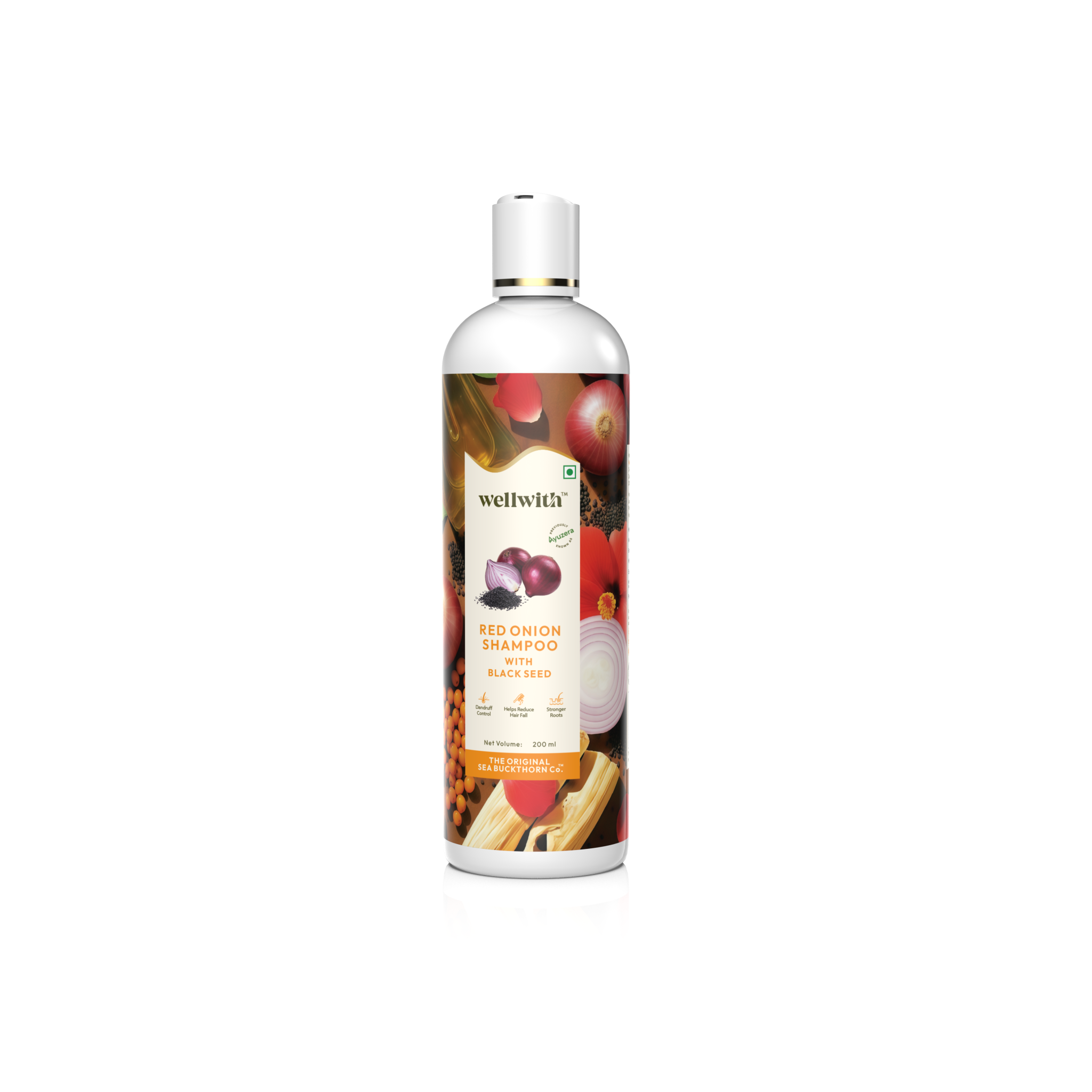

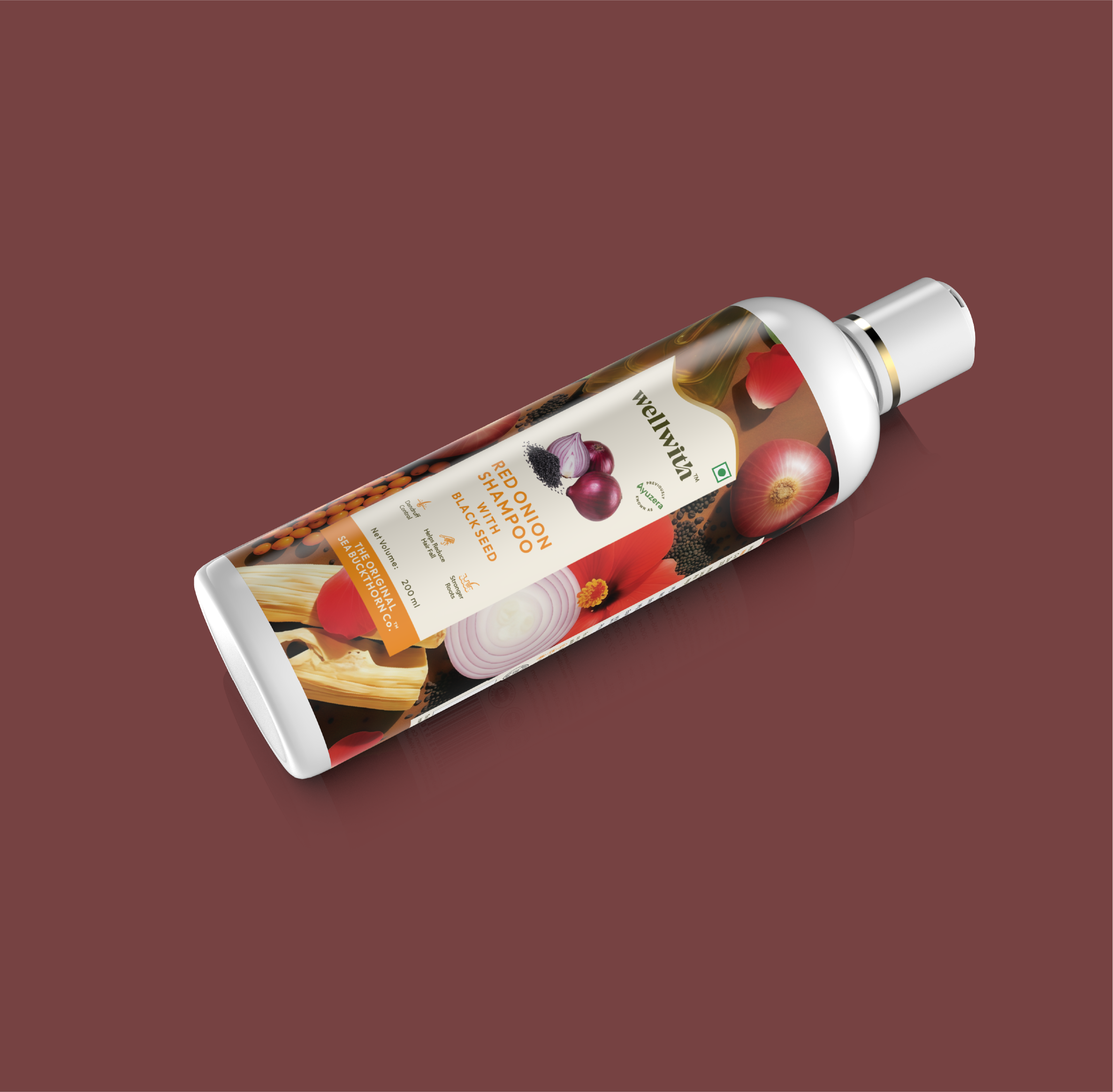
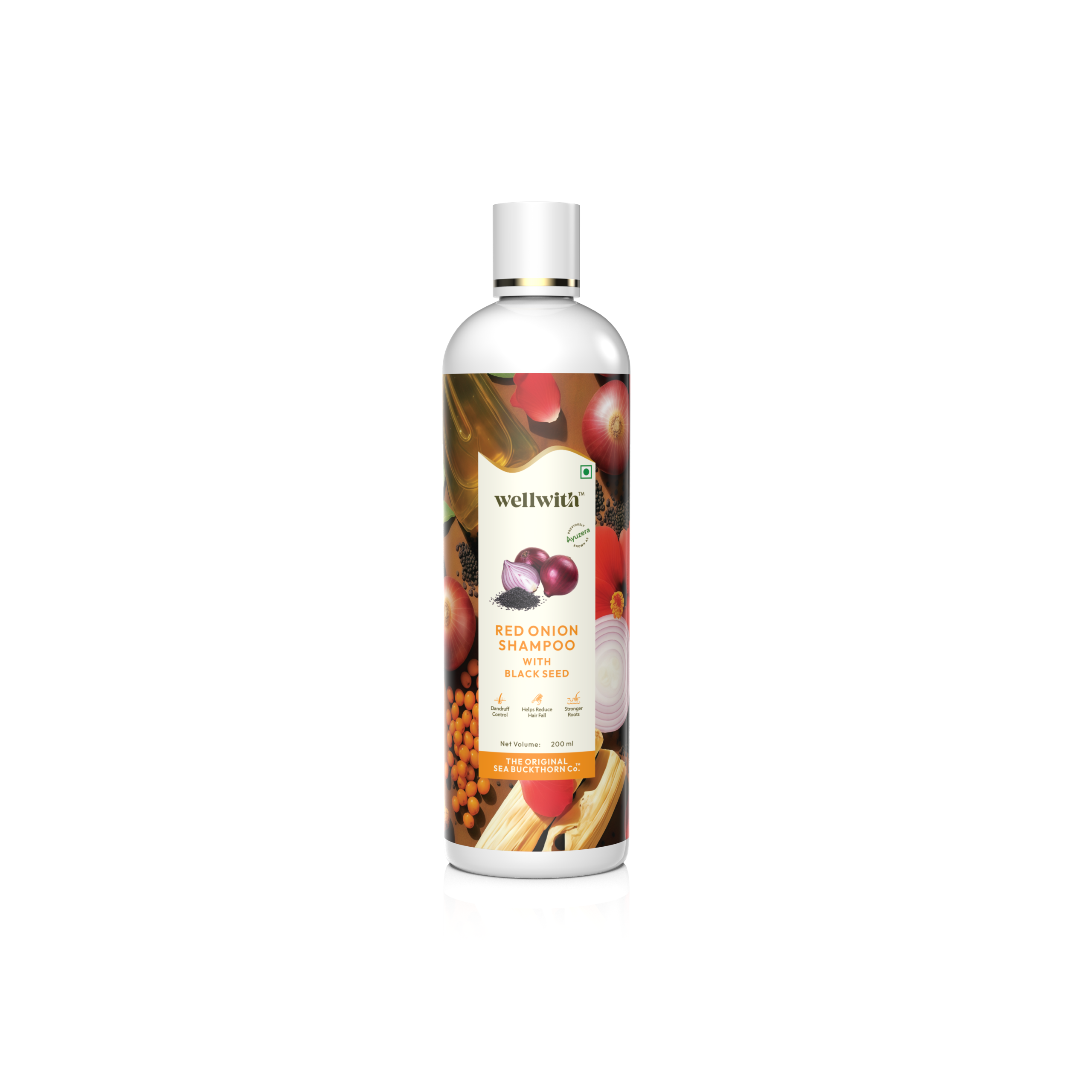
The packaging project focuses on the design and development of a premium, visually engaging bottle for WellWith Red Onion Shampoo with Black Seed (200 ml), positioned under The Original Sea Buckthorn Co. branding.
🔹 Packaging Format & Structure
The product is presented in a sleek, cylindrical plastic bottle with a flip-top white cap, ensuring ease of dispensing and user convenience. The bottle design reflects a clean, modern aesthetic while maintaining a strong natural and Ayurvedic positioning.
🔹 Visual Identity & Design Concept
The label design incorporates a rich, ingredient-driven visual theme featuring high-resolution imagery of:
- Red onion
- Black seeds
- Natural oils
- Botanical elements
These ingredients are integrated into a dark, textured background to communicate potency, nourishment, and herbal authenticity. The central label panel uses a cream-toned backdrop to ensure brand name visibility and readability.
🔹 Branding Elements
- Prominent WellWith™ logo at the top
- Product name clearly highlighted: Red Onion Shampoo with Black Seed
- Key benefit icons displayed for quick consumer understanding
- Net volume specification (200 ml)
- Brand tagline: The Original Sea Buckthorn Co.
The packaging balances premium appeal with natural wellness positioning, targeting health-conscious and ingredient-aware consumers.
🔹 Functional & Market Appeal
The design emphasizes:
- Ingredient transparency
- Clean labeling
- Modern herbal branding
- Strong shelf visibility
The vibrant contrast between warm reds, earthy browns, and natural tones enhances shelf presence and digital display performance for e-commerce platforms.
 Derrick Lin
 monther al omari
 43oz
43oz lilyz design23
 Modern Theory
 Eighteen Brand Studio
 Bhumika Singh
 MohamedMashaly
 Pixels Studio
 Gulya
Gulya UPRISE
 Lizaveta Kharitonyuk
 Bonsanco Creative Studio
 DesignRepublic
 GIRAFA STUDIO
 PiotrWisniewski
 Sophiagdotcom
 CreativeWise
 SoreThumbStudio®
 Modern World Studio
 Palashcc
 Valérie Colace