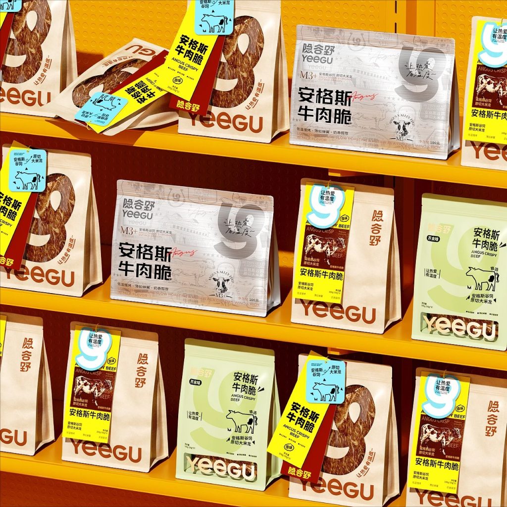

In this Curator’s Insight feature, we take a look at YEEGU / 隐谷野 designed by Hellocean, a creative agency based in Hunan, China.
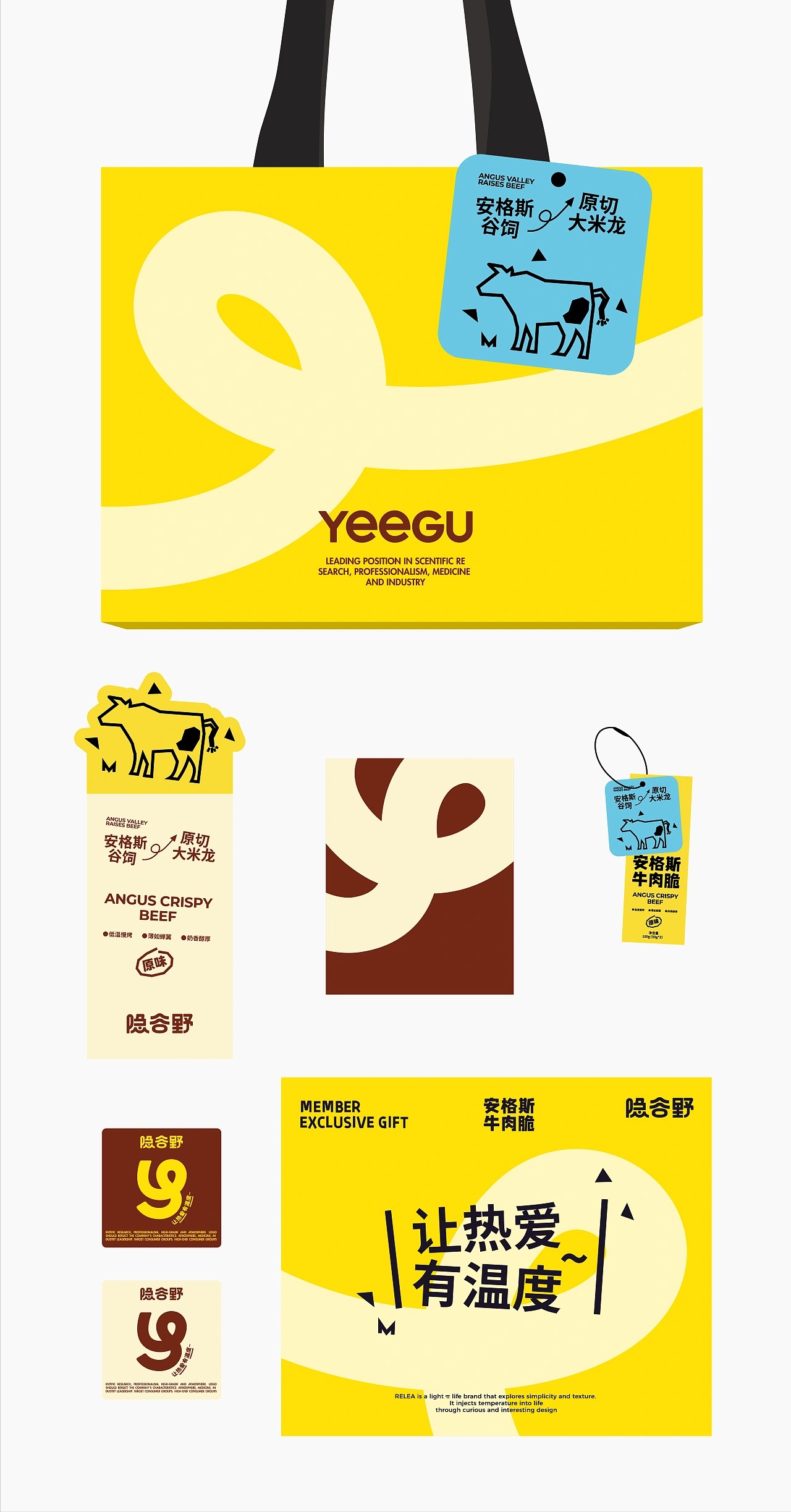
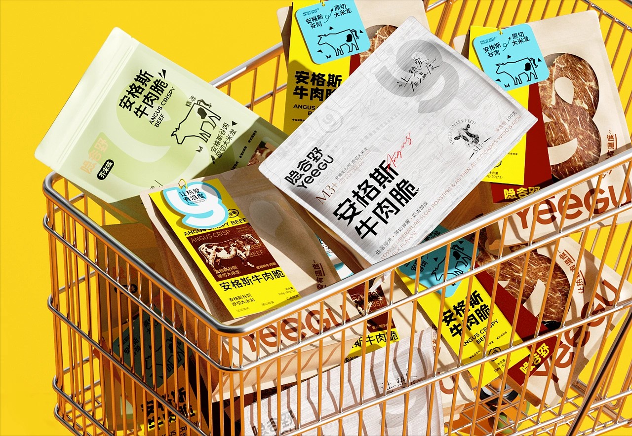
This packaging system does not try to impress with too many graphics or loud claims. Instead, it controls attention carefully. In a category where most beef snacks use flames, dramatic photography, and heavy textures, this design chooses calm structure. That decision alone makes it stand out.
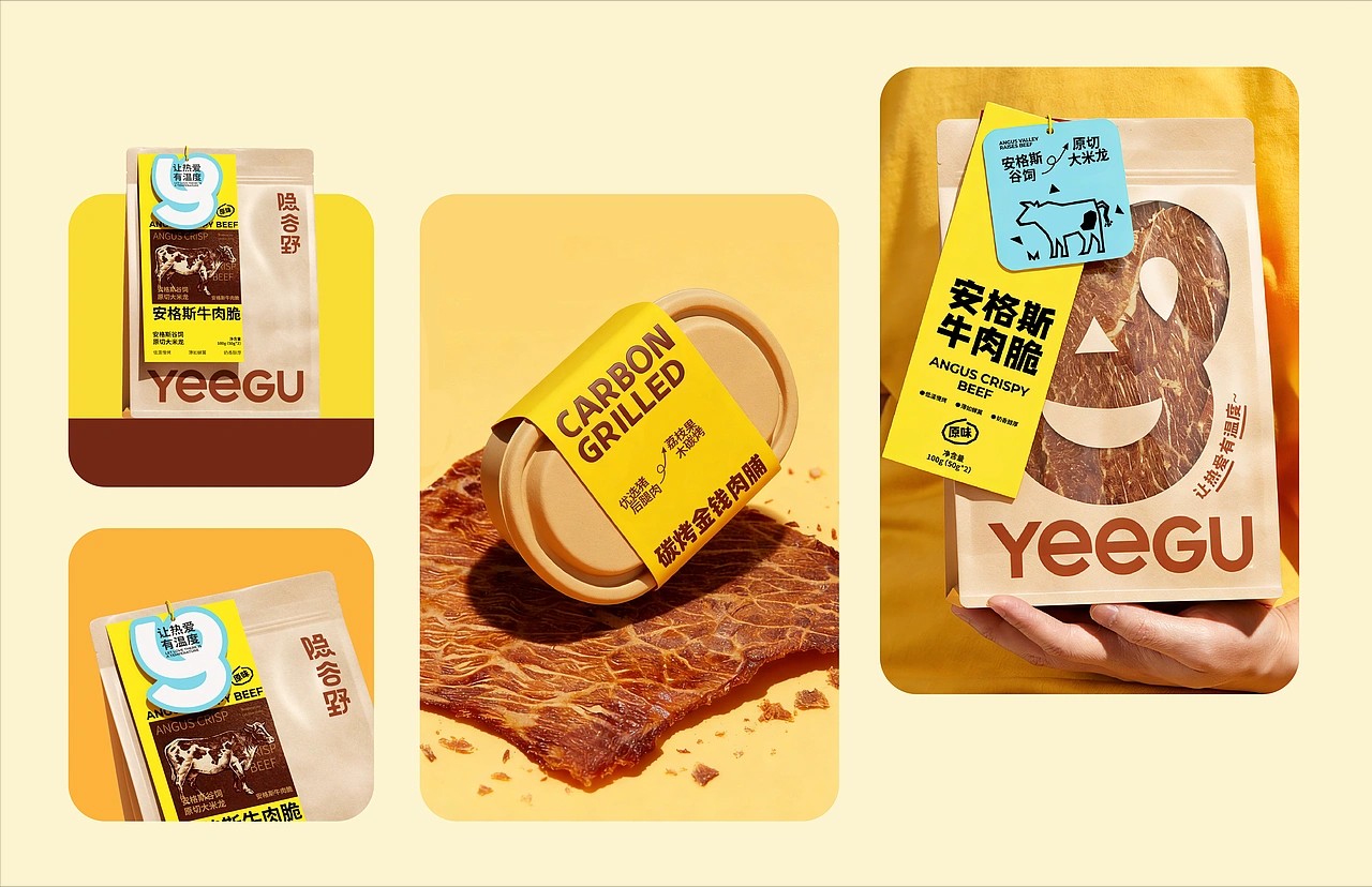
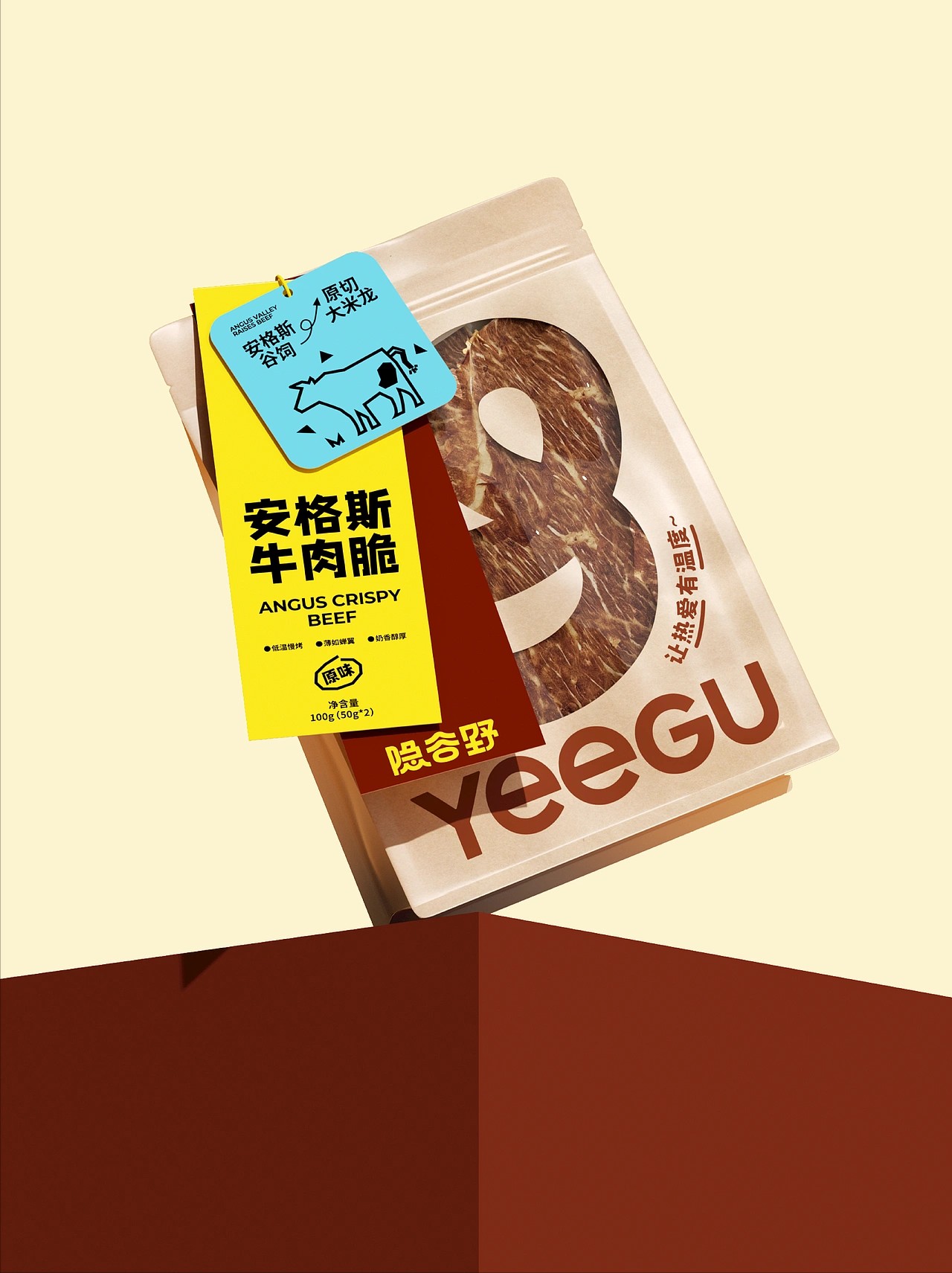
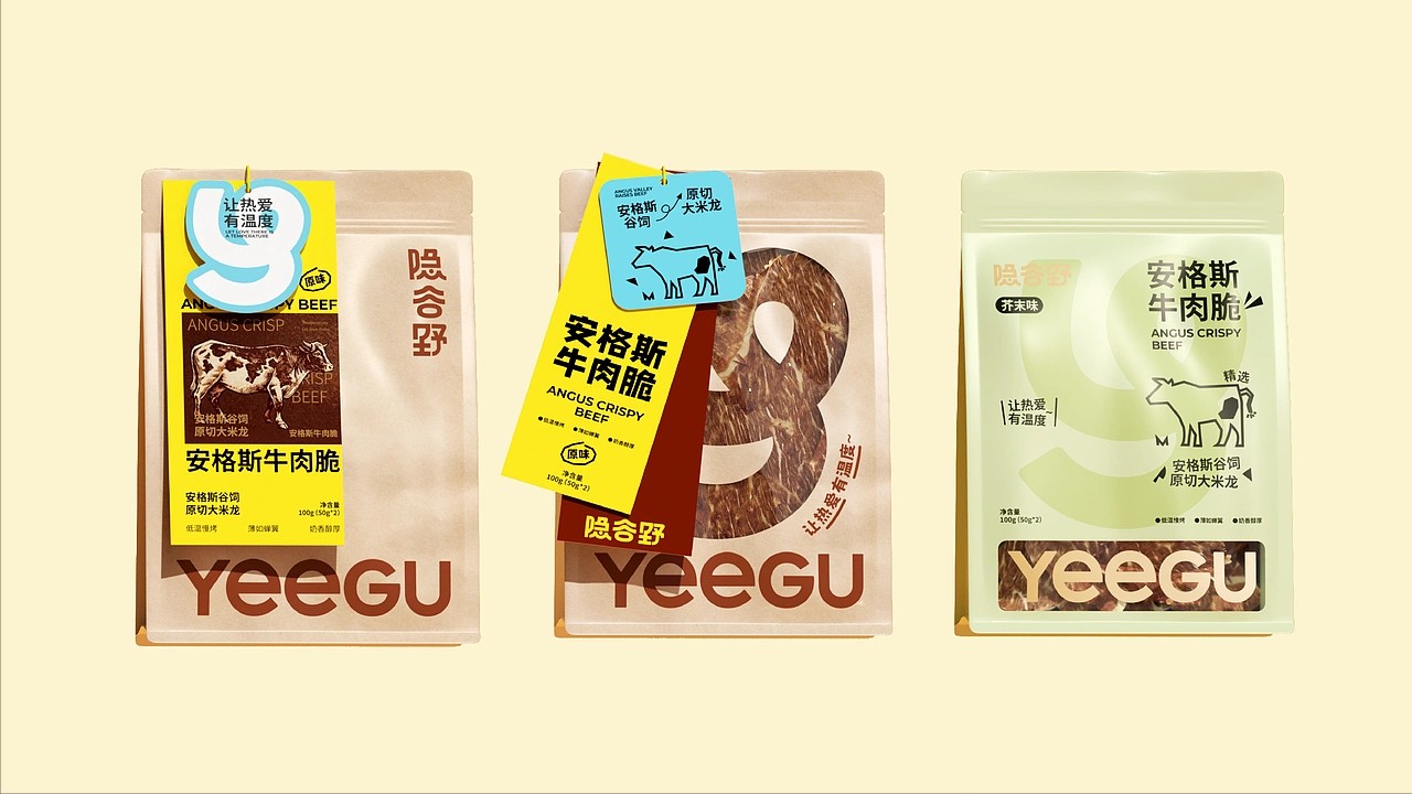
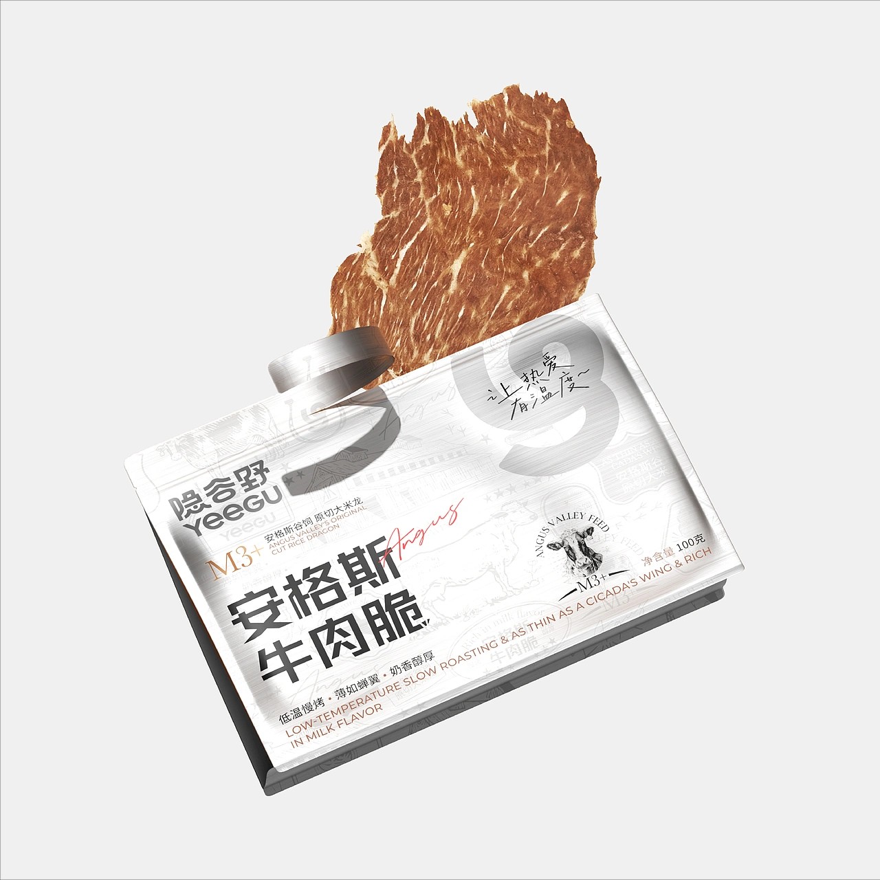
One of the most unique elements is the oversized number used as a key visual device. It becomes the architecture of the layout. The large numeral acts like a visual magnet, pulling the eye before the viewer reads anything else. Even more interesting, the number doubles as a window in some versions, revealing the actual product texture. This creates honesty. The real beef fibers become part of the design language. Instead of telling you it is premium, it quietly shows you.
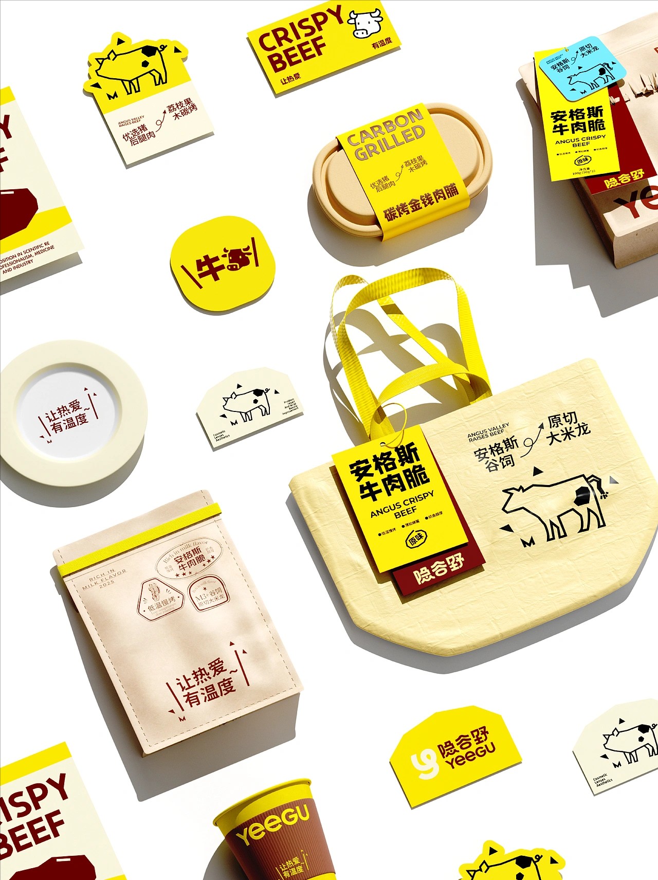
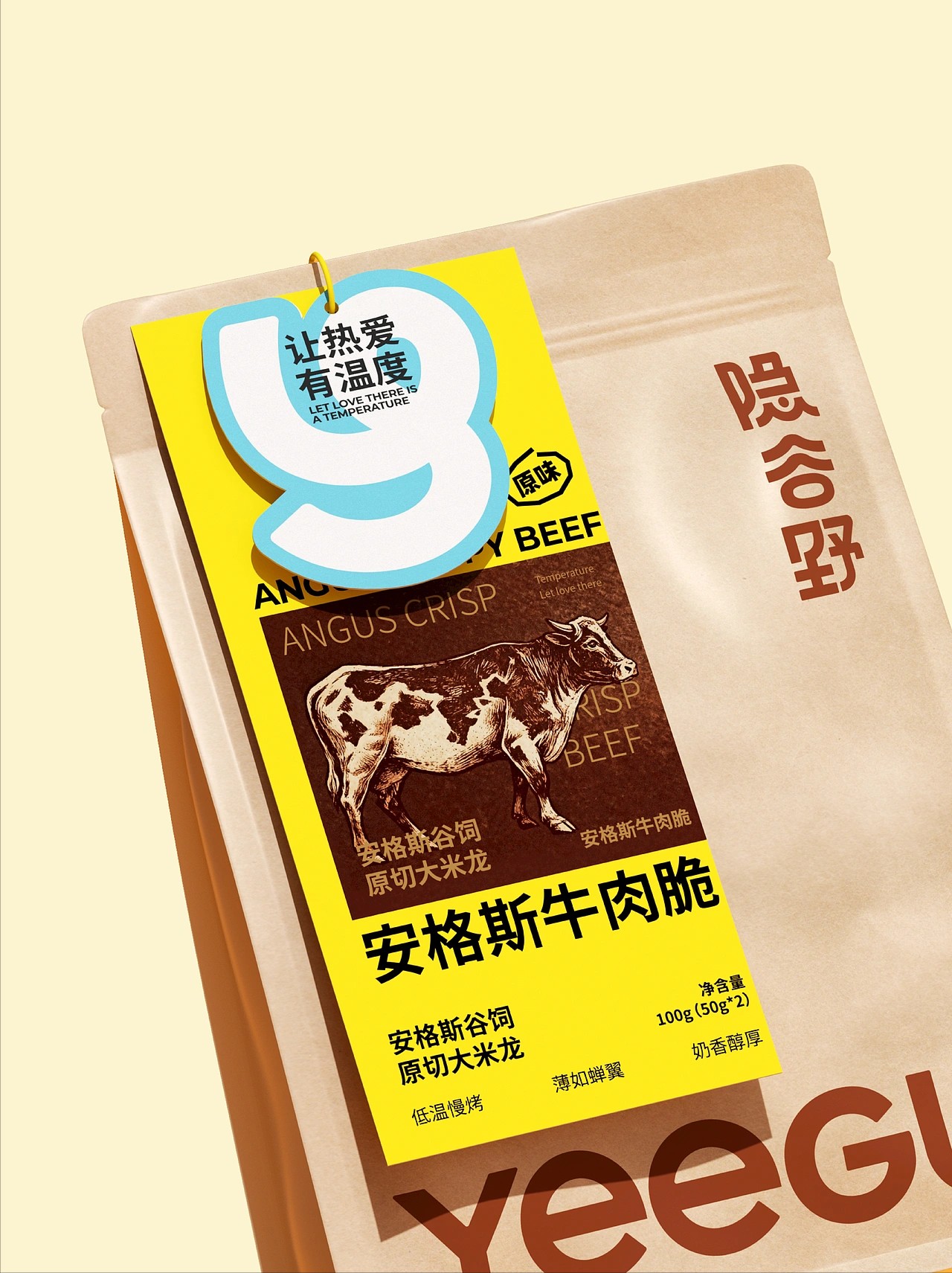
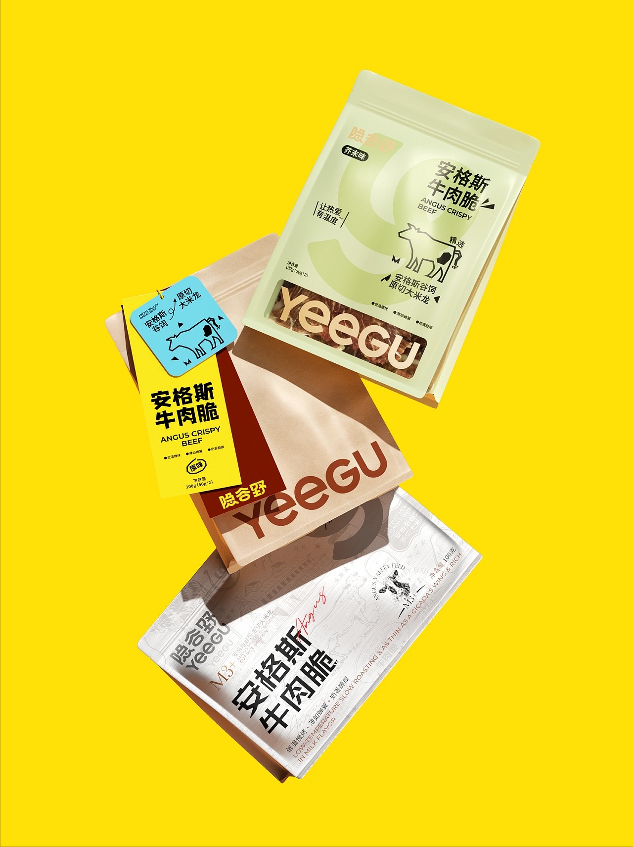
The color system is also very smart. The base packaging uses neutral, soft tones that feel stable and grounded. Then bold accents—especially bright yellow panels—cut across the surface with high contrast. This creates energy without chaos. The yellow feels almost like a temporary label or tag, which adds movement and urgency. It makes the pack feel layered and dynamic rather than flat.
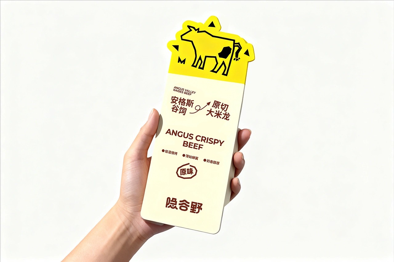
Another strong design choice is the simplified cow icon. It is reduced to clean, almost playful line art instead of realistic illustration. This softens the brand personality. Beef products can easily feel heavy or aggressive, but this icon makes the brand feel approachable and modern. It balances premium quality with friendliness.
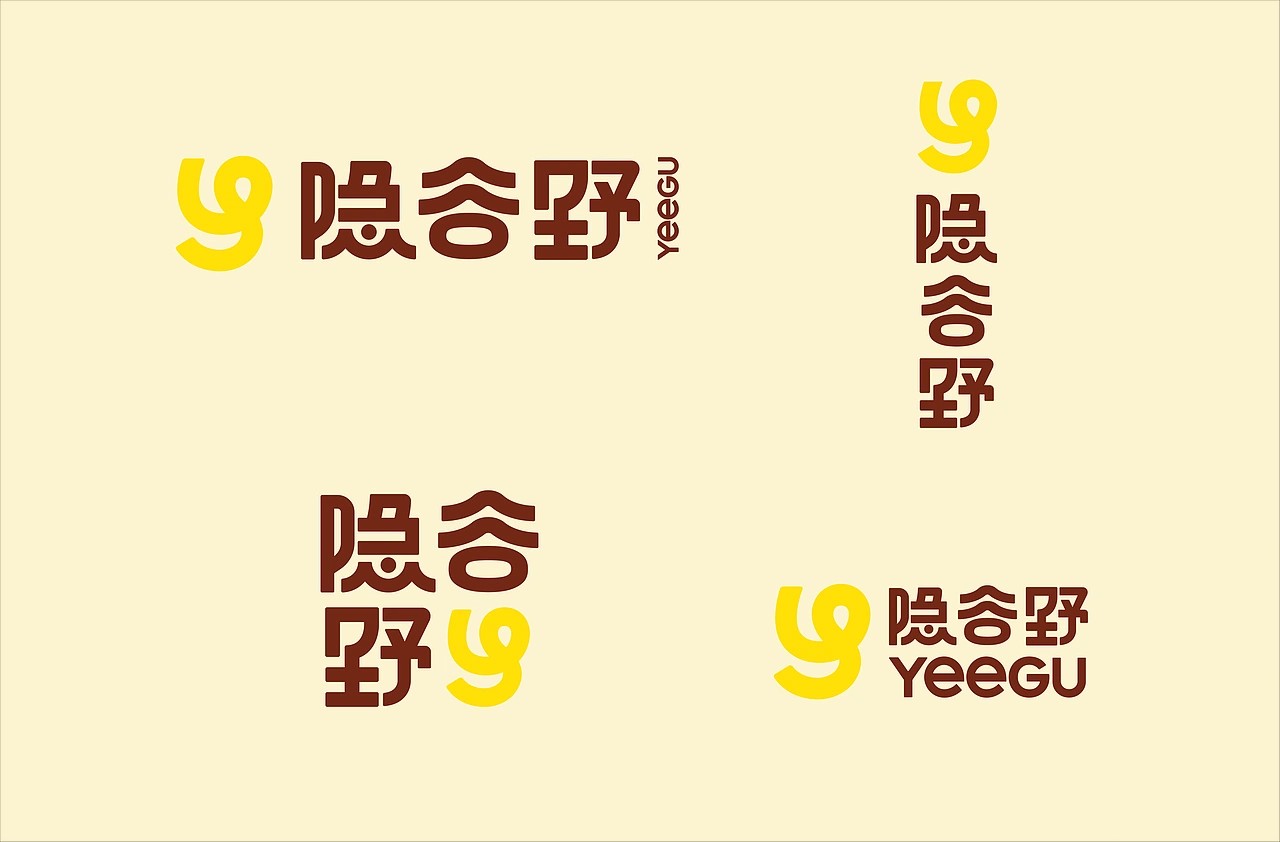
The typography hierarchy is confident. The Chinese characters are bold and dominant, carrying weight and authority. The English text is smaller and more controlled, adding a subtle international tone without competing for attention. This balance feels deliberate. It shows an understanding of audience positioning without overcomplicating the layout.
What feels most unique overall is the restraint. The design leaves space. It allows breathing room. Many snack brands fill every corner with selling points. Here, negative space becomes part of the branding. That space creates sophistication. It communicates that the brand does not need to shout.



 lunapanda
 Tridimage
 Analoguecreative
 lettera7
 alchimistestudioParis
 Lana B
 Colossal
 Pivot Studio
 M&A CREATIVE AGENCY
 monther al omari
 Anastasia Cherepanova | xtramez
 Hollóka Grafikai Műhely / Graphic Design Studio
 BOLD branding
 Antonia Skaraki
 Pâmella Lorrany
 Z9BKAdsgn
 Francesco Paternoster
 b1studio.ro
 Chris Creative Works
 Boordon
 Dmitriy Kuzovlev
 Brand Society
 yasharpic