

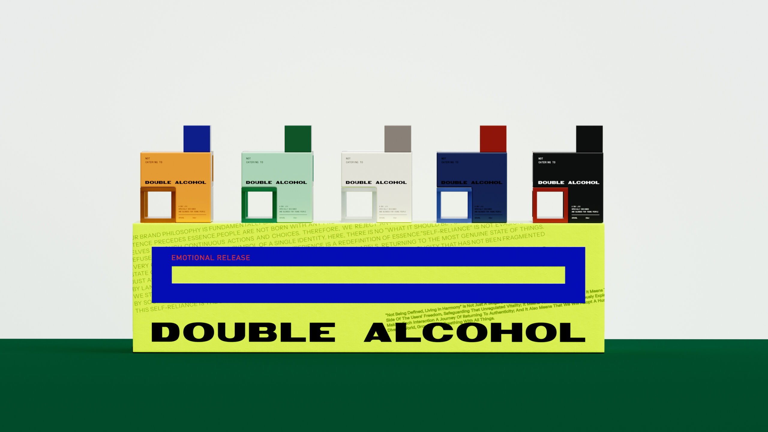
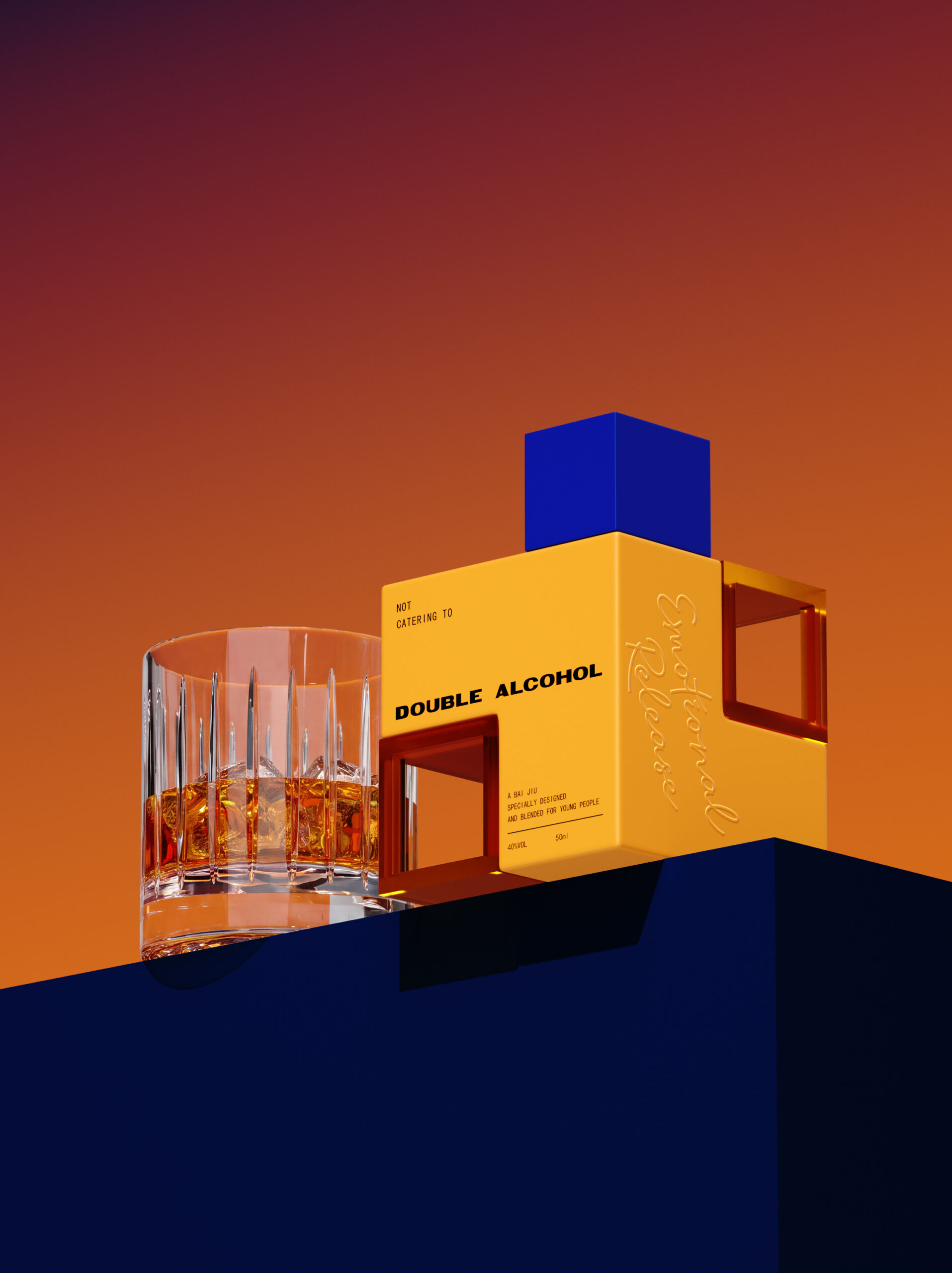
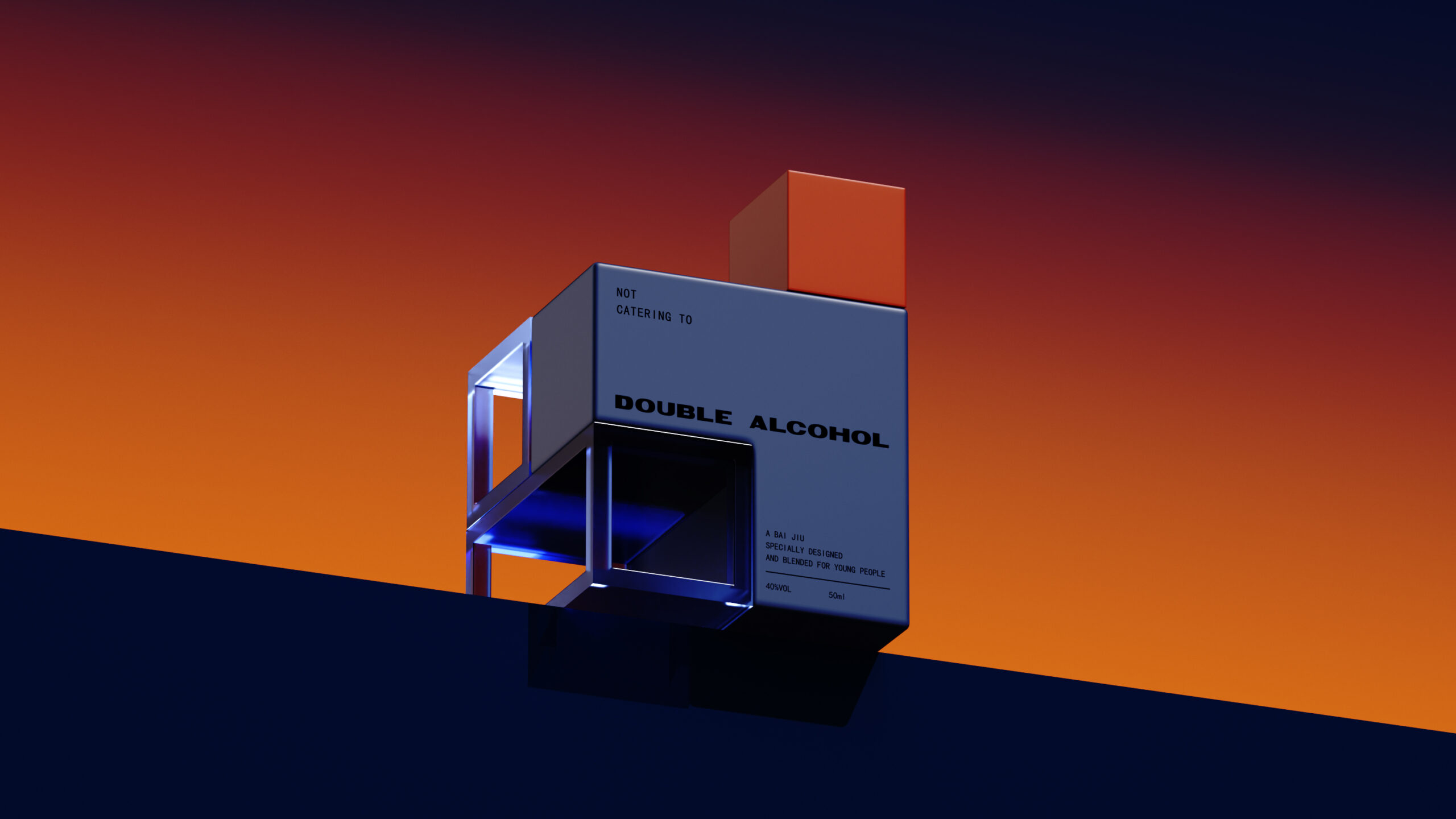
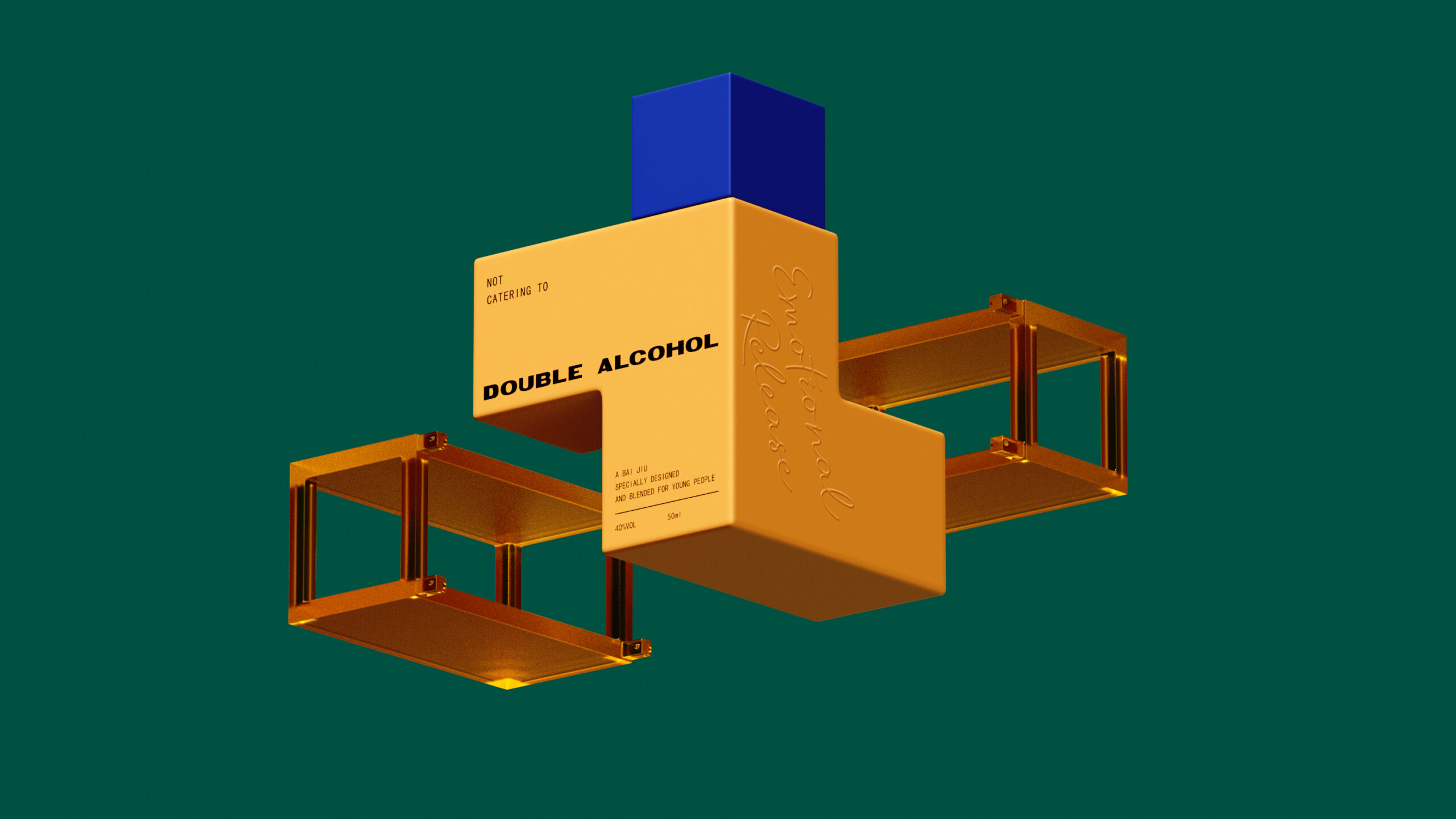
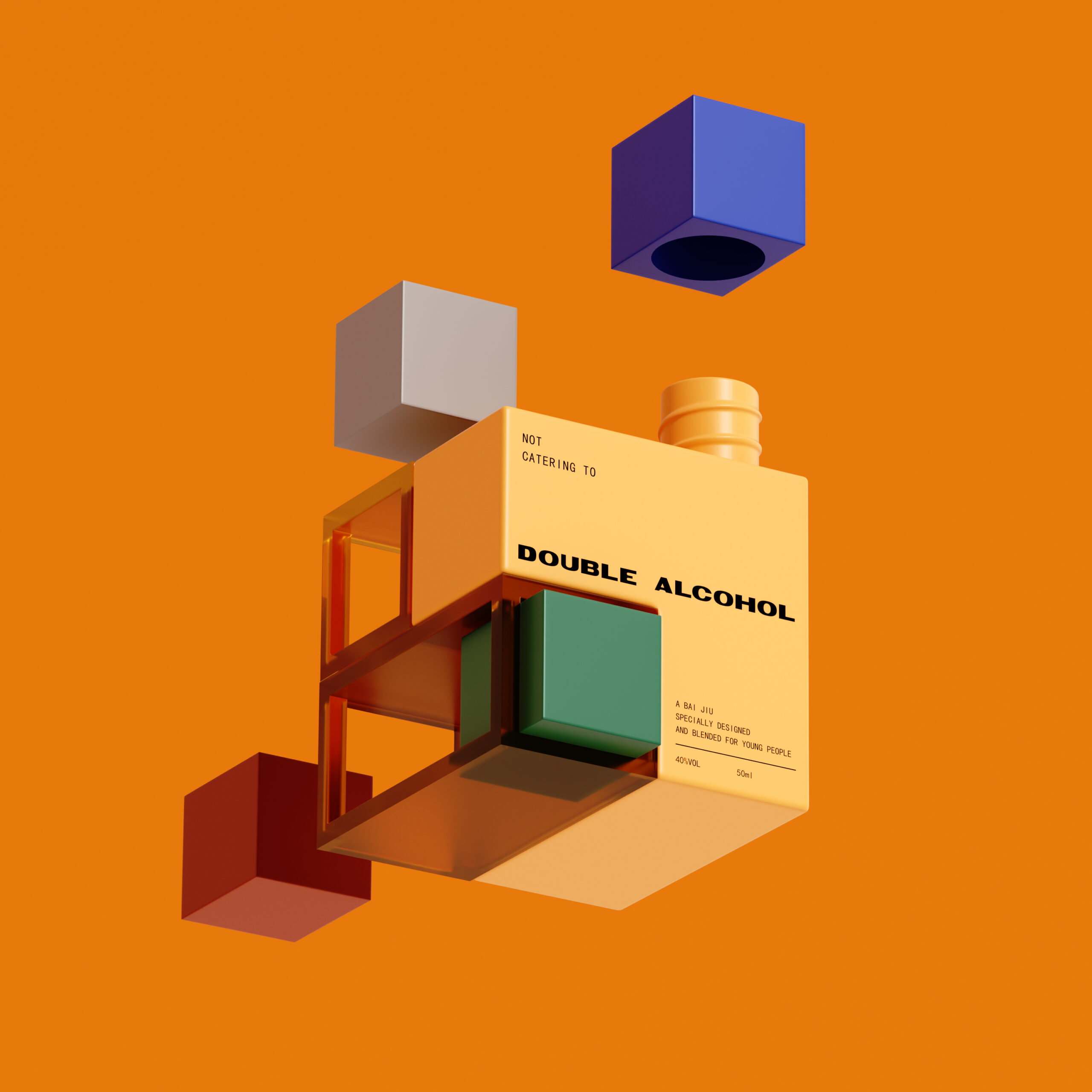
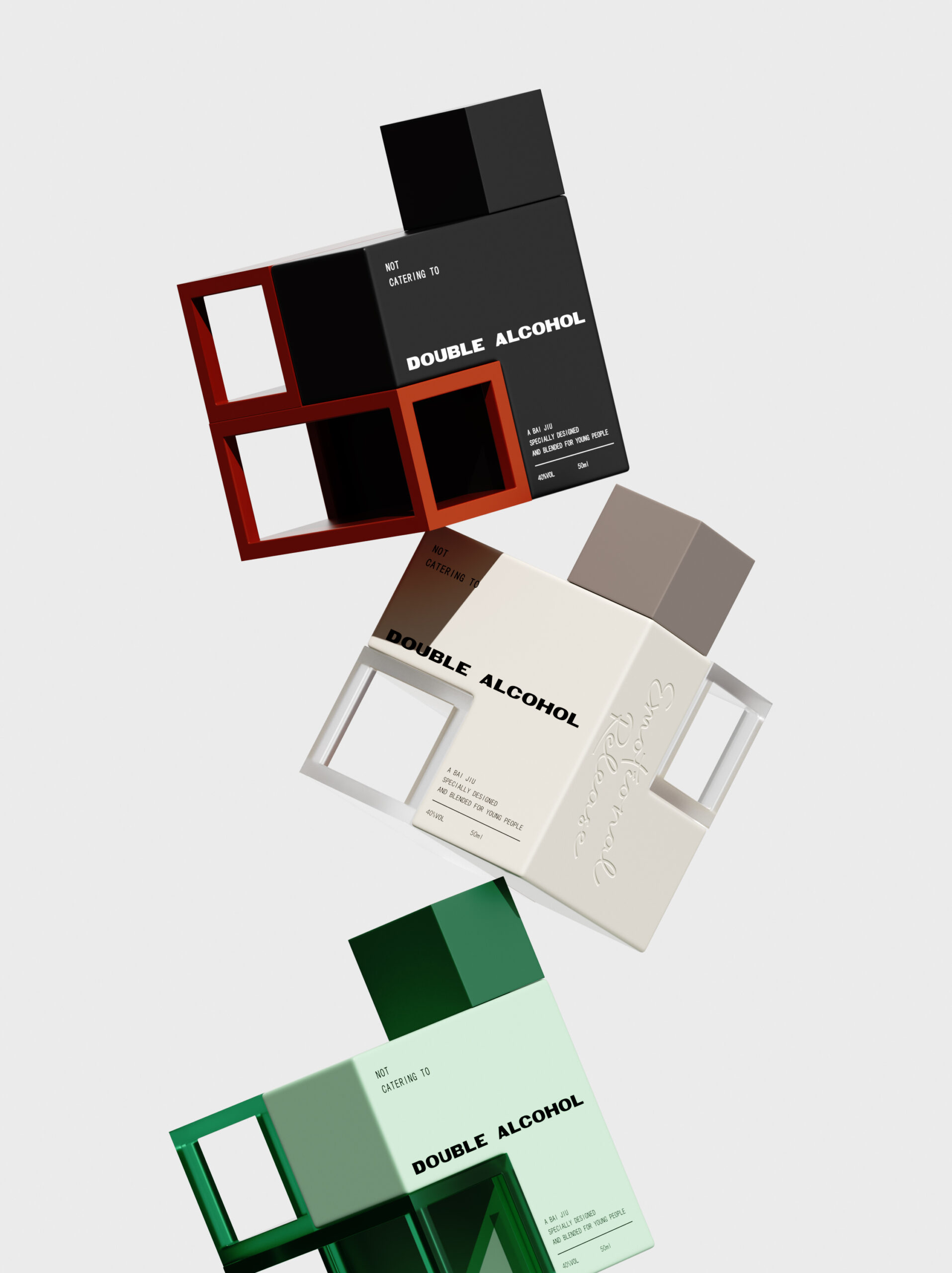
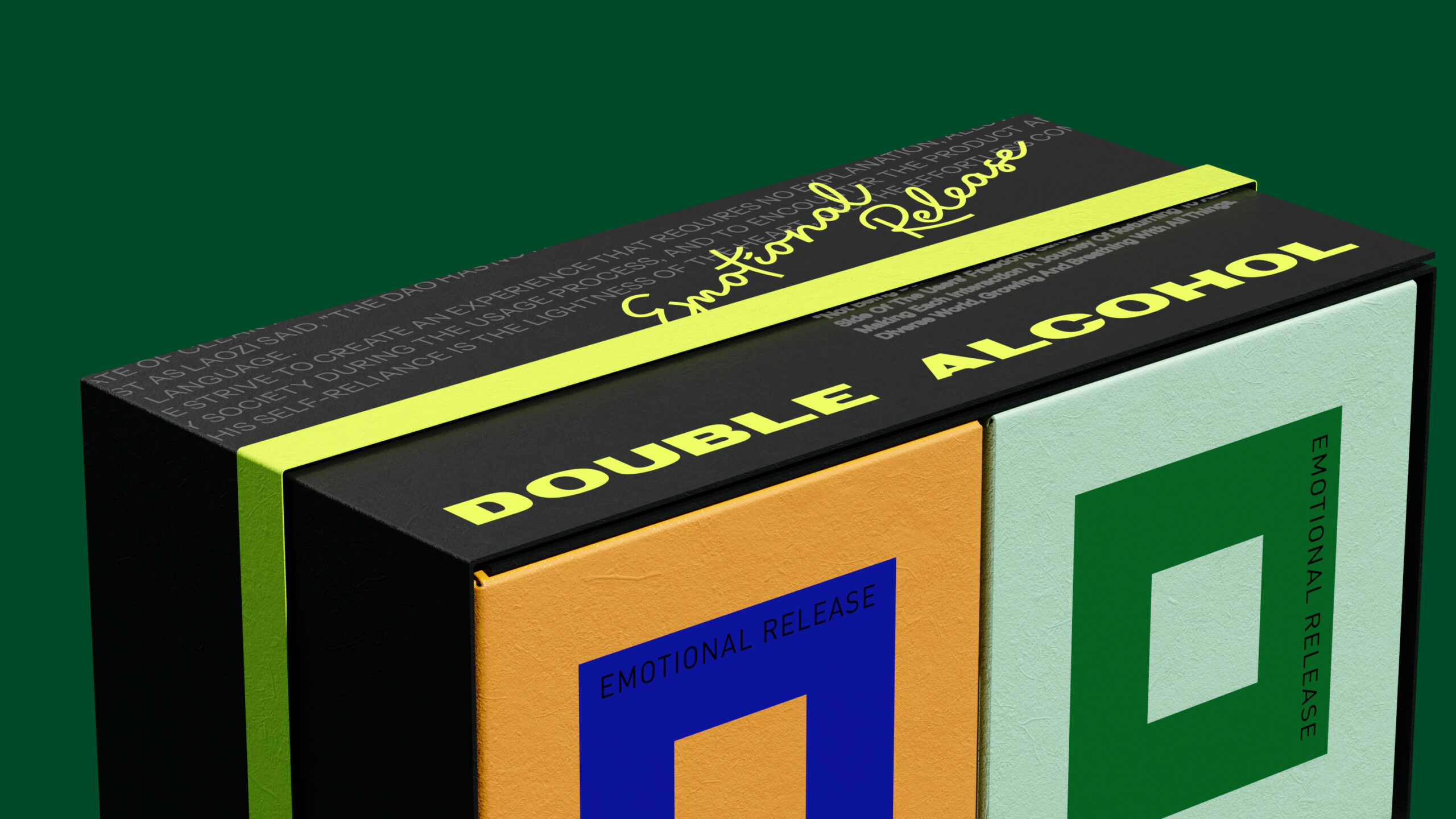
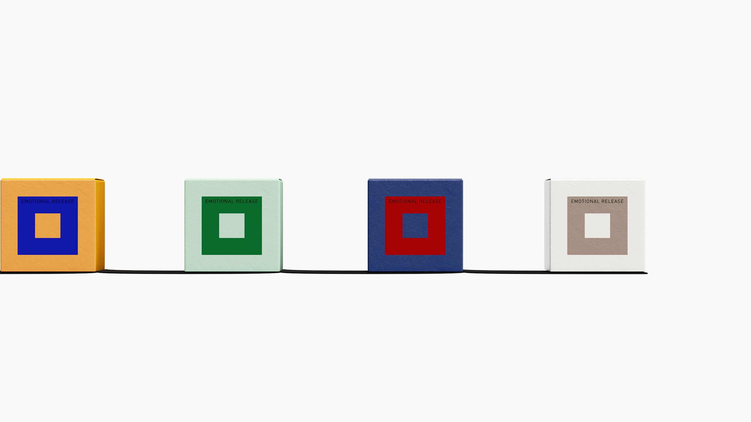
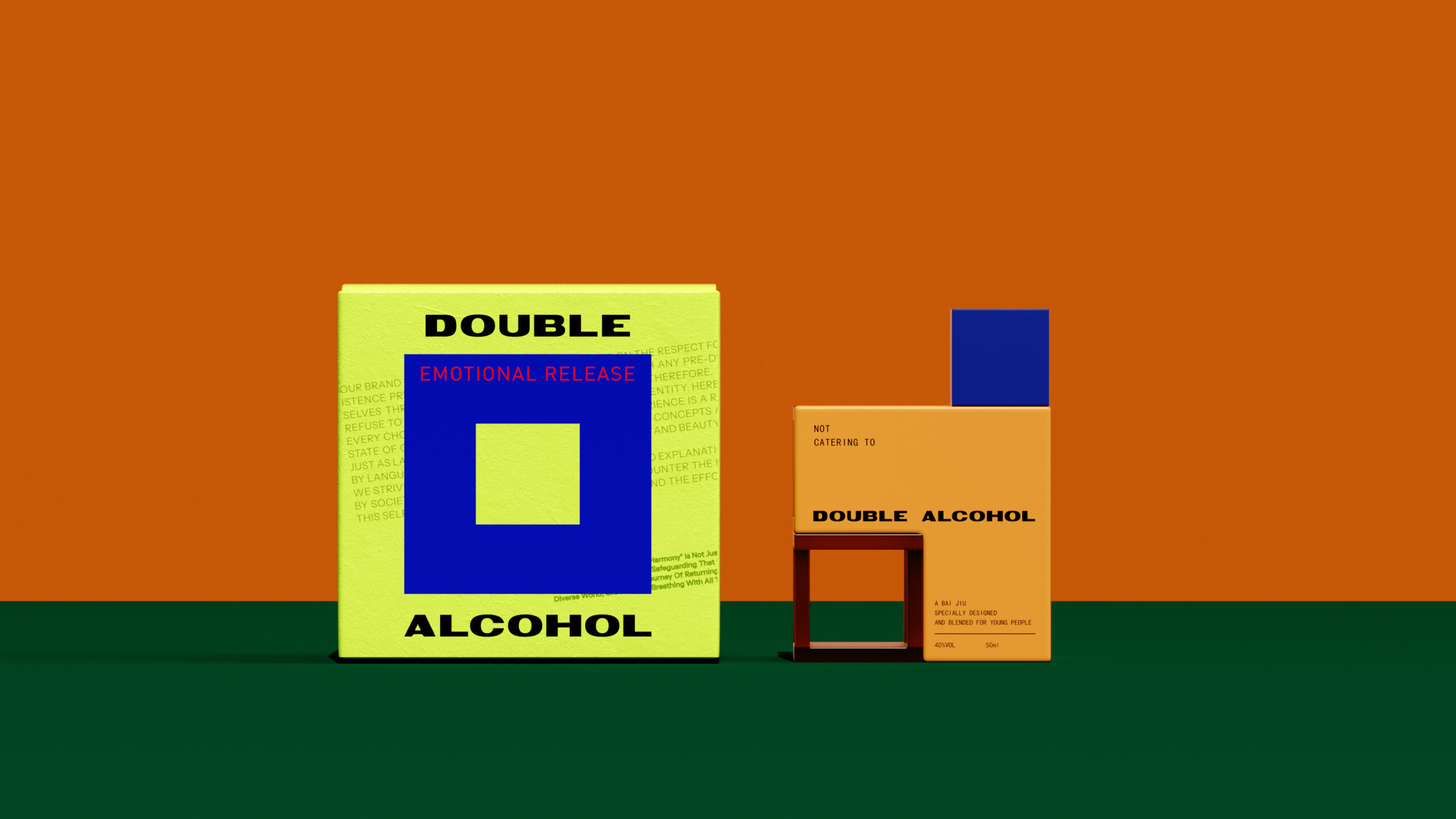
Double Alcohol takes baijiu somewhere it rarely goes, straight into bold, graphic territory built for a younger drinker. Each of the five bottles wears a saturated block colour, mustard, mint, ash, navy, black, with a contrasting cube-shaped cap and an open square cutout that turns the carton itself into a piece of geometry rather than just a box. The wordmark sits in confident, condensed type alongside the phrase “Not Catering To,” a quiet manifesto against the idea of a single fixed identity. “Emotional Release,” stamped diagonally across the packs, reads less like a tagline and more like a mood the bottle is meant to hold. Displayed together, the five colourways behave like a Rubik’s cube, snapping into one unified block that turns a shelf of individual bottles into a single striking object, treating variety and cohesion as the same design idea.
What stands out here is how the cutout square doubles as both a structural signature and a display mechanic. It is easy to design a strong single SKU, harder to design a modular system where five distinct colourways still read as one coherent object when placed side by side. The cube cap adds a second geometric anchor, so the eye has two consistent shapes to latch onto across every variant, which is likely what makes the collection feel assembled rather than merely matched. There is also a nice tension in pairing a traditionally ornate spirits category with such a restrained, almost industrial colour language, suggesting the brand is deliberately distancing itself from baijiu’s usual visual cues.








 Derrick Lin
 Biaa
Biaa Petitmoulin Studio
 White Bear Studio
 Eva Chistyakova
 monther al omari
 Atipus
 alchimistestudioParis
 oneandother
 bloomburo
 helocrene
 Shapers Studio
 Denver Design
 Aidearte
 andrew.huerta
 softmachine
 airobtq
 Buzz & Co.
 Ruby
Ruby themythographer
 IDNB Inc.
 viktorflr
 Zenpack