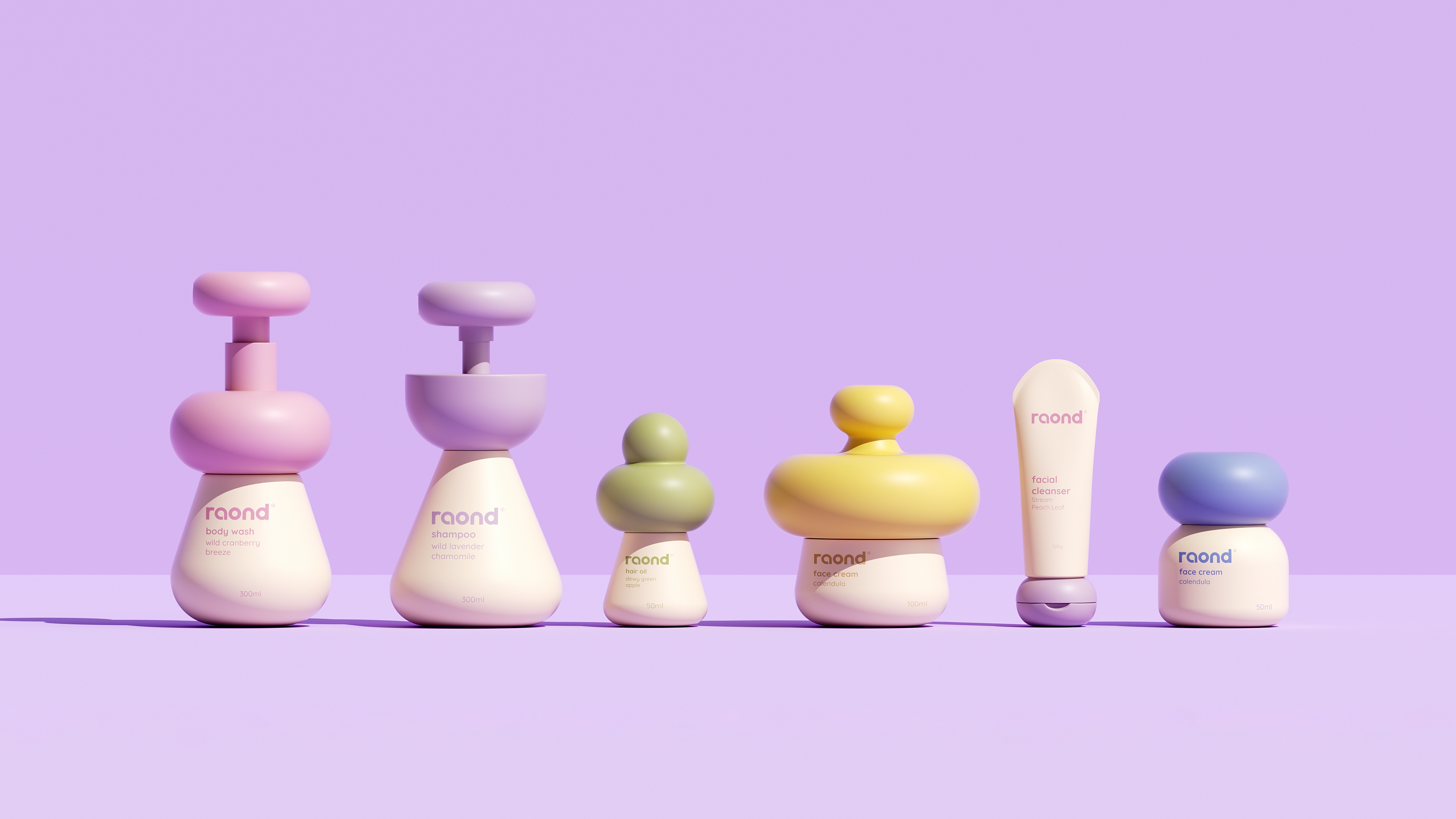

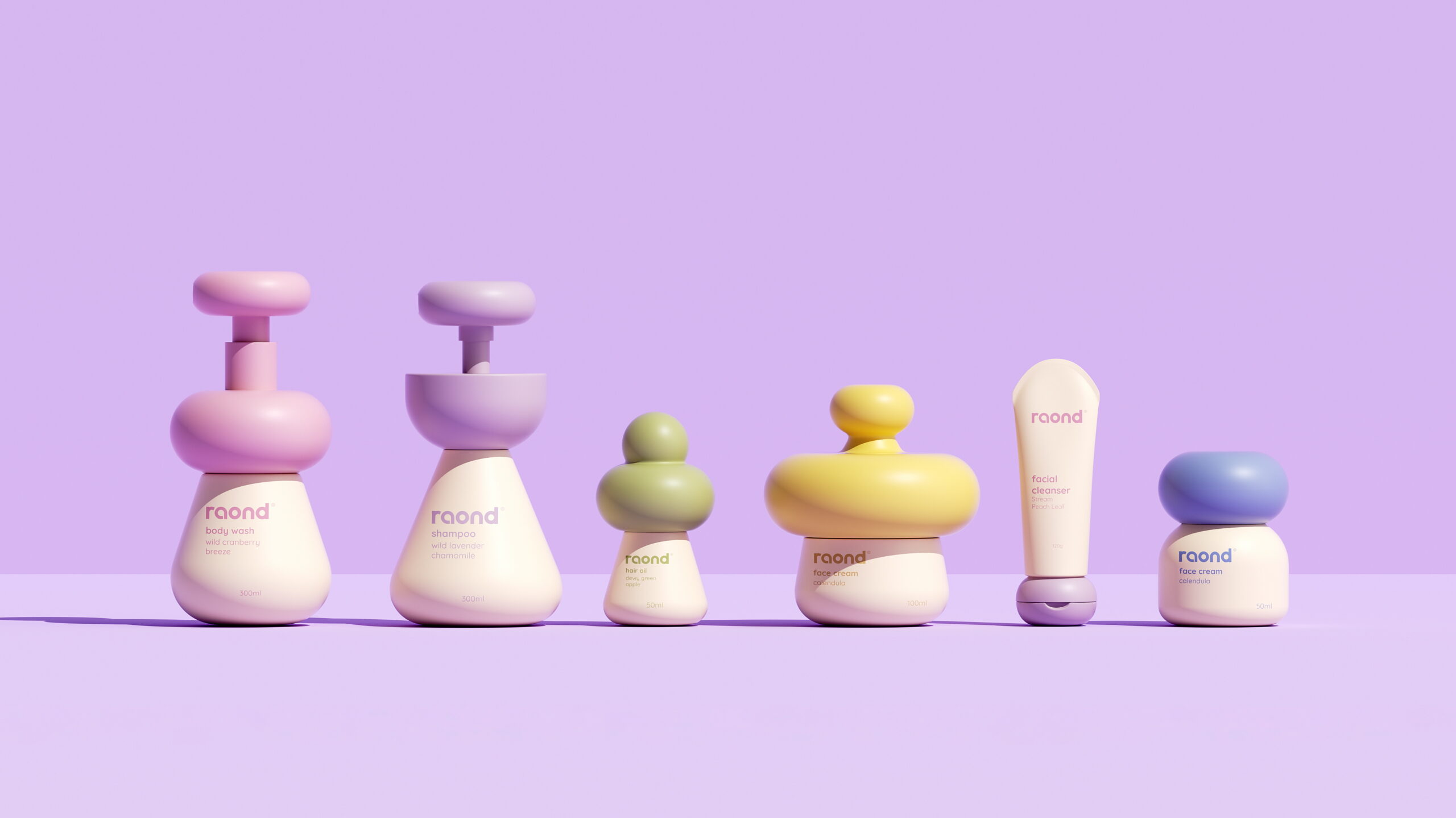
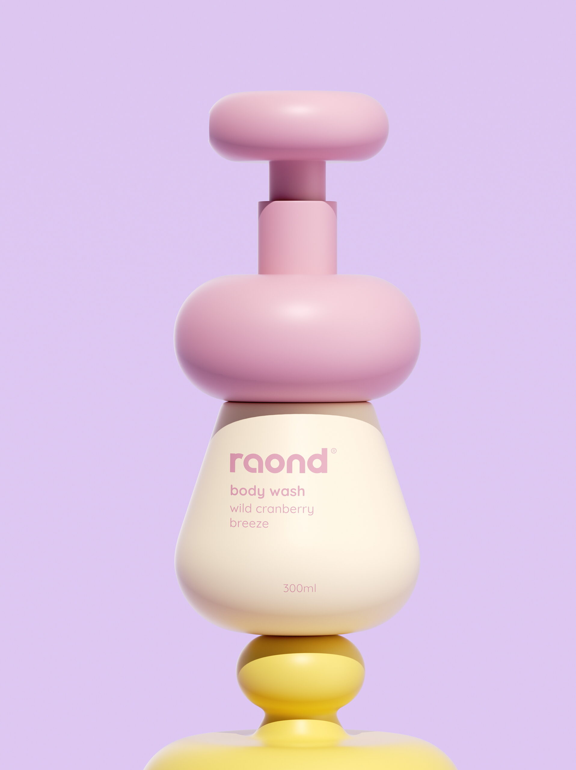
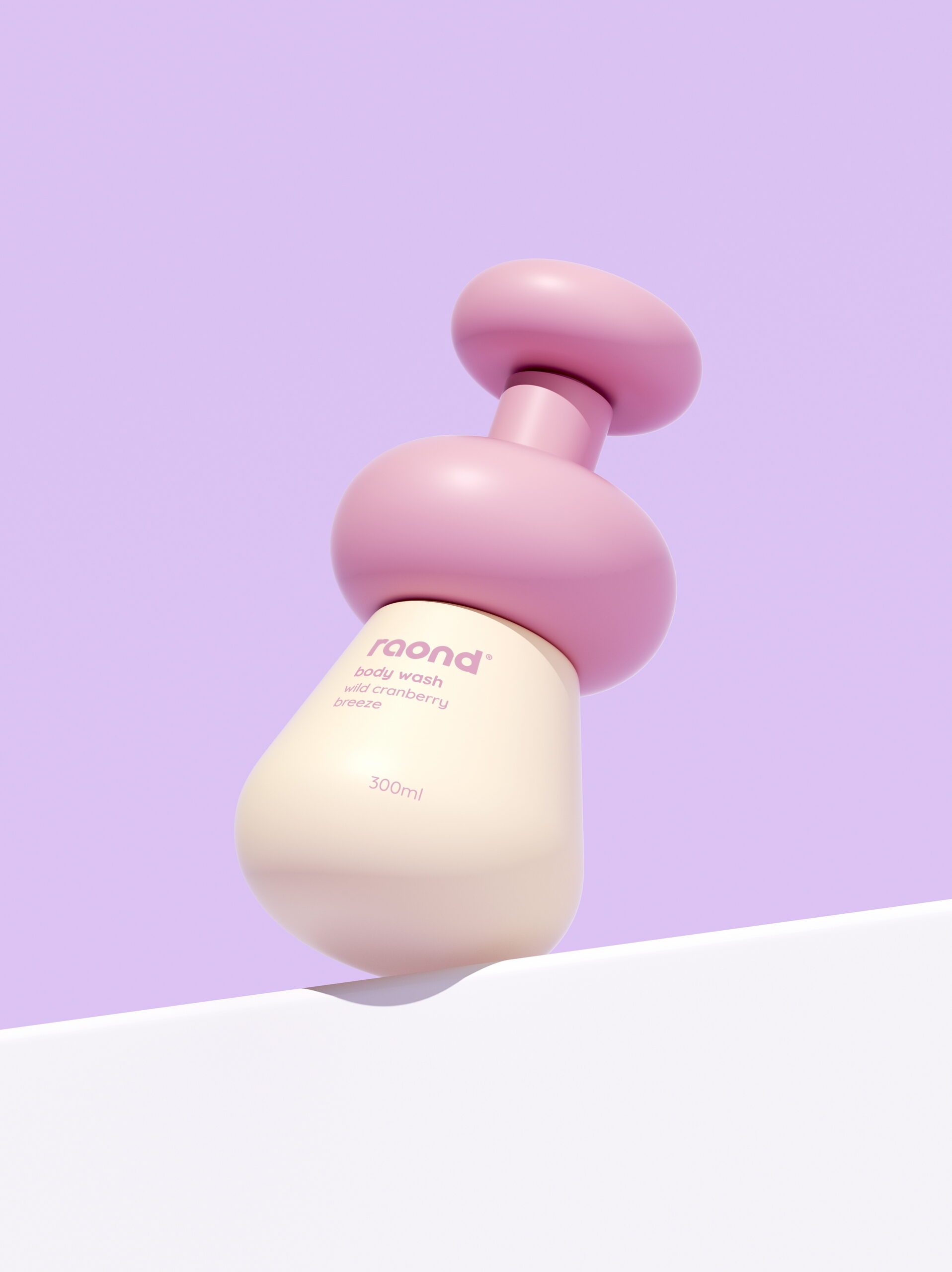
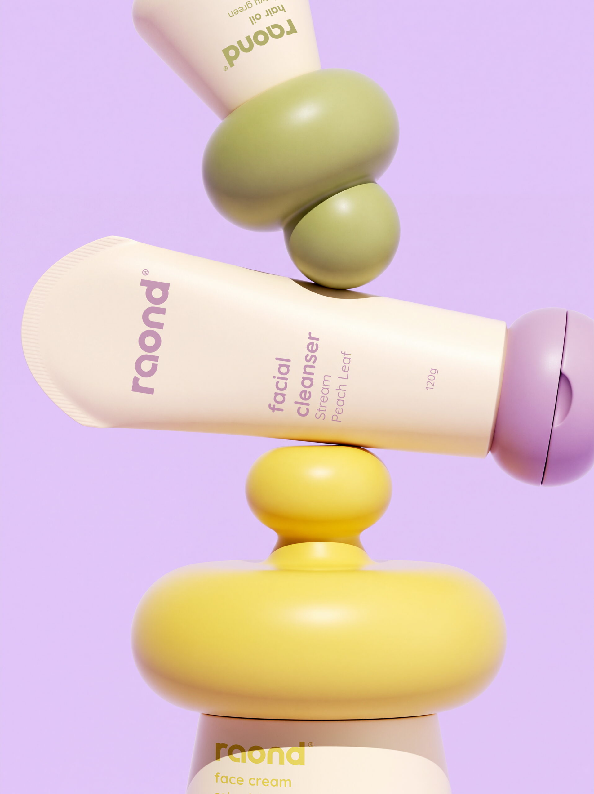
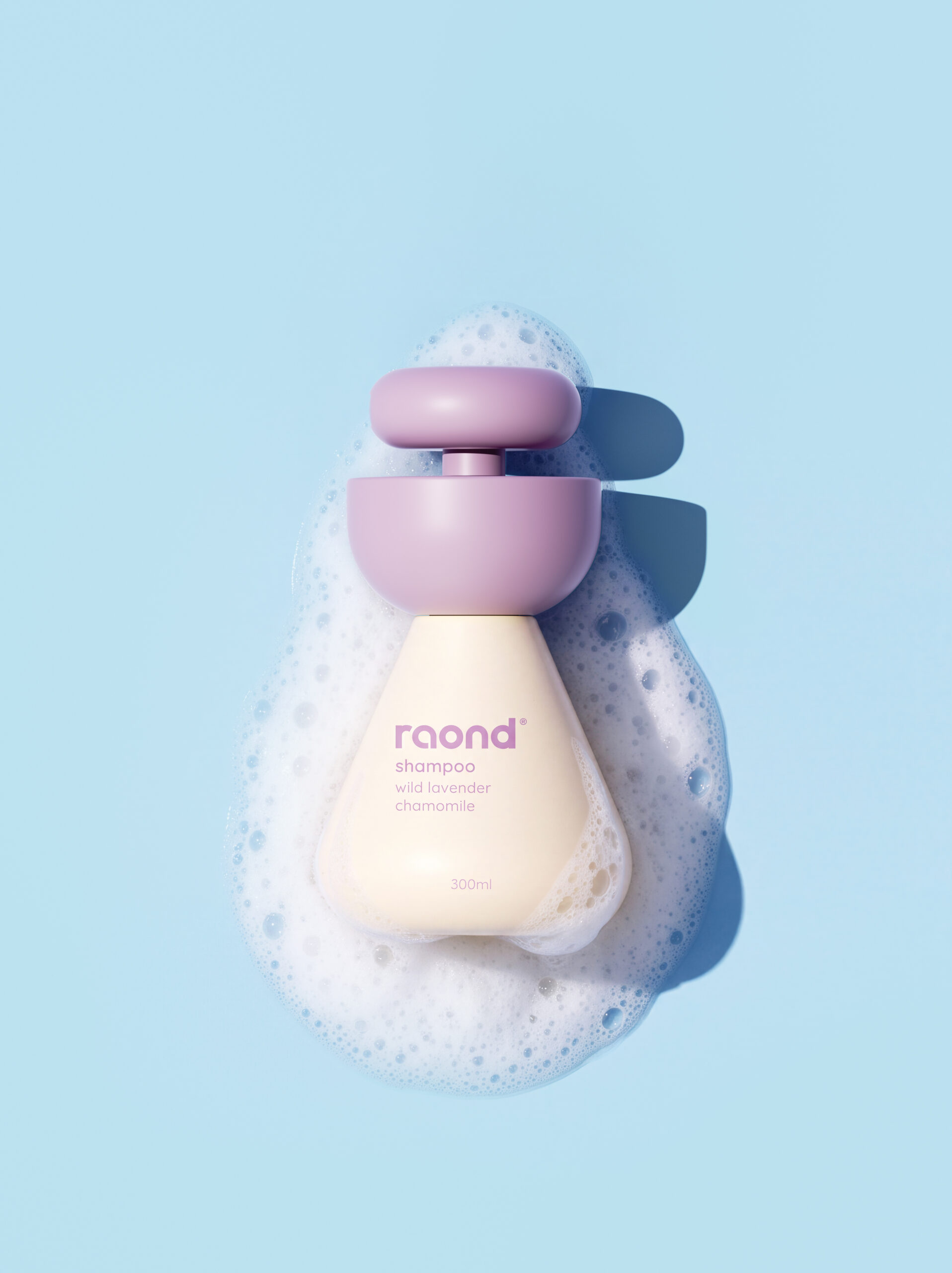
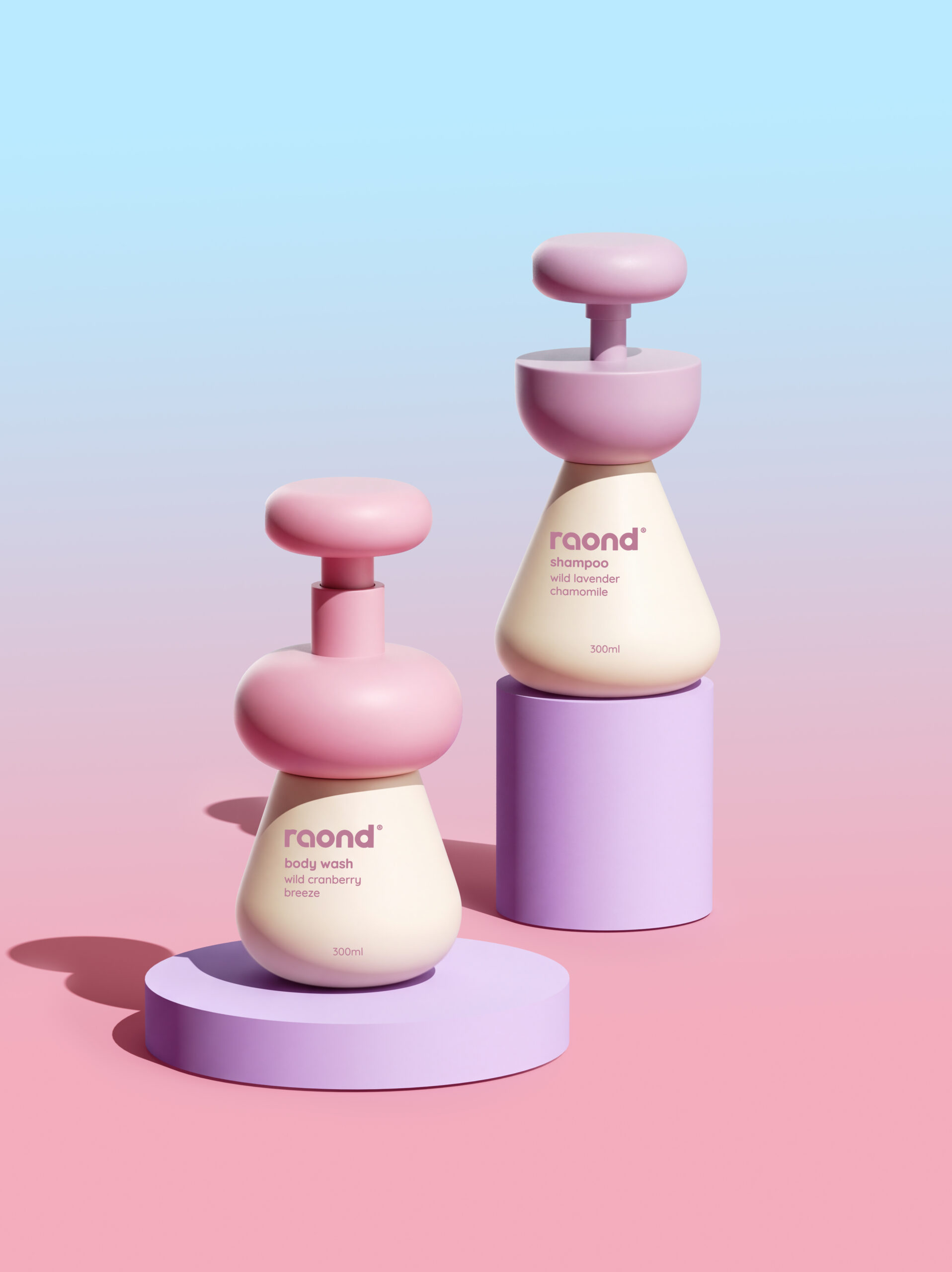
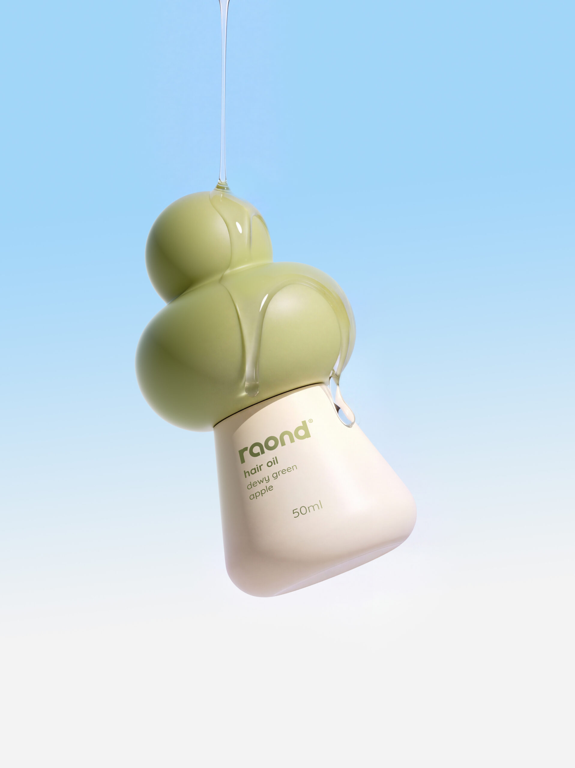
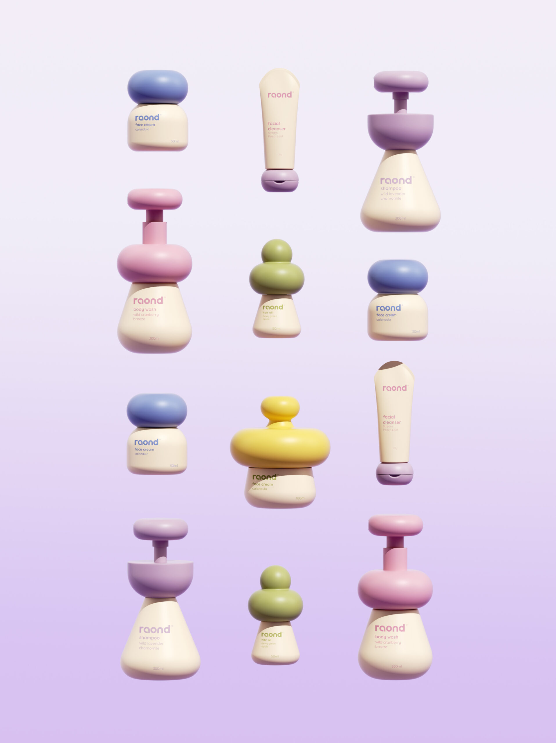
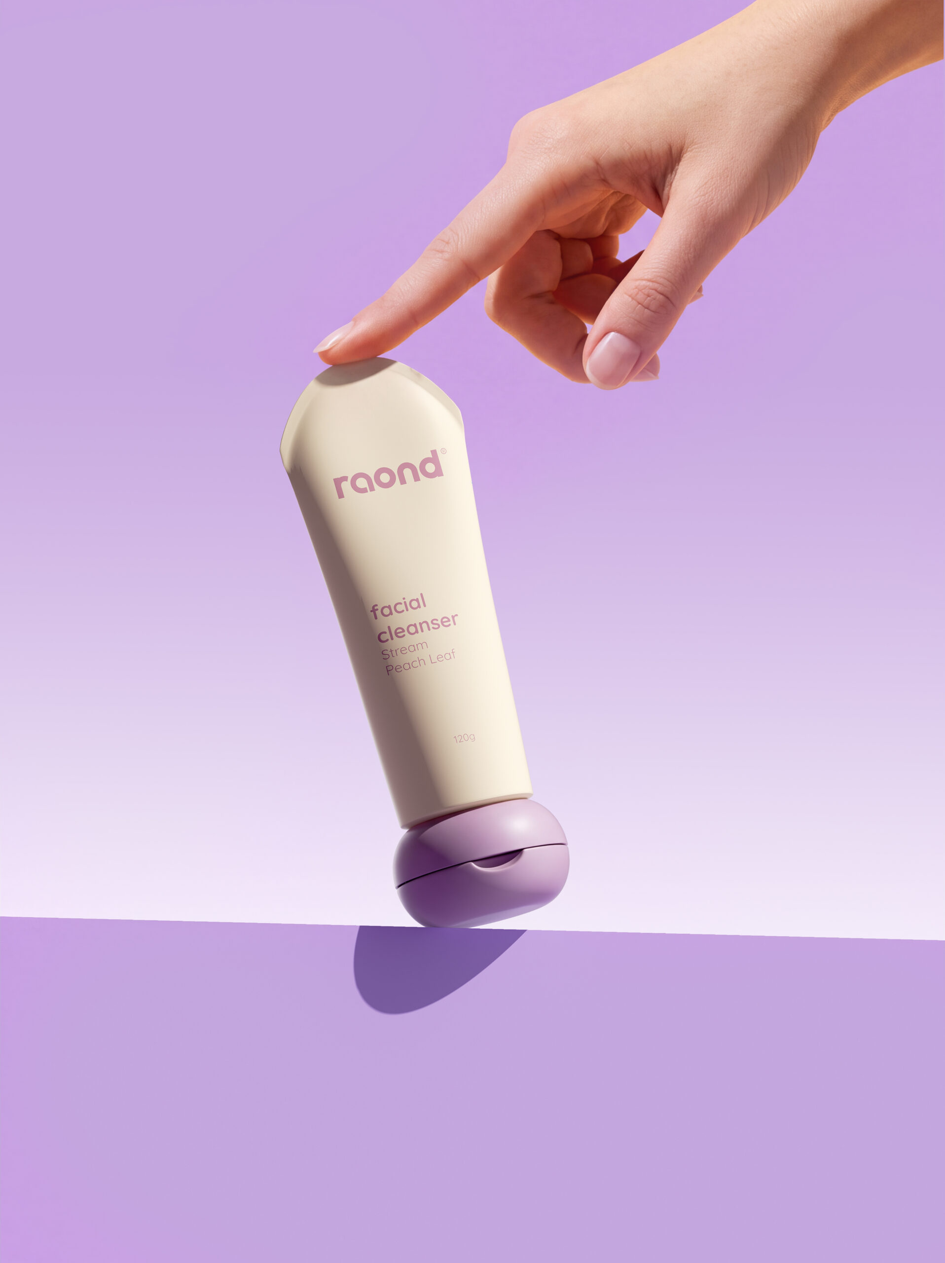
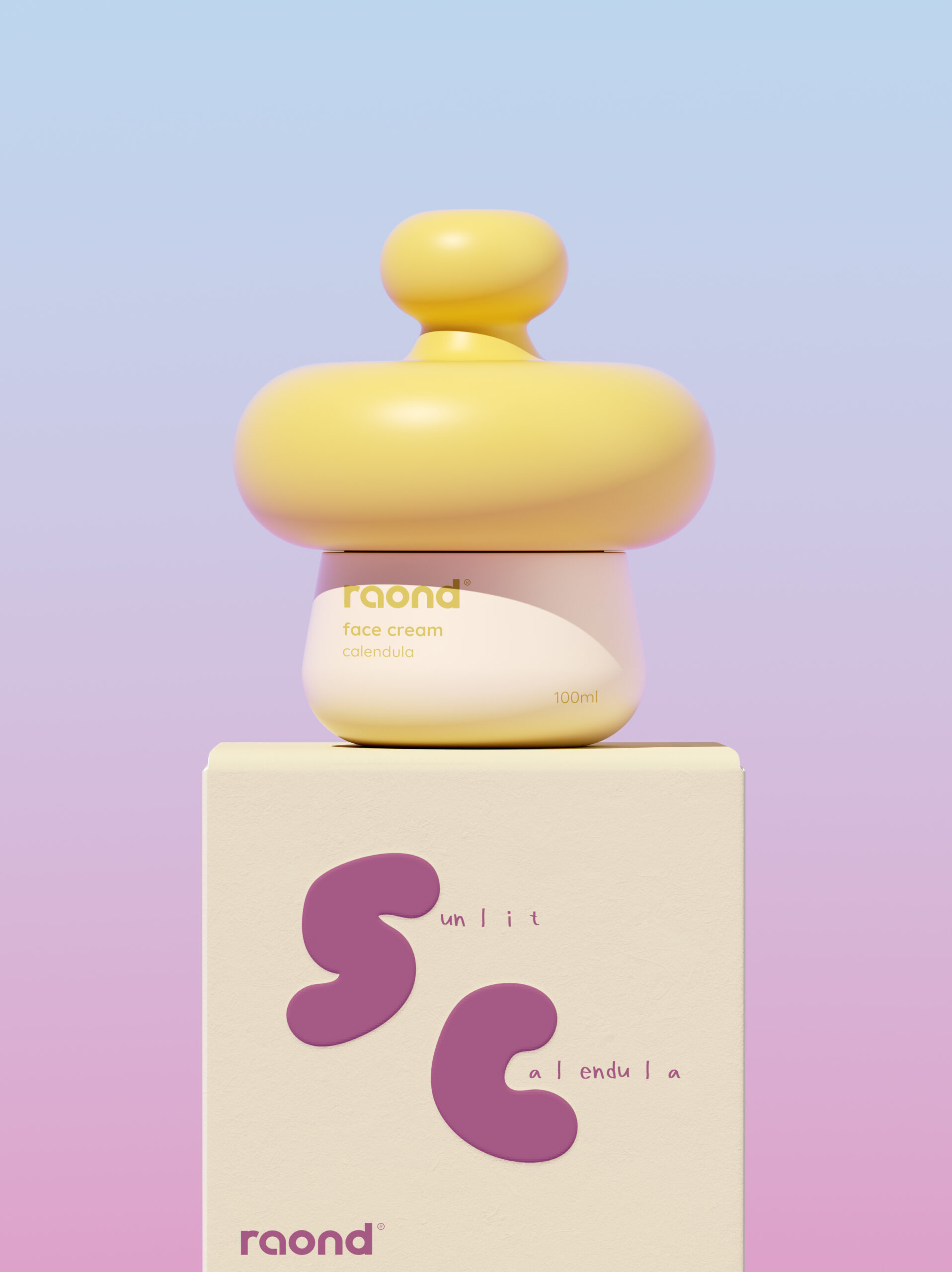
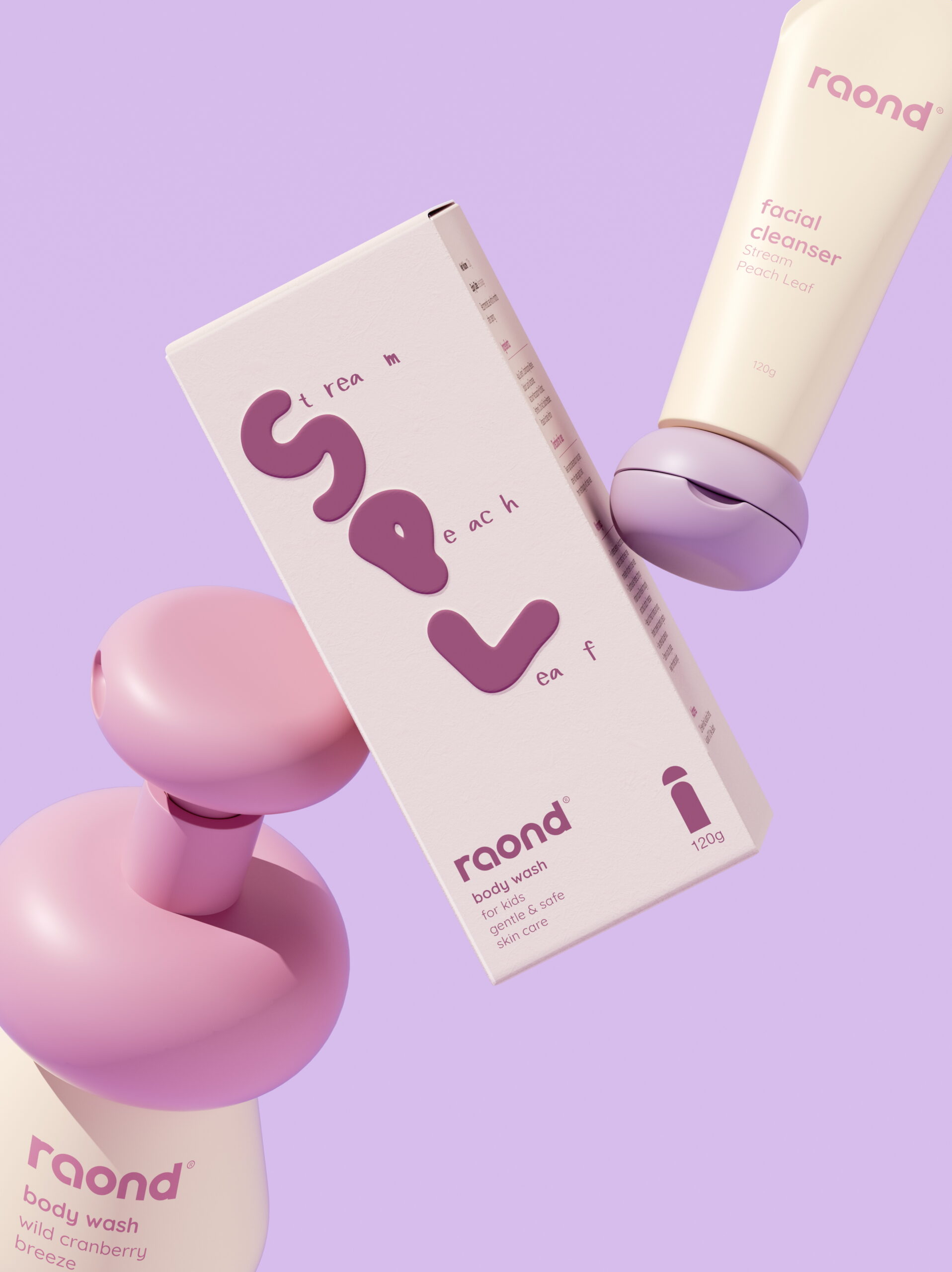
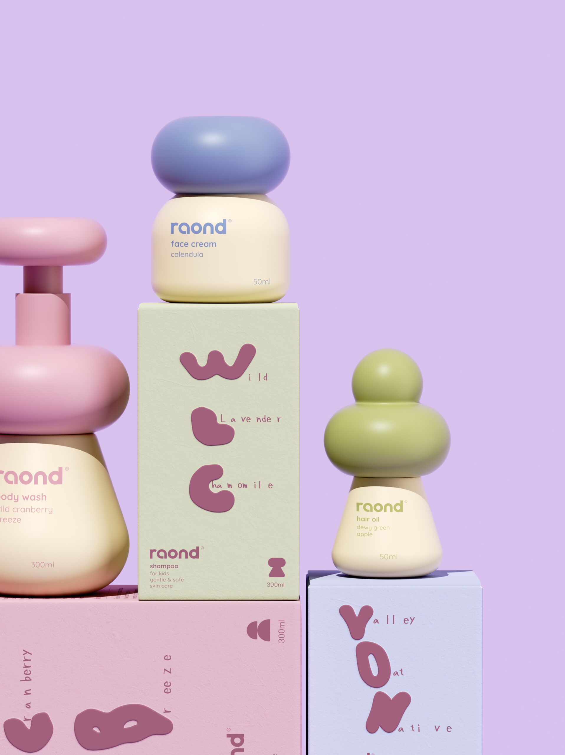
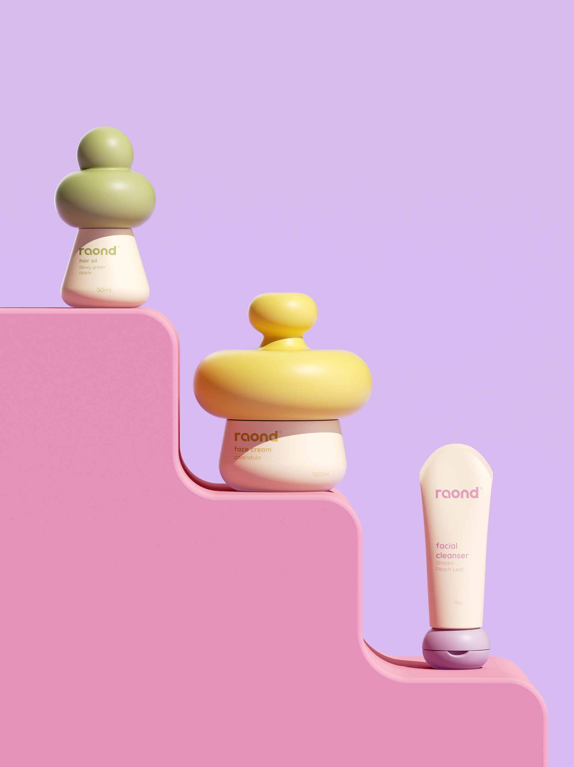
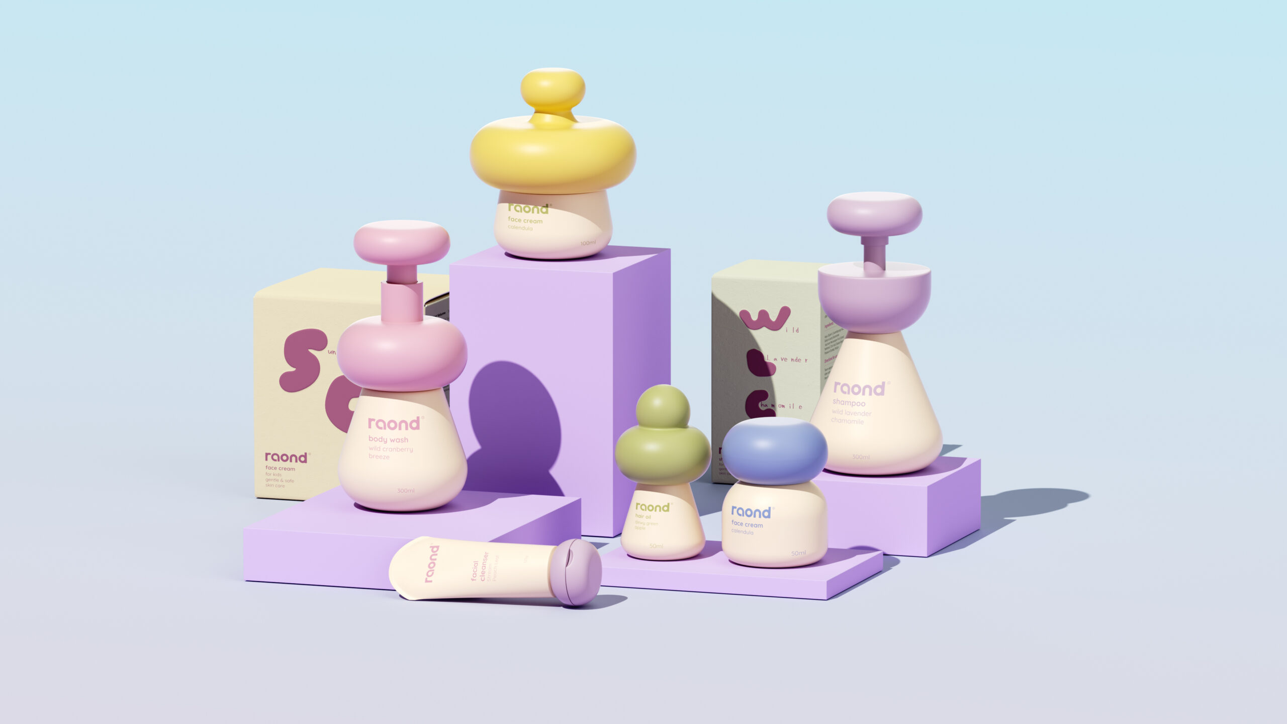
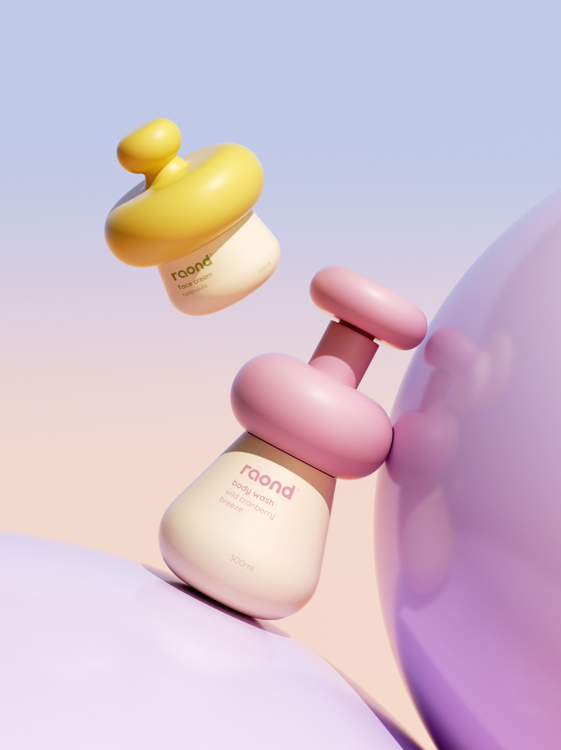
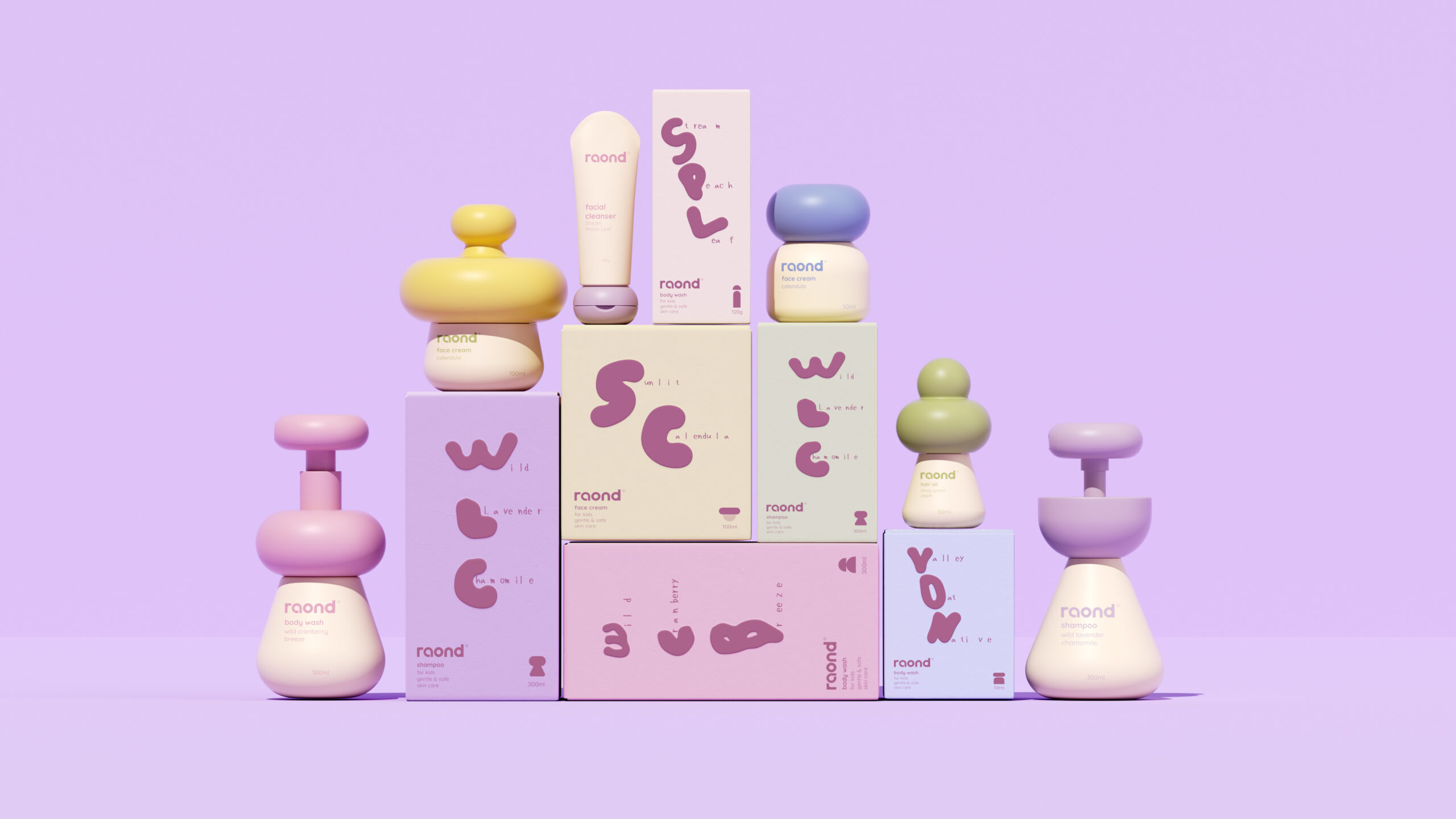
The raond range treats the bottle as a toy before it is a container. Each piece reads like a small stack of smooth pebbles, a cream body topped with an oversized cap in pink, lilac, olive, butter yellow or periwinkle. The silhouettes sit somewhere between mushrooms, gnomes and balancing stones. The name hints at the roundness, and the lowercase wordmark follows the same soft logic, taking its tint from each cap so type and form read as one object. The cream bodies keep the lineup calm and let colour live in a single gesture at the top. Scale does quiet work too: tall pumps and tiny jars stand together like a family of characters, which suits a children’s range well. The identity stays playful without mascots or illustration, trusting shape alone to carry the personality.
Curator’s Insight
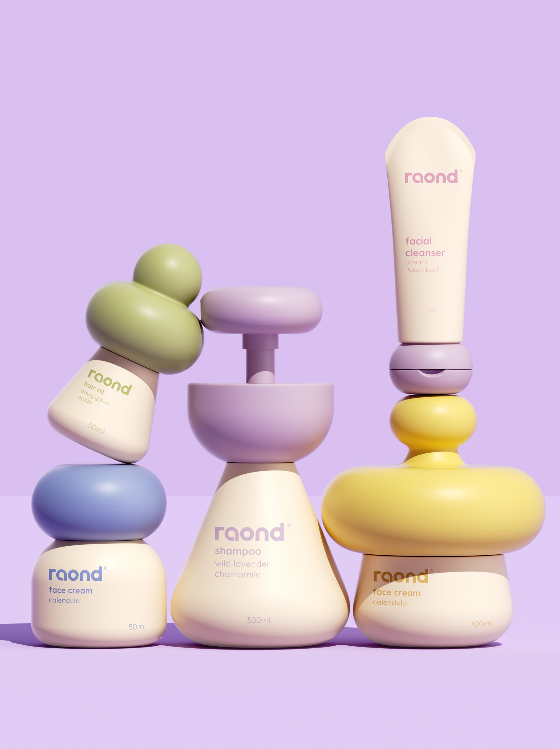
The caps do the sorting. Each closure takes a different geometry according to how it is used: a broad disc to press, a dome to lift, a sphere to hold. The shapes work as both a product code and a set of building blocks, which is why the group shot can tilt a hair oil against a shampoo pump and still look intentional. The label typography backs this up. A heavy rounded wordmark leads, the product name steps down in weight, and the scent and volume fade into low-contrast tints on the cream body. That keeps the object in charge, though the lightest lines will need care on a real shelf. When form already carries the identity, let the functional parts do the differentiating and keep the graphic layer quiet.
 ANONIMA/
 Armoder Arte y Diseño
 eimanbeh
 Biaa
 Hartson Creative
 Karen Danielyan
 AUN BRANDS
 Studio Zak
 Hey Joe Studio
 Blue.labs
 Jasmine Tsan
 Atiq Alam
 Modern Theory
 Tancybox
 Artrime Graphic Design
 WhiteWarblerCo
 Simple Studio
 M&A CREATIVE AGENCY
 monther al omari
 Husain Studio
 JDO
 INTSIGN
 Agence des Coteaux
 Yaniv Vaknin