

DABUR GLUCOSE D & GLUCOPLUS C
Energy Drink
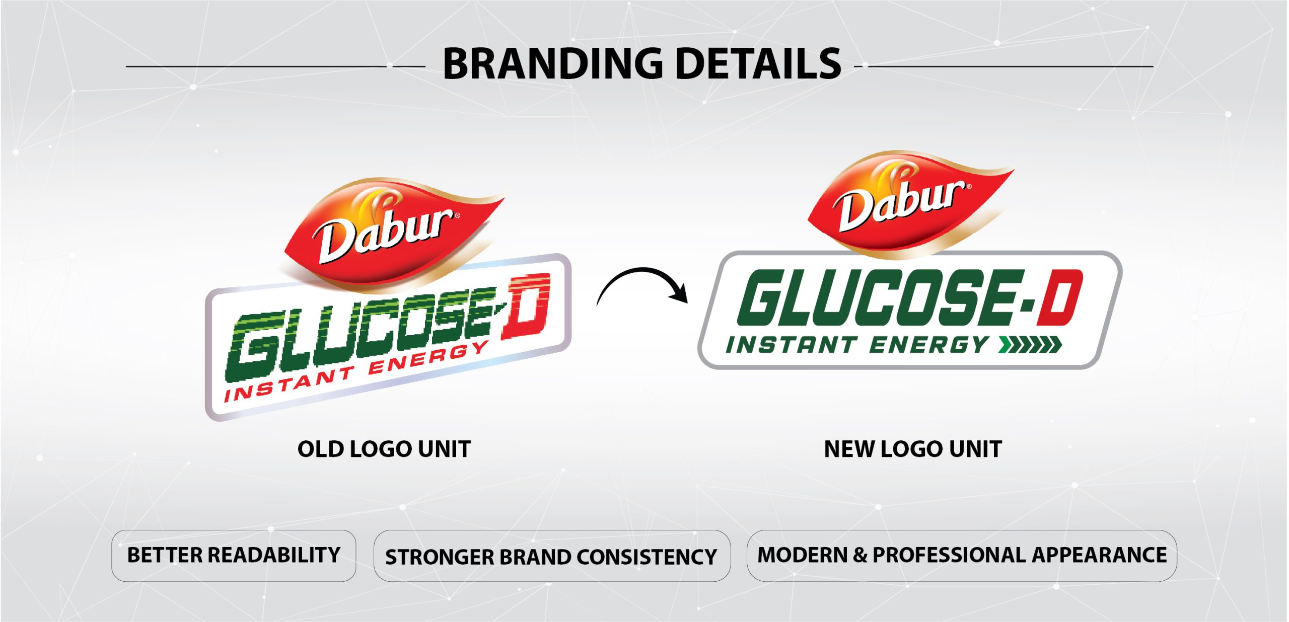
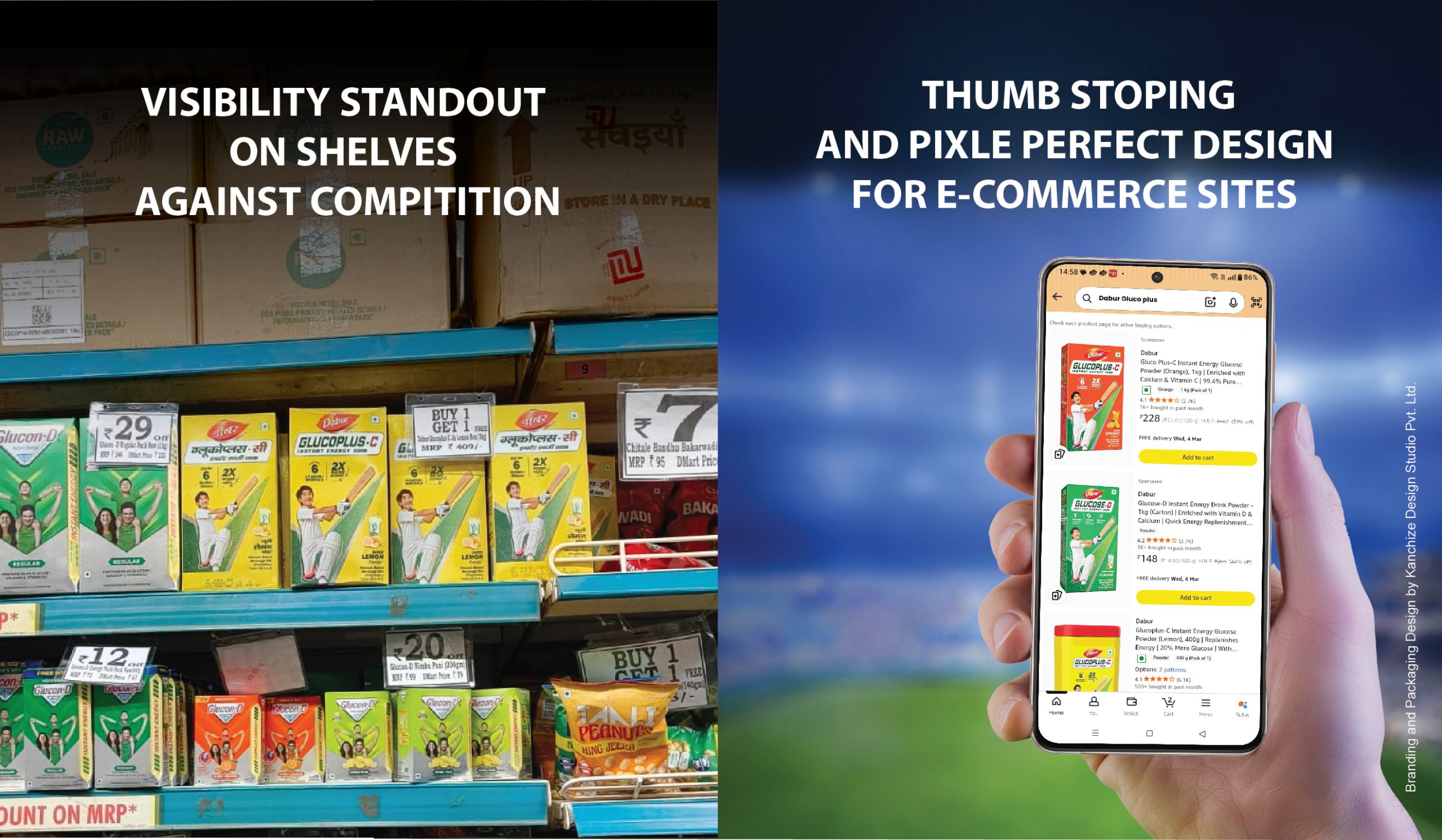
Kanchize Design Studio got the opportunity to create a refreshed look for a brand that generations have grown up with, developing the branding design and packaging design for Dabur Glucose-D. The objective was to modernize the pack with strong shelf presence while reinforcing the product’s promise of quick energy. A minimalist design approach ensures clarity while amplifying the brand’s energetic personality and retail impact.
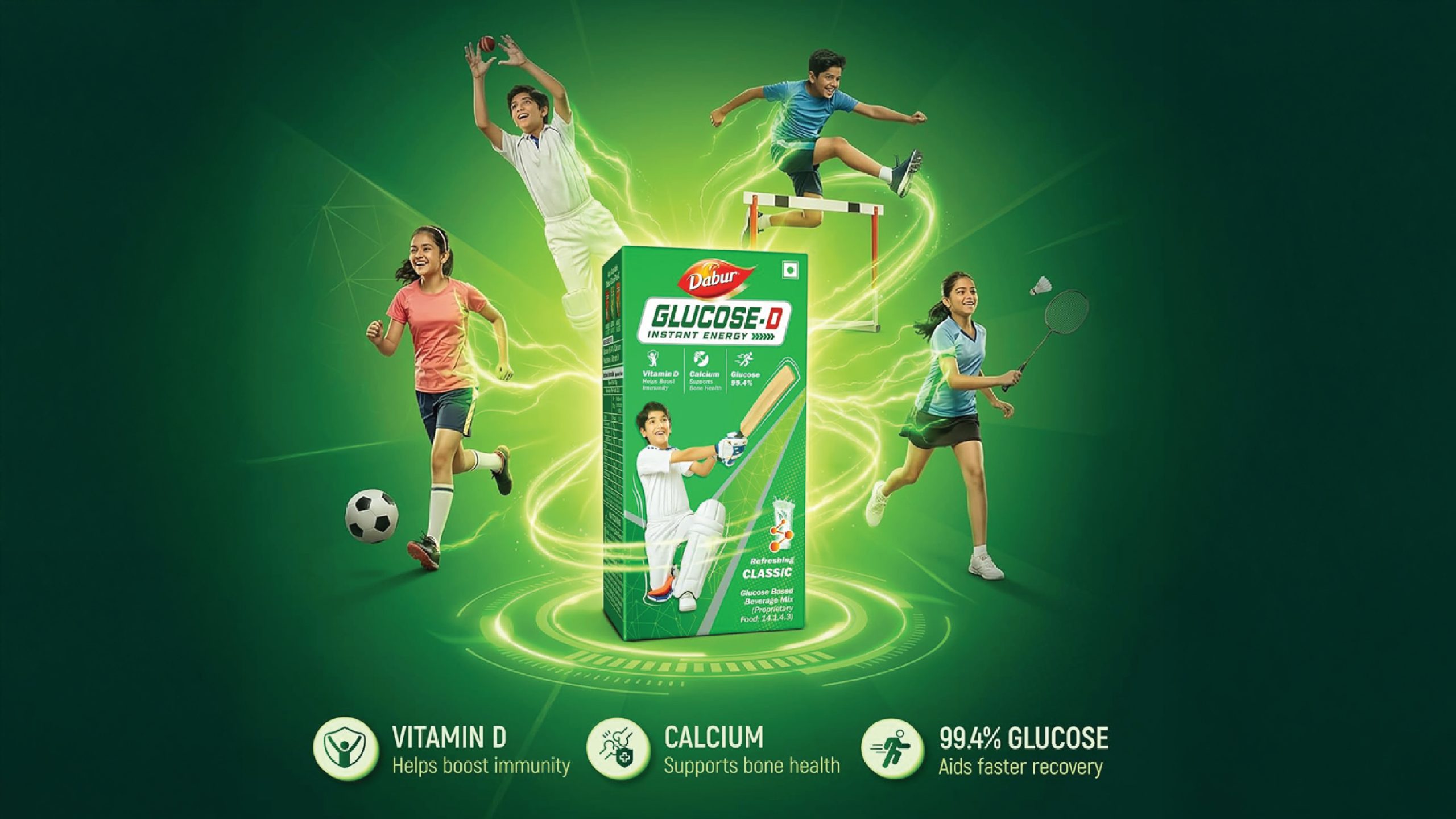
Our Solution : A high-impact packaging system designed to communicate energy and performance
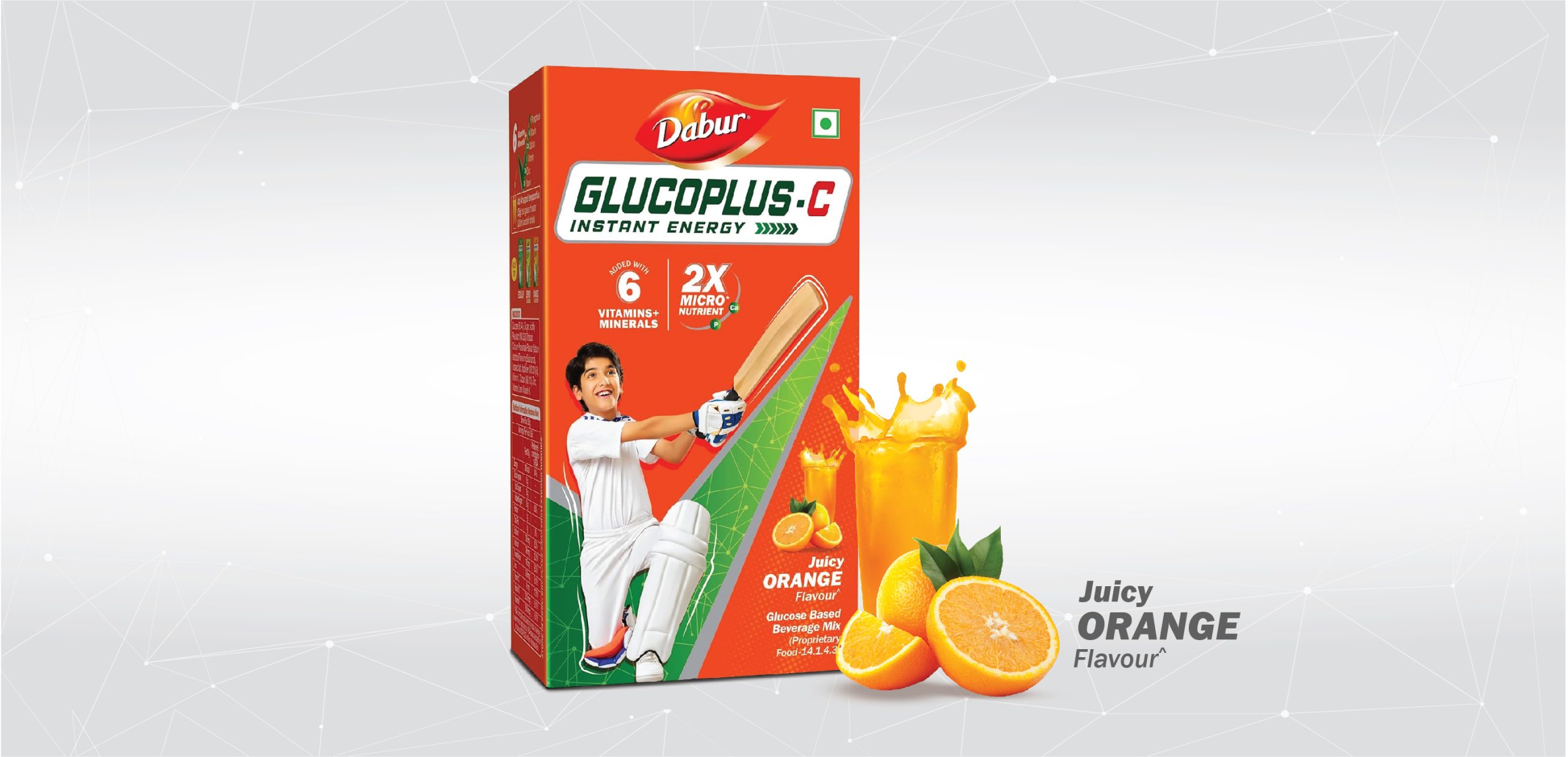
Signature Design Device : The Gluco tick mark with an energy pulse forms a distinctive memory structure across the entire range.
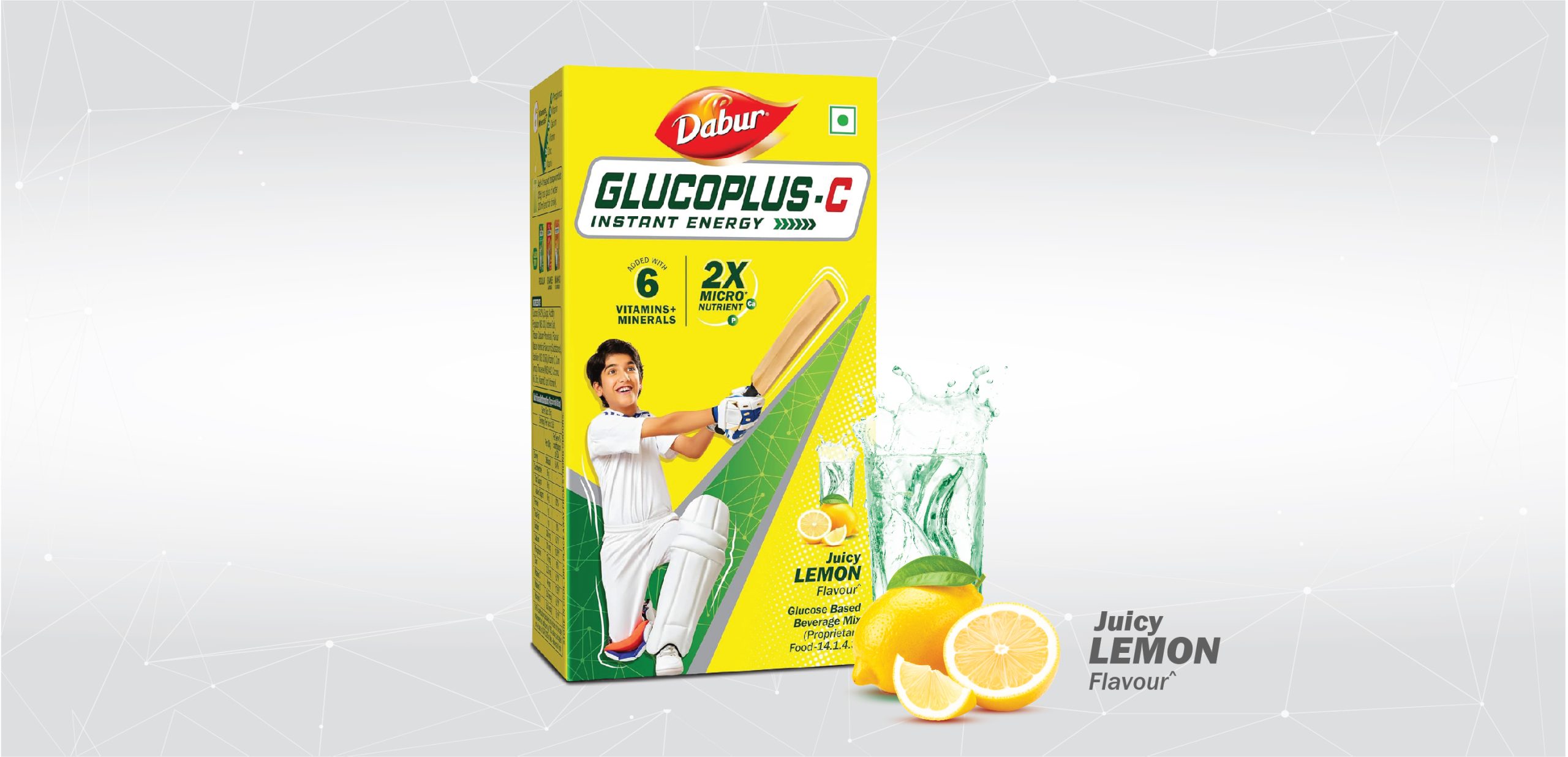
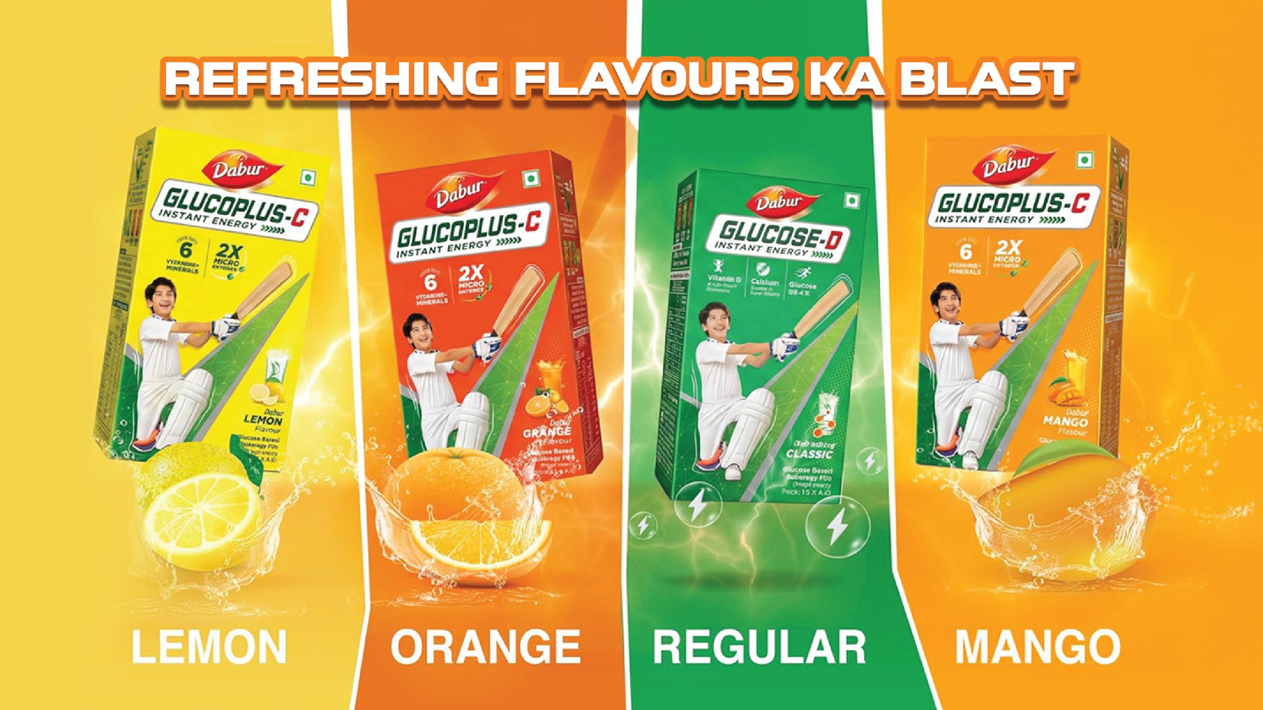
Colour Strategy: Variant-led colour coding improves navigation and shelf differentiation: core glucose in green, lemon in bright yellow, orange in deep orange, and mango in yellowish-orange tones.
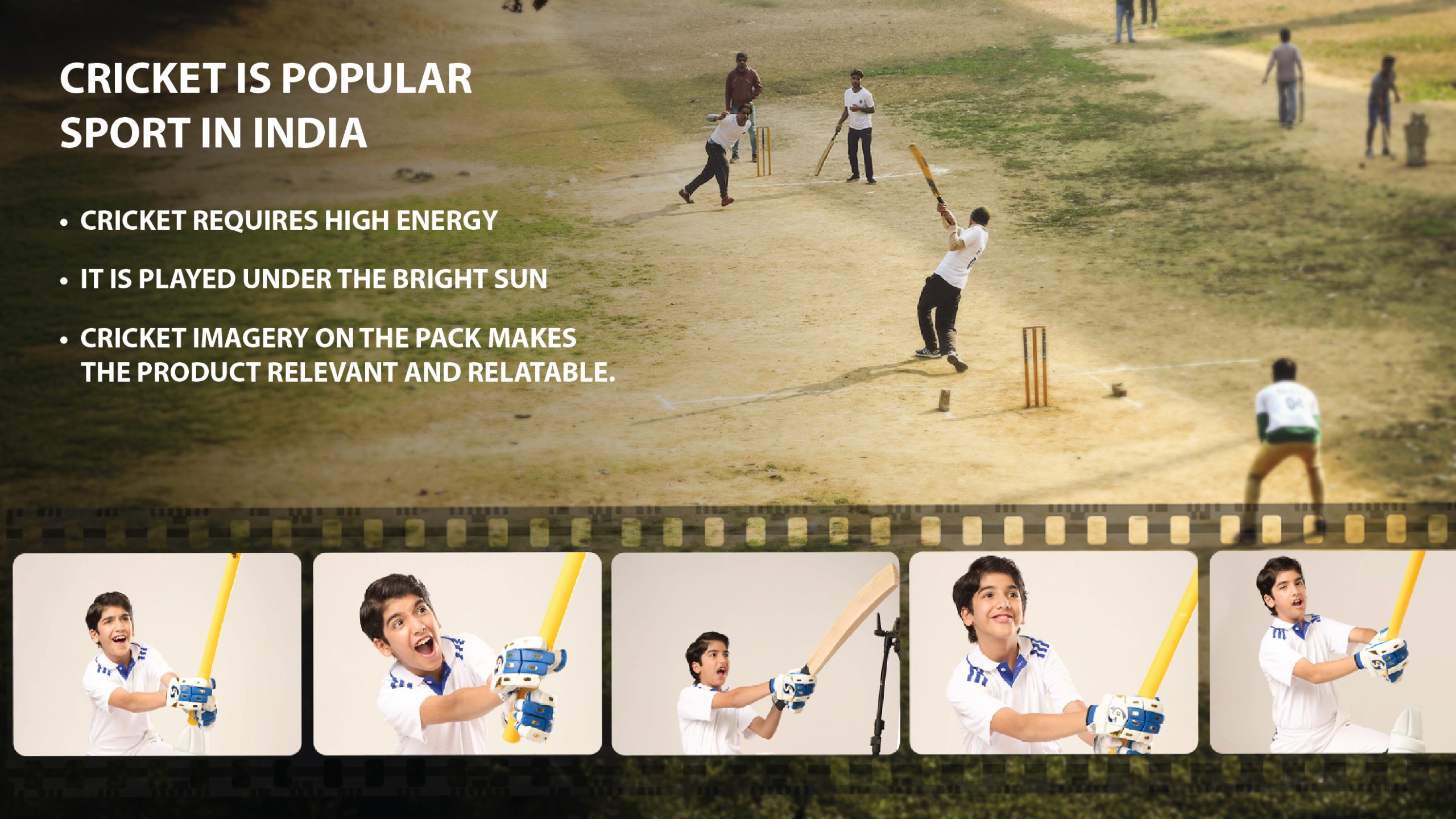
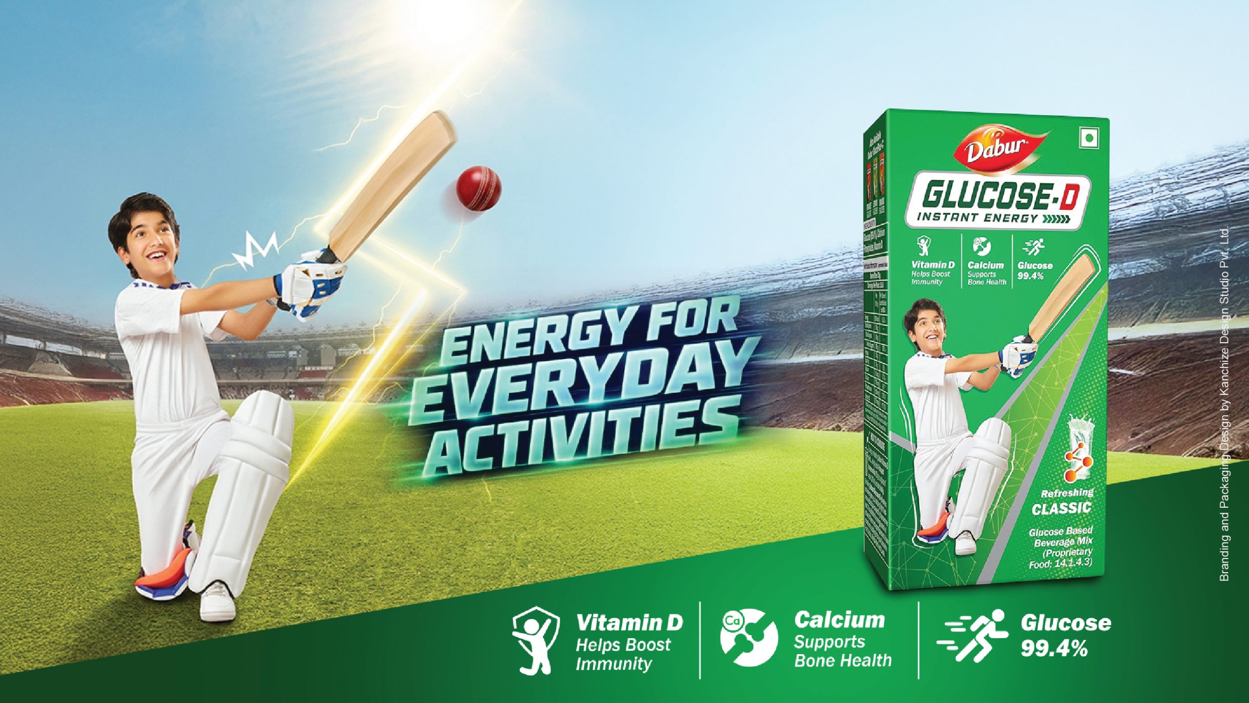
Indian Popular Sport – Cricket: Cricket imagery builds instant relatability and connects with everyday energy needs.
Clear Visual Hierarchy: Bold typography and structured layouts enhance readability and shelf visibility.
Impact & Results: The refreshed packaging improved shelf standout and strengthened brand recall. As a creative studio in Mumbai, Kanchize delivers strategic branding design and packaging design that combine clarity, memorability, and strong retail performance.



 Derrick Lin
 monther al omari
 43oz
43oz lilyz design23
 Modern Theory
 Eighteen Brand Studio
 Bhumika Singh
 MohamedMashaly
 Pixels Studio
 Gulya
Gulya UPRISE
 Lizaveta Kharitonyuk
 Bonsanco Creative Studio
 DesignRepublic
 GIRAFA STUDIO
 PiotrWisniewski
 Sophiagdotcom
 CreativeWise
 SoreThumbStudio®
 Modern World Studio
 Palashcc
 Valérie Colace