Project Name:Nyveda
Project introduction:
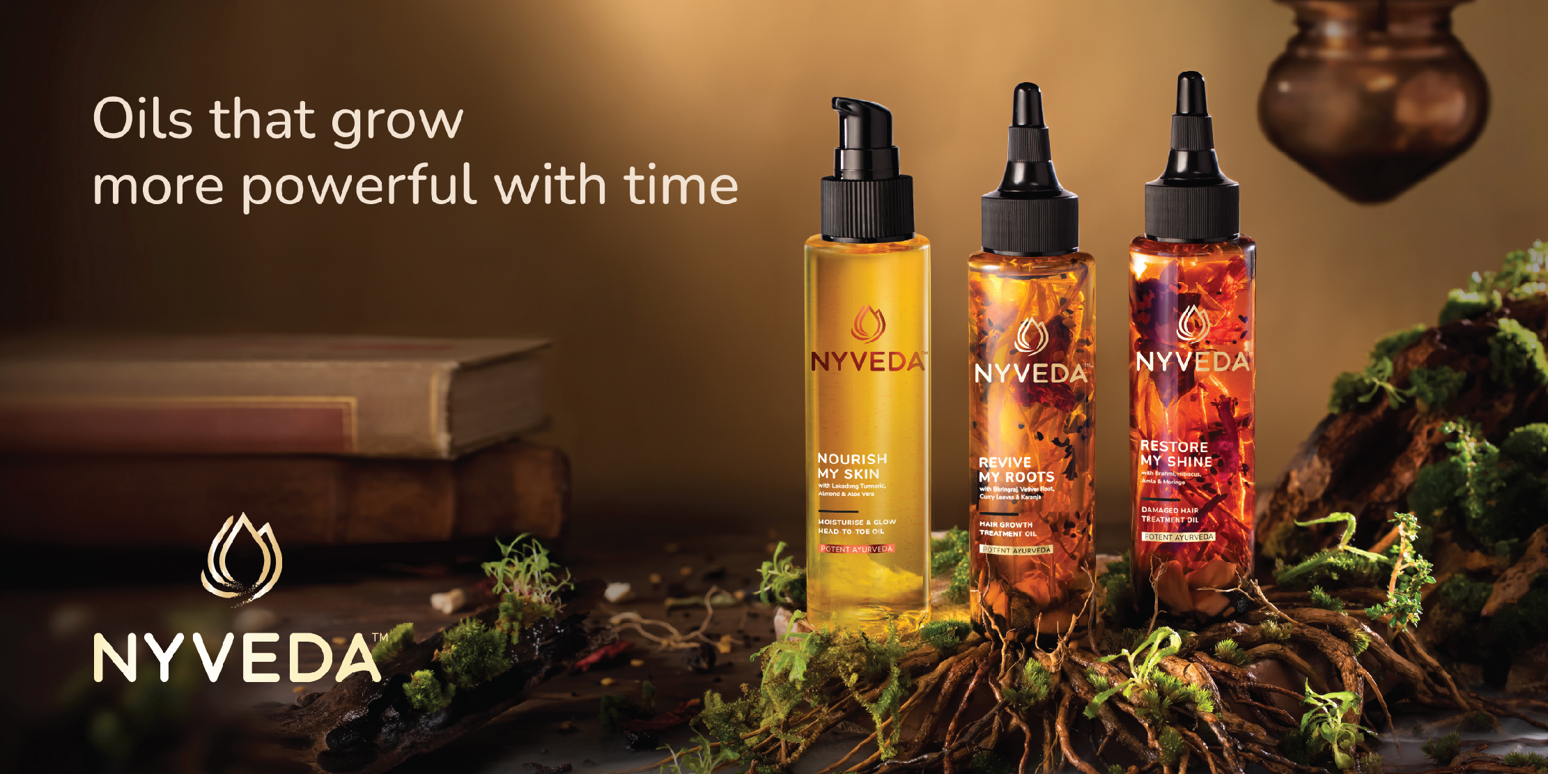
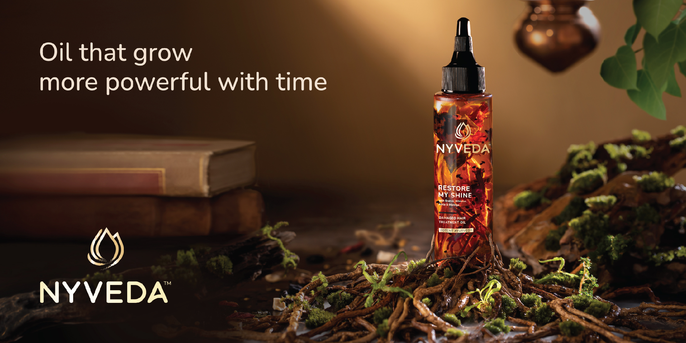
Nyveda is a personal care brand- Modern sensorial with Ancient Ayurvedic recipes. Our brief was to design branding and packaging that captures modern and traditional attributes.
Client:Nykaa
Studio Name:Kanchize Design Studio Pvt limited
Challenges:
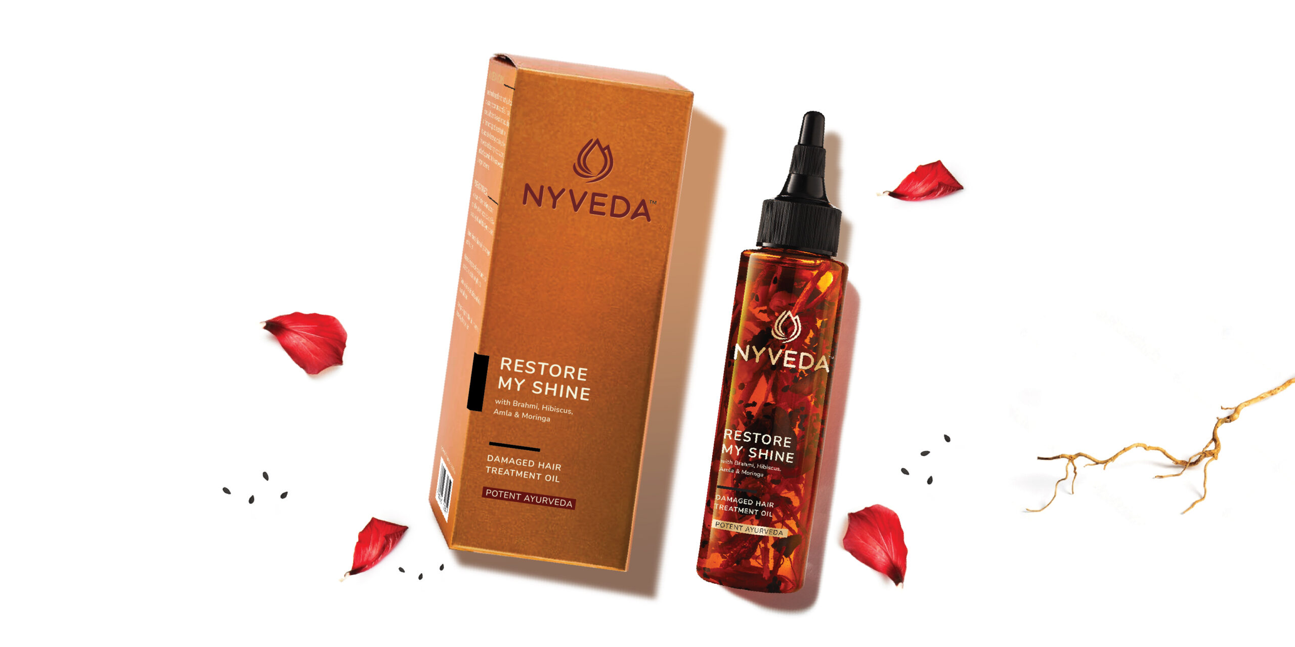
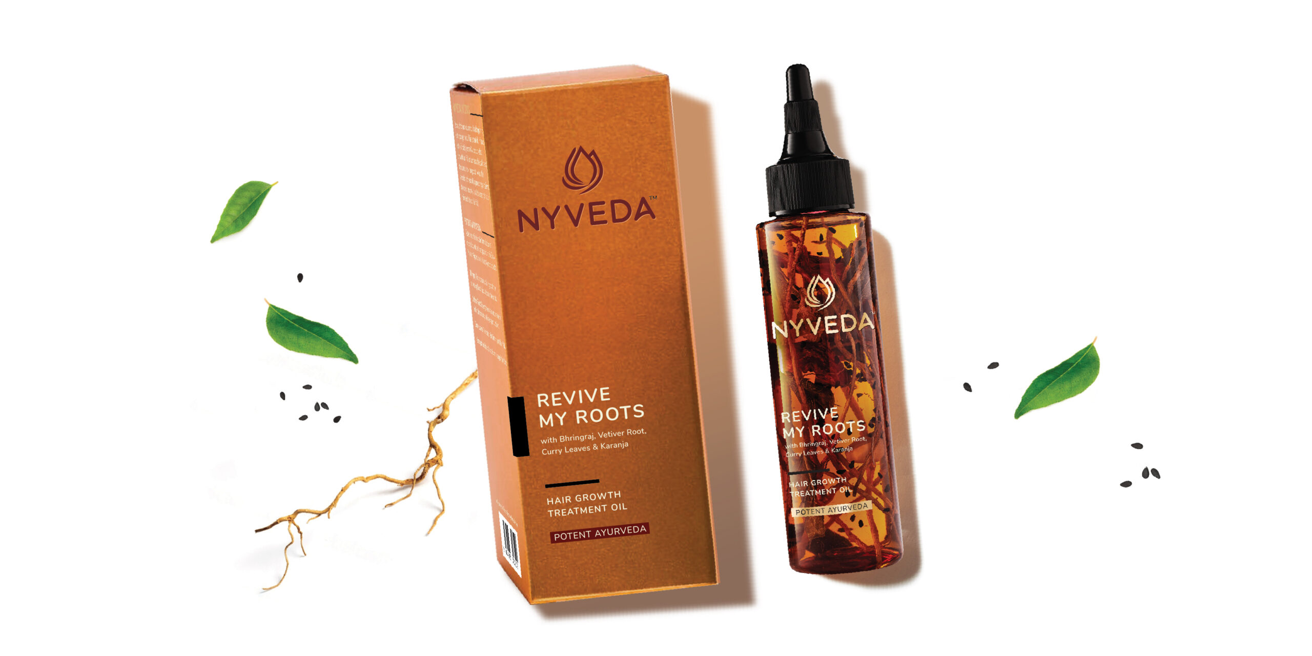
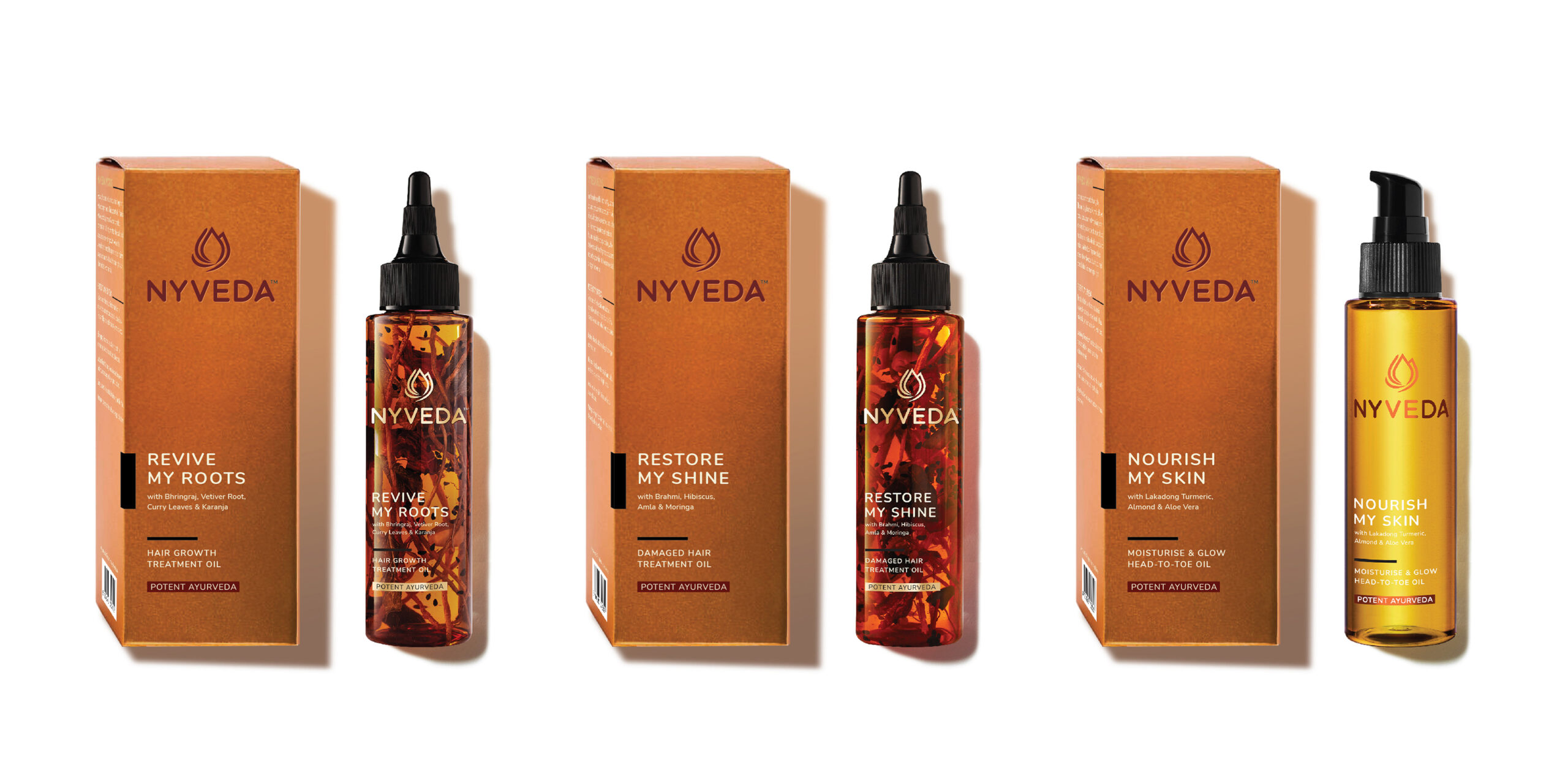
The Range of hair oils have real ingredients soaked and are visible from the bottle.
The design had to be minimalistic so that the ingredients show and yet have an impactful branding.
The brand language had to be uber premium, attract modern and evolved target audience and must have Indian roots.
Solutions:
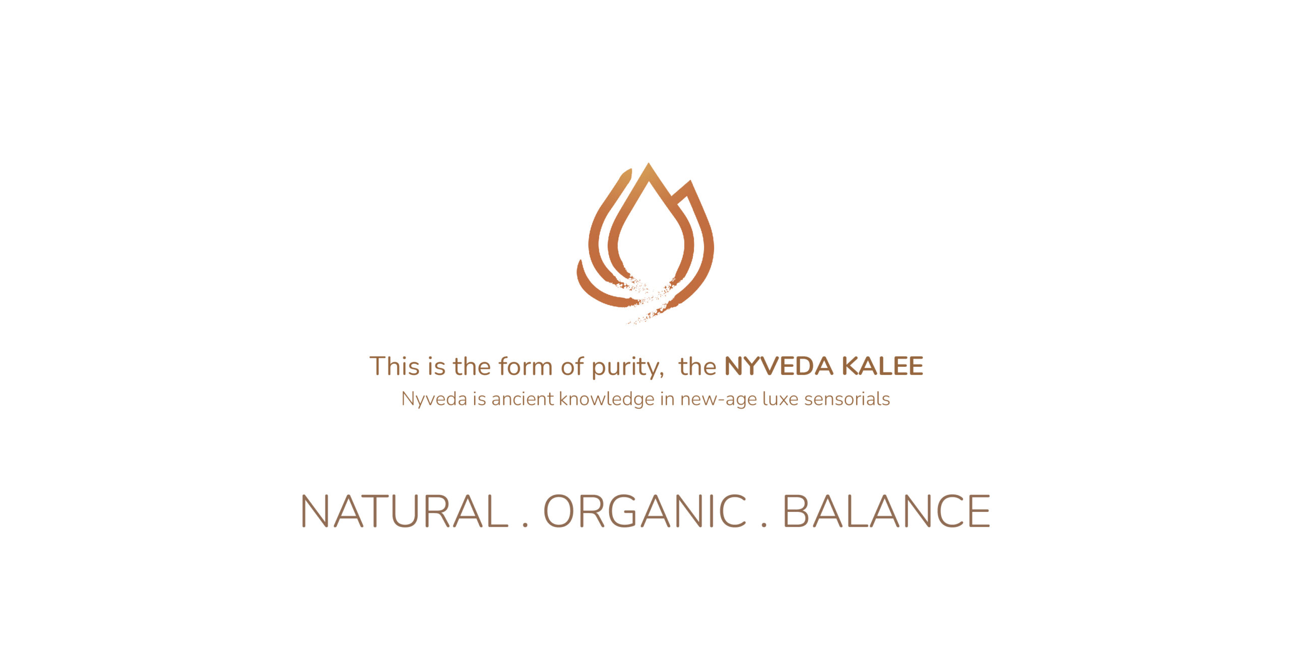
Copper vessels play a vital role in Ayurveda. We choose the primary colours of the brand to be in copper metallic shades. The minimalistic design and the black accents add to the contemporary look. The logo is a bud we call Nyveda kalee. Its made with 5 organic strokes these that represents Ayurveda philosophy of Panch tattva. The bud represents blooming beauty, youthfulness, with the strokes centering it creates a sense of peaceful balance in the symbol. The Kalee also looks like awakened third eye. The bottles were tinted in different colours in different variants to help cut the visibility of floating ingredients and allow branding to look cleaner while keeping the pack max see through.
Nyveda is a Potent Ayurveda line of Oils, that grow powerful with time. Nyveda Hair Oils has herbs that you can see. Our brief was to design this Brand and capture their virtues in packaging design. Nyveda makes Indian recipes with several efficacious herbs and ancient knowledge, accessible to youth. It has modern sensorials and the packaging design invites one to see the magic swirl inside the bottle.
Fluid movements of crude herbs in the oil inspired us to design the logo. Swirling magic is captured with calligraphic strokes that is sharp at the head and ends with leaving an organic trail. The 5 elegant strokes represent Ayurvedic principals of panch tattva and also forms a lotus bud that we call The Nyveda Kalee. A symbol of natural beauty just about to bloom.
There is beauty in imperfection and the brand acceptance of transience and imperfections. As in traditional Japanese aesthetics, wabi-sabi The aesthetic is sometimes described as one of appreciating beauty that is “imperfect, impermanent, and incomplete” in nature. A Version of logo is with organic strokes,The grains at the tail of strokes are meant to be imperfect in reproduction and hence have a very handmade feel and not mass production feel to the packs, there is beauty within imperfections and the brand accepts Wabi-Sabi aesthetic philosophy.