
Esme Rose: A Wine Label Inspired by Childhood Stories
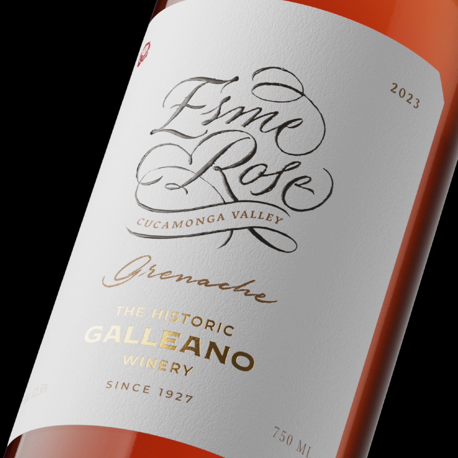
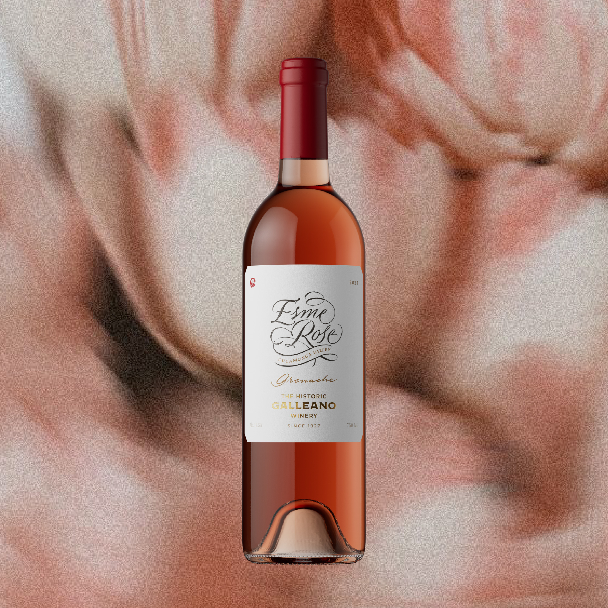
Esme Rose is a delicate wine created as a tribute to the daughter of the winery’s owner. The project explores the idea of growth, imagination and the quiet beauty of childhood through a refined and poetic visual language.
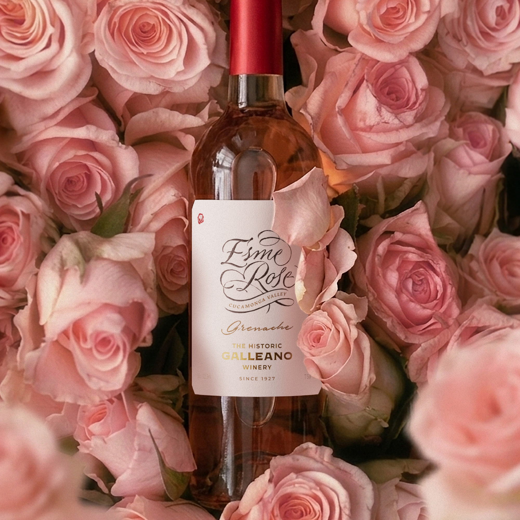
Rather than illustrating a literal narrative, the label focuses on subtle symbolism. At this first stage of the brand’s life, the design presents only the name “Esme”, accompanied by a small rose, a gentle and timeless gesture that reflects innocence, elegance and affection.
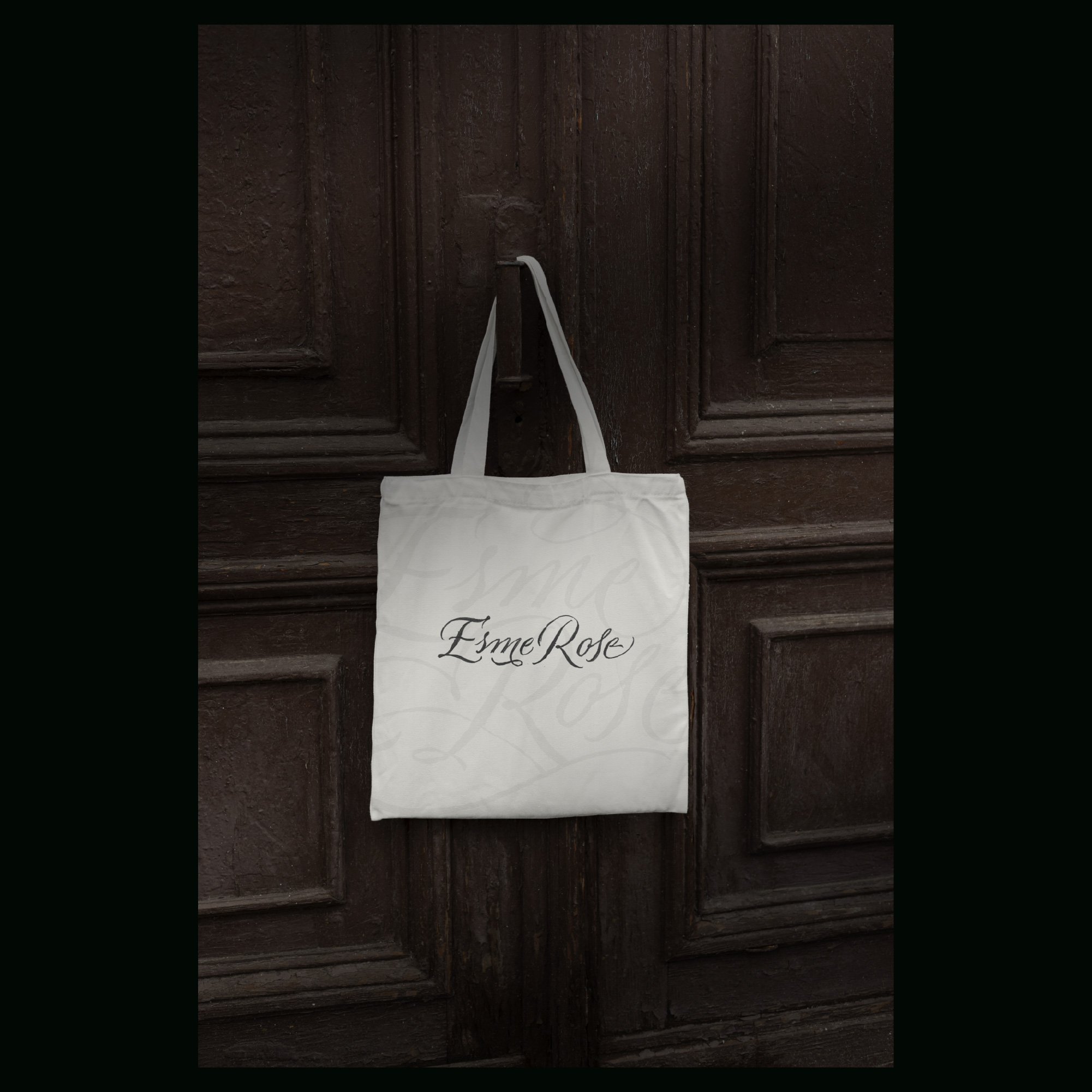
The typographic composition becomes the central visual element. A flowing calligraphic script expresses softness and personality, while the minimal layout allows the name to breathe, turning the label into a quiet dedication.
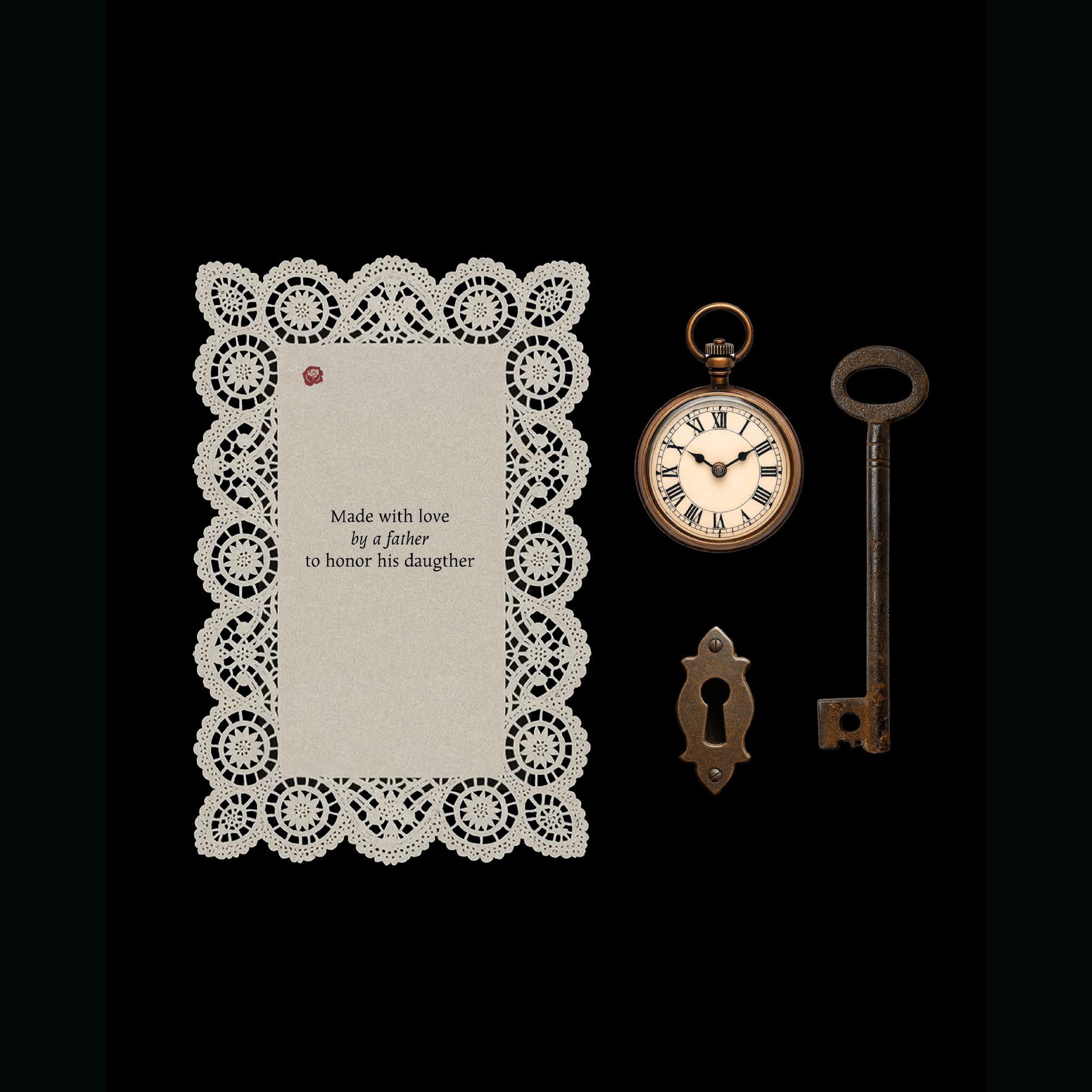
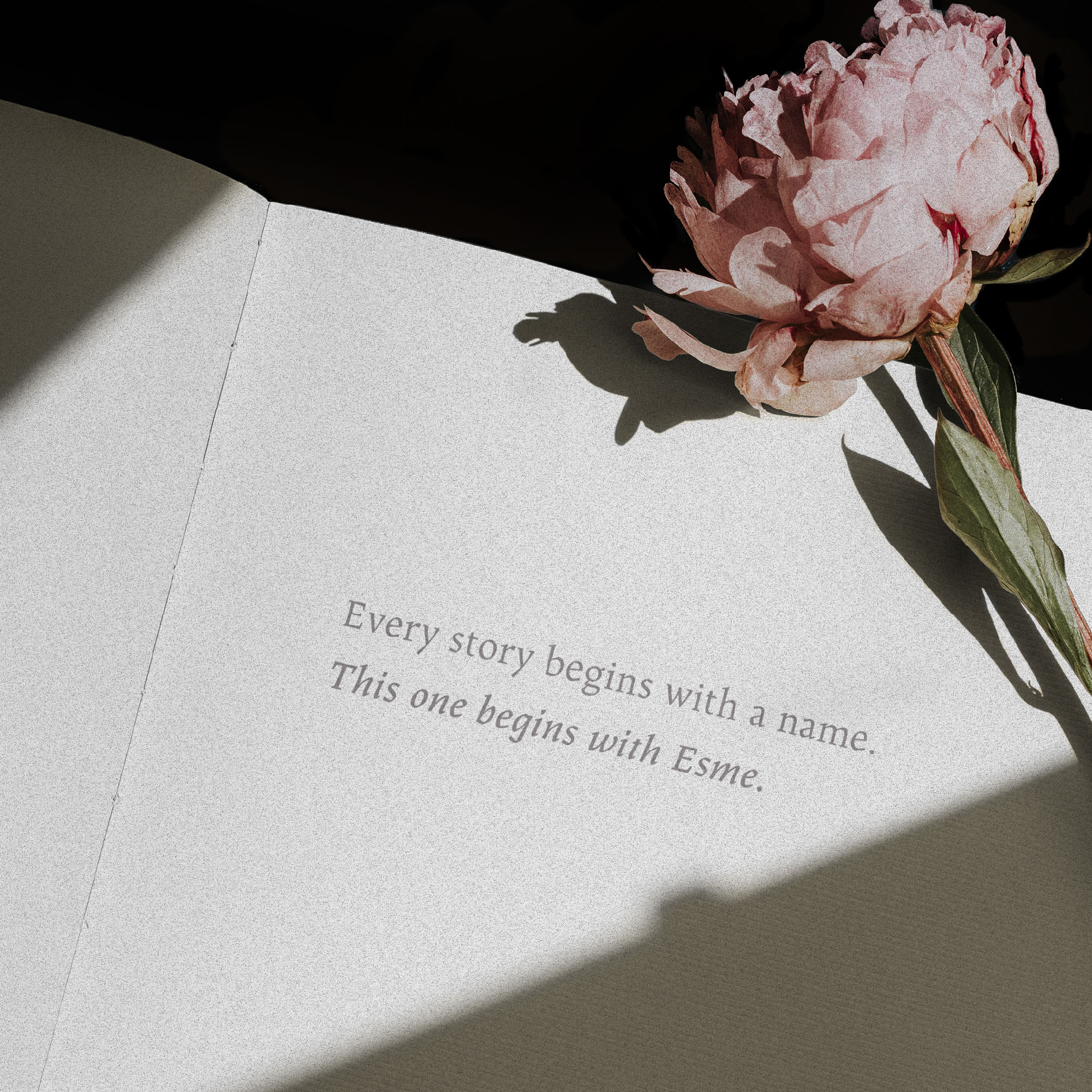
Inspired by the world of literature and classic storytelling, the project draws subtle references to themes of wonder and discovery. Elements associated with children’s tales, such as books, letters and small symbolic objects, informed the conceptual direction of the design, even if they are not explicitly represented in the final label. This restrained approach allows the brand to grow alongside its inspiration. As Esme grows older, the visual identity may evolve, gradually incorporating new narrative layers that reflect her story.
The result is a wine label that feels intimate, poetic and timeless, less about spectacle and more about emotion, memory and the quiet beauty of dedication.
 monther al omari
 Alexander Skurihin
 Studio K95
 ARMBRAND
 Richa Rai
 houseoferas by Miti
 Agence des Coteaux
 Kushi Eaknath
 Ann Treasa
 Xiao Ning
 krrrrrllii
 babyage
 Deep
Deep Atiq Alam
 TUERCA Studio
 neo creative studio
 Pinot Agency
 Pixels Studio
 Anastasia Cherepanova | xtramez
 awaiskhadim
 Studio Be Design
 Belova Oksana