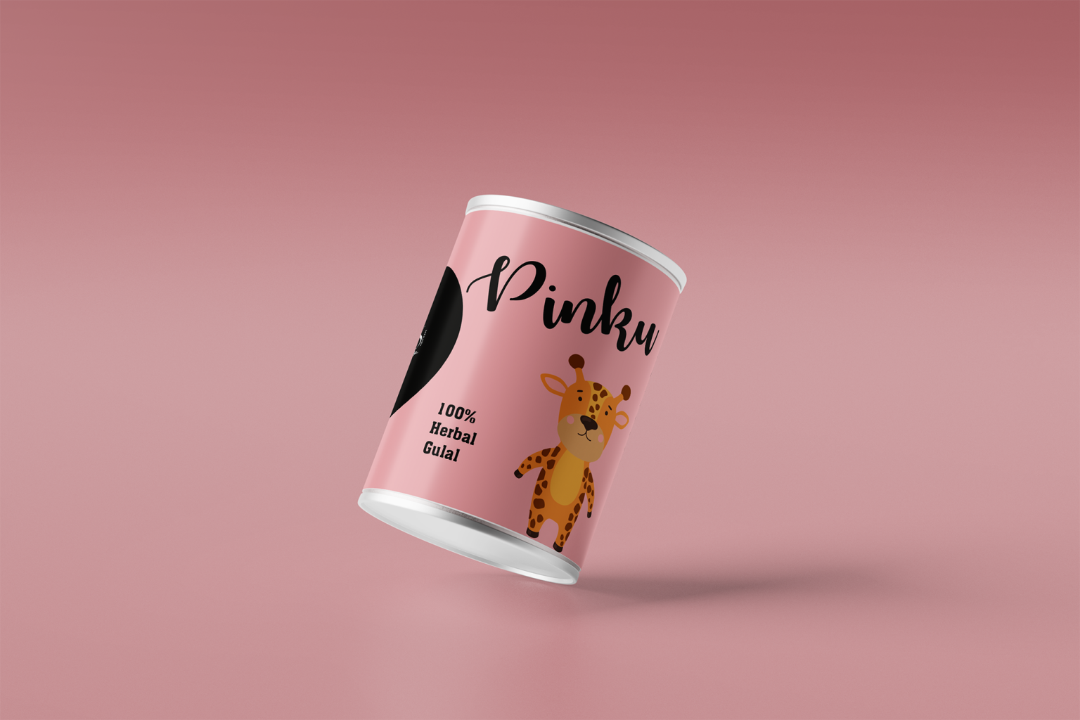

The Heru Herbal Gulal packaging was designed to reflect the spirit of Holi while emphasizing safety, nature, and joy. With growing awareness about chemical-based colors, the goal of this project was to create a packaging identity that communicates purity, eco-friendliness, and festive happiness.
The design uses a soft pastel green color palette, symbolizing natural ingredients and herbal purity. This instantly differentiates the product from traditional gulal packaging that often relies on loud and saturated colors. The calm tone builds trust and visually conveys that the product is safe, herbal, and skin-friendly.
To make the brand more approachable and memorable, a playful elephant illustration was introduced. The elephant represents celebration, friendliness, and cultural warmth, making the packaging feel joyful and family-friendly. This element also helps the product stand out on shelves and appeals to both children and adults during the festive season.
Typography was kept clean and modern, ensuring the product name “Heru” remains the visual focus while maintaining readability. The supporting text “100% Herbal Gulal” clearly communicates the key product benefit and reinforces the brand’s natural positioning.
The cylindrical packaging format enhances the premium feel of the product while providing practical storage and protection for the gulal powder. The minimal layout allows the design elements to breathe, creating a balanced and aesthetically pleasing presentation.
Overall, the objective of this packaging design was to create a fresh, friendly, and trustworthy identity for a festive product, combining modern design with cultural celebration. The result is a packaging concept that highlights nature, safety, and joyful festivities, aligning perfectly with the spirit of Holi.
 Lisa Pokrovskaya
 Simple Studio
 Studio Unbound
 David Byerlee
 M&A CREATIVE AGENCY
 alchimistestudioParis
 monther al omari
 Studio Be Design
 LogoSayLove
 agenciabud
 Shustova p
 mutta
mutta @Allenarts13
 Sirka Agency
 Atiq Alam
 Dozen Agency
 j.substance
 SCD
SCD Cristian Lepore | crilep Copia
 Chris Creative Works