

The packaging design for SHUDH Suji is crafted to communicate purity, trust, and everyday nourishment through a clean and premium visual language.
At the core of the design is a minimal yet impactful layout, using a warm beige base that reflects the natural origin of wheat. The golden framed logo panel acts as the visual anchor, symbolizing quality and authenticity, while the bilingual typography (Hindi + English) strengthens both local connection and modern appeal.
The front panel maintains clarity with a strong product hierarchy:
- Bold “SUJI” typography ensures instant recognition“SEMOLINA” adds clarity for wider audiences
- Supporting line “Pure Wheat Pure Joy” reinforces emotional positioning
The inclusion of soft wheat illustrations subtly enhances the natural ingredient story without overpowering the design.
On the right panel, a high-quality food visual (upma dish) adds appetite appeal and usage context, making the product more relatable and desirable. This is balanced with a clean white space that improves readability and keeps the design uncluttered.
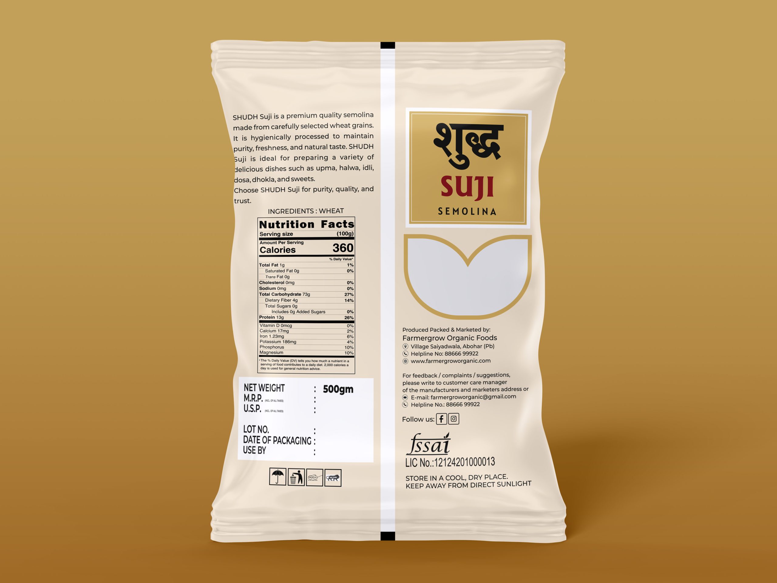
The back panel is structured with a strong information hierarchy:
- Product description emphasizes hygiene, purity, and versatility
- Nutrition facts are clearly presented for transparency
- Regulatory details (FSSAI, ingredients, storage) ensure compliance and trust
The overall design language focuses on:
- Clean composition
- Premium yet approachable aesthetics
- Strong shelf visibility
- Clear communication of quality and health benefits
This packaging successfully positions SHUDH Suji as a reliable, high-quality everyday essential while maintaining a refined and modern brand presence.
 monther al omari
 Ximena Ureta Design Studio.
 vitoramockup
 Up-Brands
 Sophiagdotcom
 Peter said
 ayeidadezigns
 Tancybox
 宏洛图品牌设计HONGLT
 Modern Theory
 Dozen Agency
 Atiq Alam
 Olio Studio
 Ruchi S. Joshi
 mmdesign
 awaiskhadim
 Octasoft
 United Creatives Studio
 Kingdom & Sparrow
 Anastasia Bakhmatskaya
 CreativeWise
 Great and Golden