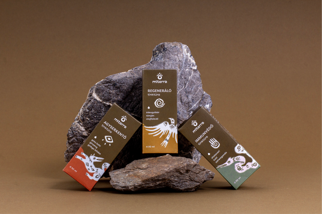

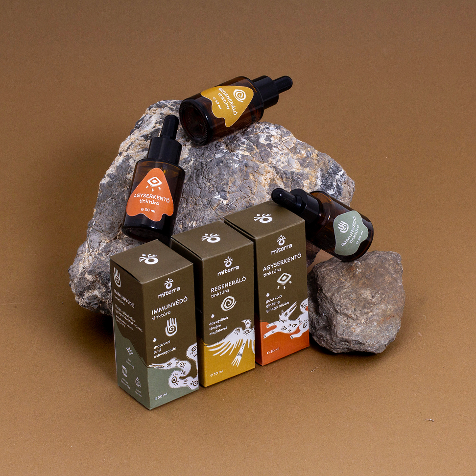
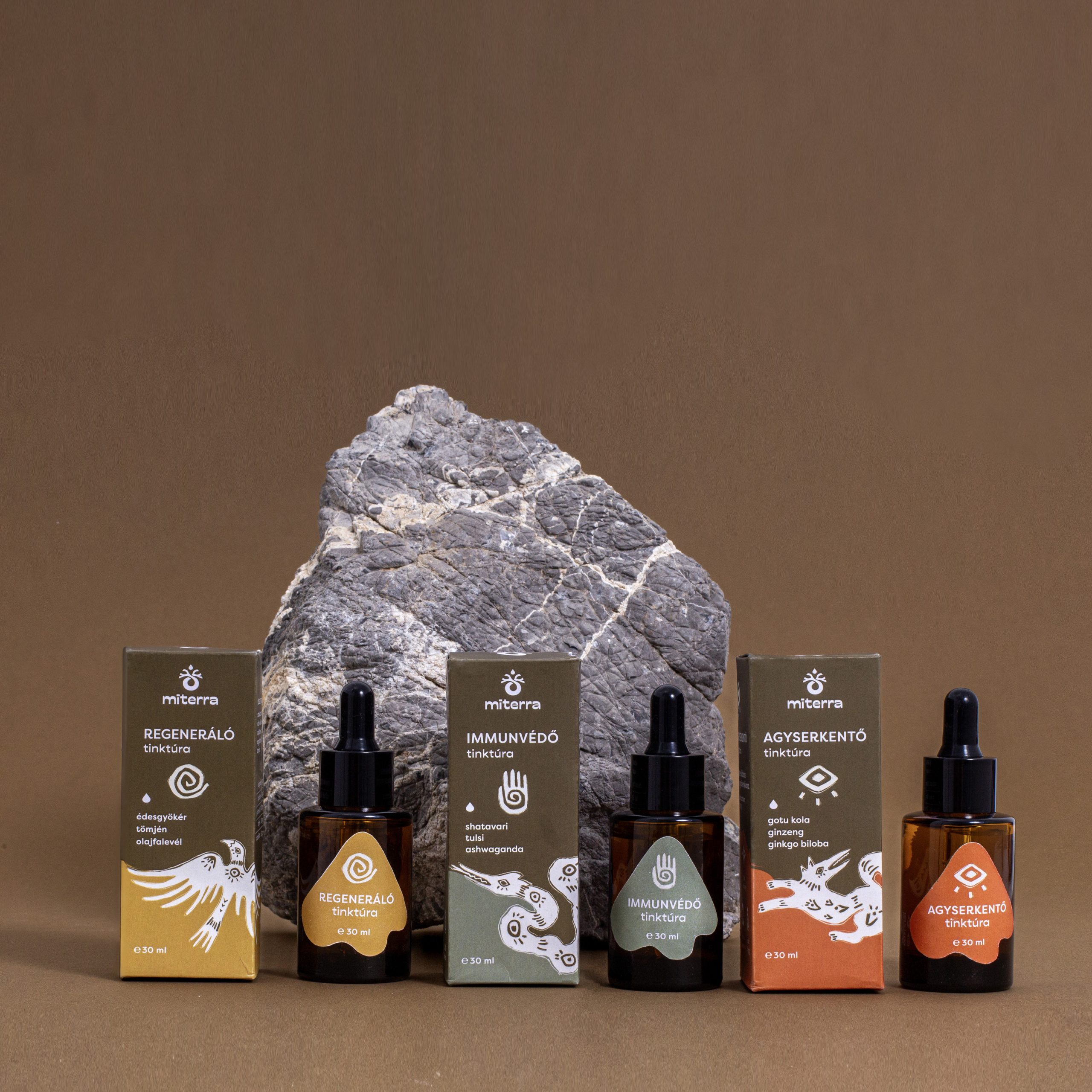
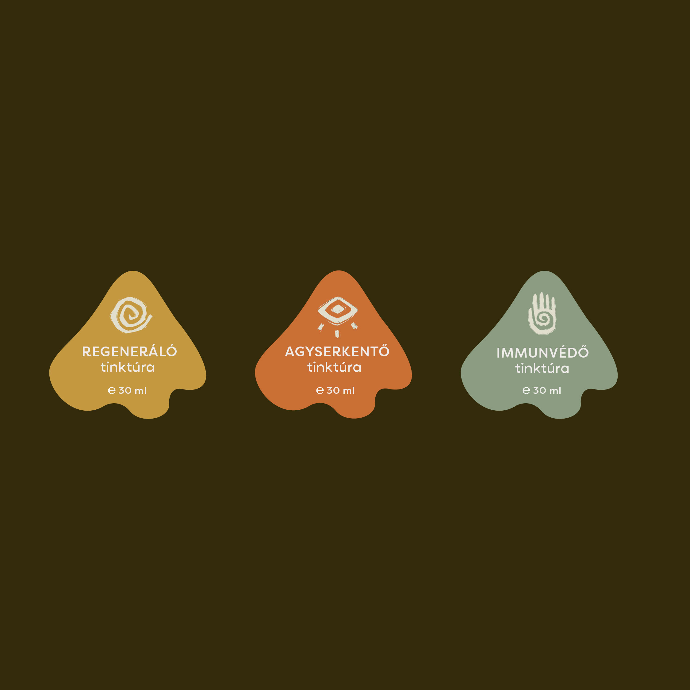
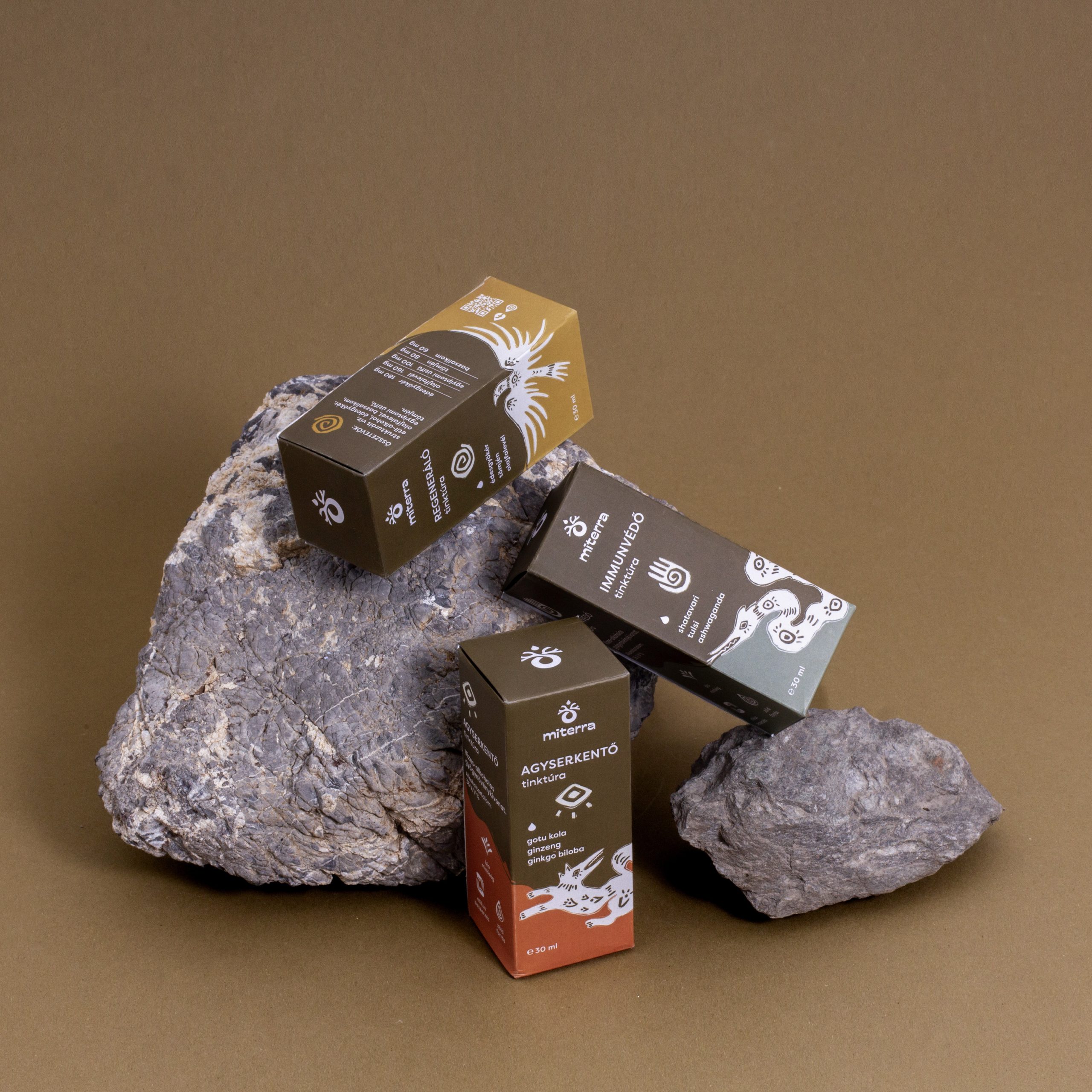
Miterra is a Hungarian family-run small business which aims to introduce the traditional healing practices and herbal medicine of various cultures through its tincture line made from ethically sourced, organic ingredients. Each tincture is symbolized by a mythical creature associated with healing powers, inspired by the cultures the founders encountered during their travels around the world. When designing the logo, the primary focus was on achieving an organic and harmonious look that reflects the brand’s strong connection to herbalism. The snake, a symbol of healing in many cultures, appears in the logo as a coiled tail ending in a tree crown motif inspired by the mythical Tree of Life—symbolizing the brand’s core mission: to support holistic health. In line with Miterra’s sustainable values, I chose a glue-free dieline that can be easily folded back after opening. The organically shaped labels on the small jars are in harmony with the brand’s visual identity.




 Hi estudio
 43oz
43oz monther al omari
 Rosario Lo Iacono
 alchimistestudioParis
 Ebbi
Ebbi Maruf Nishat
 Mind Brand
 宏洛图品牌设计HONGLT
 Iyioluwanbelarami
 sahildoesartt
 Denis Ulianov
 Garry Veda
 arutza
 Lucid mk2
 MaheswariMadhu
 sanjnasnair
 POSH FMCG BRANDING
 Modern Theory
 Shubhashish Roy
 Affogato Brand Design
 Backbar Studios
 hello ocean
 Luciana
 Valérie Colace