

Premium Packaging Design: Modernizing “Noppamas”, a 76-Year-Old Thai Heritage Brand
“Noppamas” is a classic Thai incense brand with a profound legacy spanning over 76 years (established in 1950). Over the years, our design agency has had the privilege of creating packaging designs for various Noppamas products. Historically, these designs focused strictly on functional usage while strictly preserving the brand’s original, traditional image.
However, as the brand transitioned to its 4th generation of leadership, it was time to evolve. We were entrusted with a major rebranding and packaging design project for their new “Aroma” line. Unlike traditional incense used in religious ceremonies, this new product targets modern consumers looking to elevate their home living spaces with relaxing fragrances.Modernizing Tradition: A Minimalist Approach to Thai Aesthetics
Targeting a contemporary audience requires a modern visual language that respects the brand’s rich heritage. After a deep dive into the traditional incense-making process, we adopted a design philosophy of “Simplification.”
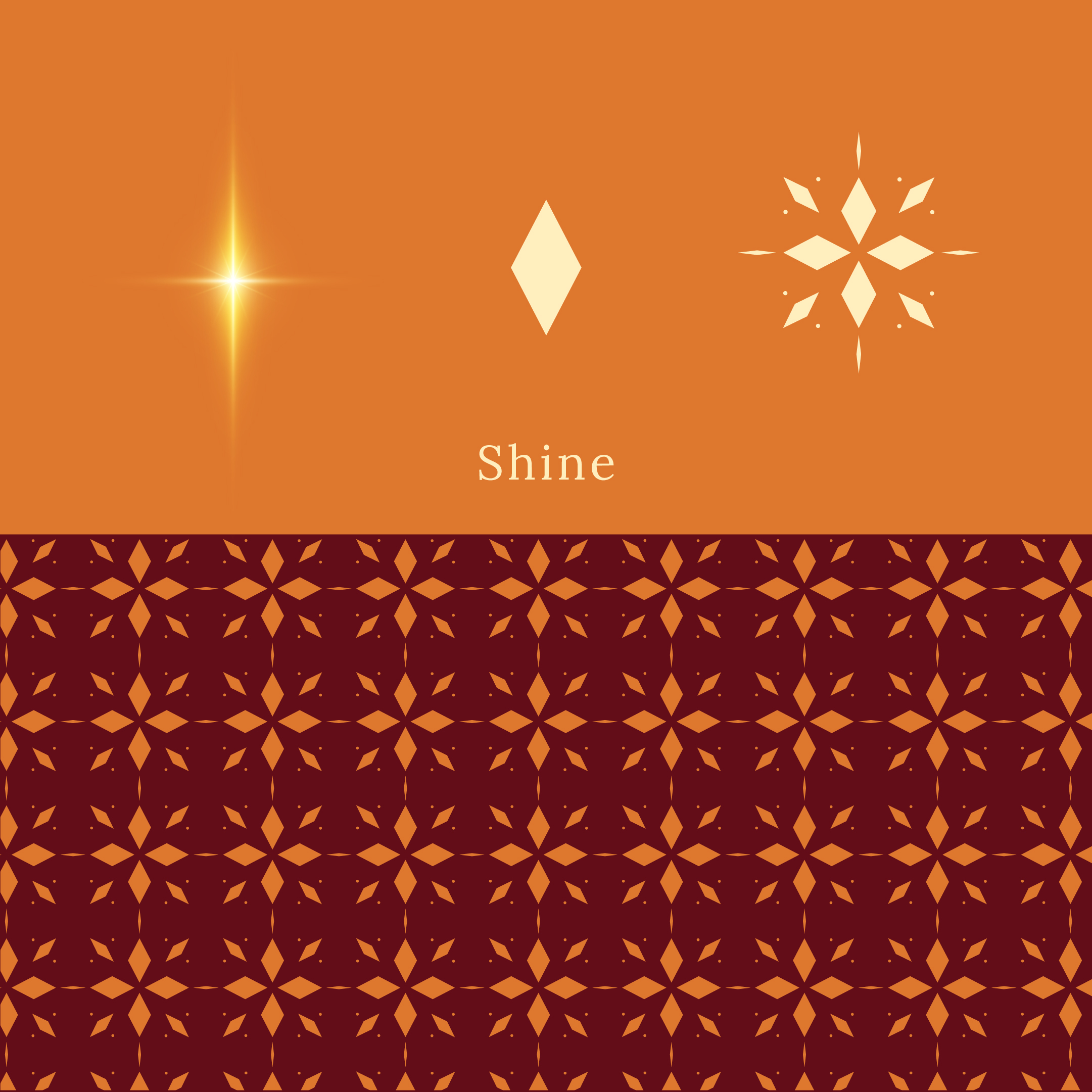
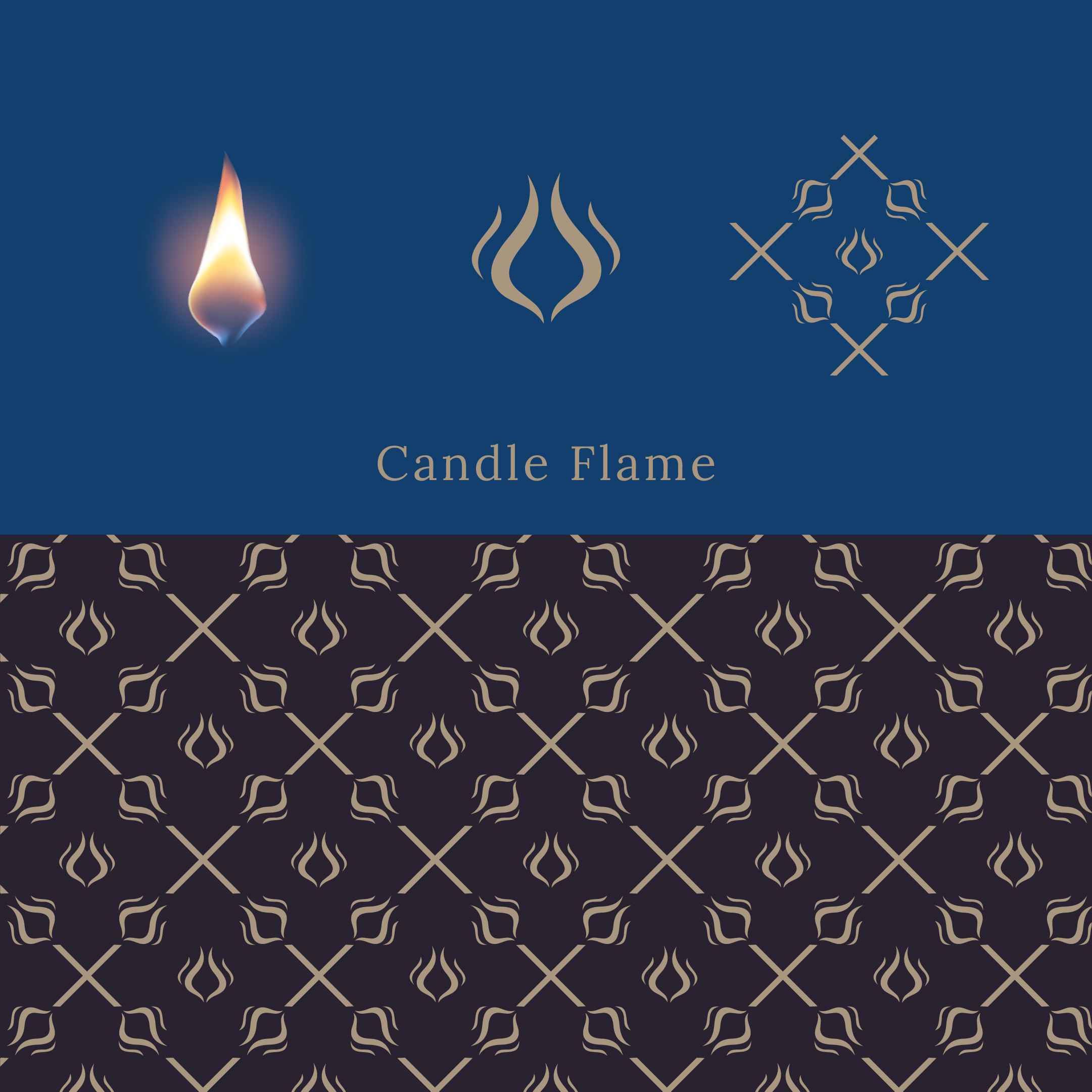
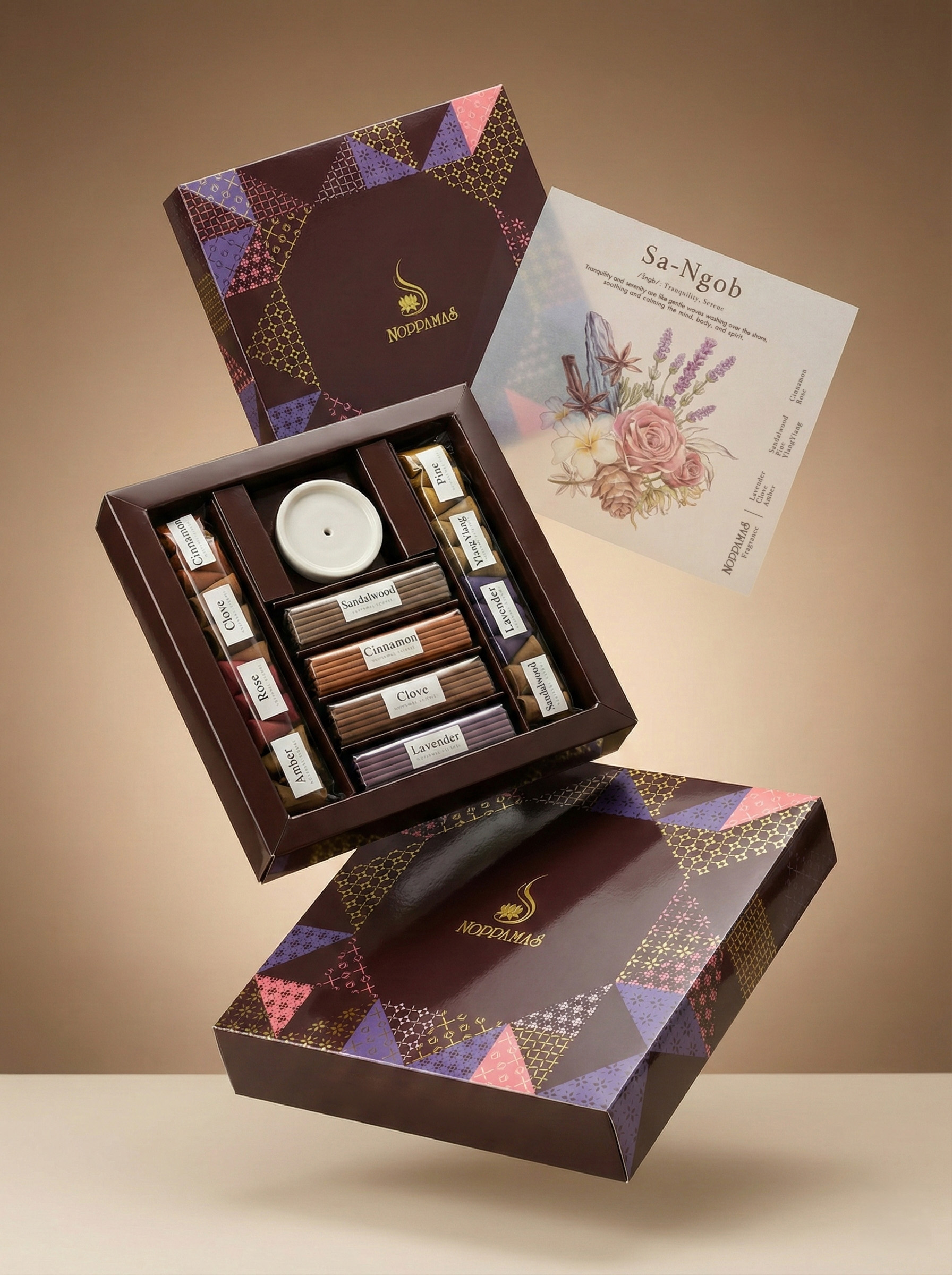
We distilled complex traditional elements—such as lotus flowers, glowing sparks, flickering flames, and incense shapes—into five minimalist geometric symbols. These symbols were then systematically arranged into grid patterns inspired by traditional Thai murals and architectural motifs.
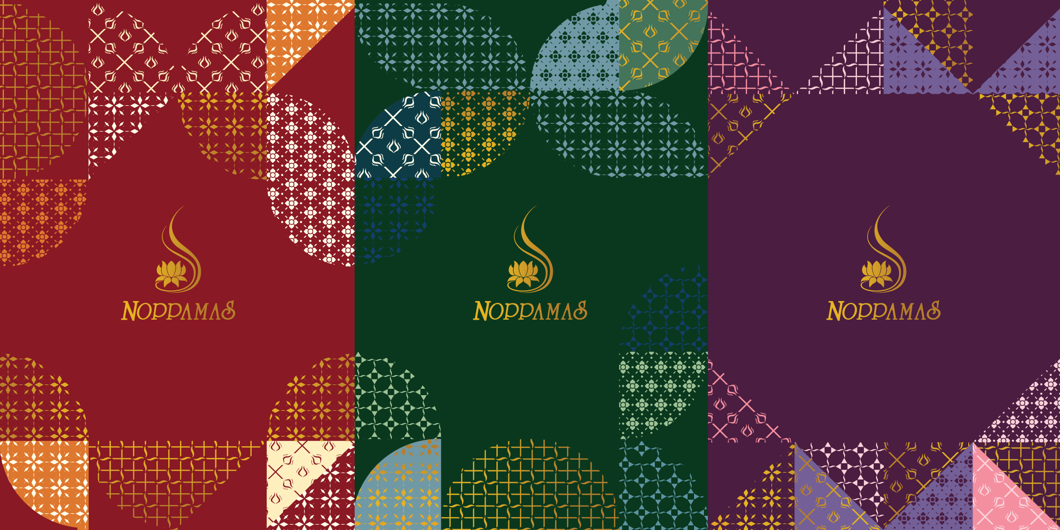
To create a cohesive yet distinct product line, we assigned unique structural patterns to each color-coded box:
Deep Purple Box: Angular geometric base
Dark Green Box: Circular geometric base
Deep Red Box: Mixed geometric base
This rhythmic arrangement creates a distinctive identity for each scent while maintaining a unified, premium brand collection.Craftsmanship in Communication: Designing for the Senses
Rather than simply naming the raw ingredients (e.g., Rose, Frankincense), we shifted the narrative to focus on the emotional experience. We curated different scents that evoke the same mood into beautifully crafted sets.
To preserve the authentic Thai charm, we used transliterated Thai words for these emotions: Sa-Ngob (Tranquility), Sod-Chuen (Freshness), and La-Moon (Harmonious). This approach captures the nuanced feelings that direct English translations often miss, creating a stronger, more culturally rich brand identity.
To further enhance the sensory experience, we designed delicate insert papers using translucent tracing paper. These feature meticulous, watercolor botanical illustrations of the raw ingredients. This detail adds a profound sense of craftsmanship and care, inviting the customer to visually experience the fragrance before even lighting the incense.
Sustainable Structure & Premium Finishes
In line with modern environmental values, the eco-friendly packaging structure maximizes the use of recyclable paper. Plastic is strictly minimized, used only where absolutely necessary to preserve the quality and moisture of the aroma.
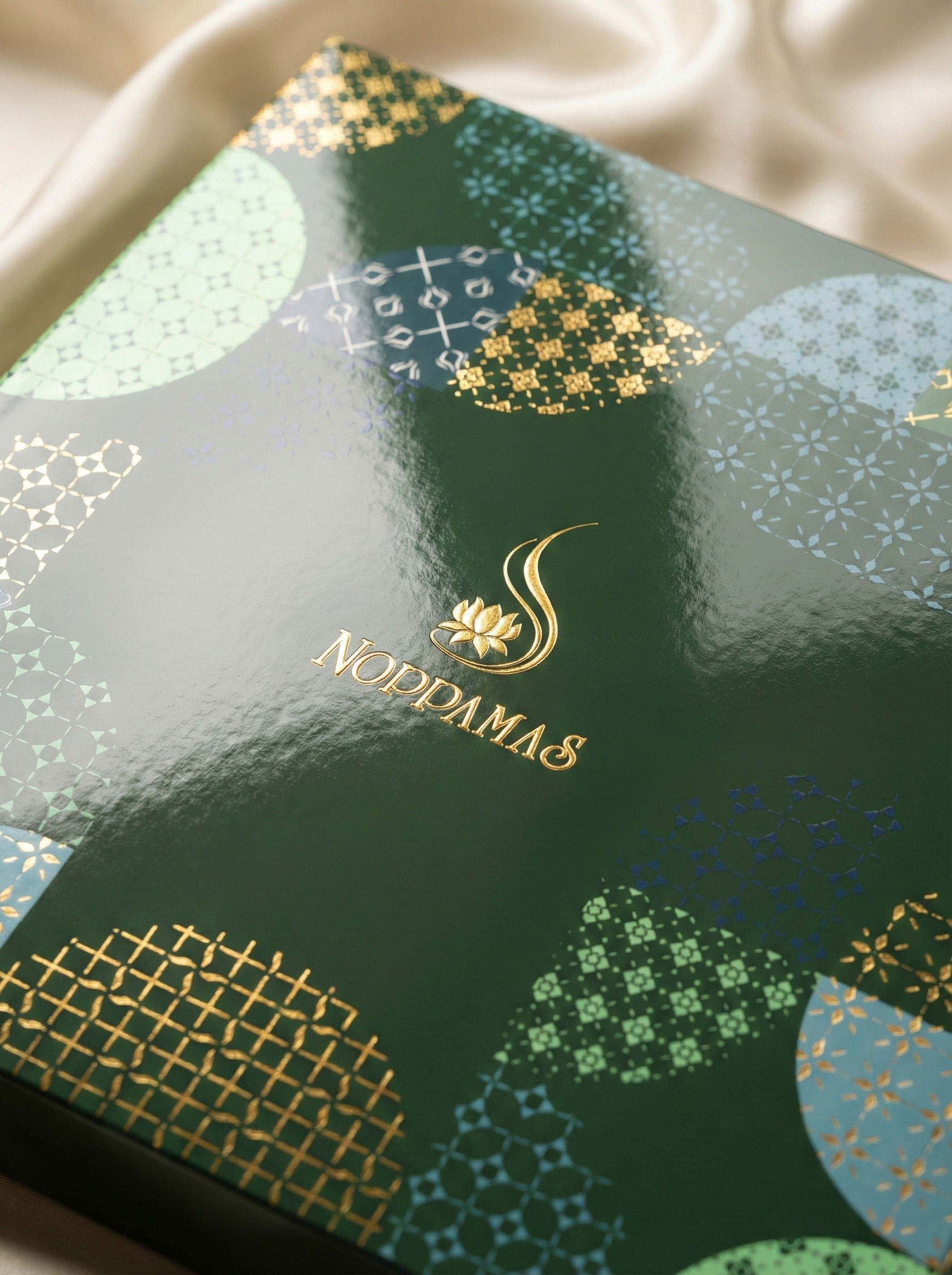
We engineered a drawer box structure that offers an intuitive unboxing experience and serves as an excellent display mechanism for retail shelves. The packaging is elevated with gold foil stamping against dark, rich backgrounds – a technique inspired by traditional Thai painting that adds a luxurious, premium touch.
Conclusion
The new Noppamas Aroma packaging is more than just a container; it is a bridge between the past and the present. By seamlessly integrating traditional Thai heritage with modern lifestyle needs and sustainable practices, this packaging design sets a new standard for the brand, ensuring the 76-year-old legacy continues to thrive in the modern market.





 habiba hatem
 Up-Brands
 sayadworks
 Kingdom & Sparrow
 furtgoods
 Si me preguntas
 Narrow House Packaging Branding & Design
 Clever Branding
 About House of Ta
 Hossam khalifa
 Valentyna Hradova
 Backbar Studios
 Holy Studio
 Prime
Prime Naeema Raashid
 Buddy Creative
 ezgidesignstudio
 Minim Brand Design
 Nenad Došen Studio
 Atyan
Atyan Massimo Lo Cascio
 Carreto Concepts Design Studio
 Charles Mason
 Pinot Agency