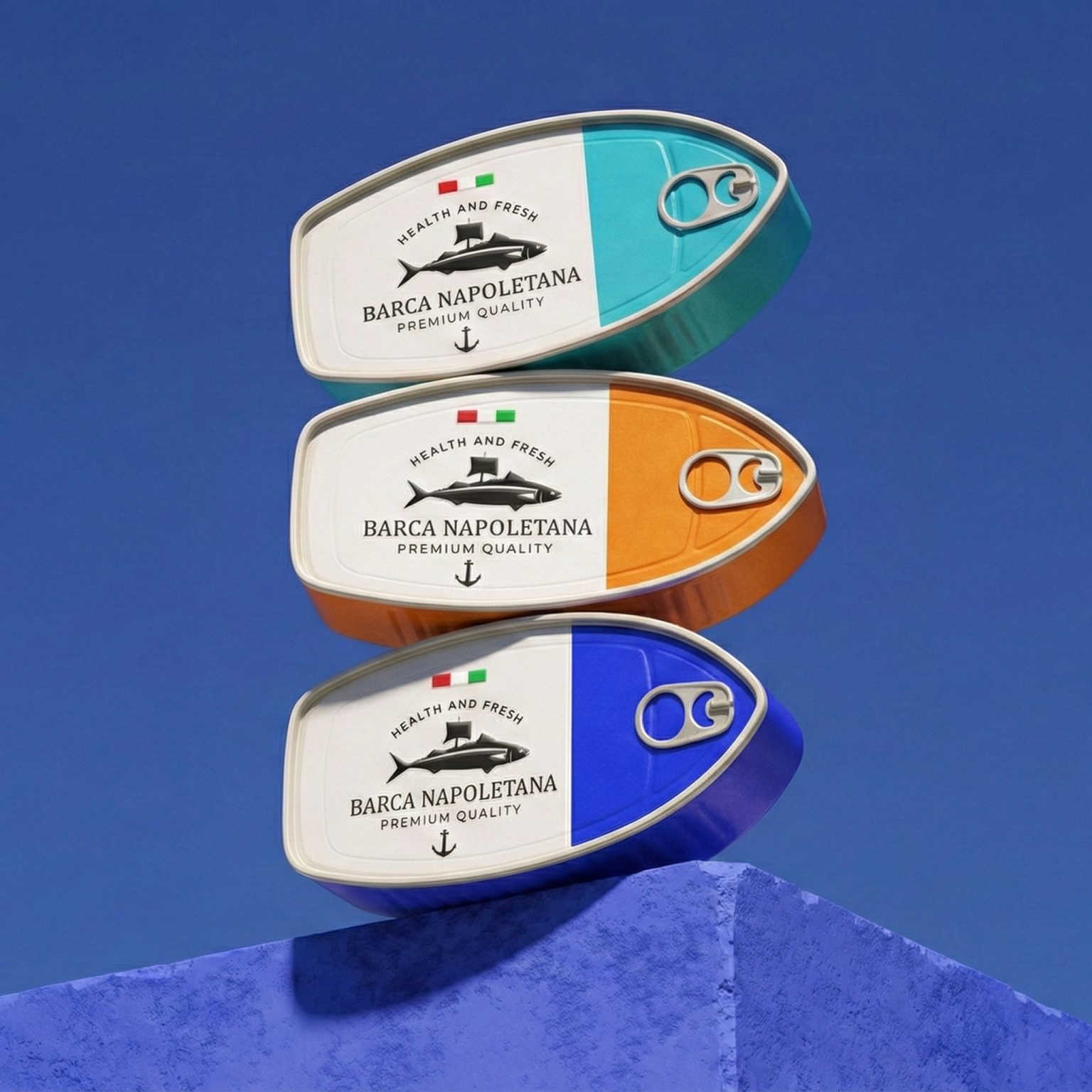

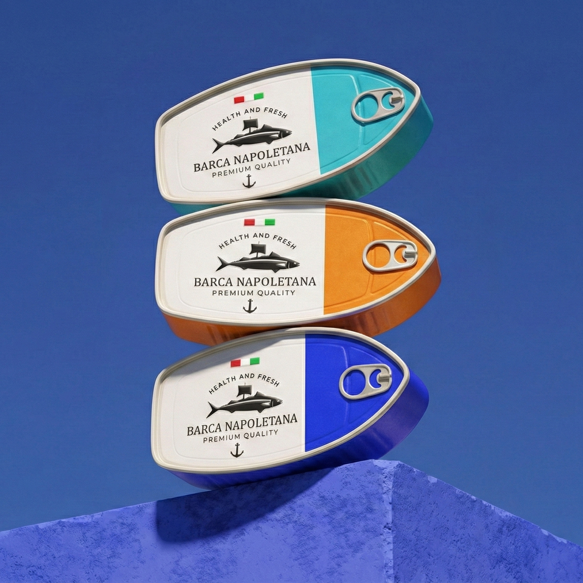
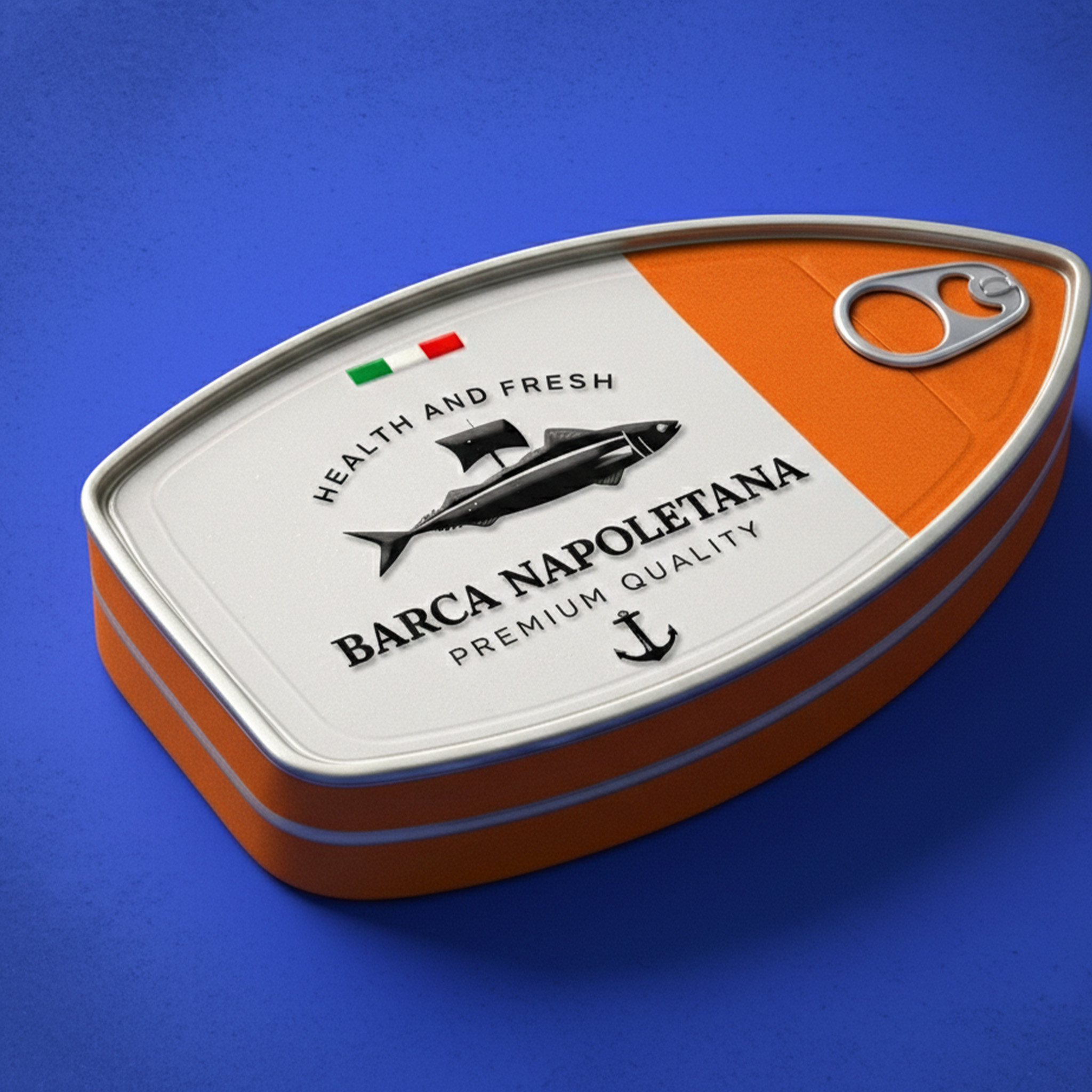
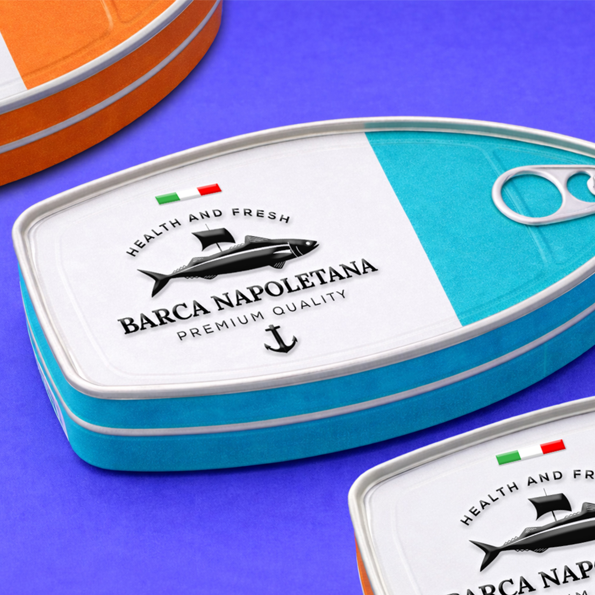
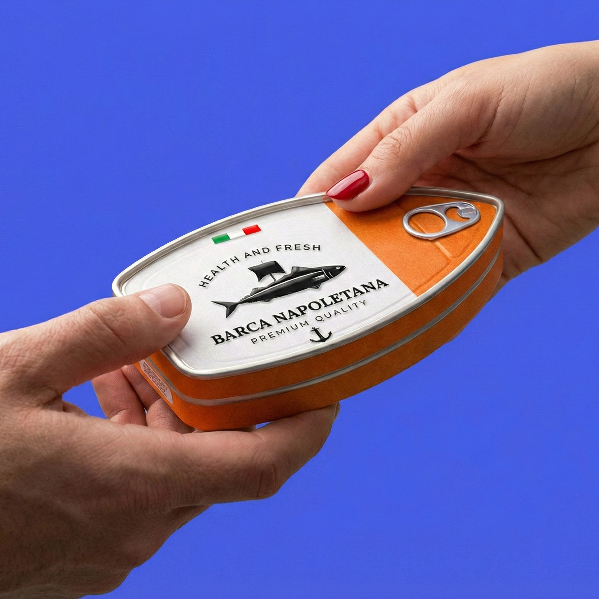
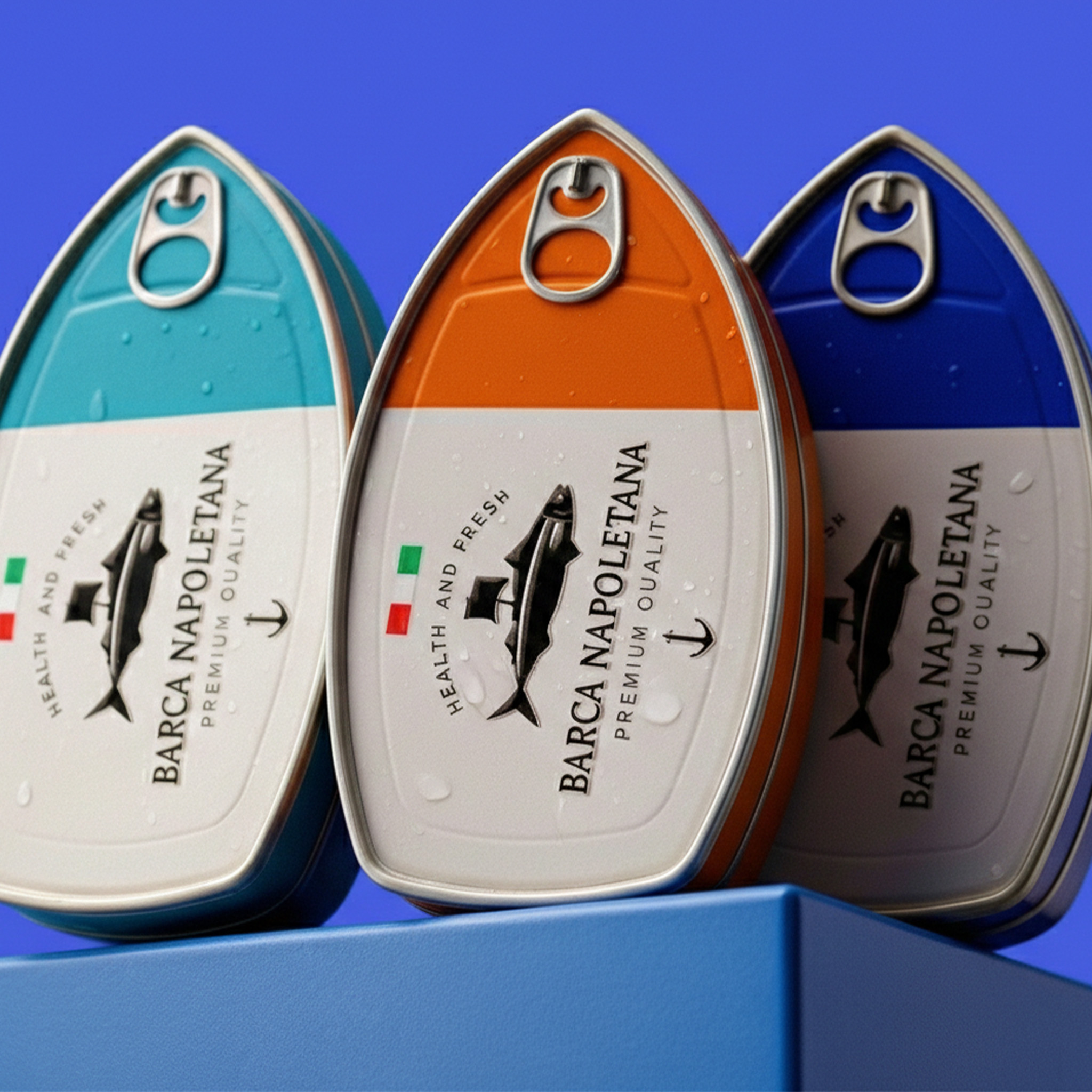
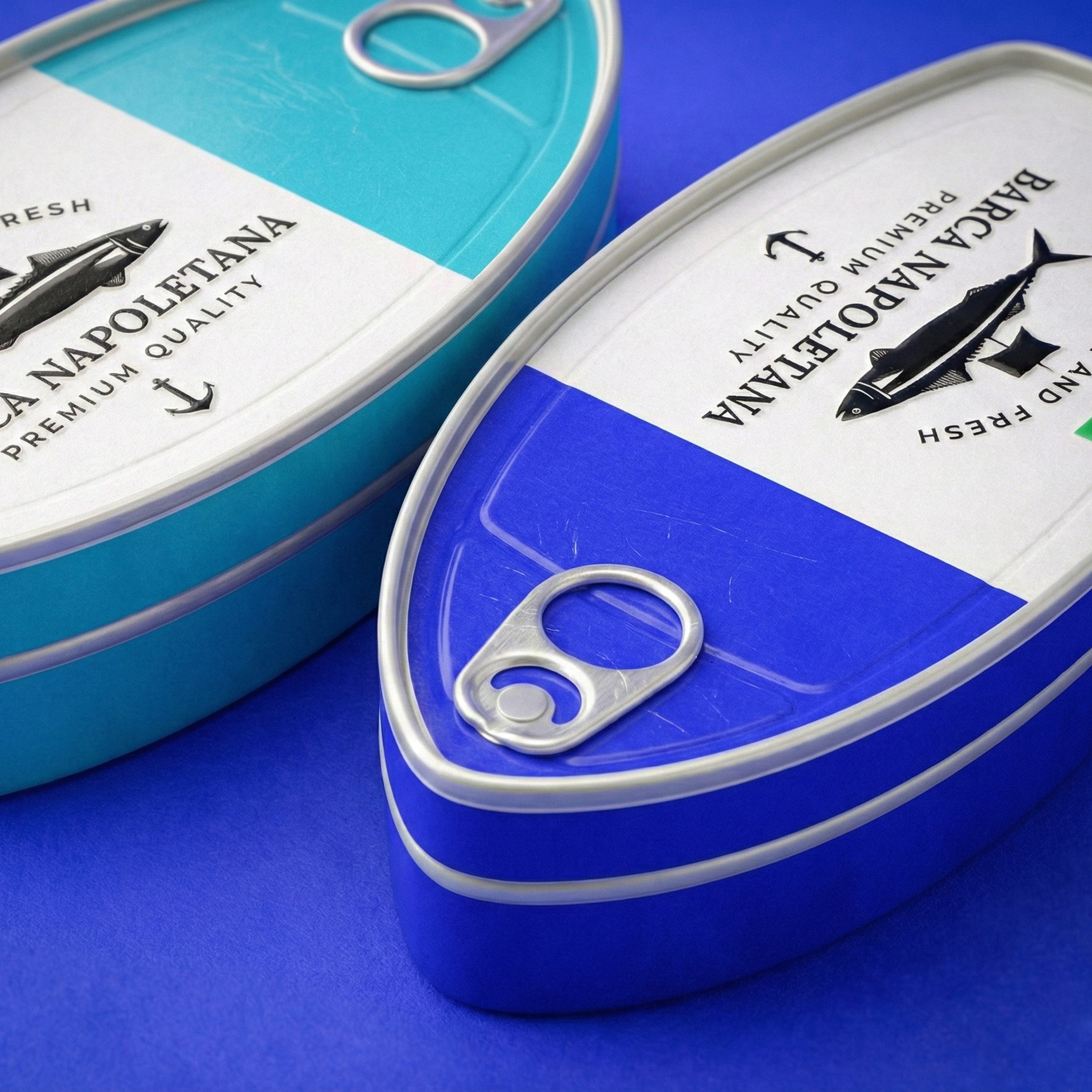
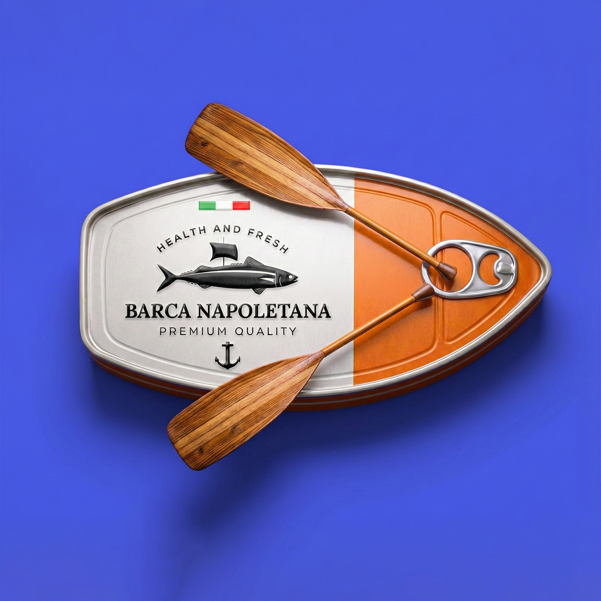
The packaging of the fish can “BARCA NAPOLETANA” is built on a clear idea: sea, travel and Italian quality. At first glance, the unique shape attracts attention: the container resembles the outline of a boat, which creates a direct connection with the brand name (“Barca” – boat) and maritime origins. This is not just a container, but a story in the form of the packaging.
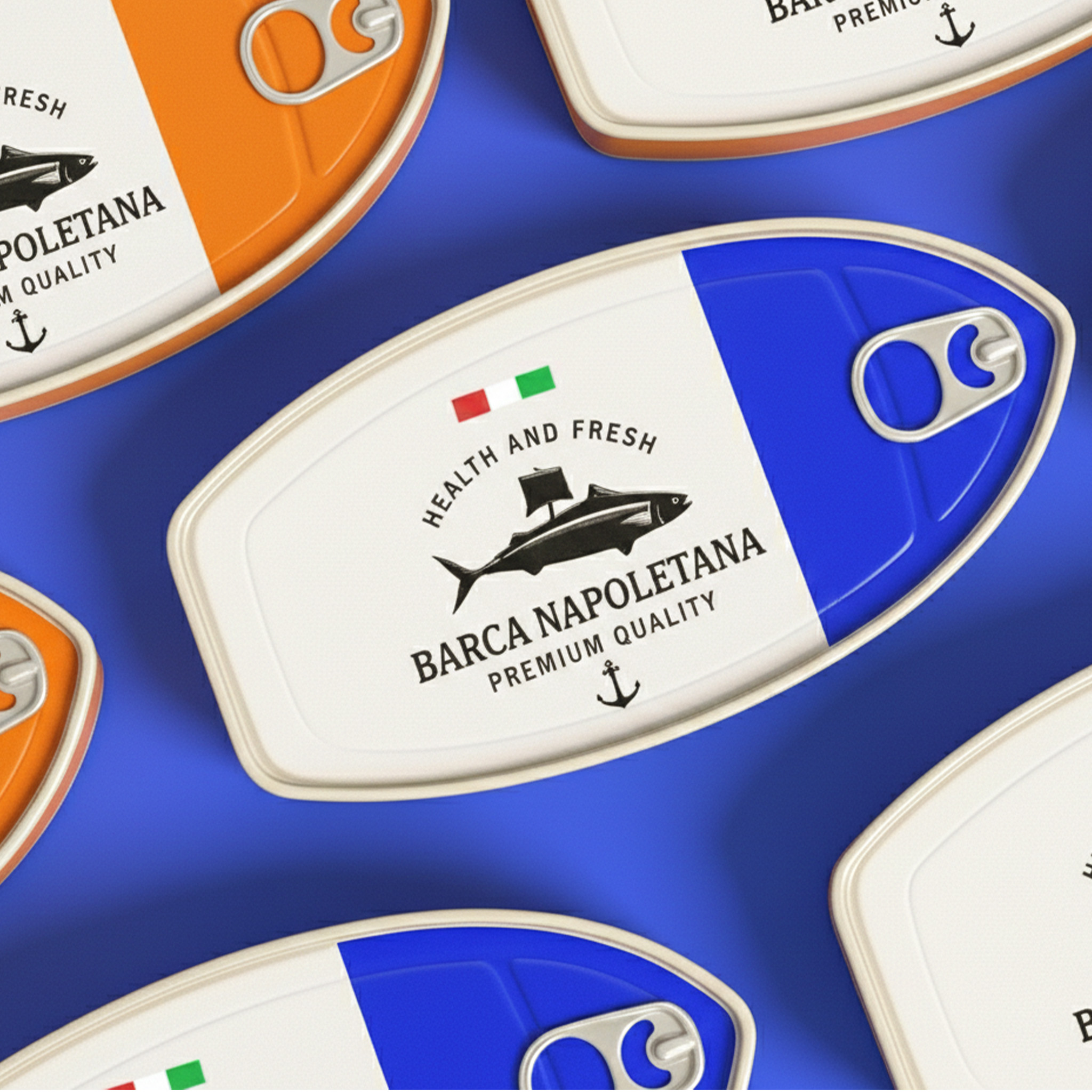
The color scheme – pure white and deep orange – creates a minimalist but strong contrast. The white part conveys freshness and hygienic cleanliness, and the orange – energy and flavor saturation. The Italian flag placed at the top is a small but clear accent, emphasizing origin and tradition.
The fish depicted in the center with a black metallic effect conveys strength, quality and confidence. The font is classic, serif, balanced, reminiscent of the signs of old Italian ports. The inscription “Premium Quality” and the anchor symbol complete the nautical theme, creating a complete brand story.
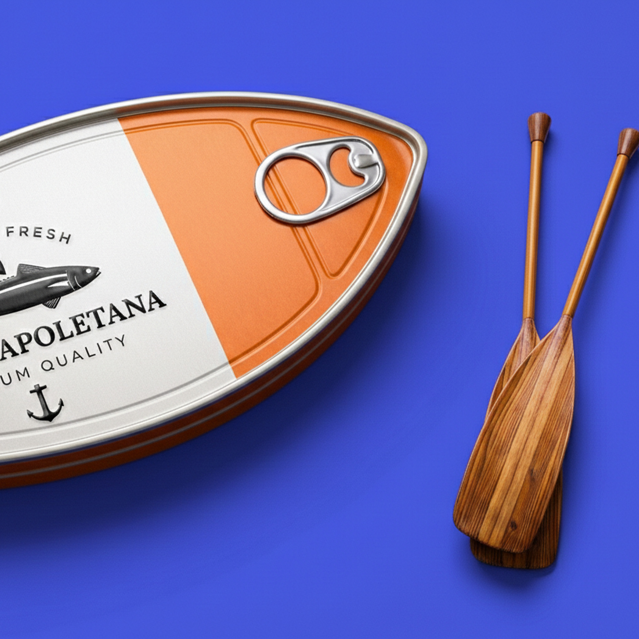
The composition of wooden oars gives the design dynamics and depth. They are not only a decorative element, but also symbolize handcraft, tradition and naturalness. The purple background enhances the colors of the packaging with contrast, making it a visual center.
The result is a product that does not just appear on the shelf, but declares its presence. This is a design where form, color and symbolism work around one idea: freshness, the sea and Italian high quality.


 Atyan
Atyan IDEOLOGO
 Eva Chistyakova
 Open Strategy & Design
 cem kutlu
 monther al omari
 Bonsanco Creative Studio
 Confetti Design Studio
 古戈品牌
古戈品牌 Rare Ideas
 Studio Pistache
 Studio Tumpic/Prenc
 Atiq Alam
 bachir bachchar
 Akshita Agarwal
 Carreto Concepts Design Studio
 Hollóka Grafikai Műhely / Graphic Design Studio
 Arsen Avetisyan
 Derrick Lin
 Axiniya Knyazeva
 Hadi Samir
 Furt Goods