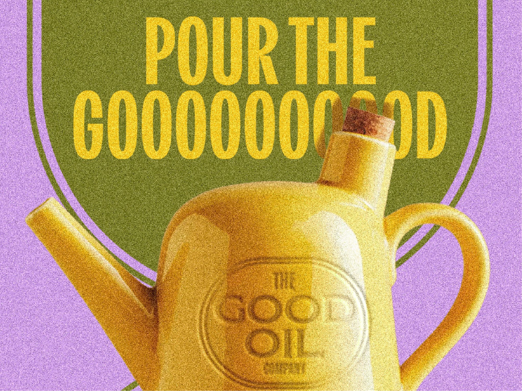

The Good Oil Company is built around a simple idea: good oil deserves the spotlight.
In many kitchens, oil is treated as a background ingredient. Yet it is the foundation of flavour and the starting point of every great dish. The brand celebrates this role by placing oil at the centre of the visual identity.
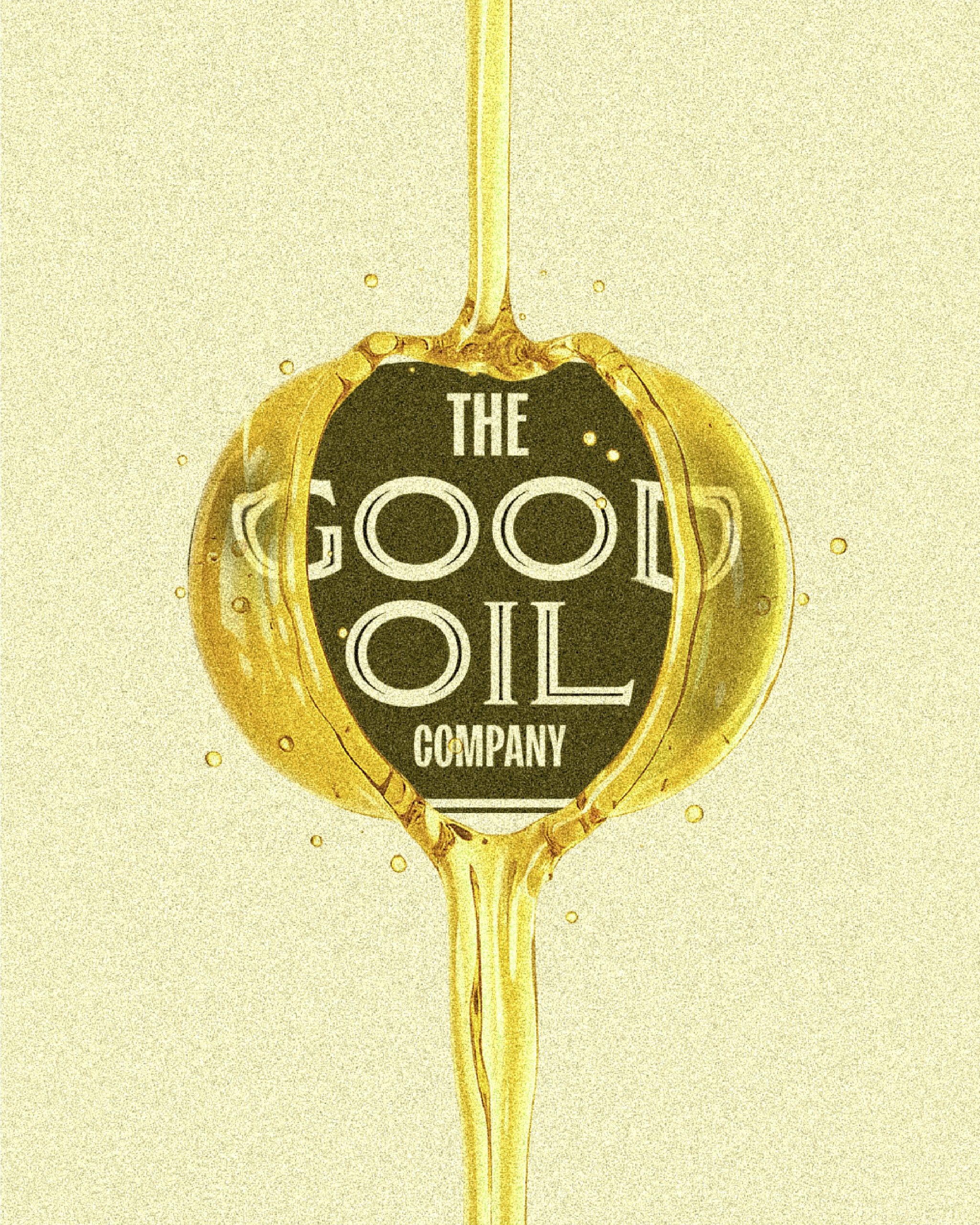
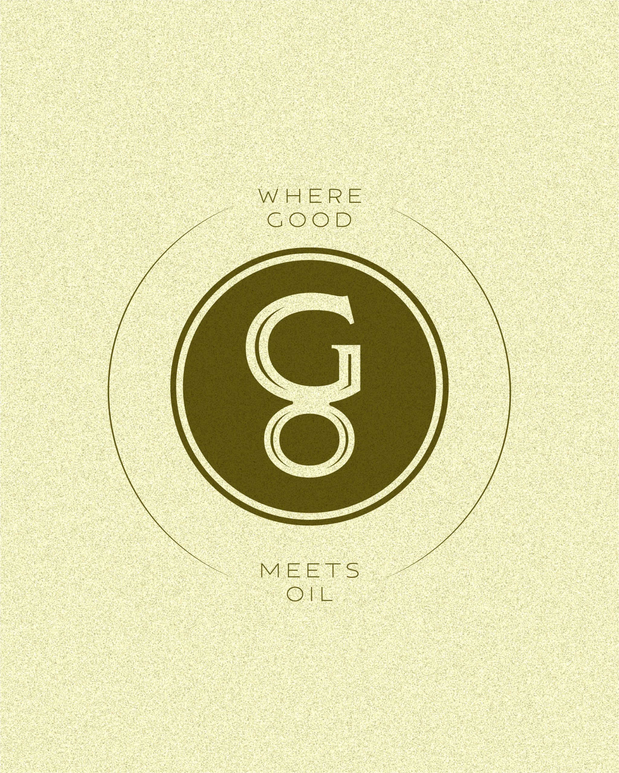
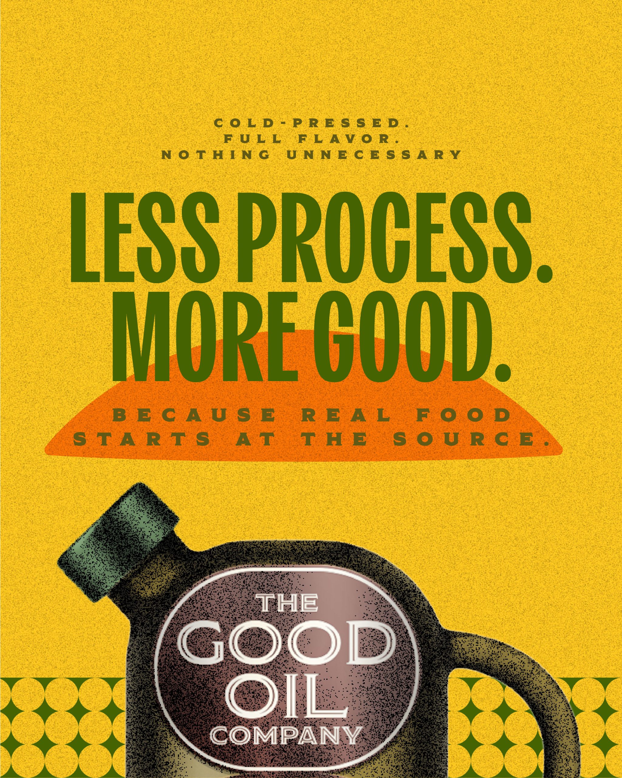
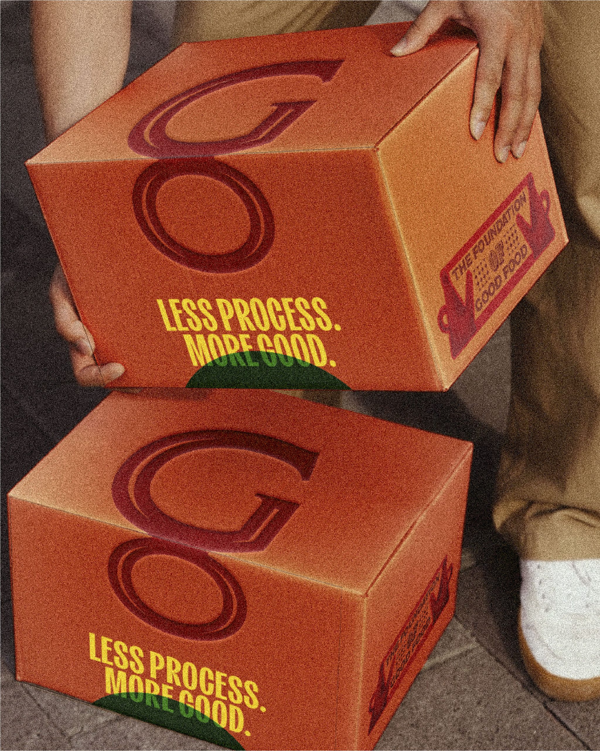
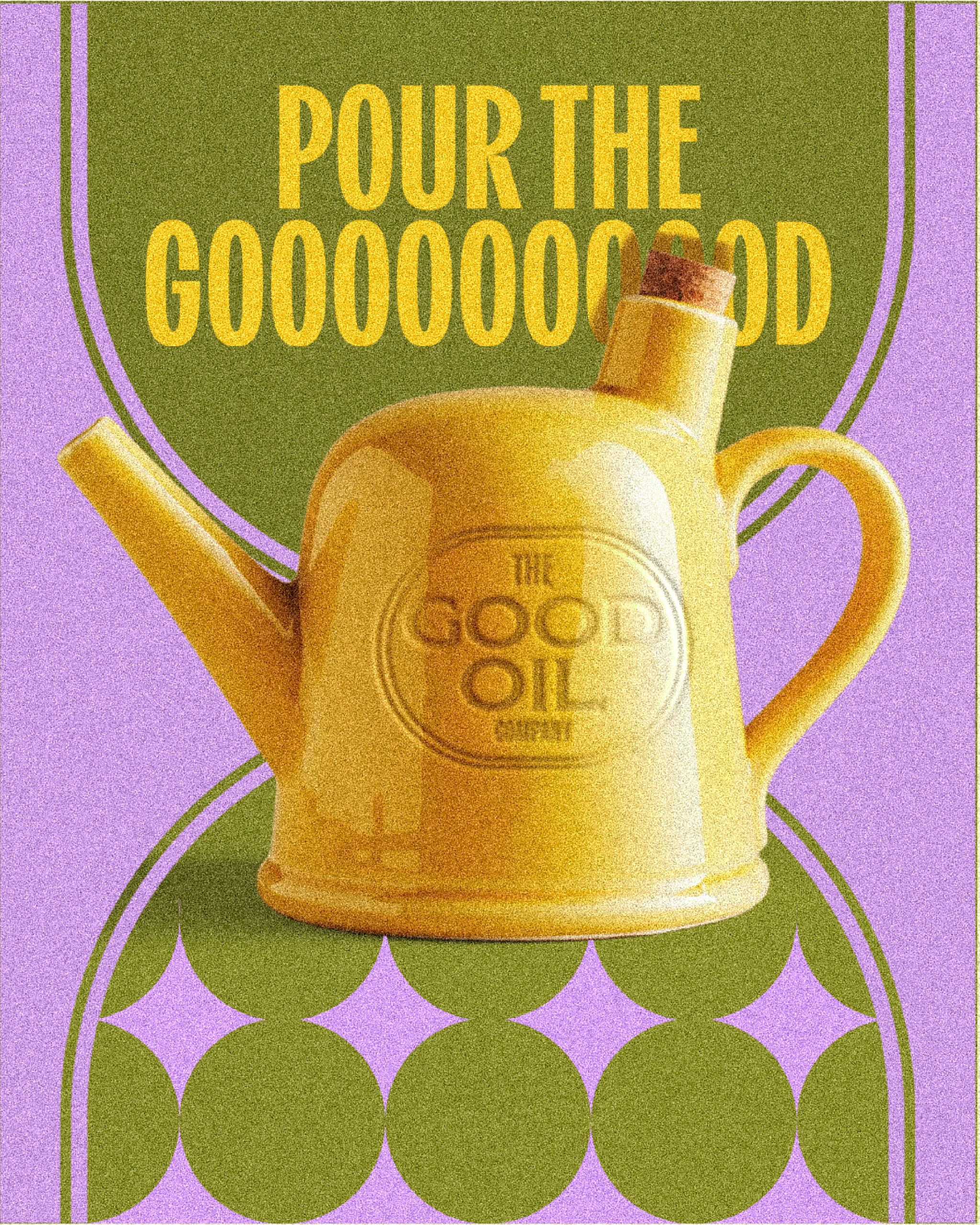
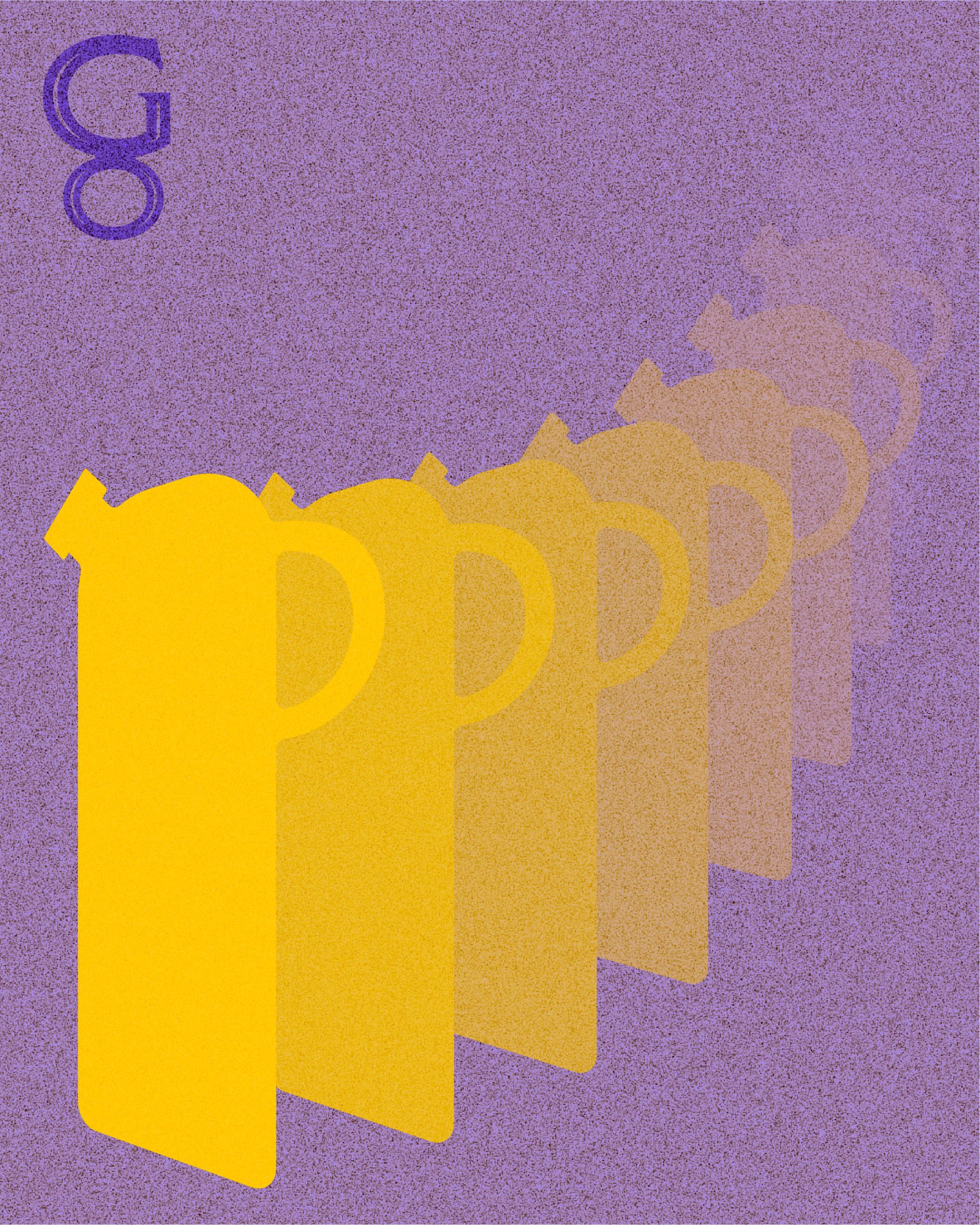
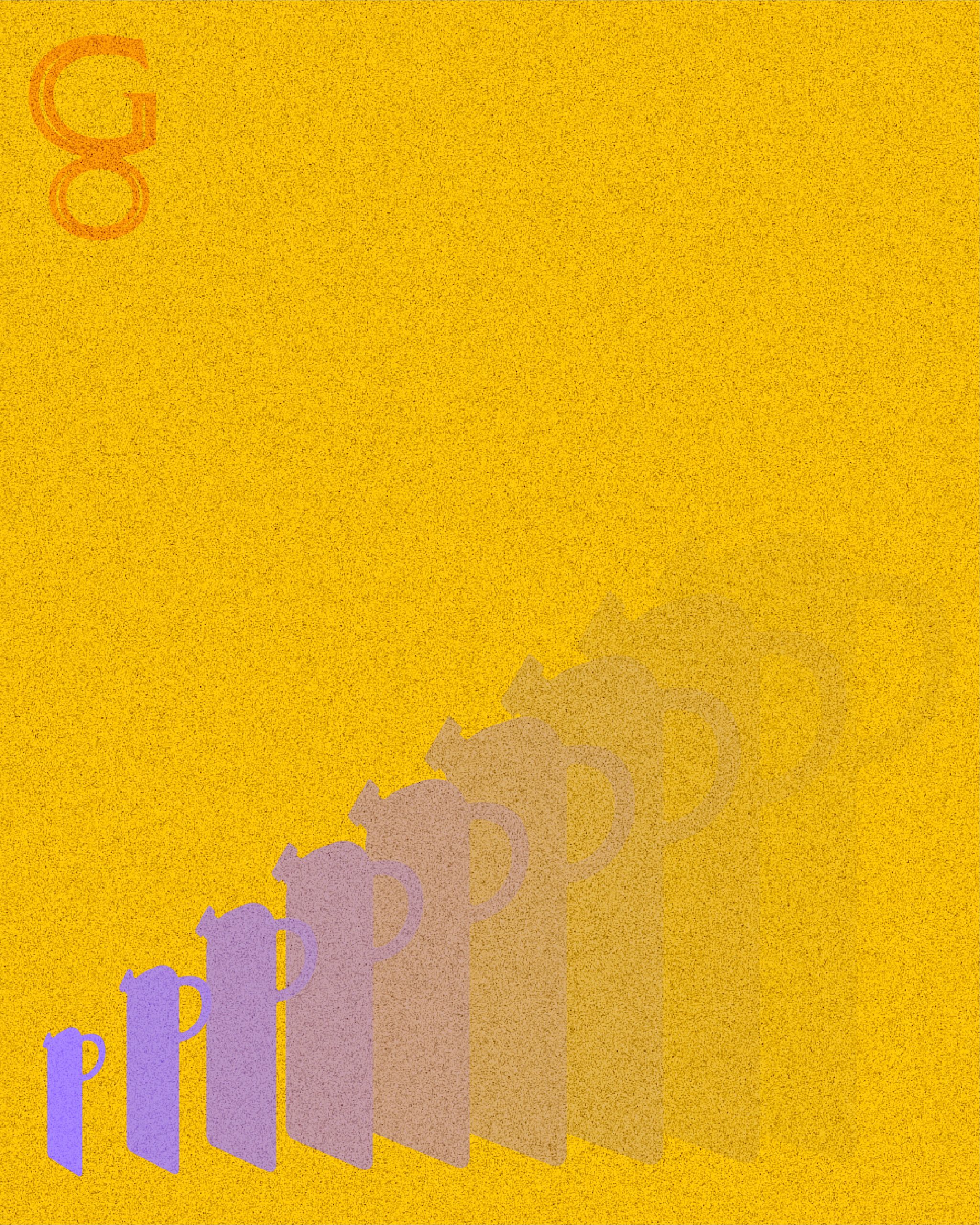
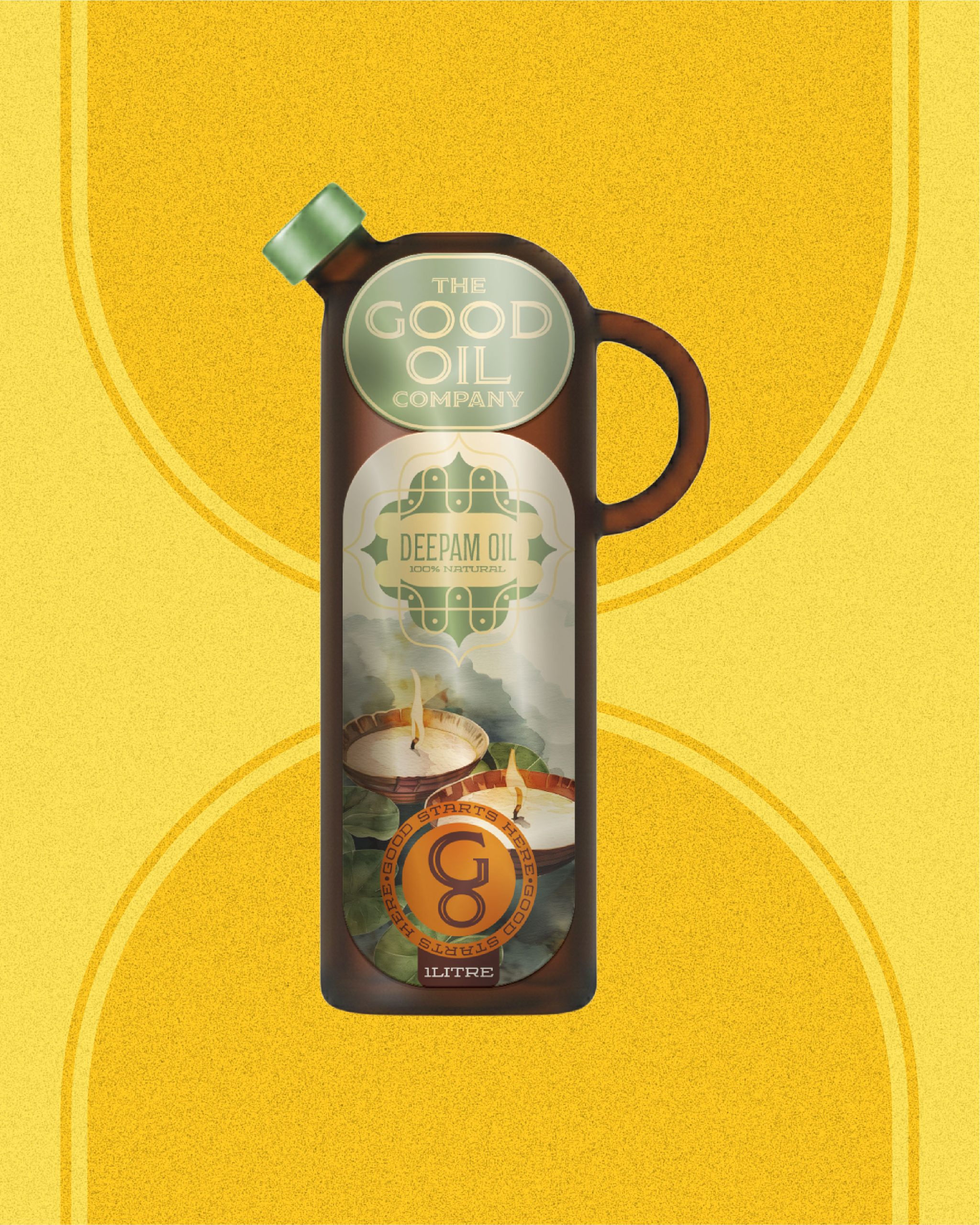
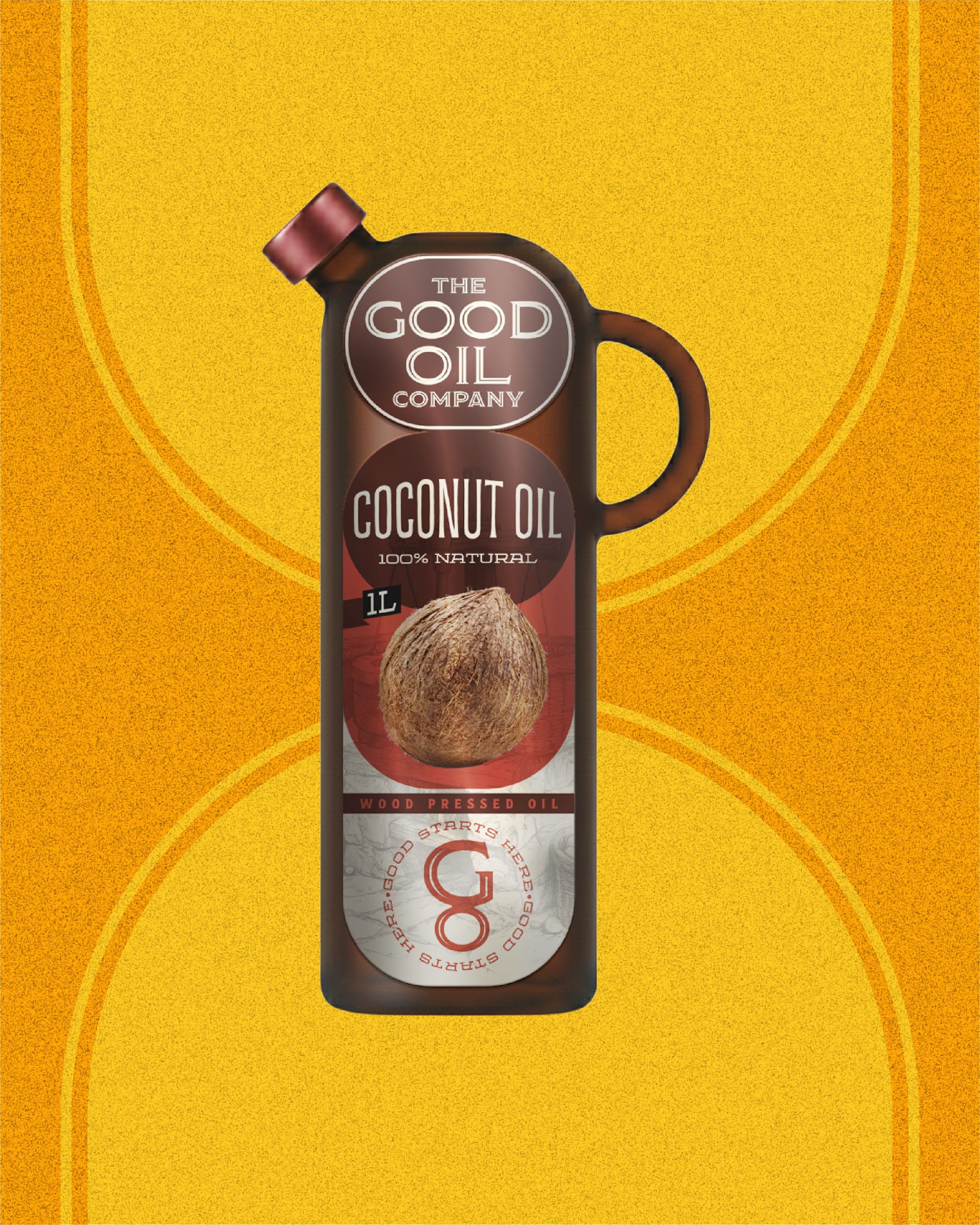
The design language is bold, graphic and expressive. A custom bottle silhouette inspired by the form of a drop becomes the defining shape of the brand, framing communication across packaging and visual assets. Circular forms echo the movement of oil, while strong colours create presence and recall.
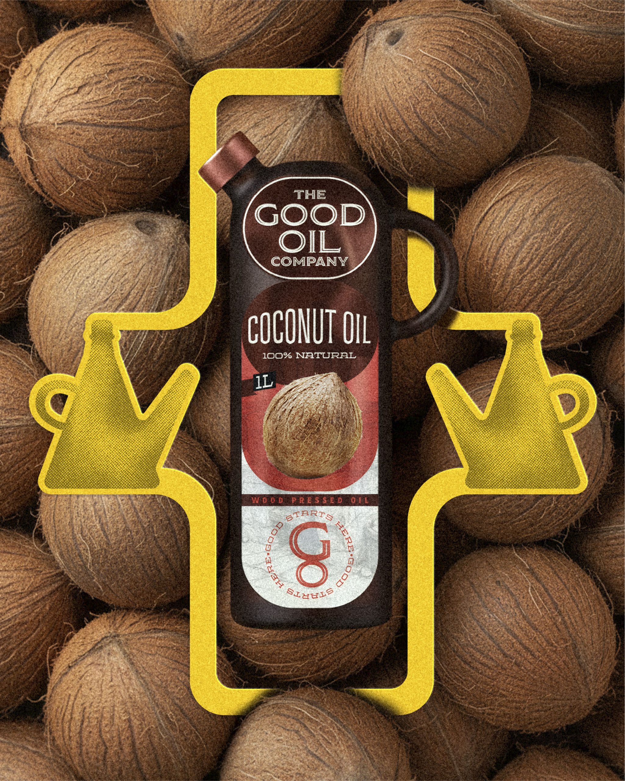
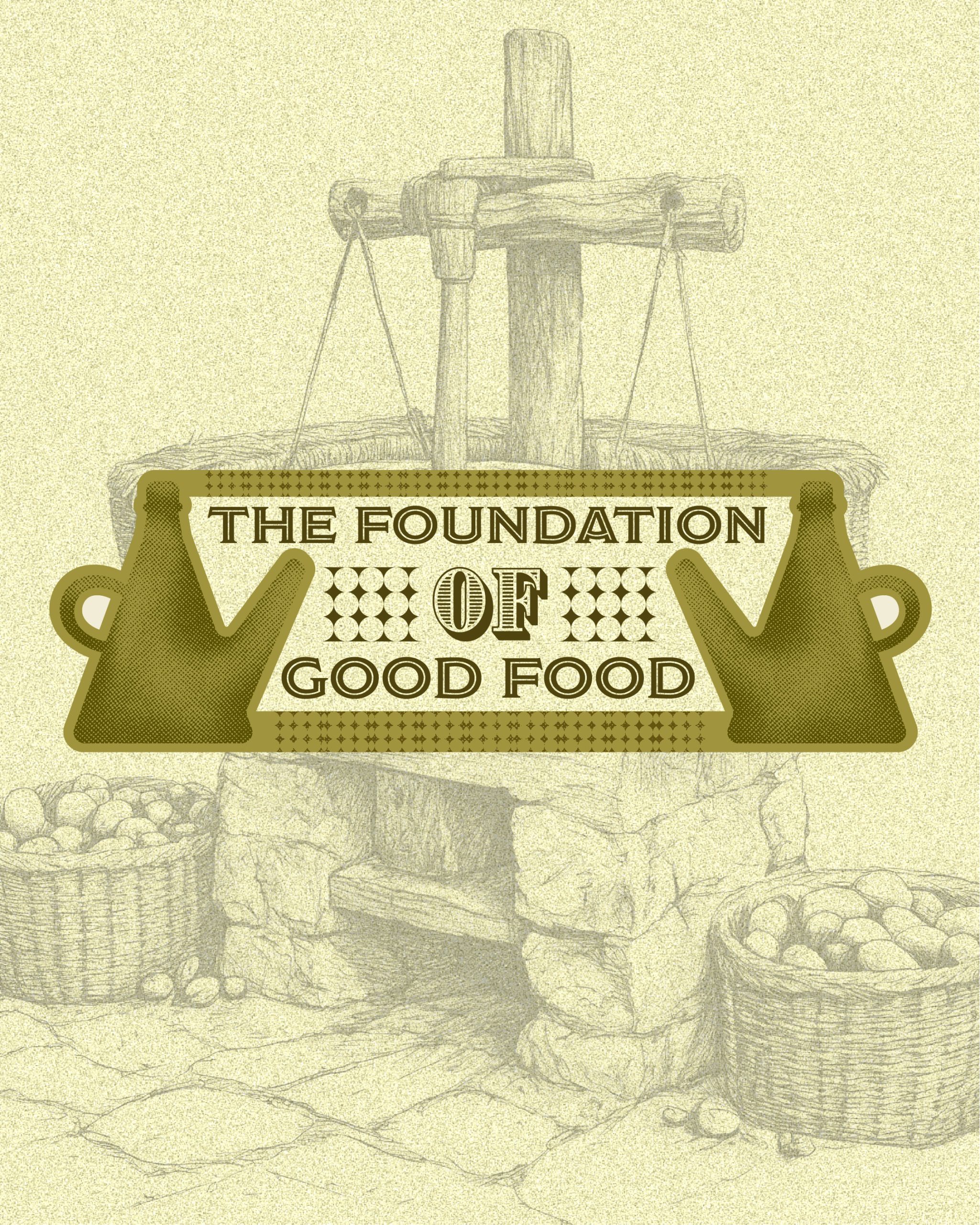
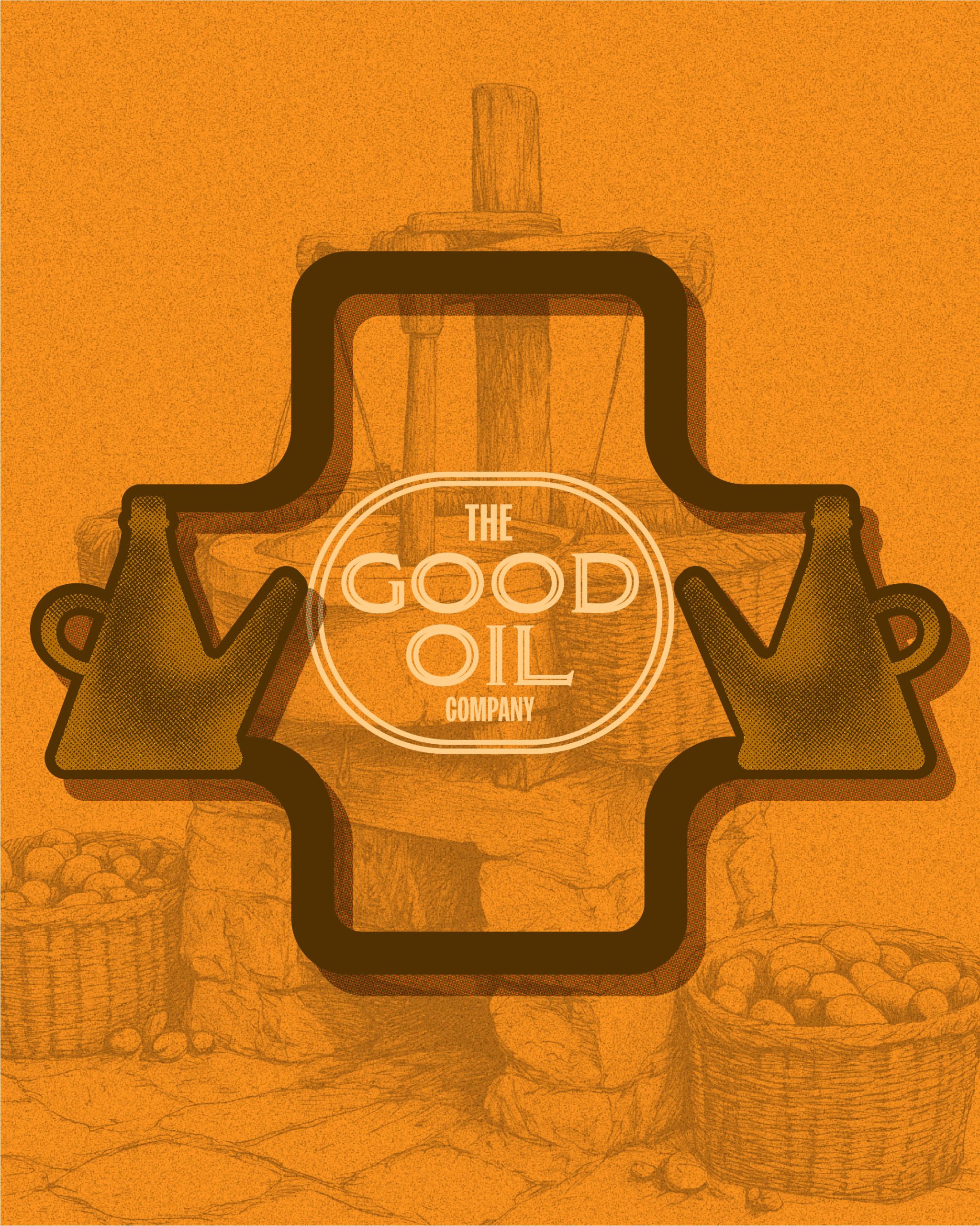
Traditional oil dispensers and source imagery reference the origins of oil making, grounding the identity in authenticity while presenting it through a modern lens.
Clean typography, confident compositions and a reduced design system reflect the same philosophy as the product itself: minimal process, honest ingredients and nothing unnecessary.
The result is a brand where oil is no longer a background element but the hero of the story.
The Good Oil Company
Where Good Meets Oil.





 butterflyhunters
 monther al omari
 Asprey Creative
 About House of Ta
 Up-Brands
 KJS CRAFT
 hello ocean
 PG Branding
 CF Napa Brand Design
 booouuuche
 Hyejung Choi
 Abbydraw Designs Unique Conceptual Branding & Packaging Designing Ideas
 Hollóka Grafikai Műhely / Graphic Design Studio
 Minim Brand Design
 saerom81
 YNL
YNL bilel tkouri
 vitoramockup
 Lampra
 Sanavala
 www.branding.uz
 alchimistestudioParis
 Estudio Argo
 Modern Theory