
About the Project
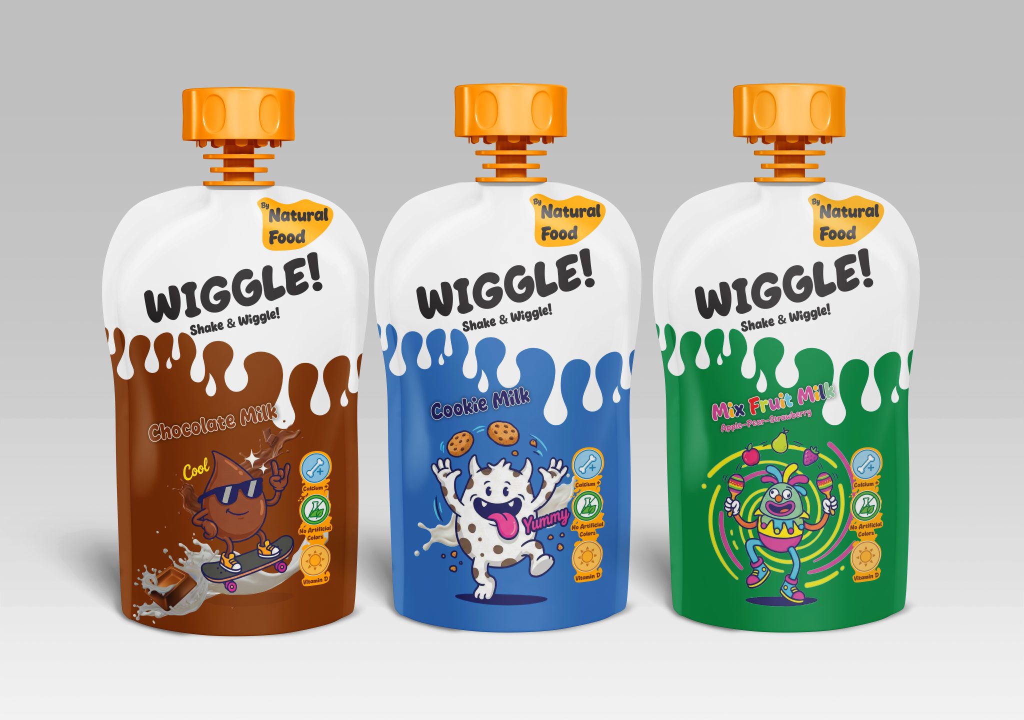
Designed for the WIGGLE! brand, this spouted pouch packaging series focuses on dynamism and fun within the children’s food category. The series consists of three different variations—Chocolate Milk, Cookie Milk, and Mixed Fruit Milk—aiming to establish a strong emotional bond with the target audience while maintaining a striking shelf presence.
Design Strategy and Visual Coding
The design utilizes a “split” background strategy to clearly differentiate the product variations. The white background on the upper section ensures the brand logo and slogan remain clean and legible. Meanwhile, the fluid forms on the lower section are color-coded (Brown, Blue, Green) to represent each flavor. This distinction allows consumers to identify their preferred flavor on the shelf in seconds.
Character Design and Storytelling
To appeal to children’s imaginations, unique mascots were developed for each flavor:
- Chocolate: A skater figure showcasing an energetic and “cool” attitude.
- Cookie: A cute, fun monster that stimulates the appetite.
- Fruit: A dancing character symbolizing joy and mobility.
These illustrations reinforce the perception that the product is not just a drink, but an entertaining experience.
Trust Factors and Shelf Impact
To support parents’ purchasing decisions, custom icon sets highlighting the product’s nutritional values (Calcium, Vitamin D, Natural Ingredients) are placed in the bottom right corner. The “Shake & Wiggle” slogan, paired with “Call to Action” typographic choices, serves as a key detail that completes the packaging’s energy.
In conclusion, WIGGLE!, is a project that successfully communicates the message of being “delicious, fun, and reliable” to its target audience through the strategic use of color psychology and character design.


 Derrick Lin
 salutifg
 ADStudio
 WeAreDepot
 Manuvila
 Yellow Umbrella Creative
 Toka
Toka Studio Zak
 Atiq Alam
 monther al omari
 Modern Theory
 Sirka Agency
 DESIGN CONCEPTS
 Eva Chistyakova
 Puigdemont Roca
 marianaaworks
 bloomburo
 andreamarinnn
 Alina
Alina Saadmost
 Bruhken
 Maruf Nishat
 Richest Branding Pvt. Ltd.
 Sophiagdotcom
 saifullahmaslool
 Up-Brands