
ABOUT
Zestix is a bold, future-forward consumer electronics brand built for the everyday digital lifestyle. From wireless headphones and earbuds to power banks, chargers, speakers, and mobile accessories, the brand focuses on delivering performance-driven technology with accessible pricing and high visual recall.
Positioned for young, tech-savvy consumers who value both functionality and aesthetic energy, Zestix aims to simplify everyday tech experiences through dependable performance, modern engineering, and confident design language. As the product portfolio expanded across categories, the brand required a cohesive packaging system that could unify diverse SKUs under one strong, recognizable identity.
Creative Branding Agency was tasked with developing a scalable packaging design language that would work across multiple electronics categories while maintaining strong shelf presence and brand recall.
DESIGN APPROACH
The core objective was to create a high-impact visual system that could:
- Work across multiple product formats
- Stand out in crowded electronics retail environments
- Communicate performance and reliability instantly
- Appeal to a young, performance-oriented audience
The color palette plays a defining role. A bold signature orange acts as the primary brand anchor, supported by neutral greys and deep tech tones to maintain credibility and balance. This combination ensures vibrancy without compromising perceived quality.
The typography system is strong and assertive, allowing the brand name to dominate shelf visibility while the product variant (such as VIBE X) integrates seamlessly into the hierarchy. The layout architecture ensures flexibility for different product sizes and technical specifications without losing visual coherence.
SOLUTION
The packaging system is built around three principles: clarity, energy, and scalability.
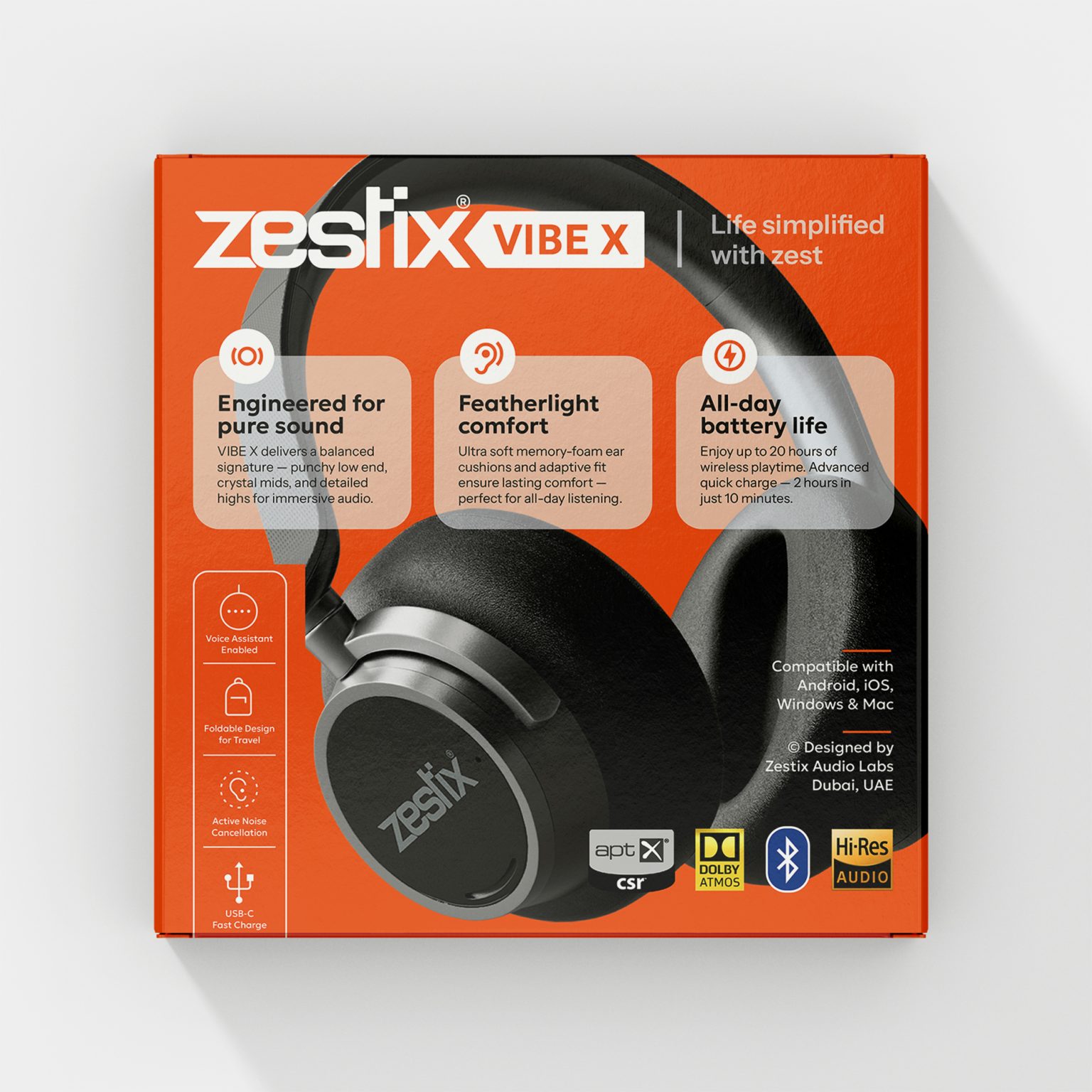
A large hero product visual dominates the front panel, allowing consumers to immediately understand what they are purchasing. Feature highlights are structured in clean information blocks, making technical benefits easy to scan in retail settings.
Technology credentials such as Bluetooth compatibility, Hi-Res Audio, Dolby Atmos, fast charging, and performance indicators are placed strategically to reinforce trust and legitimacy.
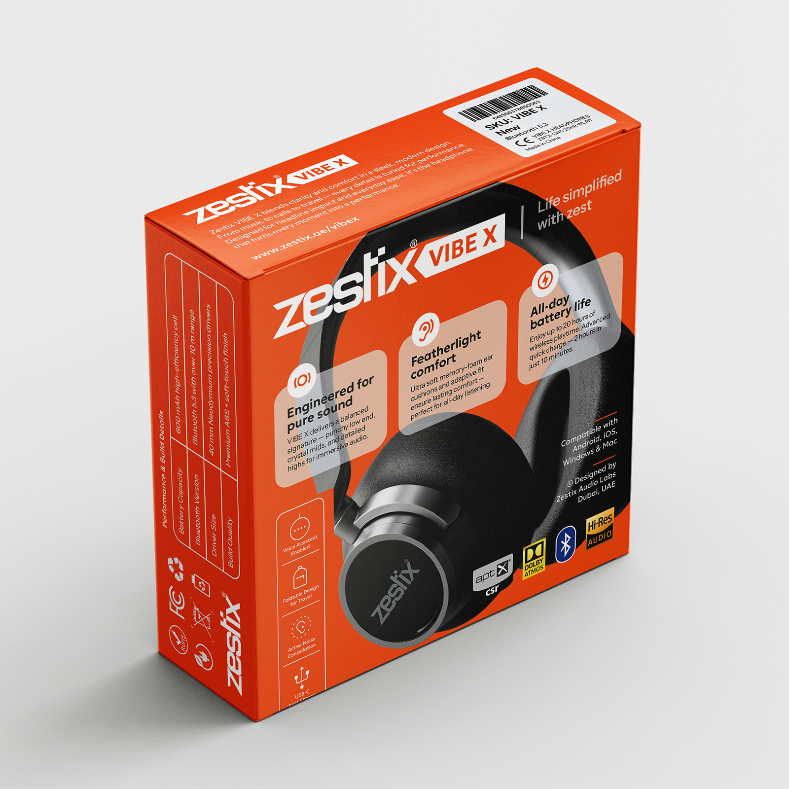
Each panel of the box plays a functional role:
- Front communicates aspiration and key features
- Side panels carry extended specifications
- Top and angled views enhance product imagination
This multi-surface storytelling approach ensures that the consumer can visualize the product fully before opening the box — increasing confidence at the point of sale.
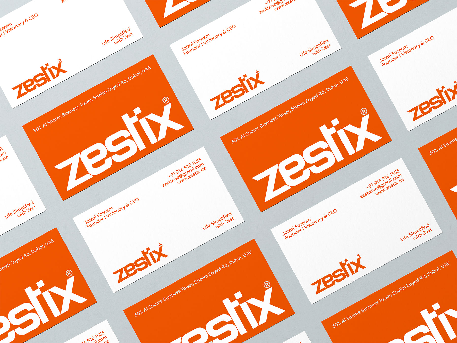
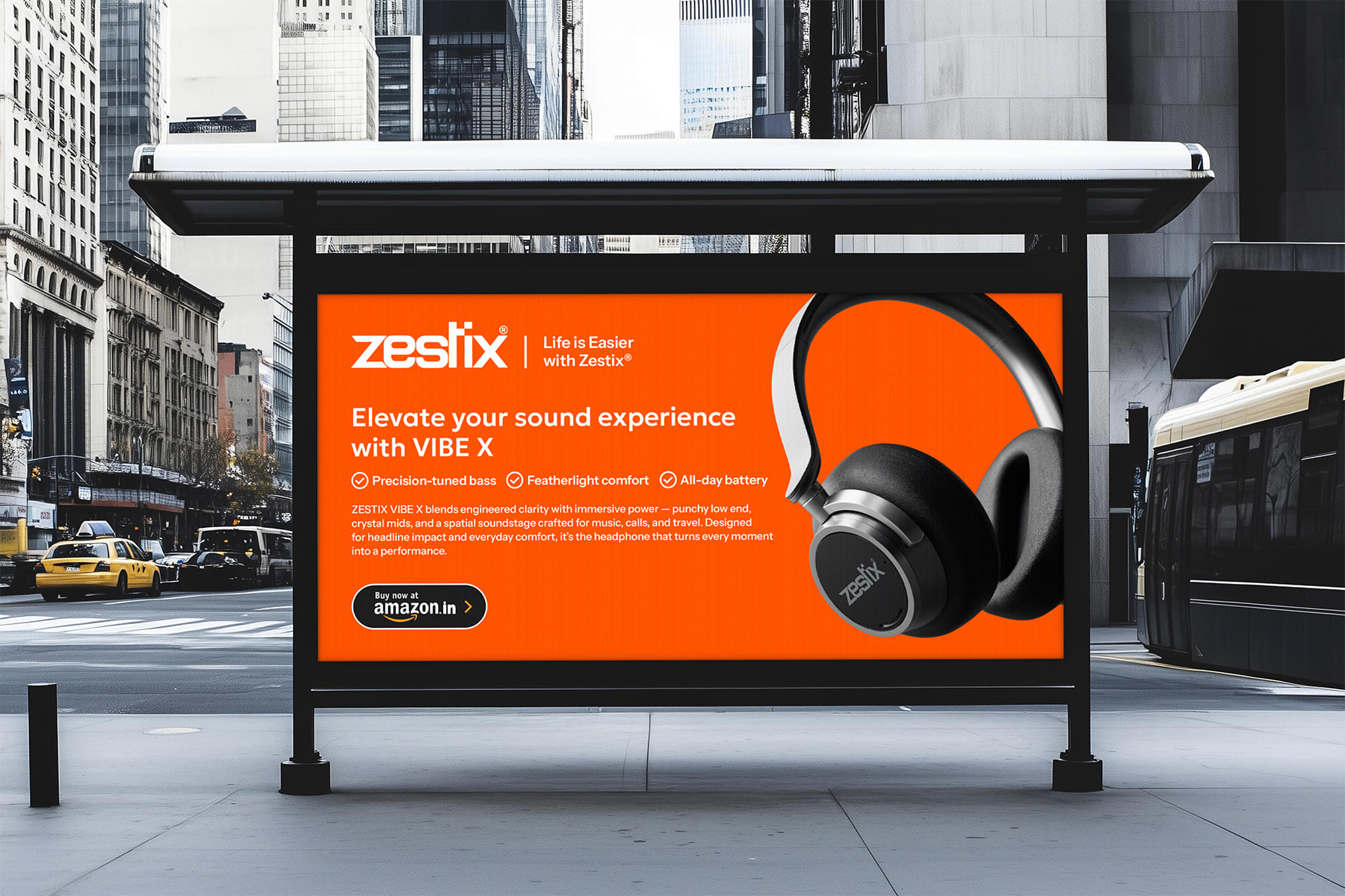
The system is designed to scale across product categories. Whether applied to earbuds, power banks, or speakers, the visual architecture remains consistent while allowing category-specific differentiation through controlled color accents and feature modules.
RESULT
The final packaging establishes Zestix as a confident, energetic, and reliable consumer electronics brand. It bridges affordability with aspirational design, helping the products compete visually against larger global brands.
By combining bold color strategy, disciplined layout systems, and structured feature storytelling, the packaging transforms everyday electronics into lifestyle-ready tech essentials.
PROJECT DETAILS
Brand: Zestix
Category: Consumer Electronics
Products: Headphones, Earbuds, Chargers, Power Banks, Speakers & Mobile Accessories
Packaging Format: Printed Corrugated Retail Boxes
Scope: Packaging Design System & Visual Identity Extension
 Hashem Gerashi
 monther al omari
 Emi Renzi
 Bonsanco Creative Studio
 Isha
Isha Confetti Design Studio
 Luks Piekut | Wytrawny
 TOGNOLLO STUDIO
 Svea Bode
 Valérie Colace
 宏洛图品牌设计HONGLUOTU
 Toolstika
 Marta Wasilewska
 Heramb Arora
 Hakob
Hakob Nadya Chunikhina
 Elodie Clarke
 MID-AIR STUDIO
 Tríona O'Donoghue • Design
 Cocoon Prague
 alchimistestudioParis
 hugo zapata