
ABOUT
Swisshaus is a contemporary eyewear brand built around precision, individuality, and considered design. The challenge was to create a packaging system that could translate these characteristics into a distinctive physical experience across multiple touchpoints: from the primary eyewear box to paper tubes and product tags.
The packaging needed to balance a refined, European-inspired aesthetic with strong visual recognition, while remaining flexible enough to accommodate different eyewear styles, product specifications, and future collections.
The objective was to create something that felt less like conventional eyewear packaging and more like an extension of the Swisshaus design language.
SOLUTION
The packaging system is built around a disciplined combination of red, warm grey, black, and white, creating a strong visual signature for Swisshaus while allowing the product information to remain clear and functional.
A distinctive cross-inspired graphic device derived from the brand identity becomes a recurring visual element across the packaging. It is used both as a bold graphic on the inner packaging and as a repeating pattern, creating continuity between the different formats.
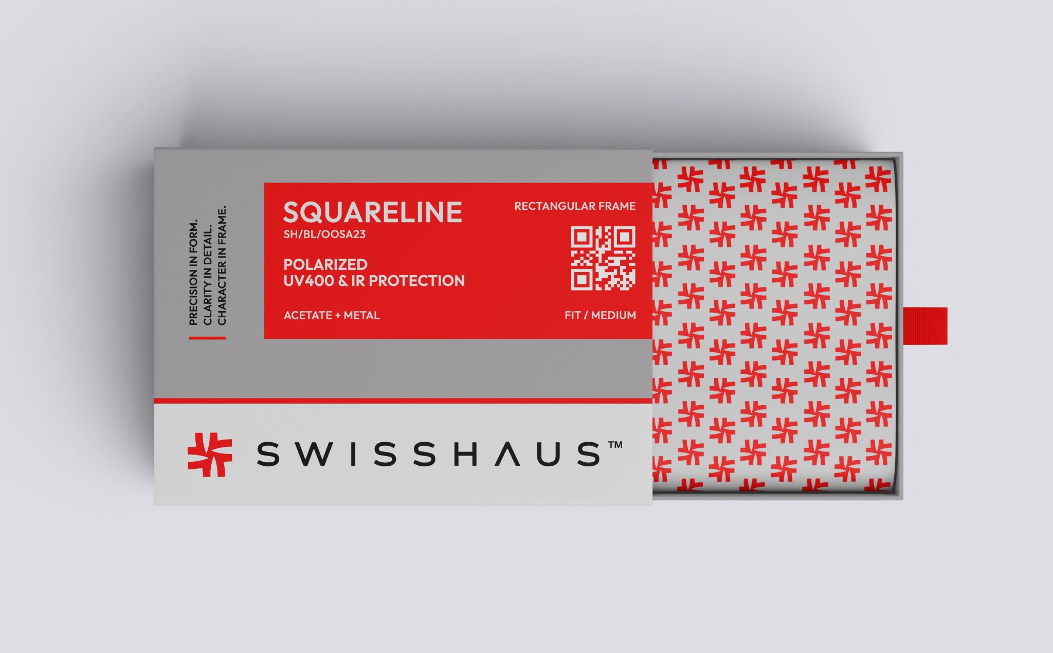
The primary eyewear box uses a structured sleeve-and-reveal format, where the outer grey sleeve introduces the product information while the opening reveals the patterned interior. This creates a layered unboxing experience and gives the packaging a stronger sense of discovery.
Information is organized through a clear typographic hierarchy. The model name acts as the primary identifier, supported by the model code, lens technology, frame construction, and fit. Technical information such as polarization, UV400 and IR protection is presented in a concise, highly structured format to make product specifications easy to scan.
The same design language extends to the cylindrical paper tube, where the information panel wraps naturally around the format while the oversized graphic mark creates a strong visual presence. The product tag follows the same system, combining essential product information with the Swisshaus brand signature.
Across all formats, the system deliberately uses scale, typography, repetition, and structure rather than excessive decoration, allowing the packaging to feel contemporary, precise, and recognizably Swisshaus.
RESULT
The final outcome is a cohesive packaging system that creates a consistent brand experience across boxes, paper tubes, and product tags while allowing each format to retain its own character.
The combination of the restrained grey base, high-impact red, structured typography, and recurring graphic pattern gives Swisshaus a distinctive visual presence while reinforcing the brand’s positioning around precision and contemporary eyewear design.
The system is also designed for scalability, allowing new eyewear models and product variations to be introduced through changes in model naming, product codes, specifications, and format while retaining the core visual architecture.
The result is a bold yet controlled packaging identity that transforms functional eyewear packaging into a recognizable and considered brand experience.
PROJECT DETAILS
Brand: Swisshaus
Category: Eyewear / Sunglasses Packaging
Designed By: Creative Branding Agency (CBA™)
Scope: Branding, Packaging design system, Box packaging, Paper tube packaging design, Product tags, and Packaging assets


 Derrick Lin
 Biaa
Biaa Petitmoulin Studio
 White Bear Studio
 Eva Chistyakova
 monther al omari
 Atipus
 alchimistestudioParis
 oneandother
 bloomburo
 helocrene
 Shapers Studio
 Denver Design
 Aidearte
 andrew.huerta
 softmachine
 airobtq
 Buzz & Co.
 Ruby
Ruby themythographer
 IDNB Inc.
 viktorflr
 Zenpack