
AEVUM
Supplement Brand Strategy, Branding, Packaging Design & Website Design
Supplement branding and packaging design for a new range of premium longevity supplement.
The Brief
AEVUM were entering a premium supplement market where every brand looks the same – clinical and cold at one end, generic wellness at the other. The brief was to build a brand identity, packaging design system, and direct-to-consumer presence for an exceptional longevity formulation that could command a premium price point and hold its own in the most discerning retail and digital environments – without resembling anything already in the category.
The Work
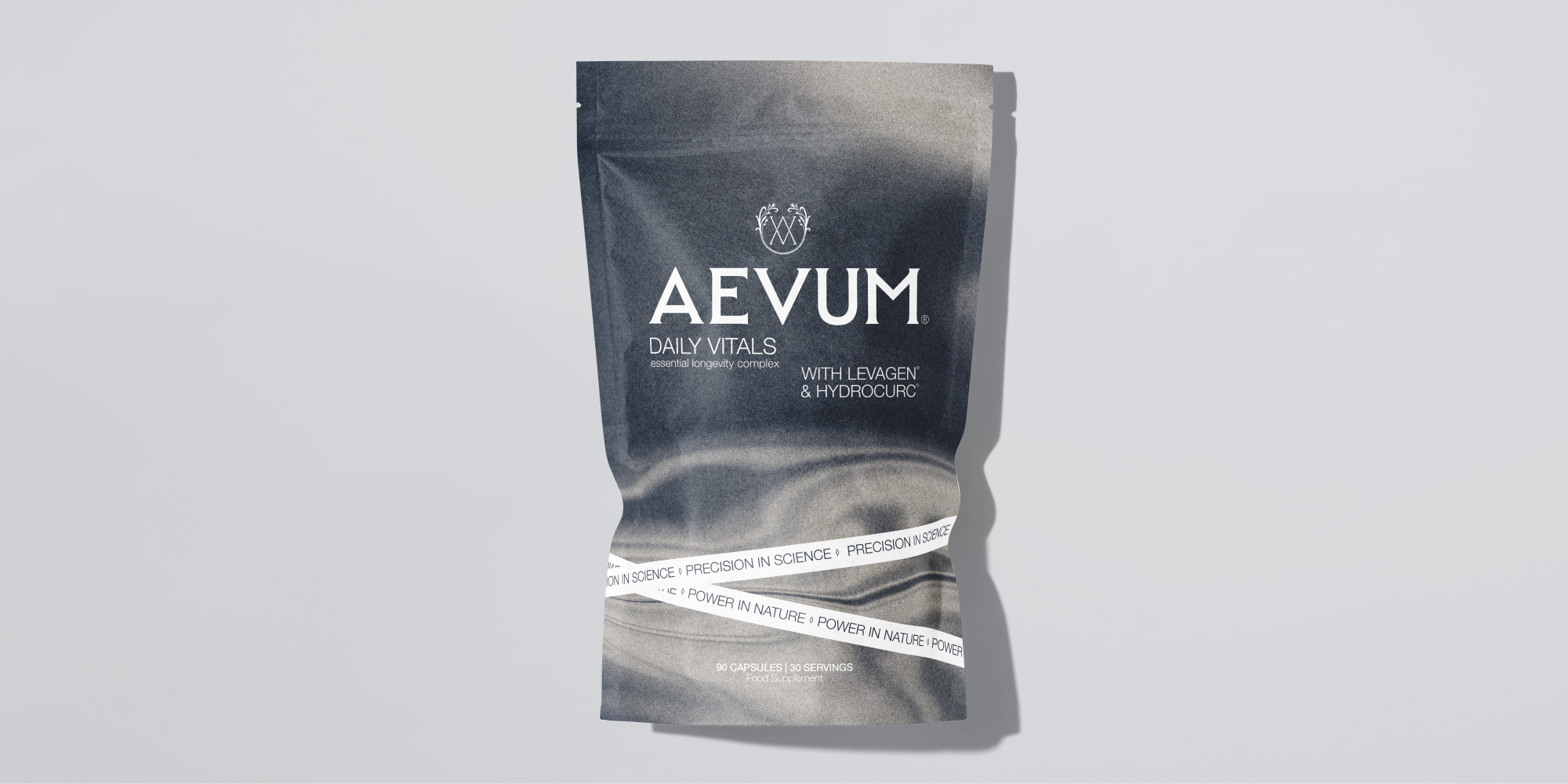
We built AEVUM from the ground up around a single creative pillar to embody the AEVUM proposition – precision in science, power in nature. A bespoke monogram sits at the heart of the identity: two intersecting letterforms within a botanical frame, the visual embodiment of that duality. The packaging is built on deep slate grey with white typography and a hero visual inspired by running water and one of the oldest symbols in human culture – the Fountain of Youth. Rendered in monochrome, geological, ancient, elemental, and enduring. The wordmark, the strapline, the packaging, and the DTC website all carry the same authority – a brand that feels as if it has always existed.
The Outcome
AEVUM launched with a brand that justifies its premium positioning before a word of proposition copy is read – timeless rather than trend-led, built to look as considered in five years as it does on day one.
Client: AEVUM
Disciplines: Brand Strategy, Branding, Packaging Design, Retail Strategy, Website Design
Agency: Greatergood® Brands




 MID-AIR STUDIO
 Heramb Arora
 monther al omari
 Tríona O'Donoghue • Design
 Cocoon Prague
 alchimistestudioParis
 hugo zapata
 Bonsanco Creative Studio
 parawaradesign
 UPRISE
 Brand Society
 Que Cálido Studio®
 Richest Branding Pvt. Ltd.
 STRATEDGY
 Shapers Studio
 Platon Ivantsov
 WPA Pinfold
 giselepereiradesign
 ShalaSketches
 05Creation
 Voit Studio
 SSTO
SSTO