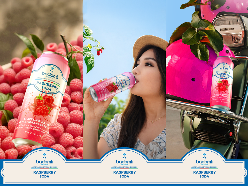

Concept & Inspiration
The Badamlı Soda collection is a vibrant expansion of the classic Azerbaijani brand into the flavored sparkling beverage market. The design concept focuses on “Explosive Freshness.” By integrating dynamic liquid splashes with hyper-realistic fruit imagery, the packaging communicates an immediate sense of thirst-quenching energy and natural flavor.
Design Features
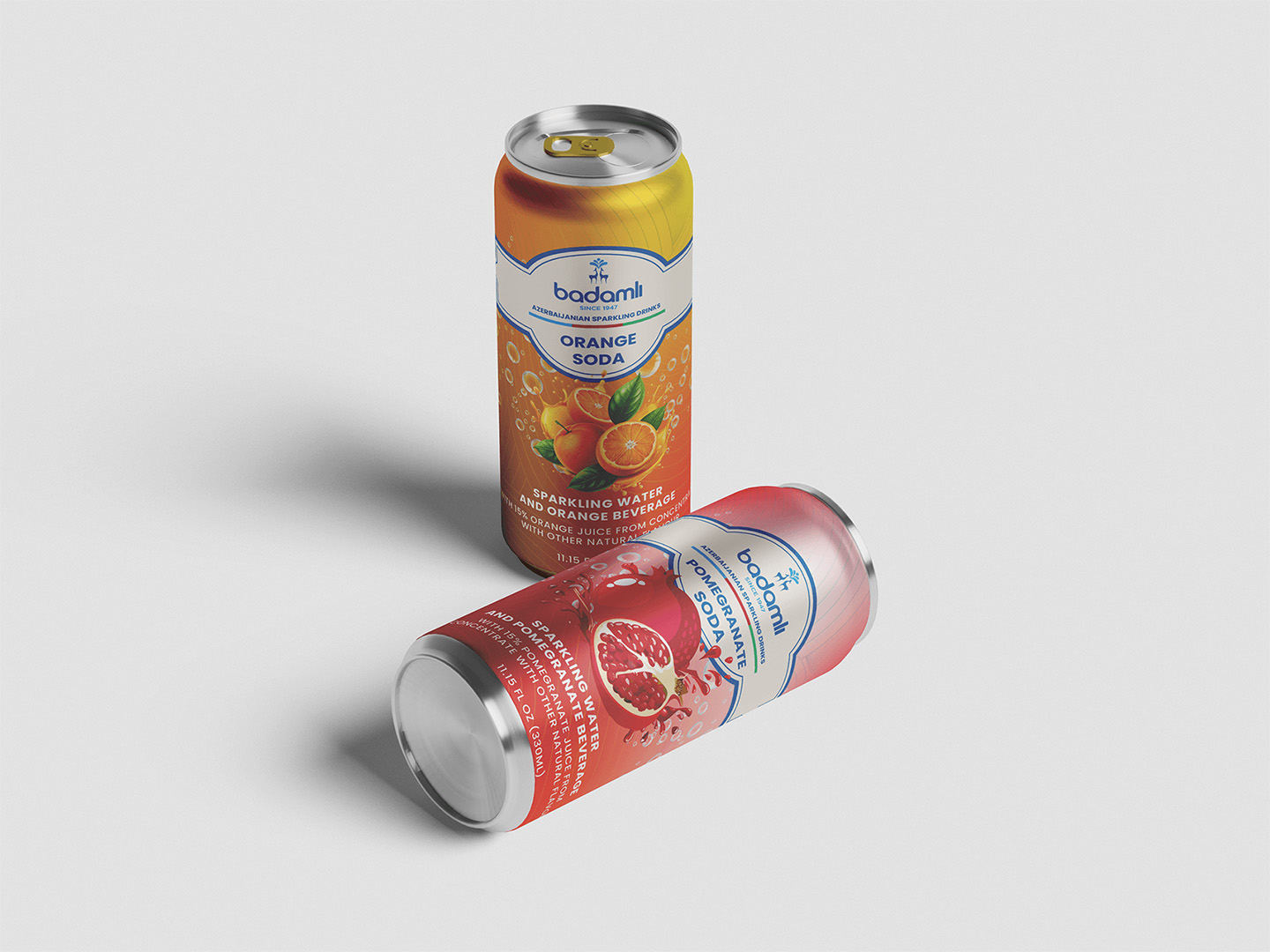
Dynamic Visuals: Each can features a high-action “splash” of juice and fruit segments (Pomegranate, Raspberry, Kiwi, and Orange) to emphasize the 15% real fruit juice content.
Color Strategy: A bright, gradient-based color palette is used for each SKU (Stock Keeping Unit) to ensure instant flavor recognition and a modern “pop” look on retail shelves.
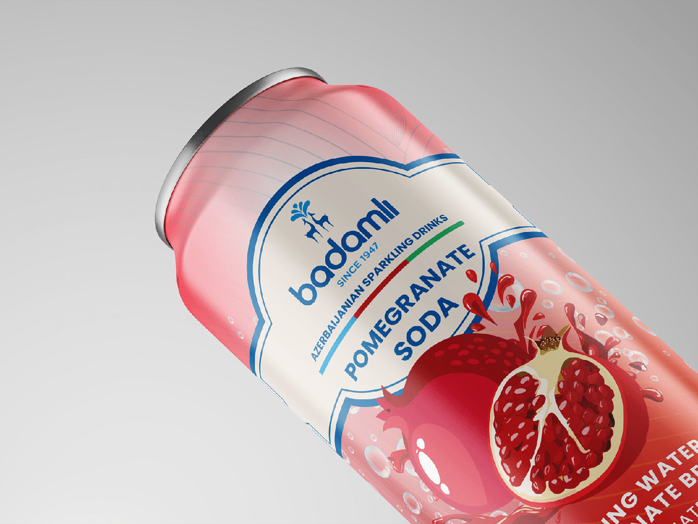
Brand Heritage: The iconic Badamlı logo is placed prominently within a clean, arched frame that pays homage to the brand’s long-standing history (since 1947), while the background textures add a contemporary digital feel.
Typography: Clear, bold sans-serif typography is used for the flavor names to ensure legibility and a minimalist aesthetic that balances the detailed fruit illustrations.
Execution & Impact
The 330ml “sleek” can format was chosen to target a younger, urban demographic. The matte finish on the upper part of the can contrasts with the glossy, vibrant fruit visuals on the bottom, creating a premium tactile experience for the consumer.



 VugarBabayev
 Derrick Lin
 Biaa
Biaa Petitmoulin Studio
 White Bear Studio
 Eva Chistyakova
 monther al omari
 Atipus
 alchimistestudioParis
 oneandother
 bloomburo
 helocrene
 Shapers Studio
 Denver Design
 Aidearte
 andrew.huerta
 softmachine
 airobtq
 Buzz & Co.
 Ruby
Ruby themythographer
 IDNB Inc.
 viktorflr
 Zenpack