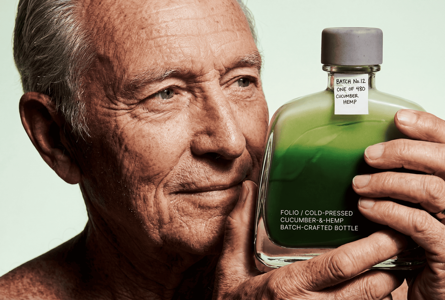

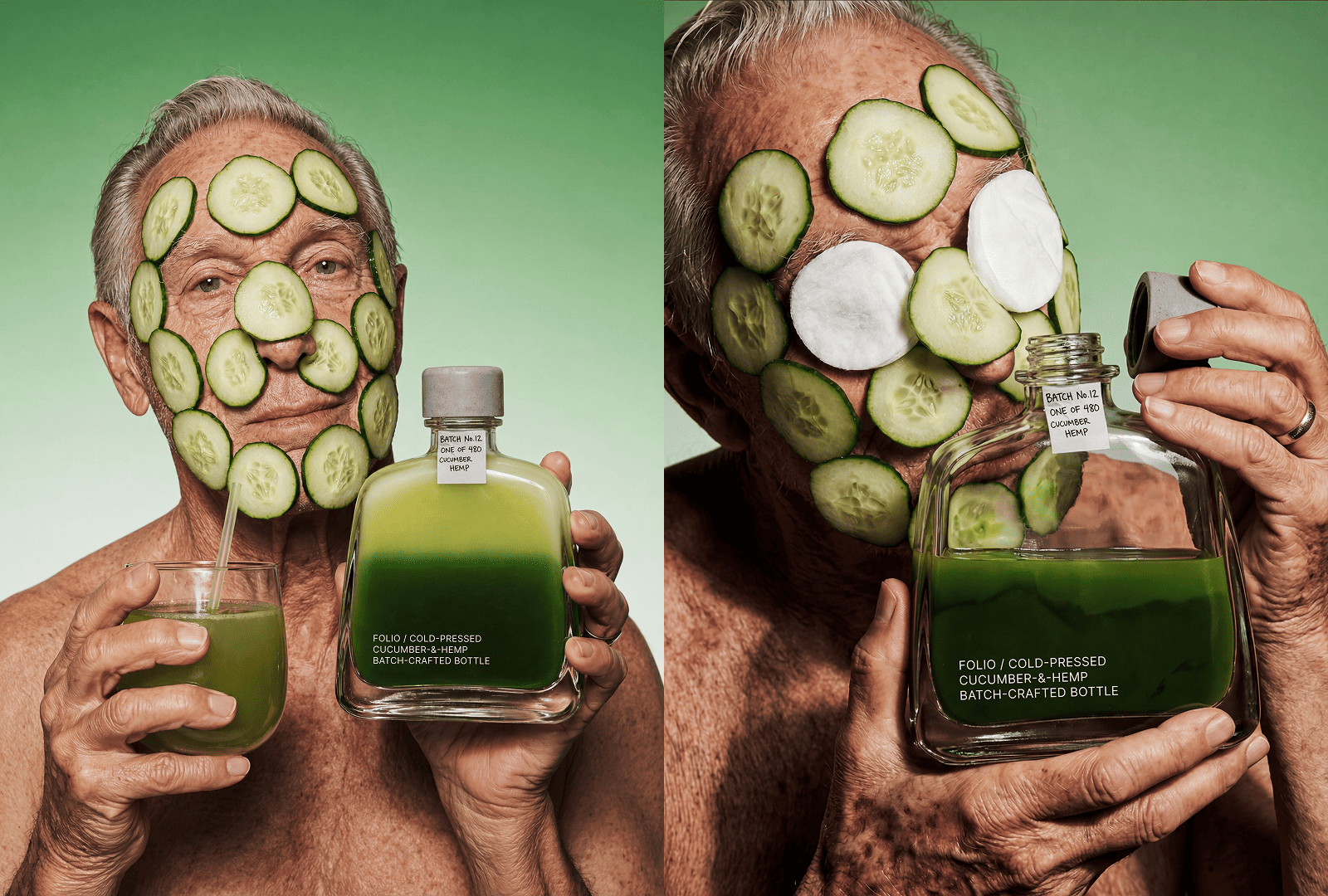
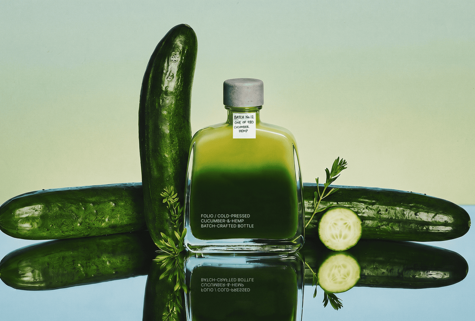
FOLIO is a non-alcoholic botanical drink made from cold-pressed cucumber and hemp extract. The concept sits at the intersection of wellness culture and craft collectibility, combining a functional approach to ingredients with a strong emphasis on physical presence and perception.
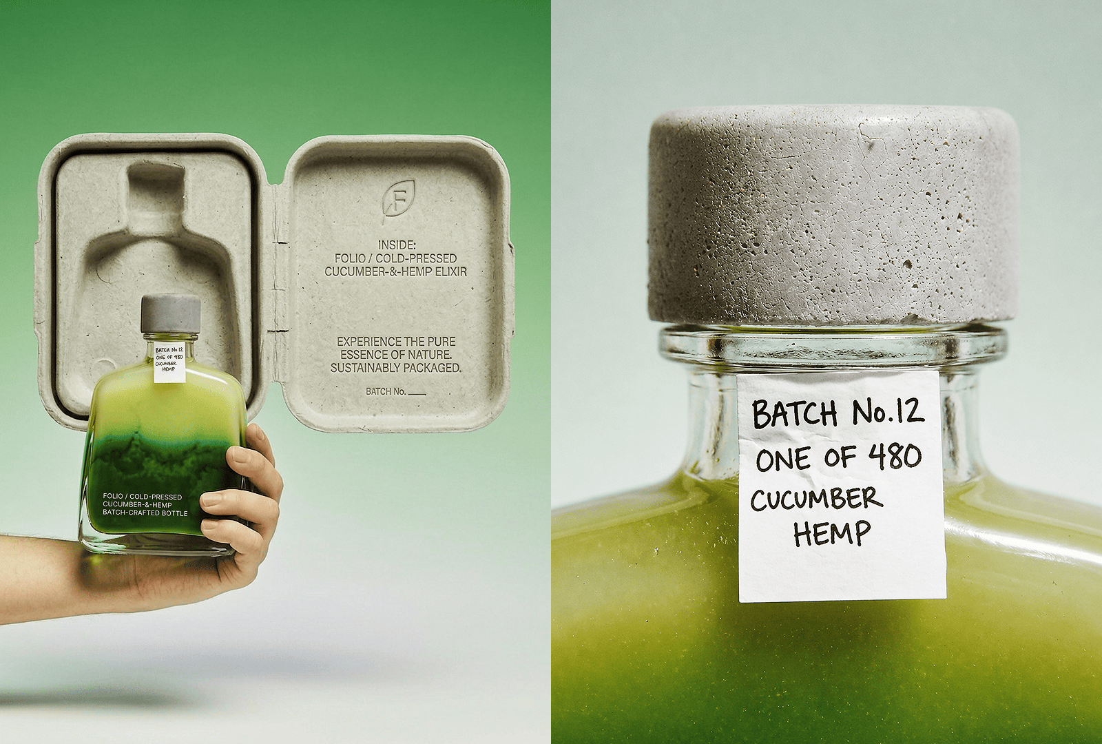
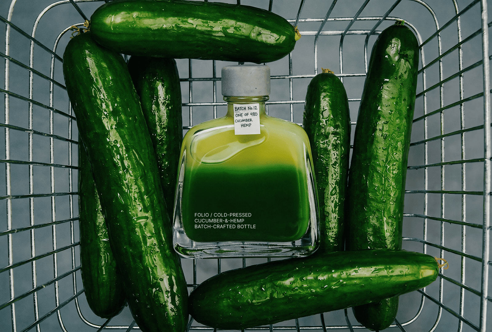
The packaging borrows the language of limited-edition spirits. Numbered bottles, handwritten batch tags, and small-run production create a sense of rarity and intention. This approach introduces a level of care and precision that is typically absent in the non-alcoholic category, where products are often positioned as secondary or simplified alternatives.
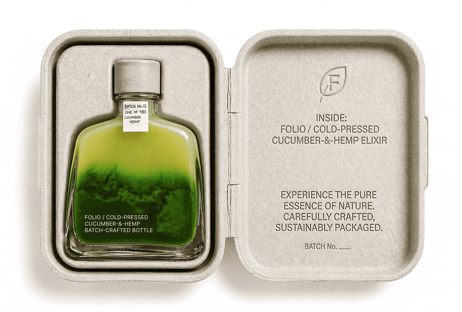
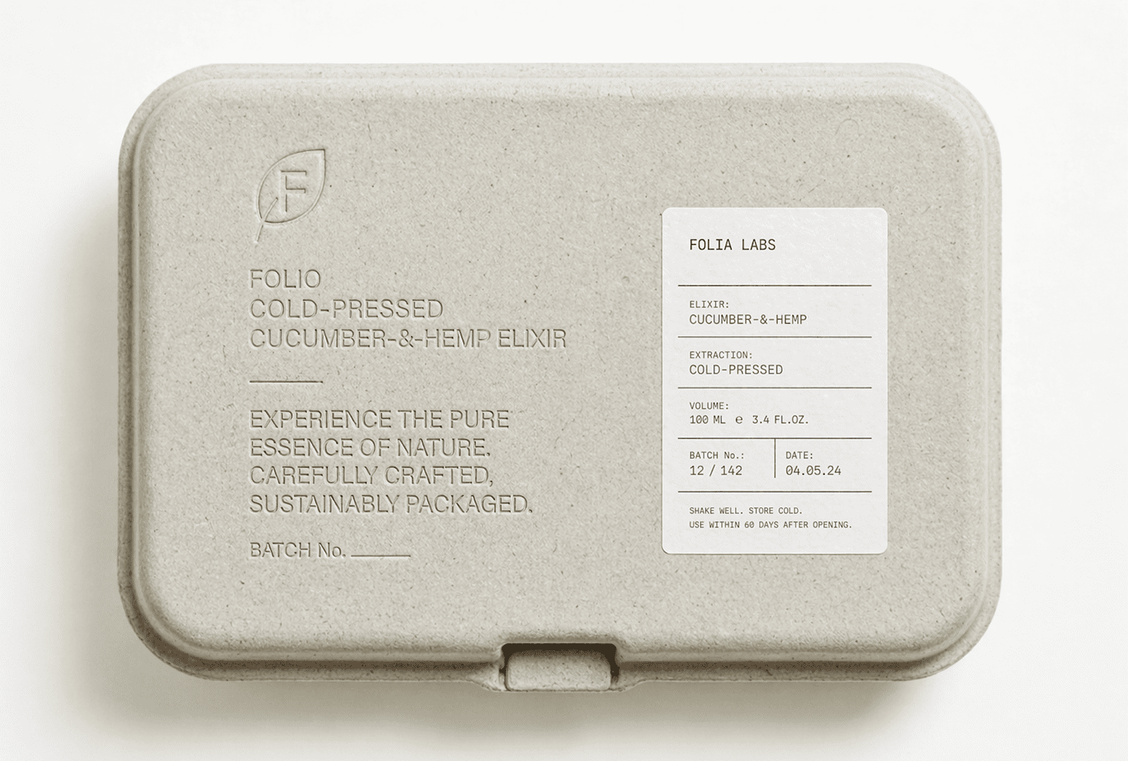
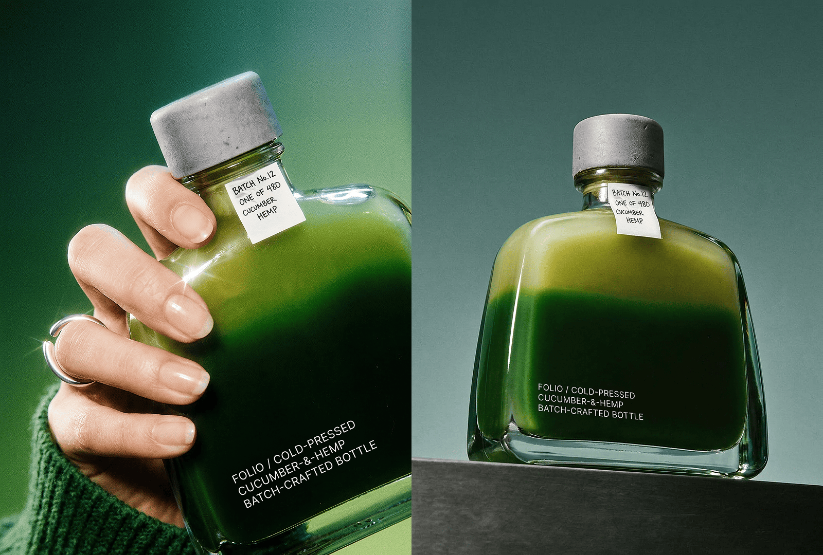
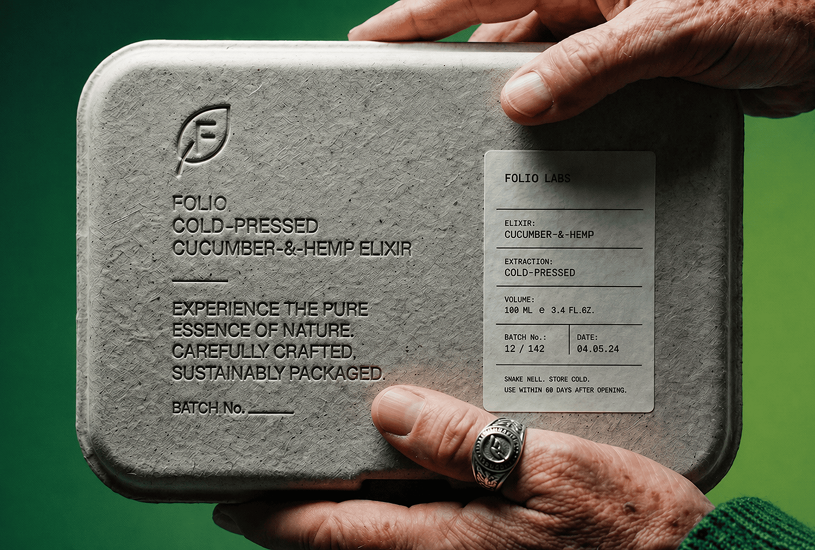
Every material choice is intentional and consistent with the core idea. Molded pulp casing, cast concrete cap, and unadorned glass form a system that feels raw and direct. There are no unnecessary layers between the consumer and the product. Each component serves a clear role without decoration or visual noise.
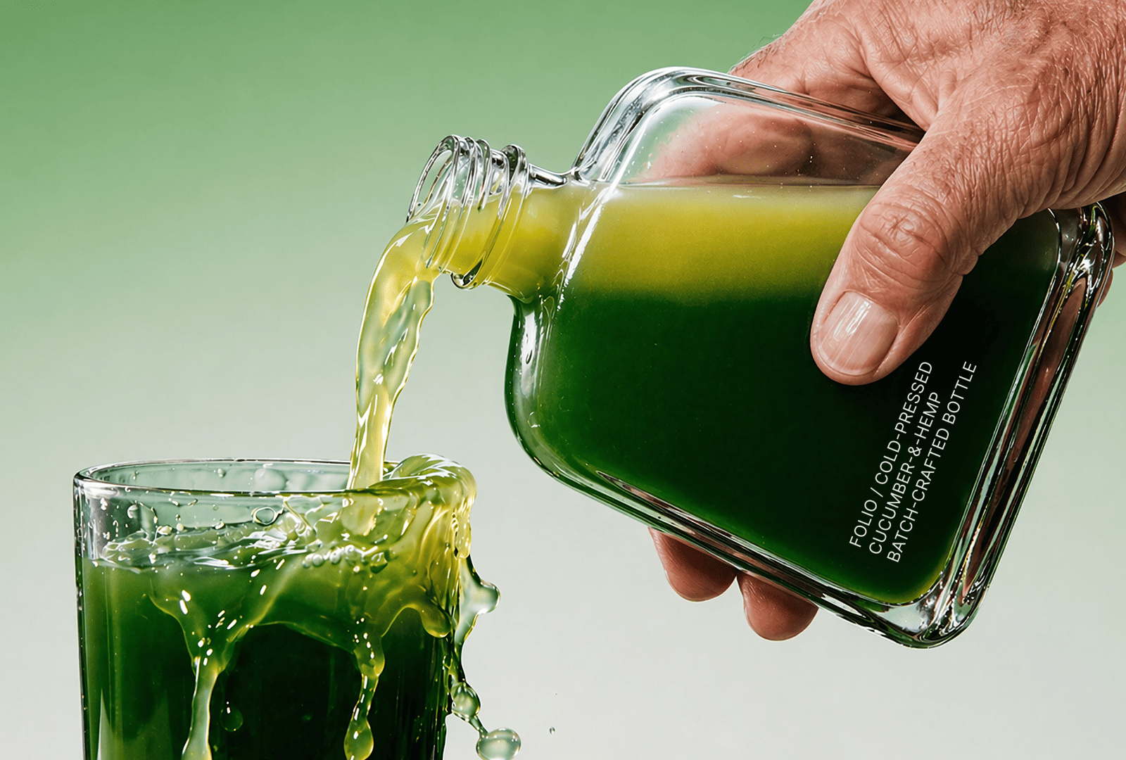
Typography is pressed directly into glass and pulp rather than applied as a surface element. This decision reinforces the idea of permanence and integration. The information becomes part of the object itself, not something added later. It reflects the philosophy of the drink, where nothing is introduced artificially and everything exists in its natural state.
The jade-to-pale-green liquid gradient is the only colour in an otherwise neutral system. It carries the full weight of the flavour narrative and becomes the central visual cue. This restrained use of colour ensures that attention stays on the product and its inherent qualities rather than external embellishment.
Curator’s Insight
The decision to press typography directly into the glass rather than apply a label is the conceptual hinge the entire project turns on. It removes the usual separation between container and communication — the bottle doesn’t carry information, it is the information. That’s a philosophically consistent move for a product built around the idea of nothing artificial, nothing added. The medium and the message align in a way that’s rare in beverage packaging.
What’s also worth examining is how FOLIO handles the tension between accessibility and exclusivity. The numbered batch tag is handwritten, informal, almost archival — the kind of label you’d find on a jar in someone’s kitchen. But it sits on a cast concrete cap and a piece of glass that reads as collectible. That contrast isn’t accidental. It positions the product as something made by people, not manufactured at scale, which is precisely the credibility gap the non-alcoholic category has historically struggled to close.
The moulded pulp casing deserves its own note. Pulp is increasingly used as a sustainability signal, but here it functions as something more considered — a material that absorbs and holds the product rather than displaying it, more reliquary than retail box. The decision to deboss rather than print inside it keeps that material integrity intact to the last detail.


 Derrick Lin
 Biaa
Biaa Petitmoulin Studio
 White Bear Studio
 Eva Chistyakova
 monther al omari
 Atipus
 alchimistestudioParis
 oneandother
 bloomburo
 helocrene
 Shapers Studio
 Denver Design
 Aidearte
 andrew.huerta
 softmachine
 airobtq
 Buzz & Co.
 Ruby
Ruby themythographer
 IDNB Inc.
 viktorflr
 Zenpack