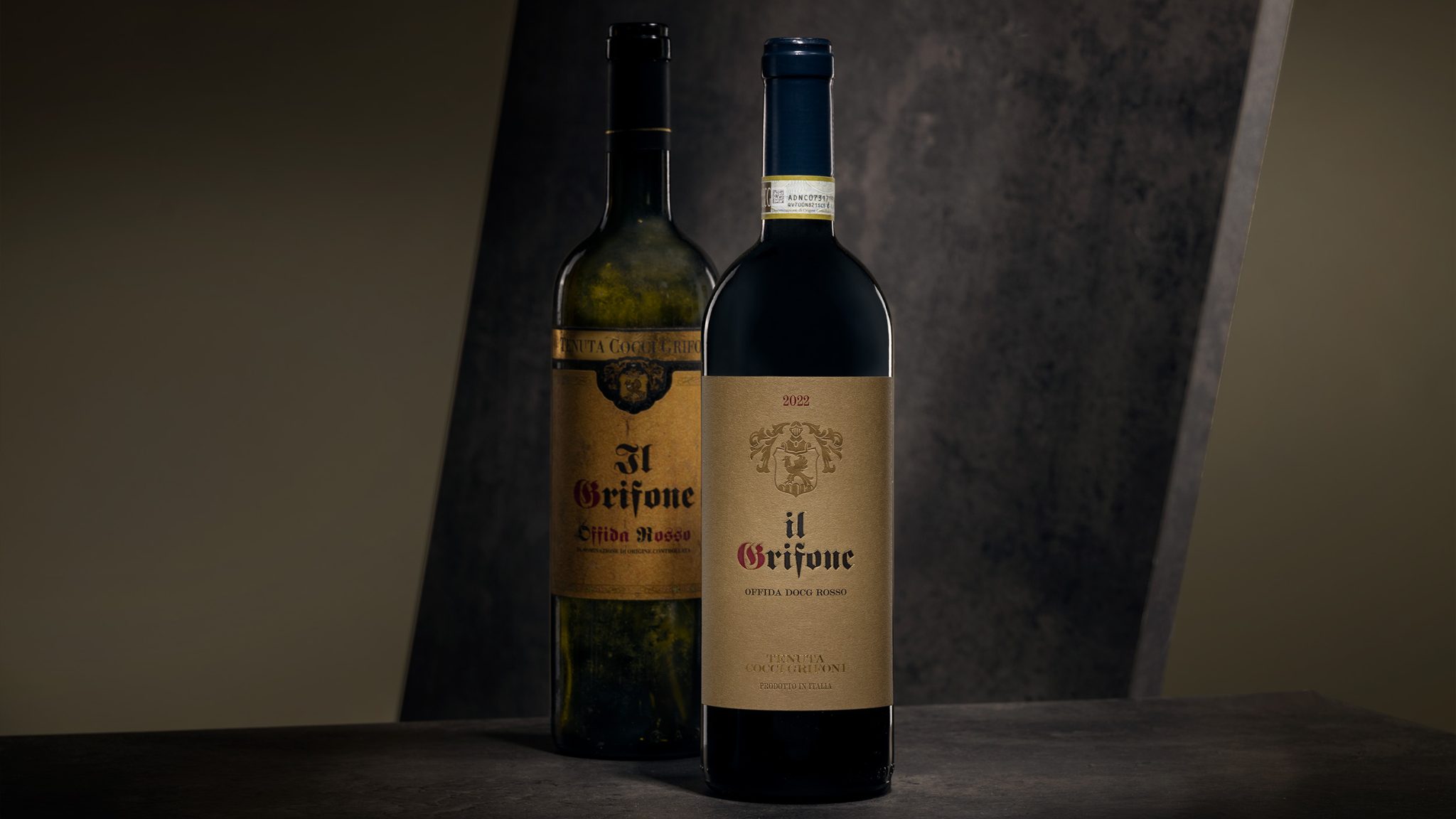

IL GRIFONE Opulence. Origins. Consistency.
Three keywords defined the brief for the restyling of Il Grifone, Offida Rosso.
Since its first vintage in 1997, Il Grifone has gone through several phases, arriving today at a renewed sense of balance, also reflected in the quality of the wine.
The project stems from the need to realign the visual identity with this evolution, preserving its heritage while translating it into a contemporary language.
SOLUTION
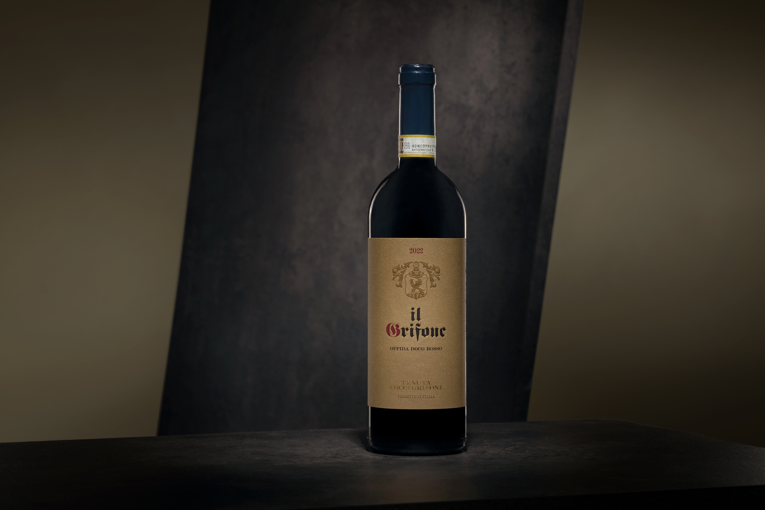
Developed in collaboration with Andrea Castelletti Studio (design), the restyling works through reduction while maintaining a strong connection to the original label.
The initial sense of opulence is reinterpreted within a more controlled system, where each element is redefined through hierarchy and balance.
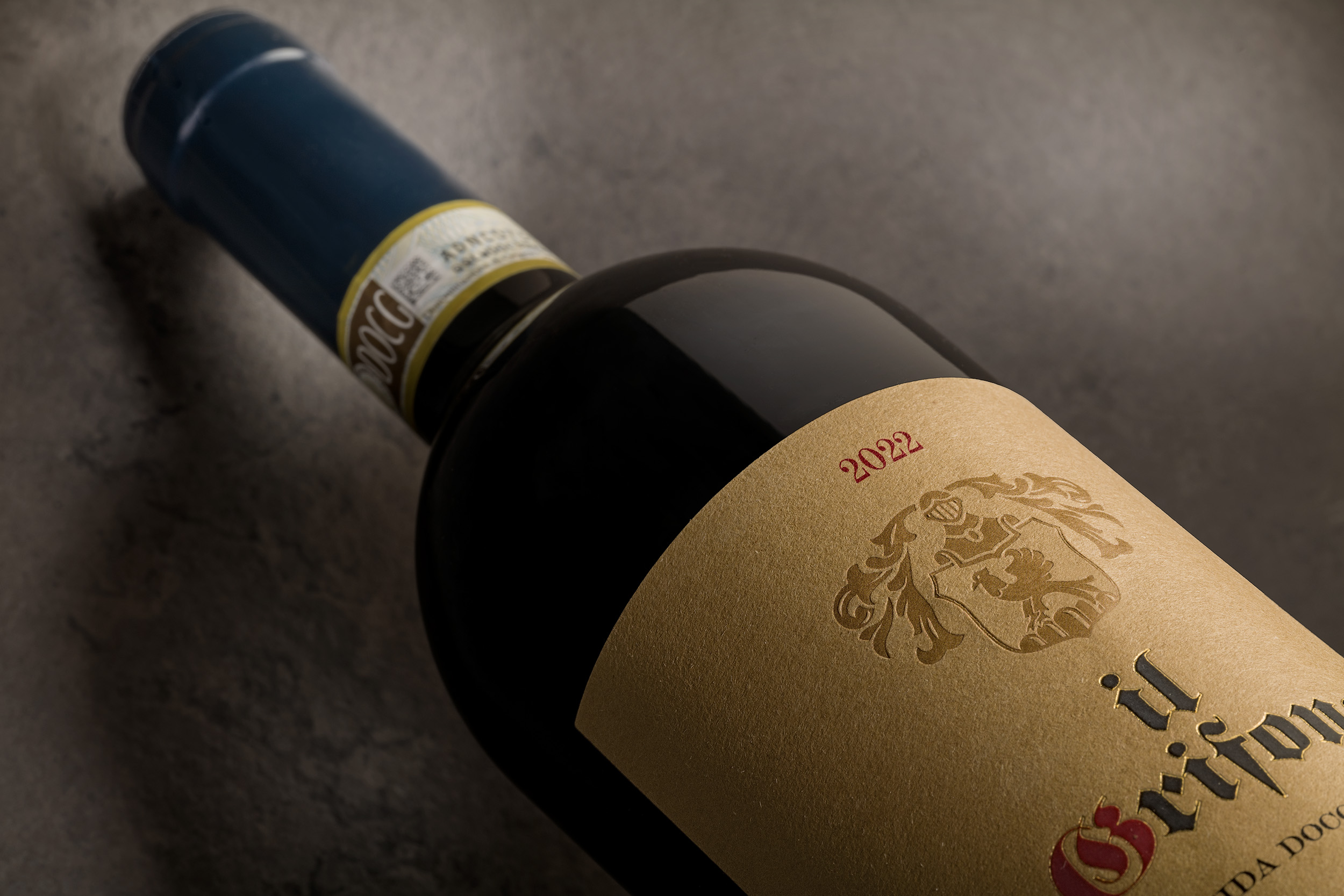
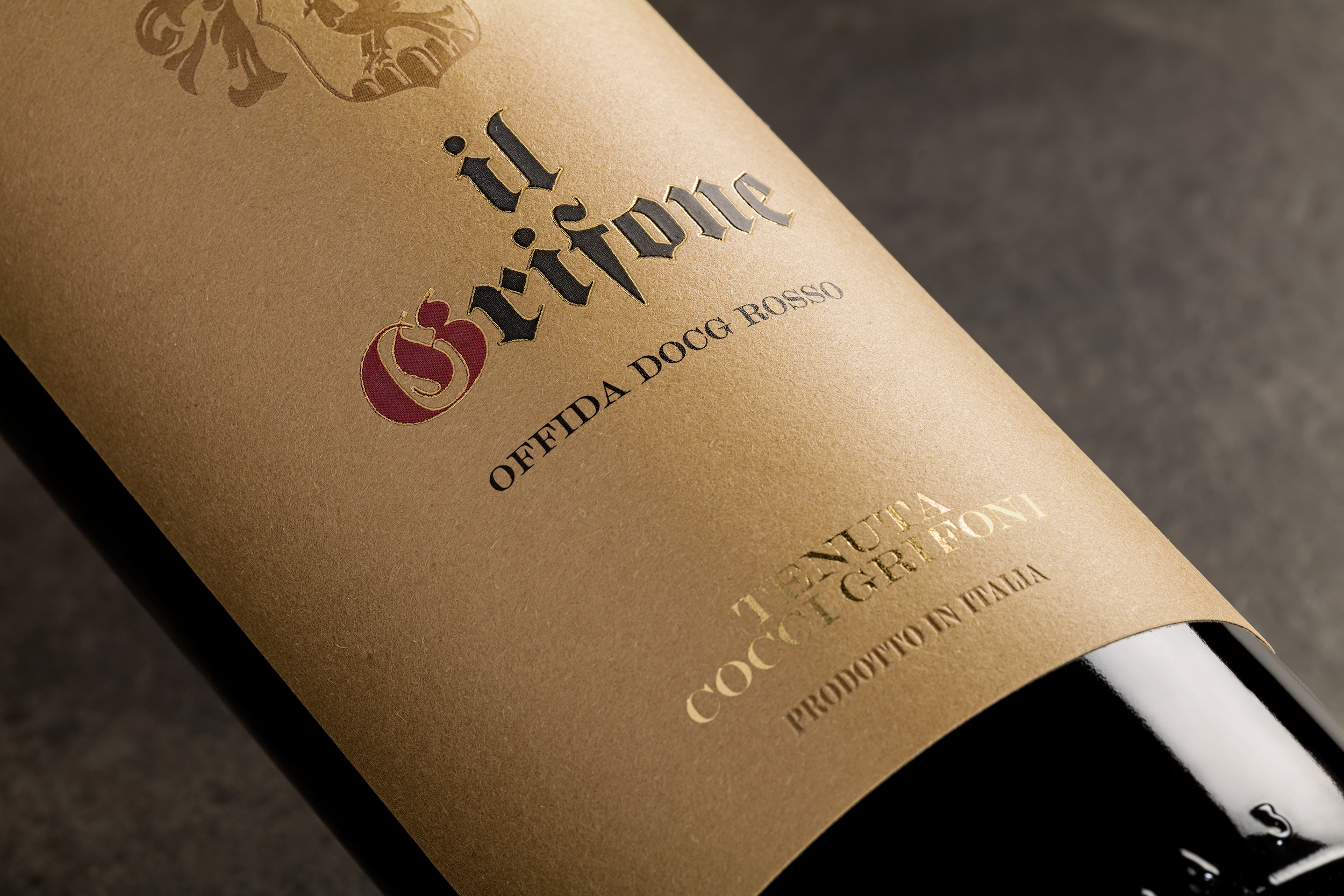
Manter Materica Kraft Ultra WS FSC™ paper — natural, dyed in the pulp and made from cotton and recycled fibers — recalls the clay tone of the original label, reinforcing the link to its origins.
The typography closely follows the original, with a minimal intervention on the naming, while the crest becomes the central element of the composition, embossed to achieve a more refined and contemporary effect.
A thin hot foil line highlights the name, while the logotype, also in foil, completes the system together with the “Product of Italy” statement, embossed like the crest.
RESULT
The result is a label that restores coherence between past and present, avoiding nostalgic reinterpretation.
Historical elements are preserved and reorganized into a more essential and legible system, capable of expressing both quality and recognition.
Il Grifone regains a stronger and more aligned identity, consistent with its evolution and current positioning.
 NEV
NEV Stefano Bracci
 Alina
Alina monther al omari
 Lizakjx
 JOAOMARCOSDESIGN
 alchimistestudioParis
 Harriet Neild
 octavio rojo
 宏洛图品牌设计HONGLT
 DESIGN CONCEPTS
 Alexander Skurihin
 Studio K95
 ARMBRAND
 Richa Rai
 houseoferas by Miti
 Agence des Coteaux
 Kushi Eaknath
 Ann Treasa
 Xiao Ning
 krrrrrllii
 babyage
 Deep
Deep