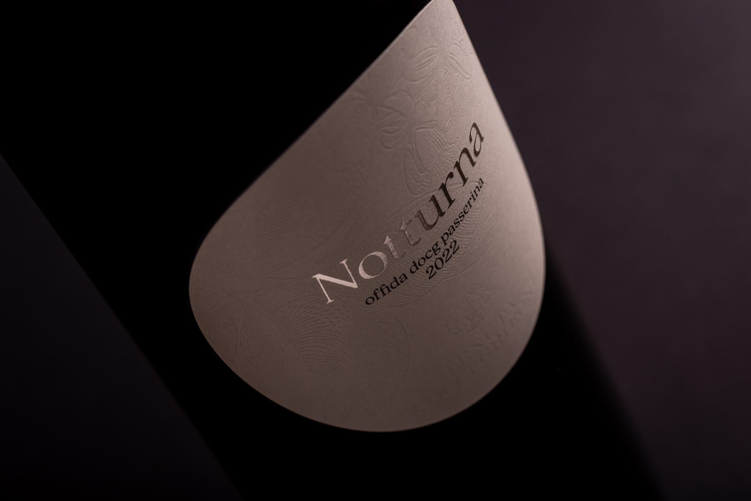

NOTTURNA
Not the usual Passerina
These were the words that guided the naming and packaging development for the new wine by Tenuta Cocci Grifoni.
The brief continued with a vivid image: Passerina is often perceived as Little Red Riding Hood, but in reality, she is a woman with a powerful voice.
From this evocative starting point, the project aims to overturn the conventional perception of the grape variety, restoring depth and character to its identity.
SOLUTION
Starting from a strongly narrative brief, the project focuses on building an identity aligned with the character of the wine.
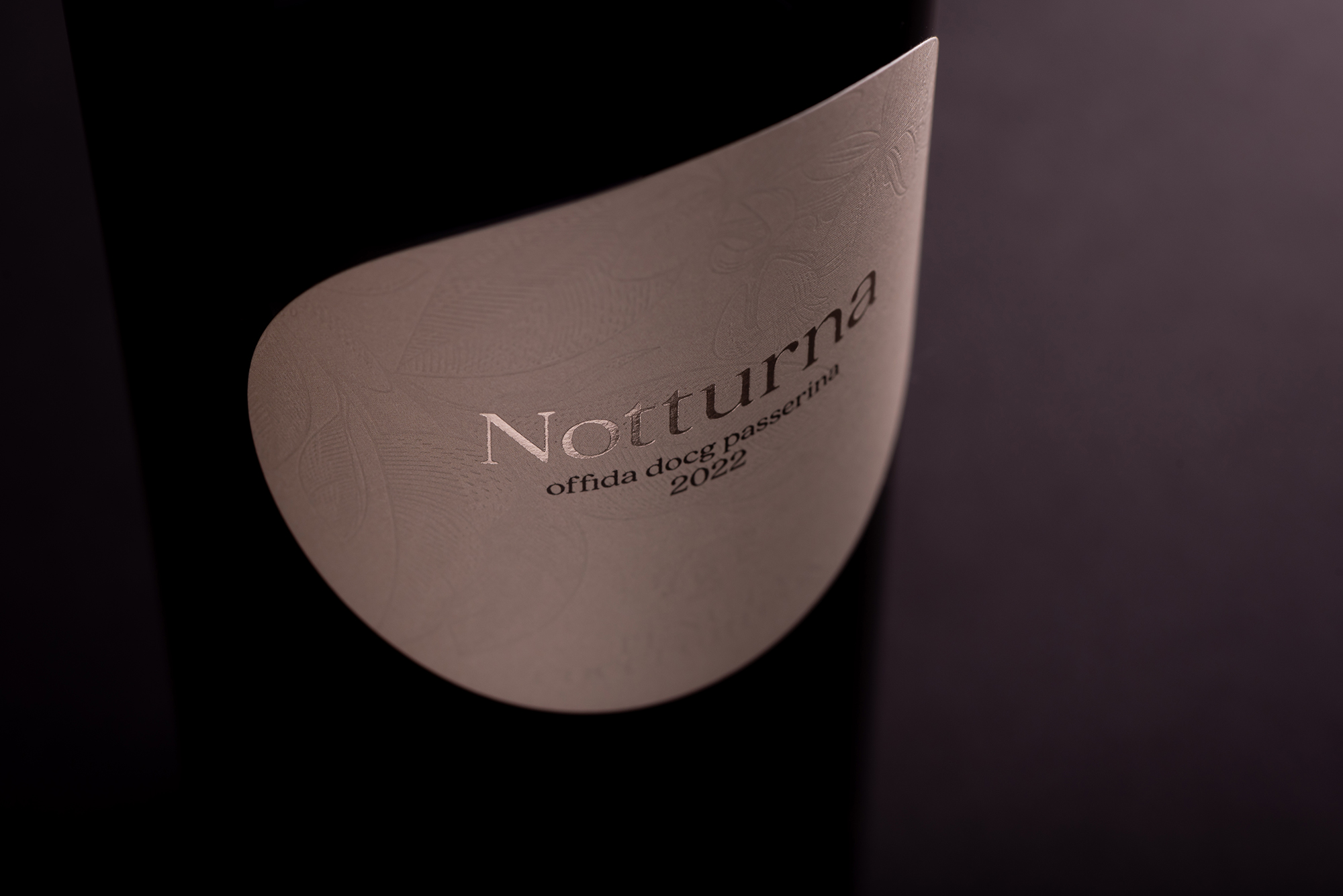
The name “Notturna” is inspired by the Moon, a symbolic reference to mystery and transformation, chosen to represent a Passerina freed from stereotypes.
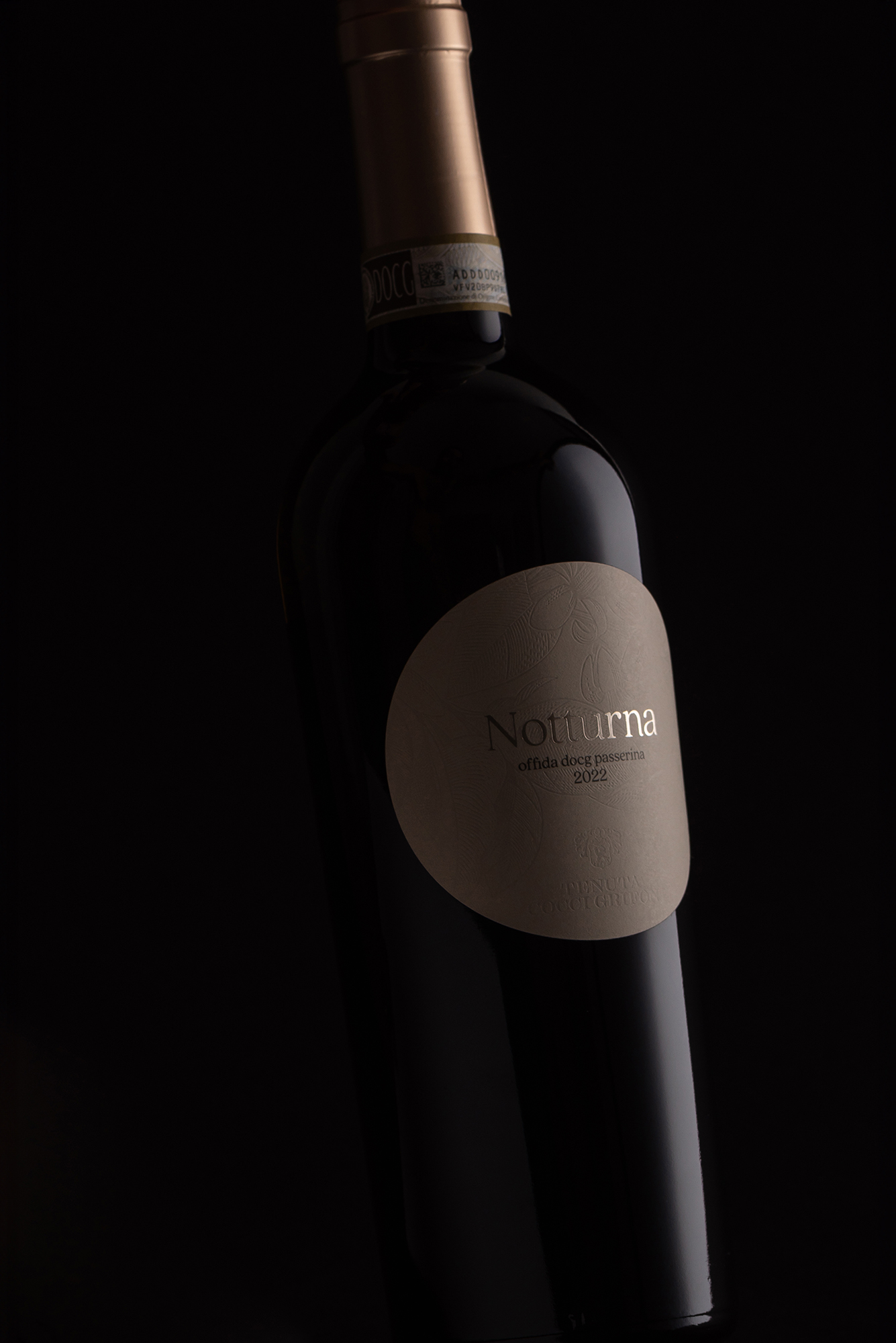
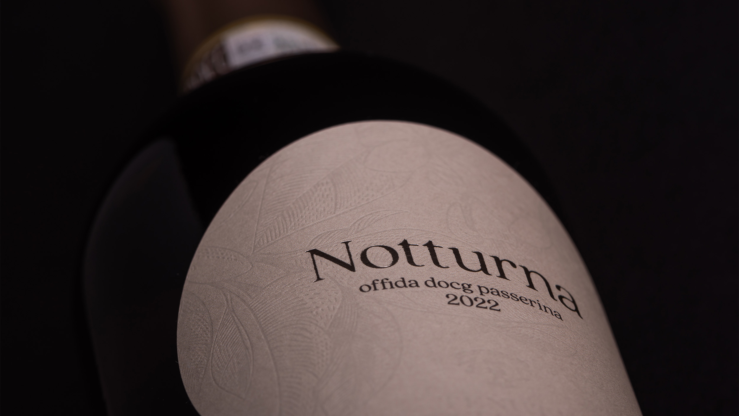
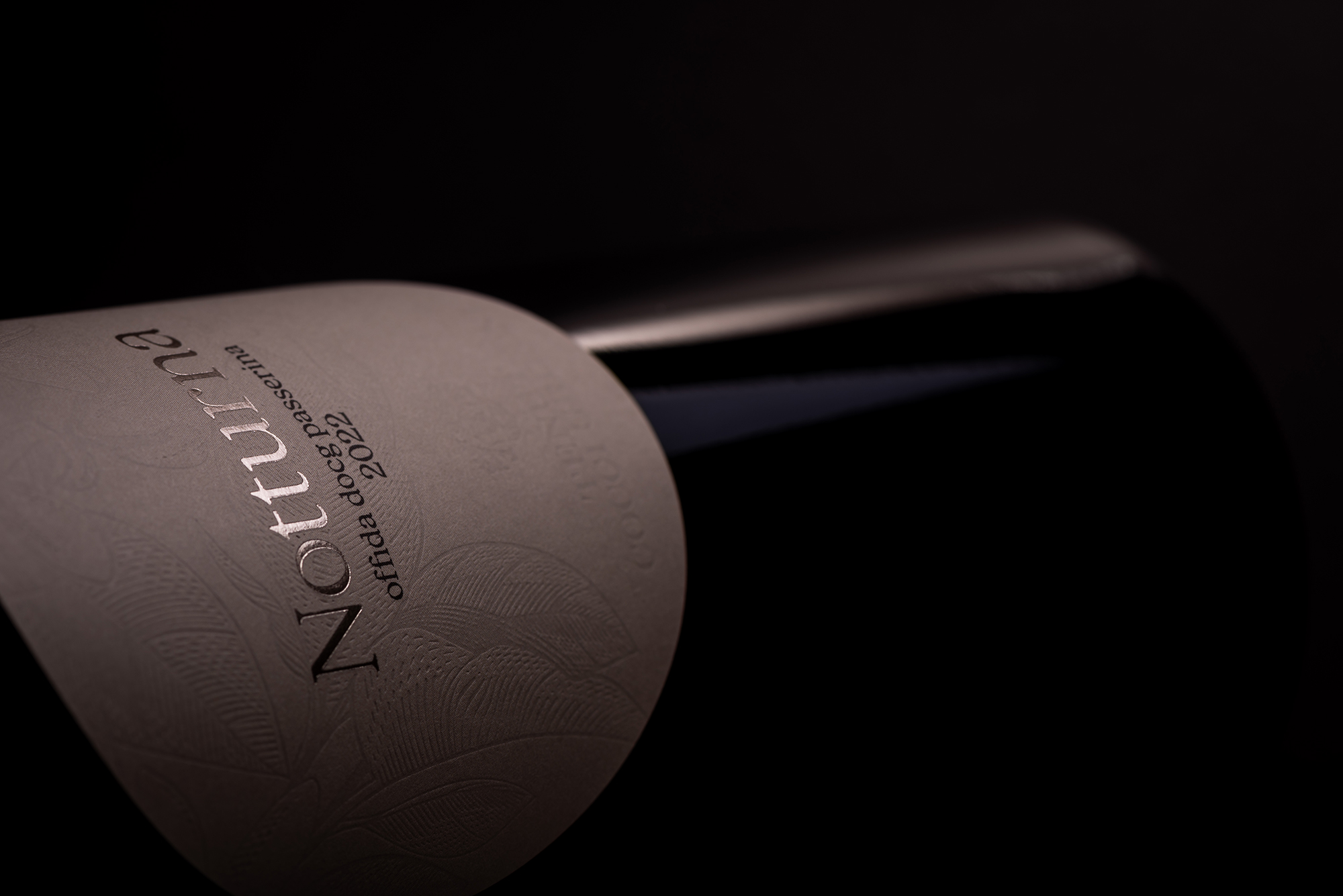
The packaging translates this concept into a soft, shaped label designed to stand out both visually and physically.
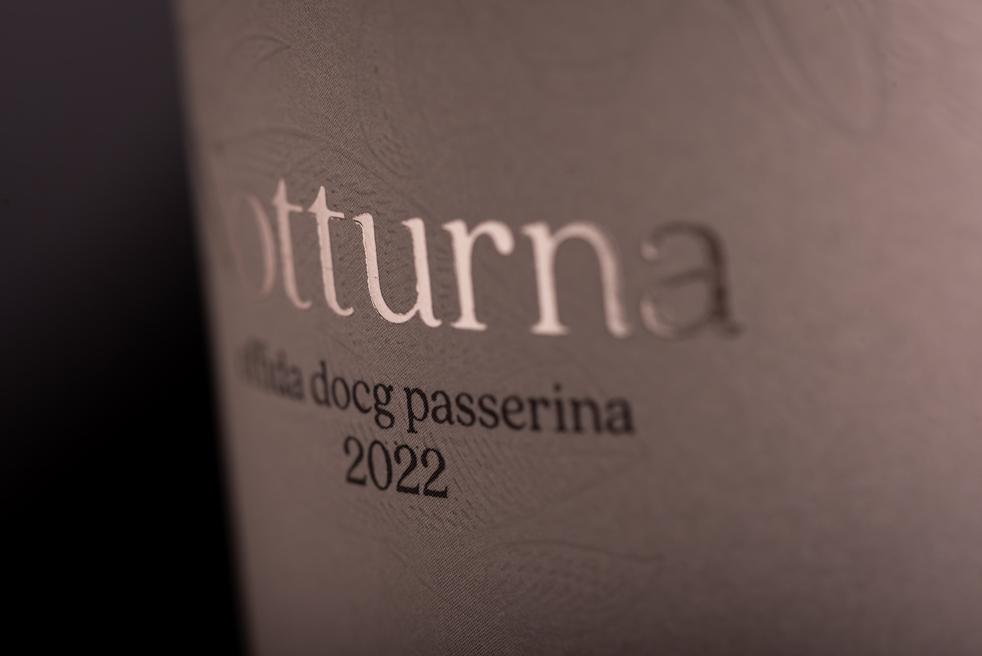
The label surface introduces a tactile dimension that recalls the wine’s citrus blossom notes, creating a direct connection between visual perception and tasting experience.
RESULT
The result is an identity that redefines the perception of Passerina through a more evocative and contemporary language.
Notturna builds a visual narrative that combines elegance, mystery, and recognizability, turning the wine into a storytelling object as much as an oenological one.

 monther al omari
 Ximena Ureta Design Studio.
 vitoramockup
 Up-Brands
 Sophiagdotcom
 Peter said
 ayeidadezigns
 Tancybox
 宏洛图品牌设计HONGLT
 Modern Theory
 Dozen Agency
 Atiq Alam
 Olio Studio
 Ruchi S. Joshi
 mmdesign
 awaiskhadim
 Octasoft
 United Creatives Studio
 Kingdom & Sparrow
 Anastasia Bakhmatskaya
 CreativeWise
 Great and Golden