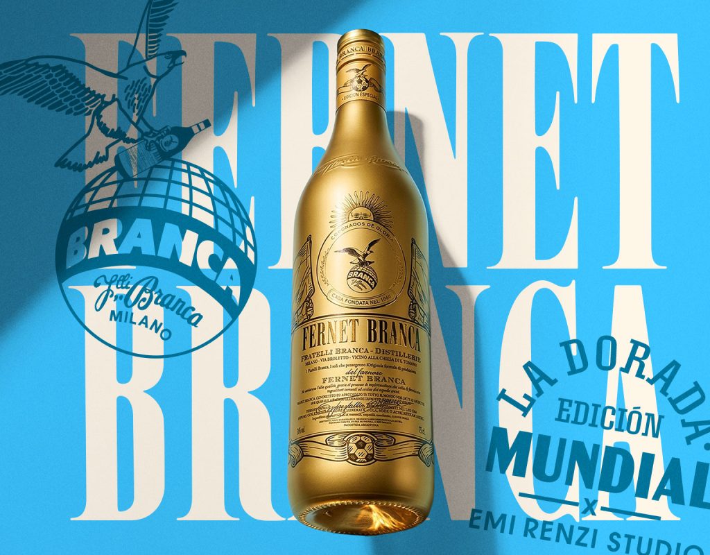

Fernet Branca – World Cup Limit Edition
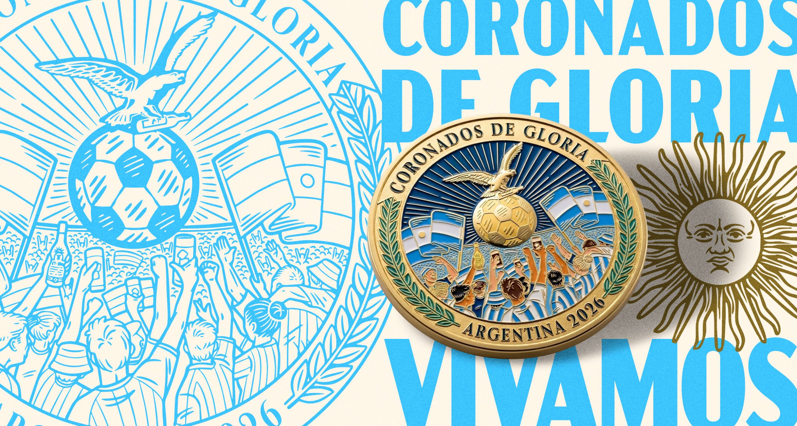
Design and illustration of the packaging and the limited edition collector coin.
World Cup season is approaching once again, and we’re right in the thick of it 🏆
I’m thrilled to present the first part of this beautiful project: the “World Cup Edition” for Fernet Branca.
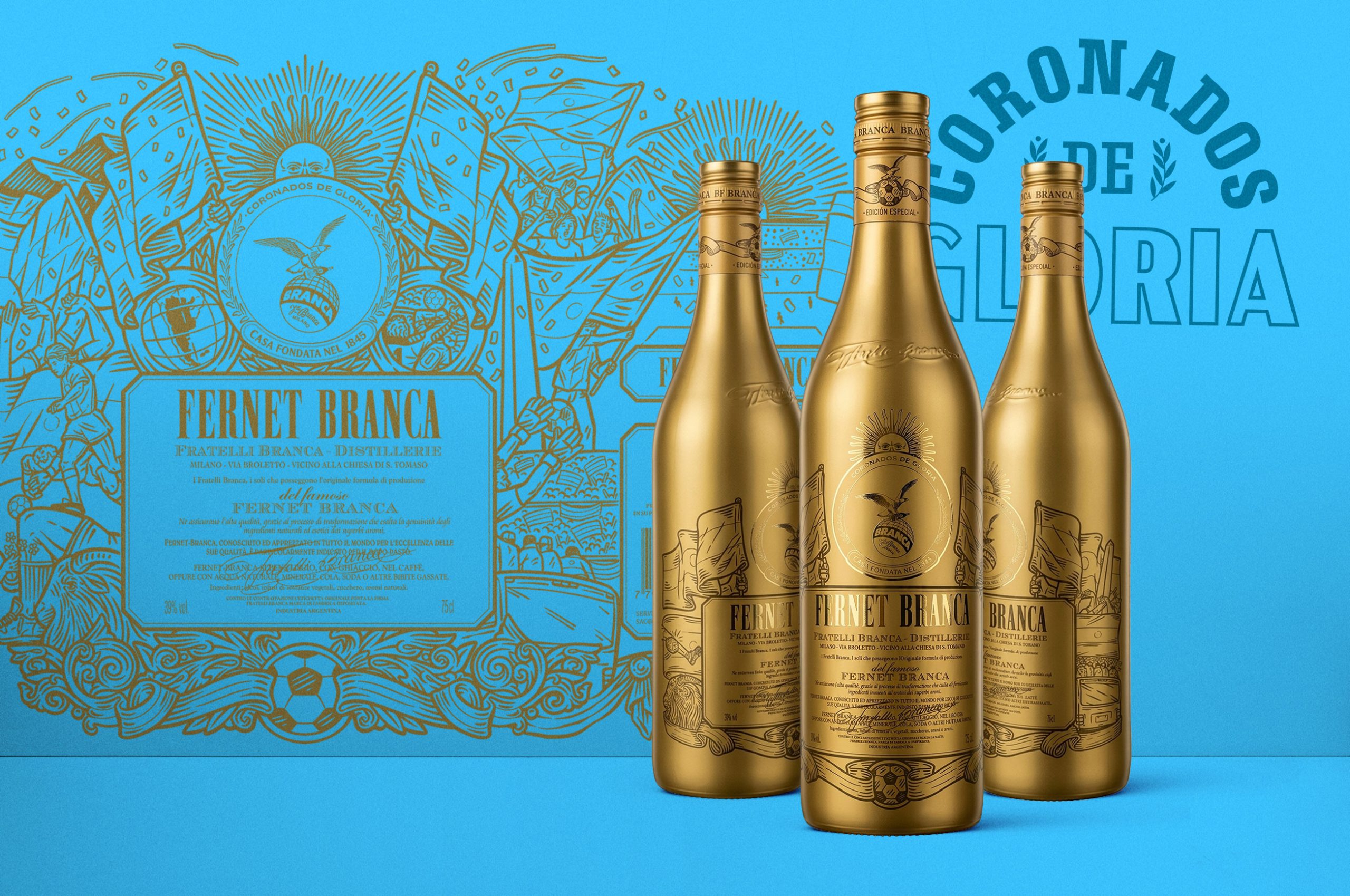
With its long history and immense popularity in Argentina, Fernet Branca is the go-to drink for asados, social gatherings, and, above all, the previa before a football match. Embracing this spirit, the brand decided to create a limited edition called “La Dorada” (The Golden One)—a tribute to the World Cup trophy.
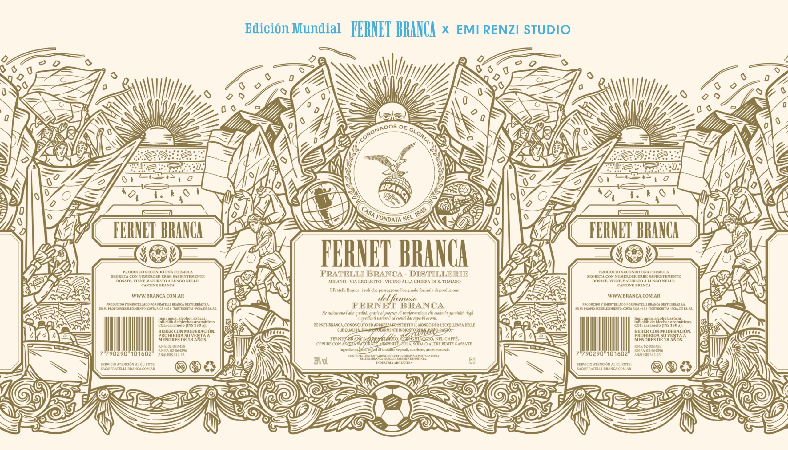
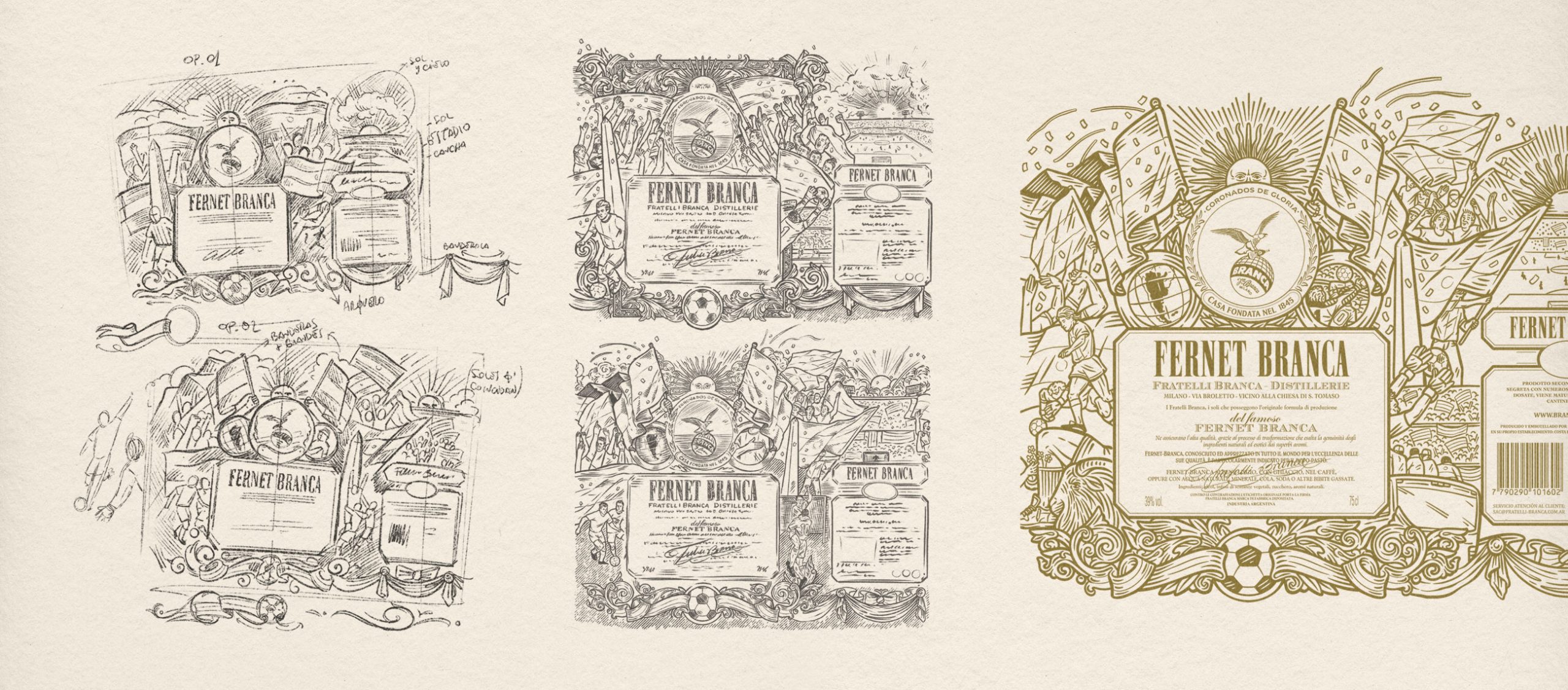
The illustration and design capture the raw fervor of Argentine fans: the five million people at the Obelisco, the players’ parade bus, Dibu’s life-saving stop, the G.O.A.T. of world football (no introduction needed), and the banners that fly at every stadium and celebration. All of this, crowned by the Argentine Sol de Mayo, wraps the new limited edition bottle. The design is executed almost entirely in silkscreen ink, featuring the sun, the eagle emblem, and the logo in gold foil stamping to ensure they truly stand out.
Curator’s Insight:
What distinguishes this project beyond its obvious cultural occasion is how Renzi treats the bottle as a panoramic canvas rather than a label surface. The full-wrap illustration has no front or back in the traditional packaging sense: every axis of the bottle rewards rotation, functioning more like a collectible object than a retail vessel. This approach subverts the conventional hierarchy of packaging design, where the primary face dominates and the reverse panel serves disclosure copy.
The decision to render the crowd scenes, flags, and figures in a single-weight engraving line also deserves attention. By keeping tonal variation out of the illustration entirely, the design achieves a visual consistency that holds across both the raw cream substrate of the label flat and the gold metallised bottle in the finished product. The foil-stamped elements, by contrast, introduce the only material differentiation, quietly reinforcing which icons belong to Branca’s permanent identity and which belong to this moment.


 monther al omari
 Shustova p
 mutta
mutta @Allenarts13
 Sirka Agency
 Atiq Alam
 Dozen Agency
 j.substance
 SCD
SCD Cristian Lepore | crilep Copia
 Chris Creative Works
 Aligned Design Co.
 CreativeWise
 Agence des Coteaux
 Ramyromeo2024
 Grain of Design ®
 Ebbi
Ebbi BFS Studio
 butterflyhunters
 Asprey Creative
 About House of Ta
 Up-Brands
 KJS CRAFT
 hello ocean
 PG Branding