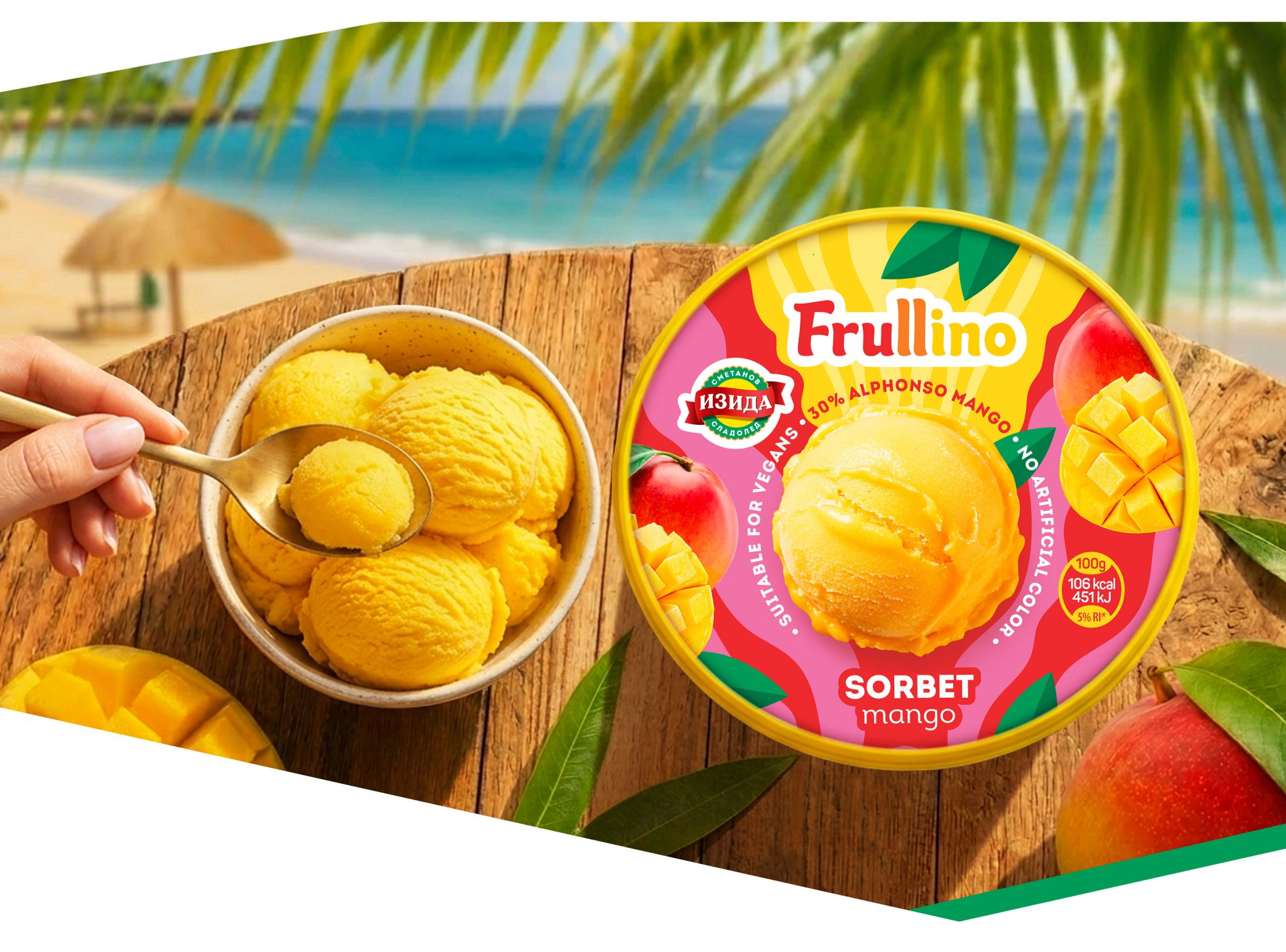

Our client, Izida, approached us with an exciting redesign project for their already established “Frulino” ice cream bar product line. The reason behind the redesign was that the visual language and overall design of the line had become outdated and no longer met modern expectations for shelf impact and consumer perception.
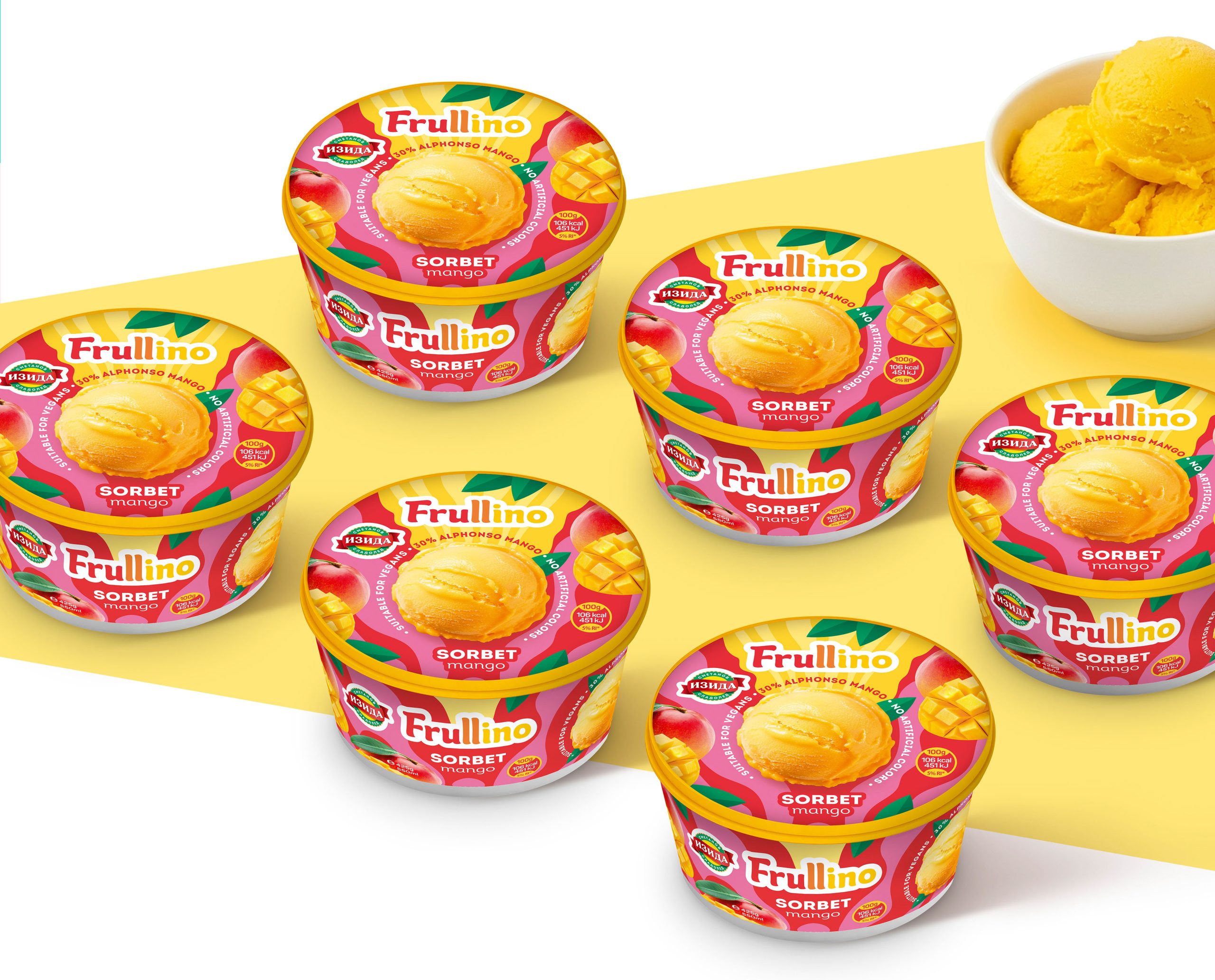
The main task of Modern World Studio was to develop a new visual architecture for the sorbet ice cream box line that would modernize the overall appearance of the product while preserving the recognizable spirit and character of the brand, without breaking the connection with the existing product range.
The project required achieving a careful balance between:
brand evolution while maintaining recognizability;a more contemporary and premium visual language;clear product differentiation;strong shelf presence;
and creating a more appetizing and emotionally engaging communication with the end consumer.
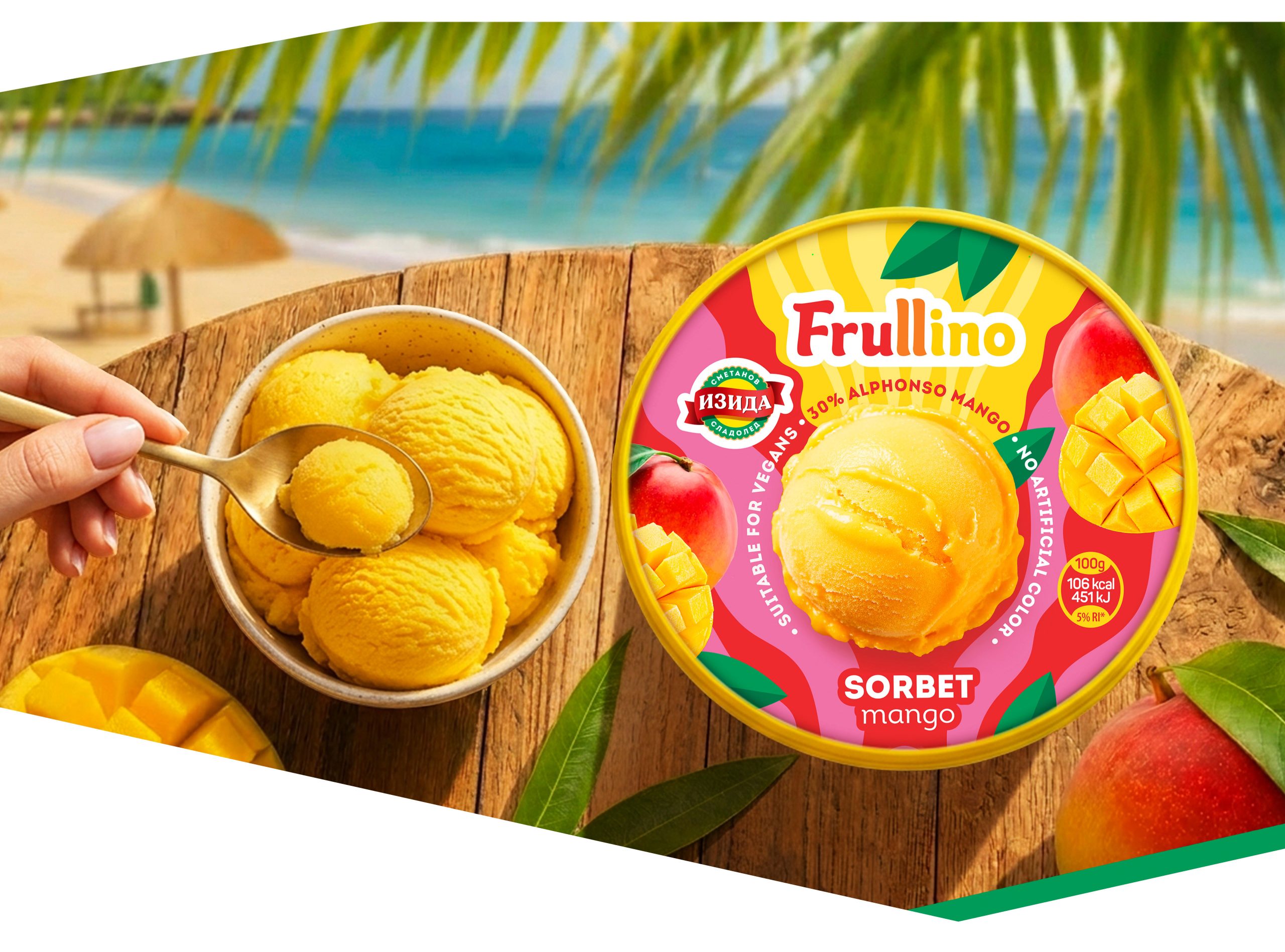
The sorbet ice cream packaging is characterized by a fresher, lighter, and fruit-forward appearance, with a strong emphasis on fruits, a vibrant color palette, and a sense of freshness and natural ingredients. Unlike classic dairy ice creams, the communication in sorbet packaging design focuses more on lightness, freshness, and a fruity experience, expressed through a cleaner and more airy visual language.
 NEV
NEV Stefano Bracci
 Alina
Alina monther al omari
 Lizakjx
 JOAOMARCOSDESIGN
 alchimistestudioParis
 Harriet Neild
 octavio rojo
 宏洛图品牌设计HONGLT
 DESIGN CONCEPTS
 Alexander Skurihin
 Studio K95
 ARMBRAND
 Richa Rai
 houseoferas by Miti
 Agence des Coteaux
 Kushi Eaknath
 Ann Treasa
 Xiao Ning
 krrrrrllii
 babyage
 Deep
Deep