
Most consumers don’t associate fresh produce with a specific brand. Tomatoes are just tomatoes. Apples are just apples. On the shelf, these products are usually distinguished only by price, variety, and origin — assuming anyone even stops to read the label. Mushrooms are no different.
Today, our client Korona Gomba is Hungary’s most recognisable private-label mushroom retailer. This achievement was made possible through clever branding and packaging design that sets the brand apart from a sea of generic, unnoticeable mushroom trays in the supermarket.
At Modern World Studio, we took on the challenge of breaking away from uniform, uninspired design solutions. Our goal was to create an attractive visual identity that elevates both the brand and the product, all while remaining commercially viable.
Picture this:
After a long day at work, you walk into the supermarket with a clear goal in mind: grab ingredients for dinner. You head over to the produce section where the mushrooms are… aaand the problems begin right there: Different varieties from multiple producers are stacked five columns wide and five rows deep. Before you is an endless, blurry, beige-and-brown sea of plastic trays.
Somewhere in that pile are the exact porcini mushrooms that, just two weeks ago, turned your kids from mushroom-haters into their biggest fans. You’re drained and just want to get home and cook, but you can’t leave without those exact mushrooms. So, you start reading label after label, printed in ultra-tiny font.
If only there was a way to spot your favourite product within five seconds of reaching the produce aisle…
Our client Korona knows its consumers inside out and understands they don’t want to be the main characters in this scenario. This is why the brand offers curated mushroom mixes—different varieties or combinations with other vegetables like carrots—pre-packed in the precise quantities needed for a single dinner. This saves the consumer from wasting time calculating and weighing produce.
At the core of Korona’s mission is a simple idea: making healthy food accessible and convenient for young and middle-aged adults. These are people balancing work and family life who refuse to compromise on the quality and freshness of the food they eat.
When it comes to making a quick choice in the aisle, packaging is the ultimate deciding factor. That is why we at Modern World Studio created a design that intuitively guides the consumer to the product, highlighting the brand in an appealing, memorable way.
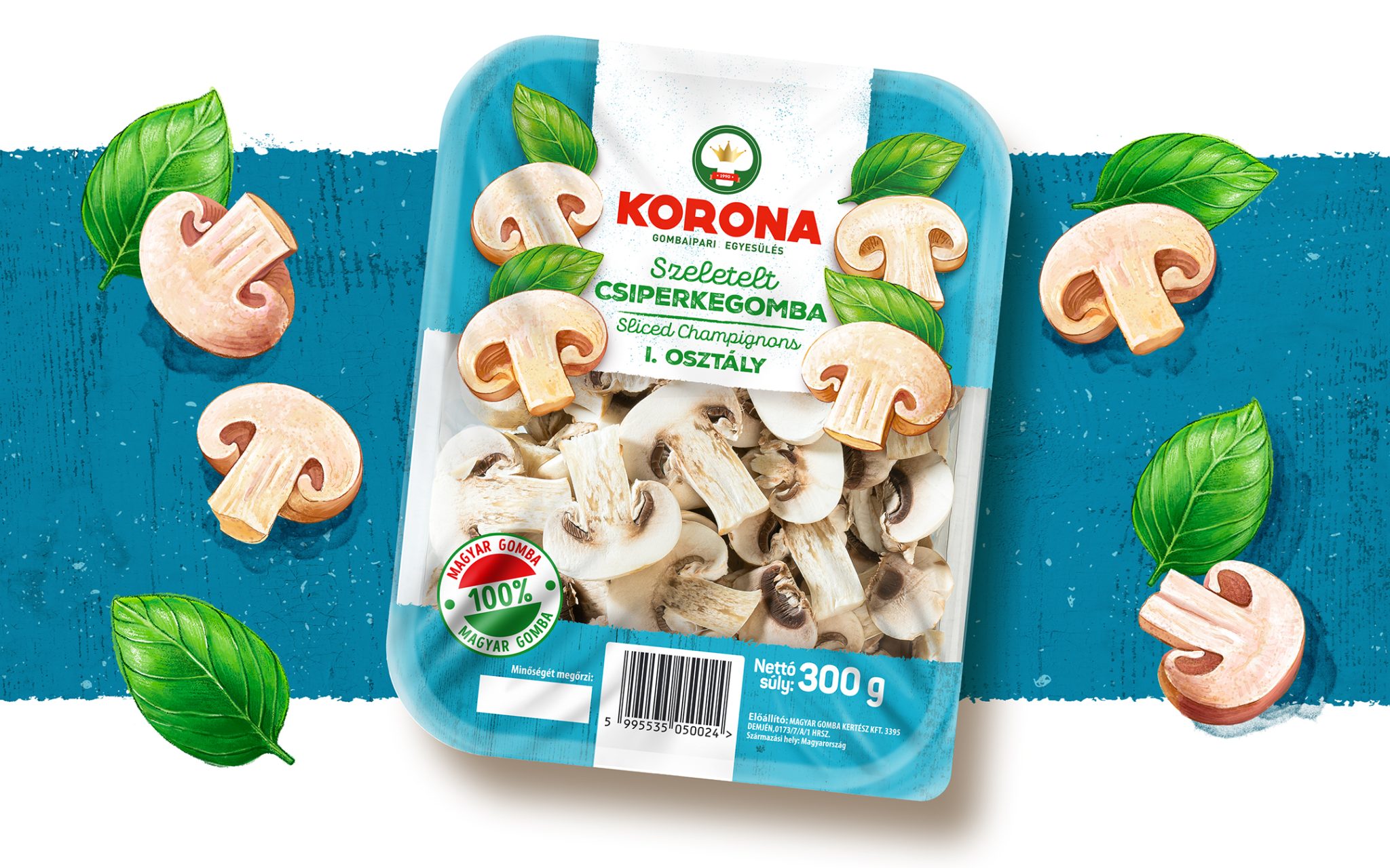
The product is packaged in a standard tray with a label featuring the brand name alongside essential details like variety, origin, and weight. While this information is crucial for the consumer, the large label size ends up covering a significant portion of the tray’s contents. This creates a challenge—especially for the curated mushroom and vegetable mixes, where the vibrant ingredients often end up hidden from view behind the label.
To tackle this, we developed a series of custom illustrations that seamlessly complement the visible fresh produce, guiding the user quickly and intuitively. Rather than relying solely on product photography or generic visuals, we established a distinctive illustrative style with a recognisable character. This gives each package its own unique identity and makes the product pop from a distance.
Typography & layout:
Our typographic approach plays a key role in the design. We selected a bold, clean, and well-structured typeface capable of communicating essential information instantly—even in the hectic, fast-paced environment of a supermarket. Instead of forcing customers to squint at tiny text, the packaging layout is organized so the most vital data is absorbed at a glance. Centered key elements naturally anchor the eye, turning a potentially frustrating choice into an effortless, five-second decision.
Color coding:
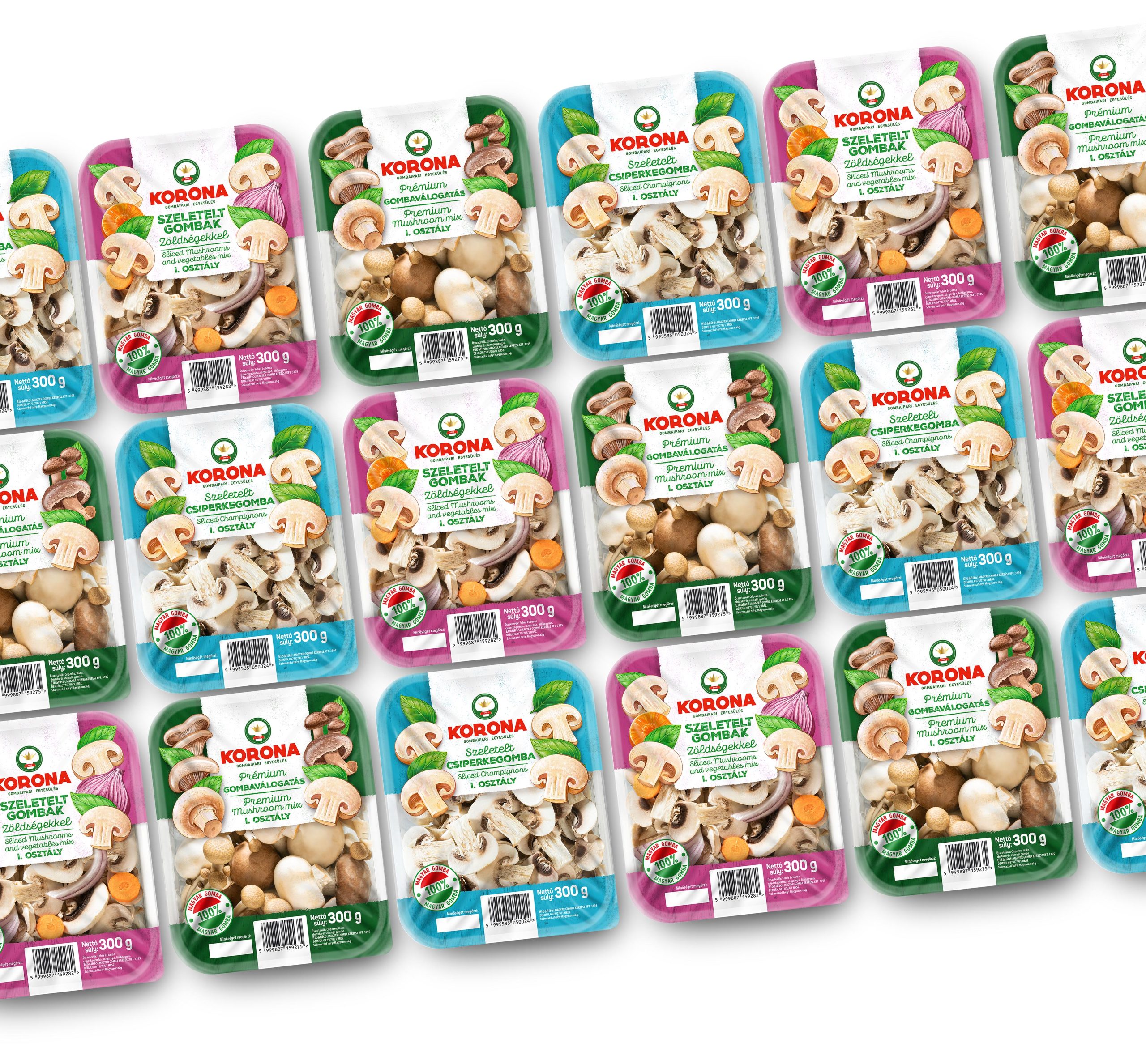
Additionally, each distinct mix was assigned its own signature color code. This allows returning customers to spot and grab their favorite product without needing to read a single line of text.
The impact:
This design does much more than just make the packaging look beautiful—it solves a real, everyday user problem. In a category where most products blend into a blurry background, Korona successfully establishes a highly recognizable retail presence. We transformed a generic mushroom tray into a memorable brand that consumers easily identify, trust, and seek out again and again.
 Derrick Lin
 Biaa
Biaa Petitmoulin Studio
 White Bear Studio
 Eva Chistyakova
 monther al omari
 Atipus
 alchimistestudioParis
 oneandother
 bloomburo
 helocrene
 Shapers Studio
 Denver Design
 Aidearte
 andrew.huerta
 softmachine
 airobtq
 Buzz & Co.
 Ruby
Ruby themythographer
 IDNB Inc.
 viktorflr
 Zenpack