

KRWN
KRWN is a premium pet supplement brand formulated from natural, enriched sources, designed to support the health and well being of pets.
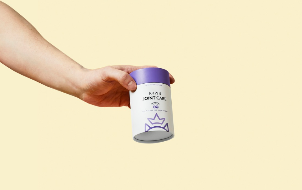
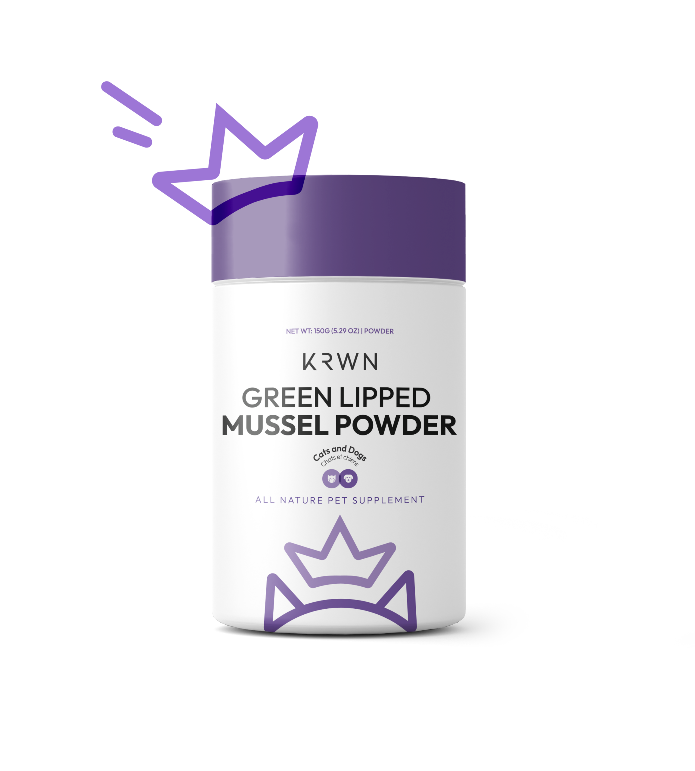
The core concept was to establish a “pharmaceutical” aesthetic. While the pet supplement market is heavily saturated with packaging that feels overly playful, loud, and cluttered with imagery, KRWN was positioned to feel clinical, trustworthy, and distinctly high end.
To solve the issue of blending in with “fun” competitor brands, the design strips away heavy imagery in favor of a minimalist approach. The solution relies on clean lines and a highly legible layout, utilizing the brand logo as the core distinctive element to anchor the identity.
The packaging utilizes a strategic “dual face” layout:
The Front Face: Dedicated entirely to clean, immediate product distinction and brand recognition.
The Back Face: Designed with a strong UX research approach to handle dense information. It seamlessly integrates bilingual text and a space-efficient dosage table that prioritizes readability and clear hierarchy.
What is unique about your packaging design? The uniqueness lies in its stark contrast to industry norms. By applying UX principles to physical packaging and choosing a clinical, refined visual language, the design elevates a standard pet product into a premium, editorial space.
The product line was met with a highly positive reaction from customers. Because the clean design offered such a refreshing contrast to what consumers usually encounter in the pet care aisle, the packaging itself became a talking point and a highly shareable asset organically featured across social media.


 Natasha Spitsyna
 babyage
 GruppoSaida
 ahmedraoudgfx
 Hi estudio
 Nadezhda Gorelikova
 Studio Garces
 Brandsbylufo
 Rewot
Rewot alchimistestudioParis
 Asprey Creative
 kat bres
 Valérie Colace
 Atiq Alam
 Sara Communications
 David Hakobyan
 monther al omari
 Innovāt - Empowering Creative Innovation
 mmdesign
 Amjad Battal
 Hollóka Grafikai Műhely / Graphic Design Studio
 Palashcc
 ABC Design Communication
 ChrisSkarlatos
 Hedayat Hadavi
 Tia Nguyen