

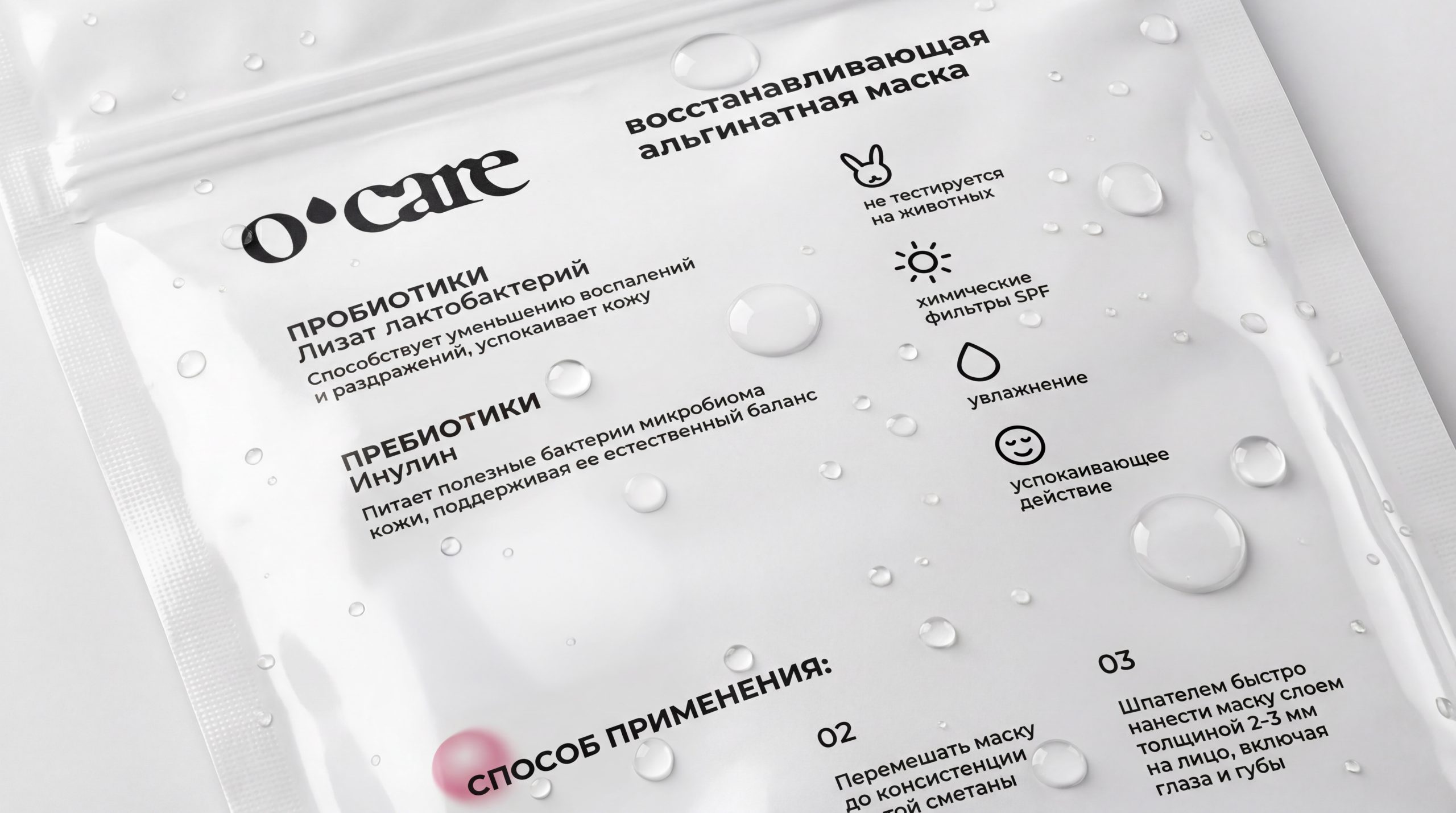
O’CARE is a brand that makes skincare simple, logical, and thoughtfully designed. The packaging redesign was built around a new product line structure. We reorganized the assortment, removed some products, and combined others to create a clearer and more intuitive system. As a result, customers can now understand more easily which products belong to which line and how to navigate the range.
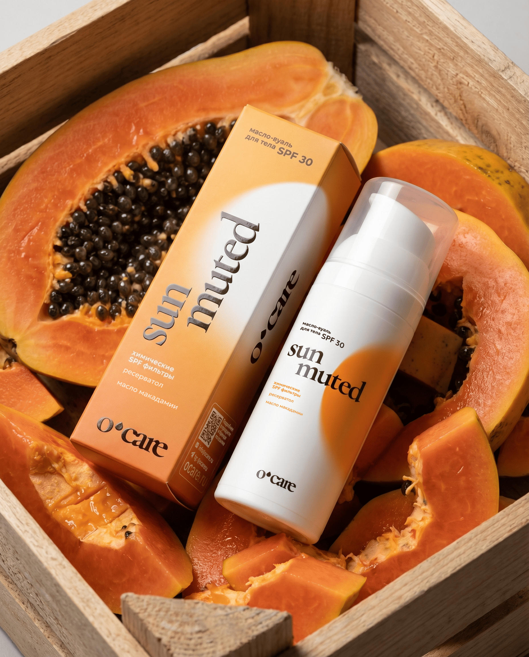
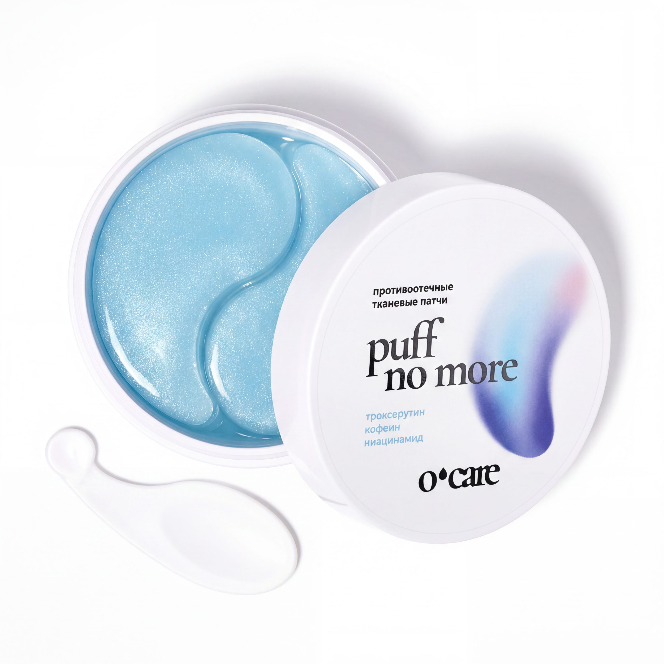
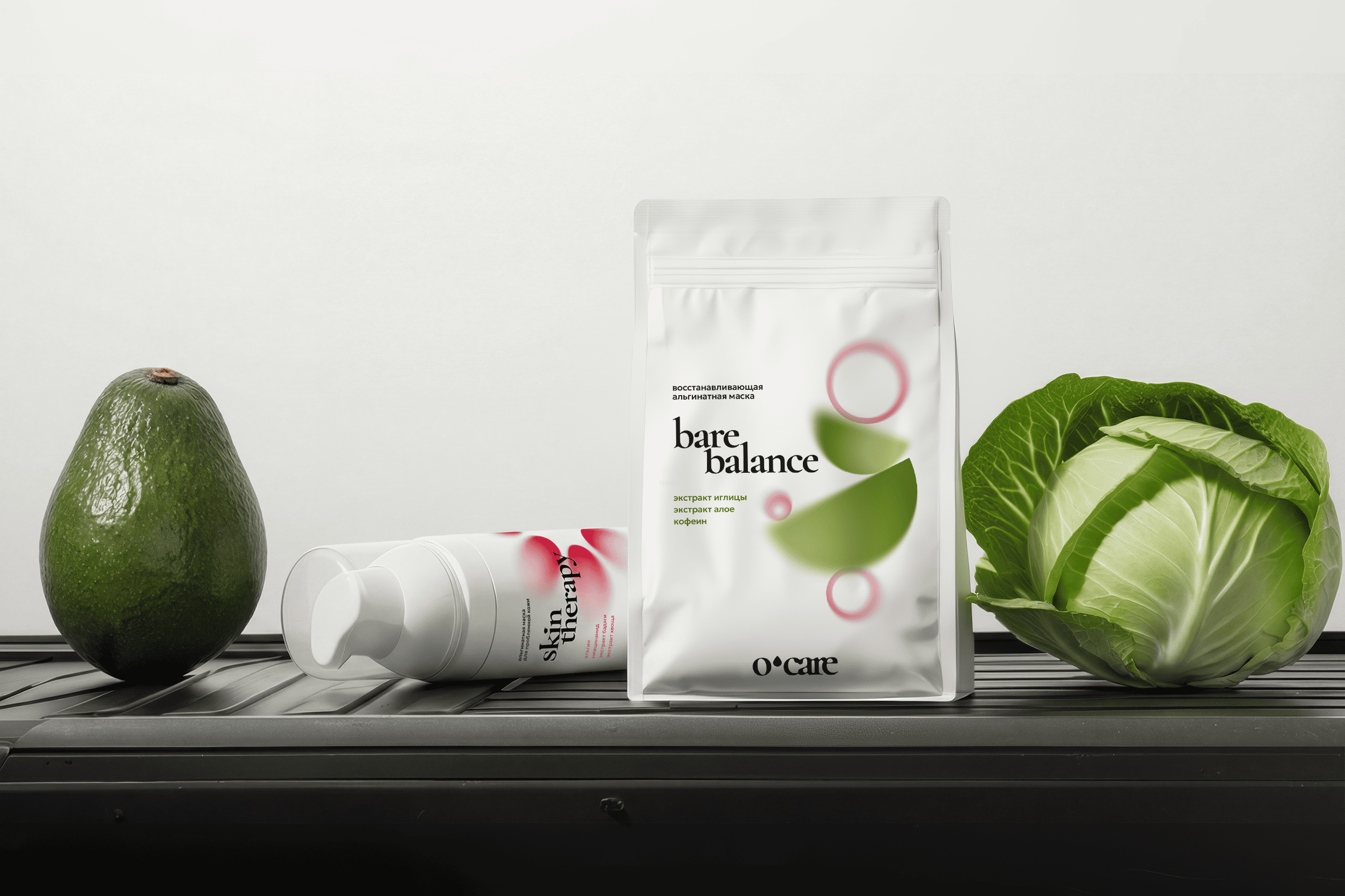
Each product line received its own color palette, giving every category a distinct visual identity. At the same time, the overall brand impression remains consistent through the shared white background and bright accent elements across the packaging.
The white base also creates continuity with the previous O’CARE packaging, which was already associated with a clean white layout and vivid color accents. We preserved this recognizable shelf code, but updated it with a more modern, expressive, and structured visual language.
The result is a unified yet flexible packaging system that supports the brand’s new Smart Skincare System positioning and makes product selection clearer for customers.


 butterflyhunters
 monther al omari
 Asprey Creative
 About House of Ta
 Up-Brands
 KJS CRAFT
 hello ocean
 PG Branding
 CF Napa Brand Design
 booouuuche
 Hyejung Choi
 Abbydraw Designs Unique Conceptual Branding & Packaging Designing Ideas
 Hollóka Grafikai Műhely / Graphic Design Studio
 Minim Brand Design
 saerom81
 YNL
YNL bilel tkouri
 vitoramockup
 Lampra
 Sanavala
 www.branding.uz
 alchimistestudioParis
 Estudio Argo
 Modern Theory