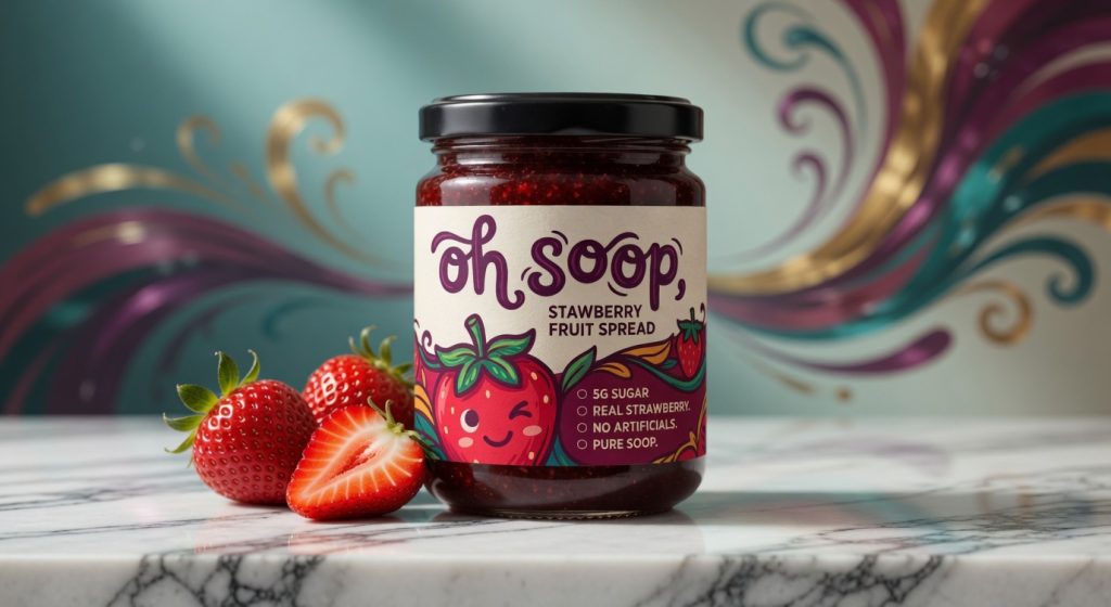

Oh Soop Strawberry Fruit Spread Brand Identity & Premium Packaging Design
Client: Oh Soop
Scope: Brand Strategy | Visual Identity | Packaging Design | Product Storytelling
Executive Summary
Oh Soop Strawberry Fruit Spread is a premium, low-sugar fruit spread crafted with real strawberries, delivering authentic fruit-forward flavor without compromise. The brand stands for joyful indulgence, natural goodness, and thoughtful simplicity — offering a wholesome alternative to traditional jams loaded with sugar and artificial additives.
The objective of this project was to develop a distinctive brand identity and packaging system that captures the product’s playful personality, premium quality, and clean credentials while creating strong shelf appeal and emotional connection with health-conscious consumers who value real ingredients and delightful experiences.
Project Brief & Strategic Challenge
In a crowded category dominated by mass-market jams and artisanal preserves, even superior products can struggle to stand out if their packaging fails to communicate both premium quality and approachable joy. While Oh Soop’s formulation excels with 5g sugar, real strawberries, and zero artificial ingredients, the visual presentation needed to elevate it from a basic pantry staple to a desirable, feel-good everyday indulgence worthy of premium retail placement and repeat purchase.
The core challenge was to design a visual identity that balances fun, friendly appeal with sophisticated craftsmanship — ensuring the product feels both playful and trustworthy on shelves alongside high-end food brands.
Core Strategic Insight
Today’s conscious consumers are not just buying spreads, they are choosing moments of simple joy and better-for-you ingredients. They seek brands that deliver genuine taste, transparency, and a touch of delight without sacrificing quality or health. Oh Soop speaks directly to this mindset by turning everyday breakfasts, snacks, and recipes into something uplifting and nourishing.
Research & Strategic Foundation
The design process was guided by in-depth analysis including:
- Trends in premium fruit preserves, clean-label foods, and playful gourmet packaging
- Competitor benchmarking across supermarket, specialty, and health-focused brands
- Consumer insights for families, young professionals, and health-aware buyers who prioritize real fruit and lower sugar
- Requirements for strong visual impact in both physical retail and e-commerce environments
This research reinforced the need for a warm, approachable identity that highlights natural ingredients while using illustration and color to create instant joy and memorability.
Brand Identity Development
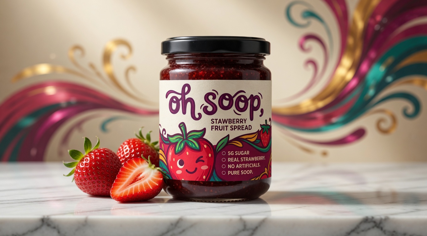
We created a cohesive, vibrant visual language built on three core pillars: Playful Authenticity · Natural Vibrancy · Premium Simplicity.
Key Identity Components:
- Signature playful yet refined typography with a custom wordmark for “oh soop”
- Cheerful, character-driven strawberry illustration that feels friendly and premium
- Rich color palette featuring deep berry reds, warm creams, vibrant greens, and accent purples
- Clean, modern layout with excellent hierarchy that prominently features product benefits
- Comprehensive brand guidelines for consistent application across packaging, digital, and future product extensions
The identity successfully marries whimsy with professionalism. The winking strawberry mascot adds personality while the overall design feels elevated and trustworthy.
Packaging Design & Structural Excellence
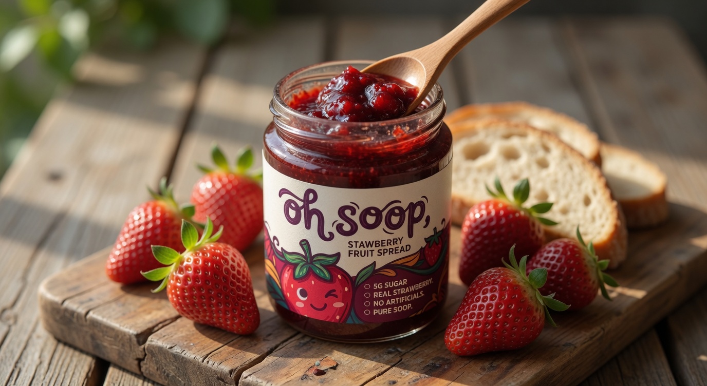
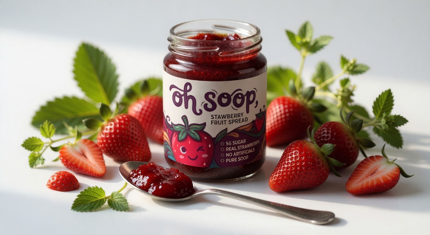
The primary packaging (glass jar with black lid) was optimized for both function and visual storytelling. Key features include:
- High-quality label with premium matte and selective gloss finishes for tactile appeal
- Bold yet balanced composition that showcases the product color through the glass
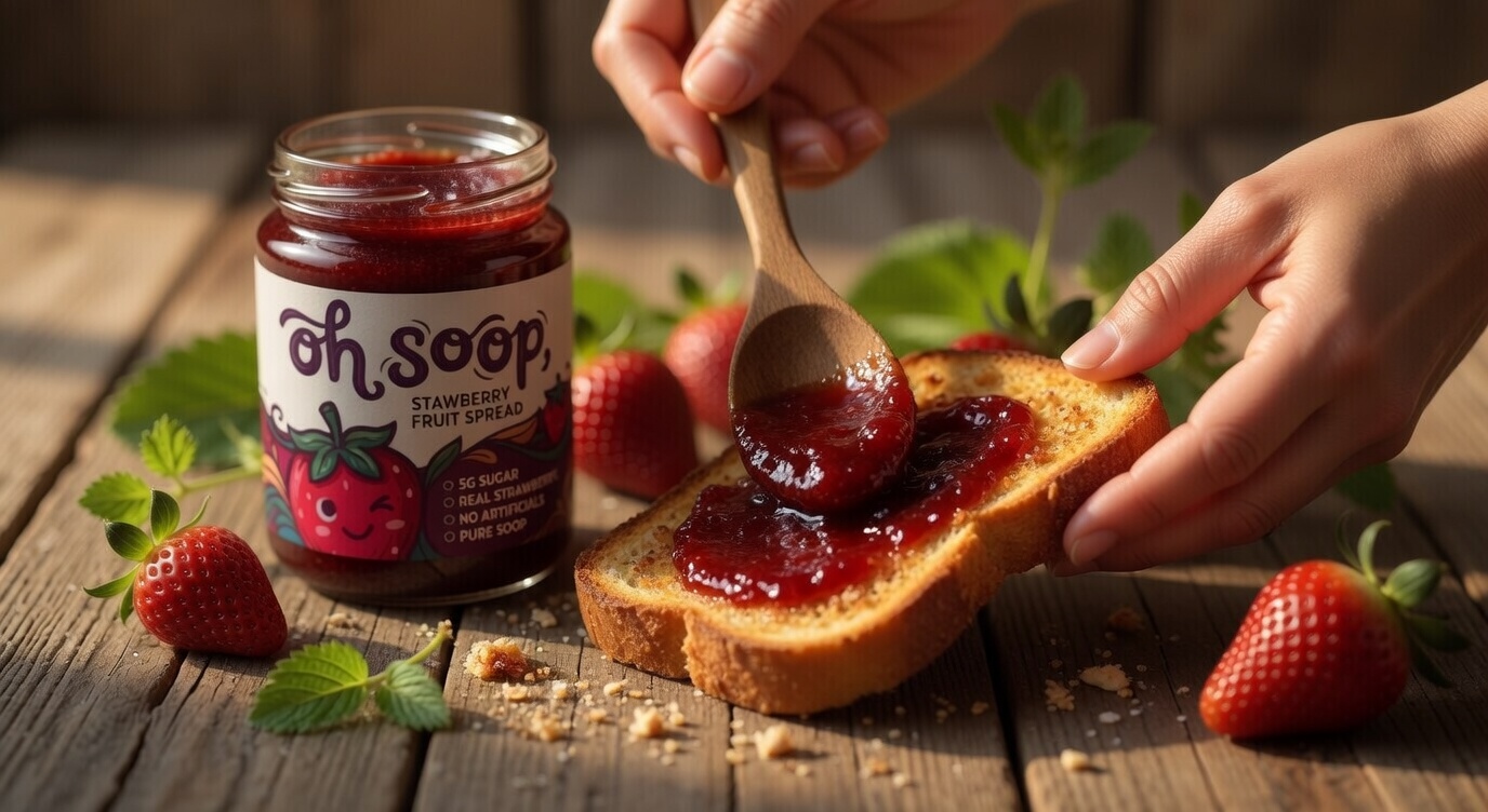
- Prominent benefit callouts (5g Sugar • Real Strawberry • No Artificials • Pure Soop)
- Eye-catching illustration that creates emotional connection at first glance
- Clear, appetizing product photography cues and strong shelf presence
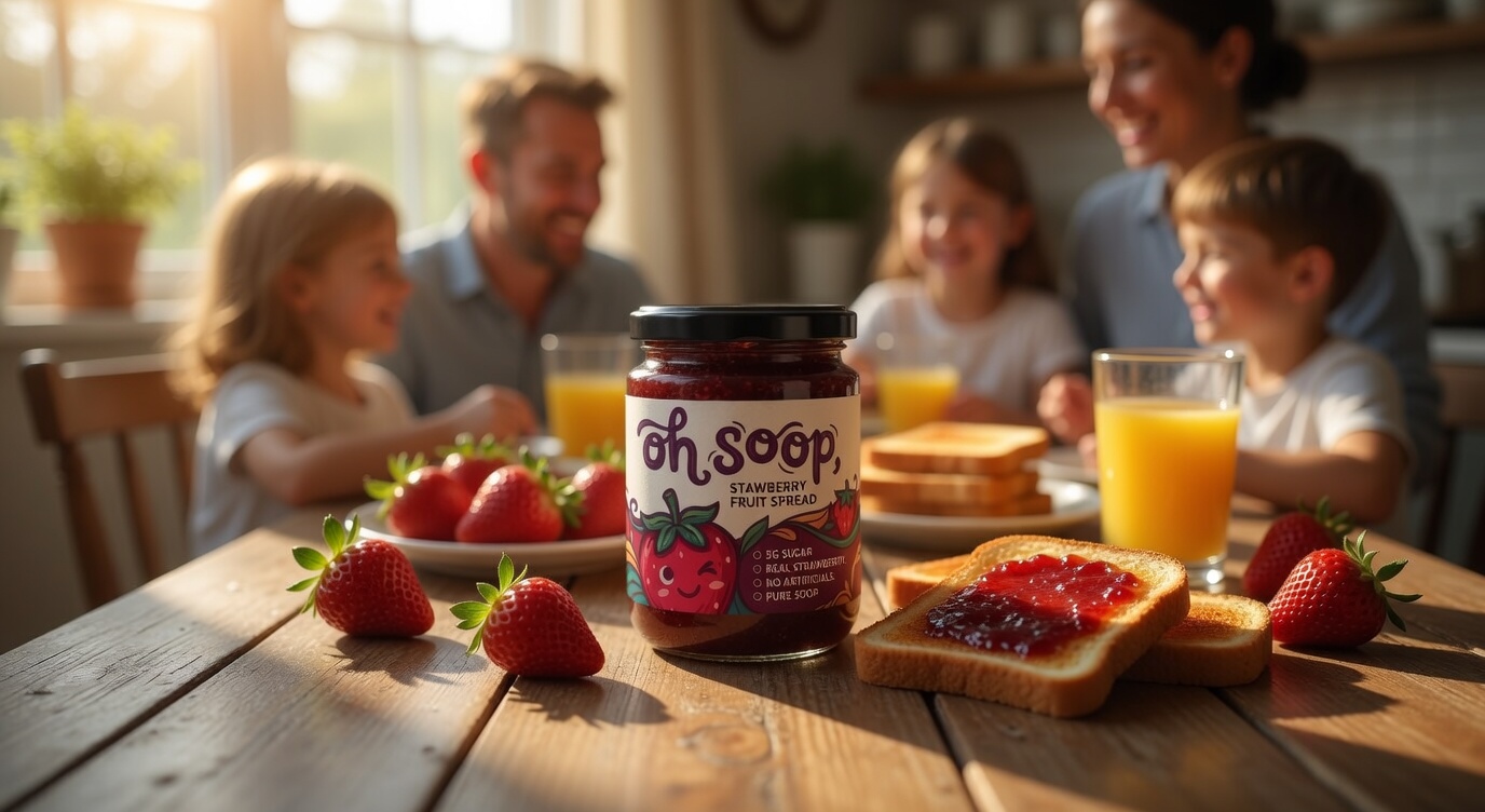
The design ensures the jar looks inviting in a pantry, on a breakfast table, or on retail shelves.
Ready to Elevate Your Food Brand?
Your product already has the quality. The right packaging and identity ensure it communicates that excellence with clarity, personality, and shelf confidence.
If you have a great food product that deserves to be noticed and loved, we’d be happy to help craft a distinctive brand presence tailored to your vision.
Contact Us:
Email: musab@designbymusab.com
www.designbymusab.com








 Hi estudio
 43oz
43oz monther al omari
 Rosario Lo Iacono
 alchimistestudioParis
 Ebbi
Ebbi Maruf Nishat
 Mind Brand
 宏洛图品牌设计HONGLT
 Iyioluwanbelarami
 sahildoesartt
 Denis Ulianov
 Garry Veda
 arutza
 Lucid mk2
 MaheswariMadhu
 sanjnasnair
 POSH FMCG BRANDING
 Modern Theory
 Shubhashish Roy
 Affogato Brand Design
 Backbar Studios
 hello ocean
 Luciana Gutierrez
 Valérie Colace