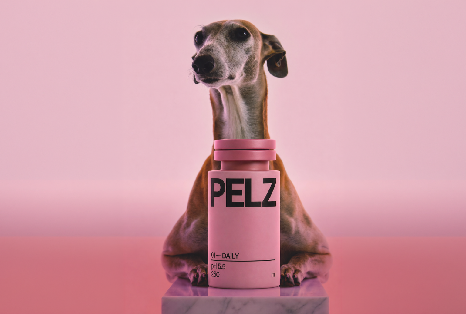

PELZ is a full pet care brand created from zero to campaign within a single, continuous session. It is powered by AI but guided by clear strategic thinking at every step. The project demonstrates a new approach to brand creation, where human decision-making remains central, while execution becomes fast, flexible, and scalable. Instead of fragmented workflows and long production cycles, the entire process was compressed into one focused evening of work.
During this session, we built a complete and coherent brand system. This included naming, positioning, packaging architecture, visual hierarchy, typographic language, SKU differentiation, label copy, and campaign-ready visuals. Each element was developed in relation to the others, ensuring consistency across touchpoints and eliminating the typical gaps between concept and execution.
At its core, PELZ operates between two extremes that dominate pet care branding today. On one side, there are overly playful and decorative brands that resemble toys more than functional products. On the other, there is strict, clinical minimalism that feels distant and purely medical. PELZ deliberately positions itself in the middle. It combines a sense of clinical clarity and reliability with warmth, softness, and everyday appeal.
The result is a brand that feels both trustworthy and emotionally engaging. It speaks to pet owners who care about quality and safety, but also about connection and experience. PELZ is not only a finished brand system but also a working example of how branding can evolve when tools, speed, and process are rethought from the ground up.
Curator’s Insight
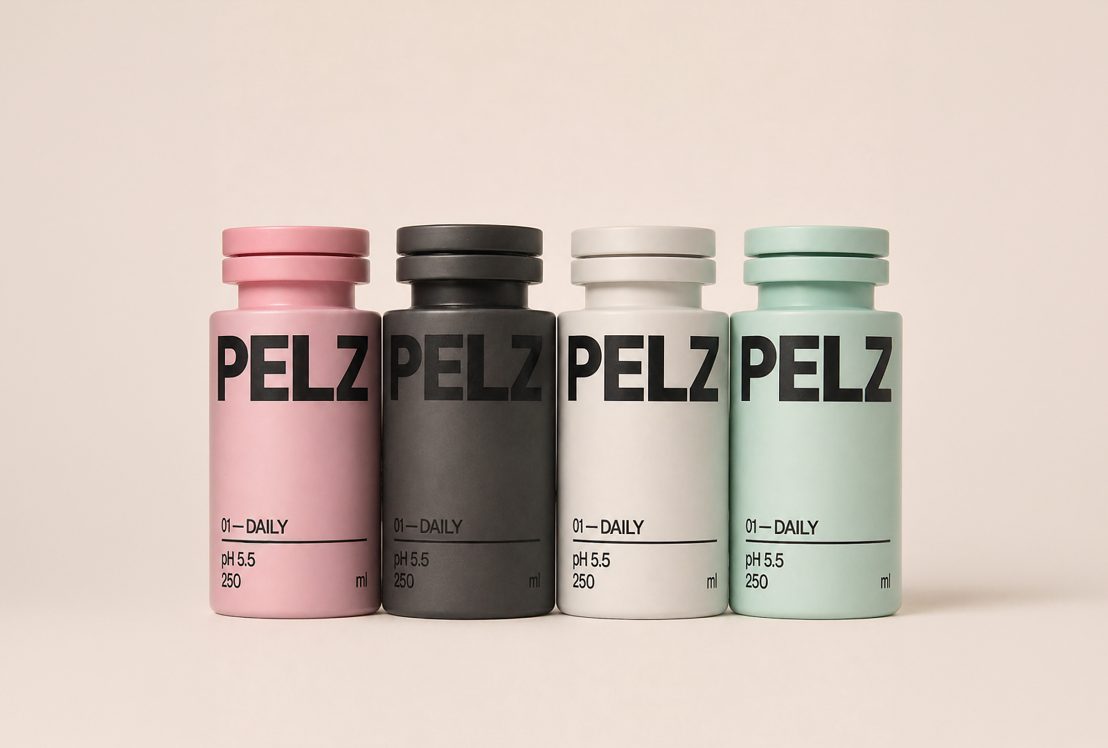
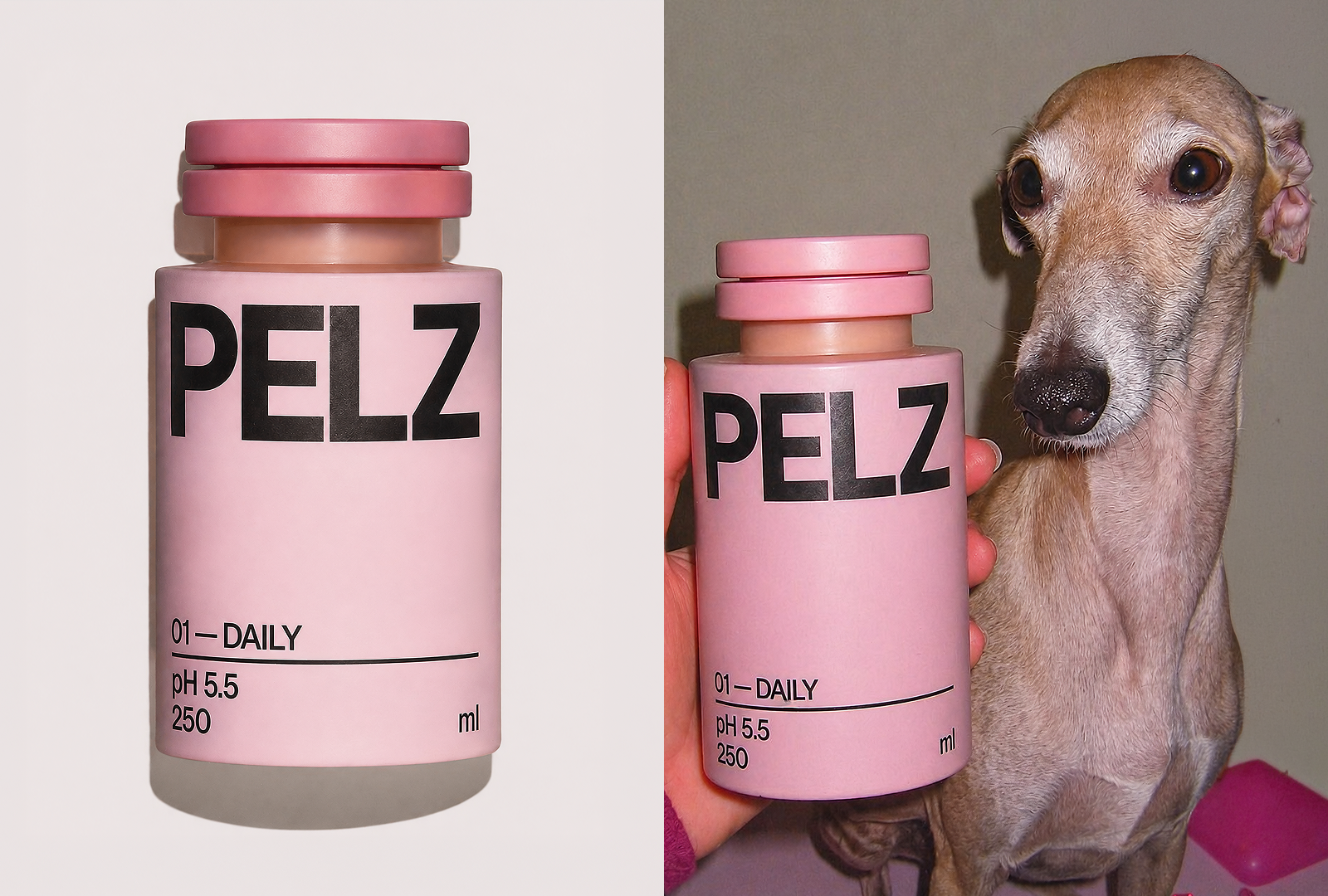
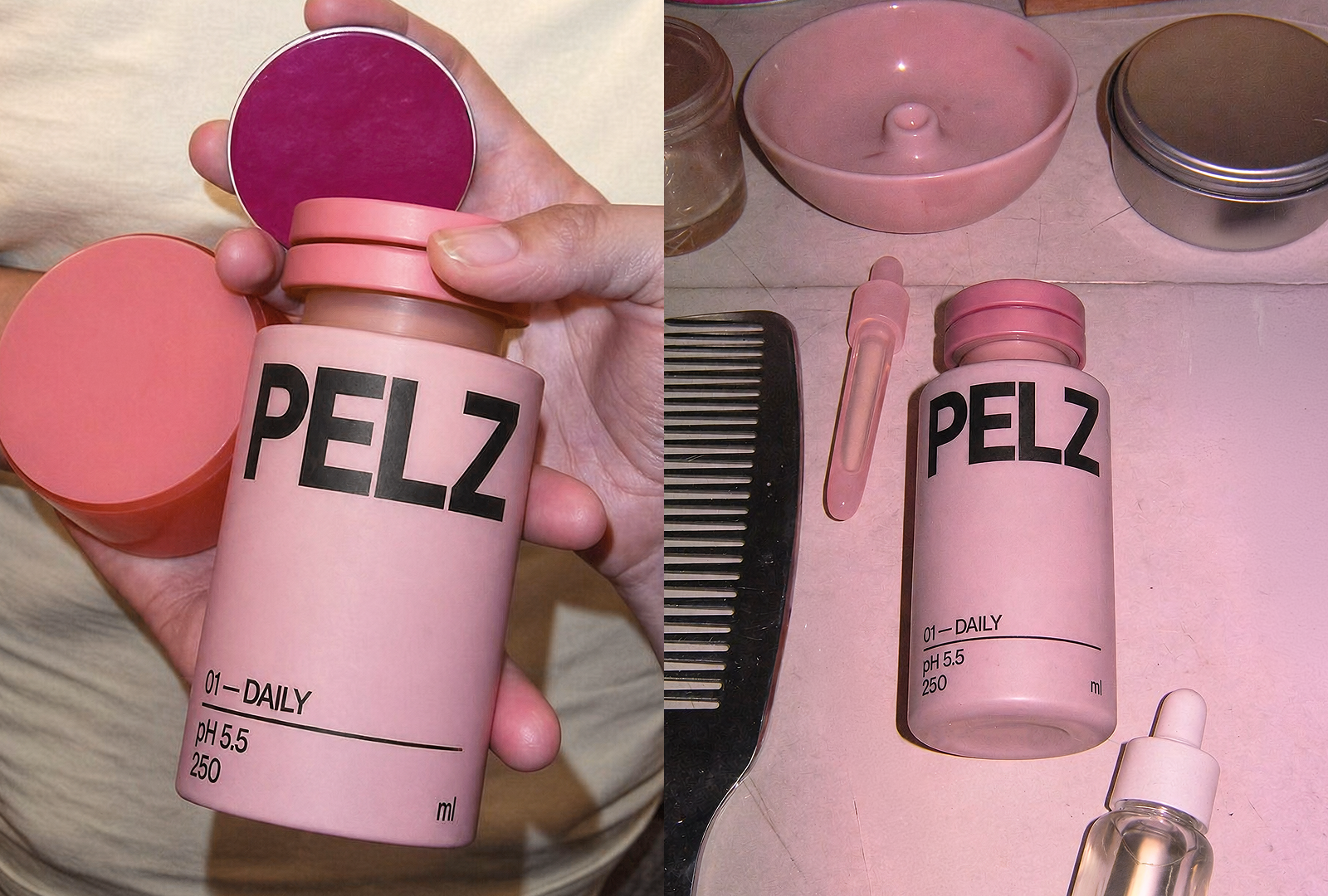
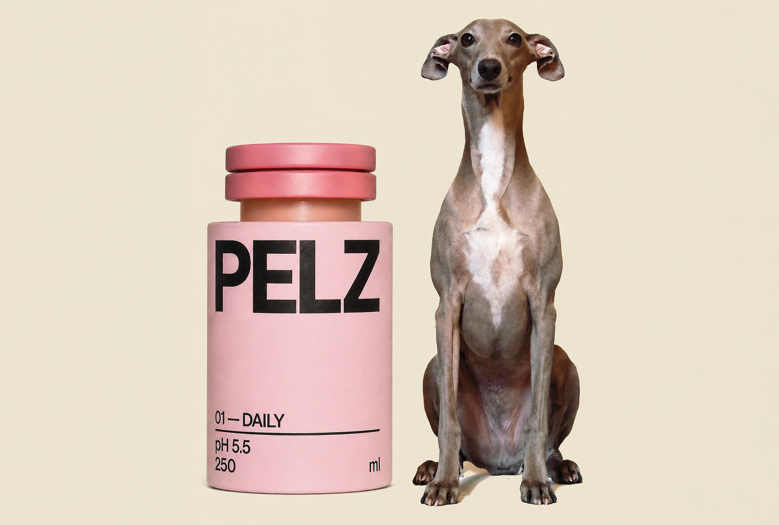
The most telling design decision in PELZ is what was left off the bottle. No paw prints, no illustrated pets, no softening iconography of any kind. The label hierarchy reads almost like a pharmaceutical dossier: bold logotype, SKU number, pH value, volume. It is the grammar of a product that takes itself seriously, and that restraint is a deliberate market argument.
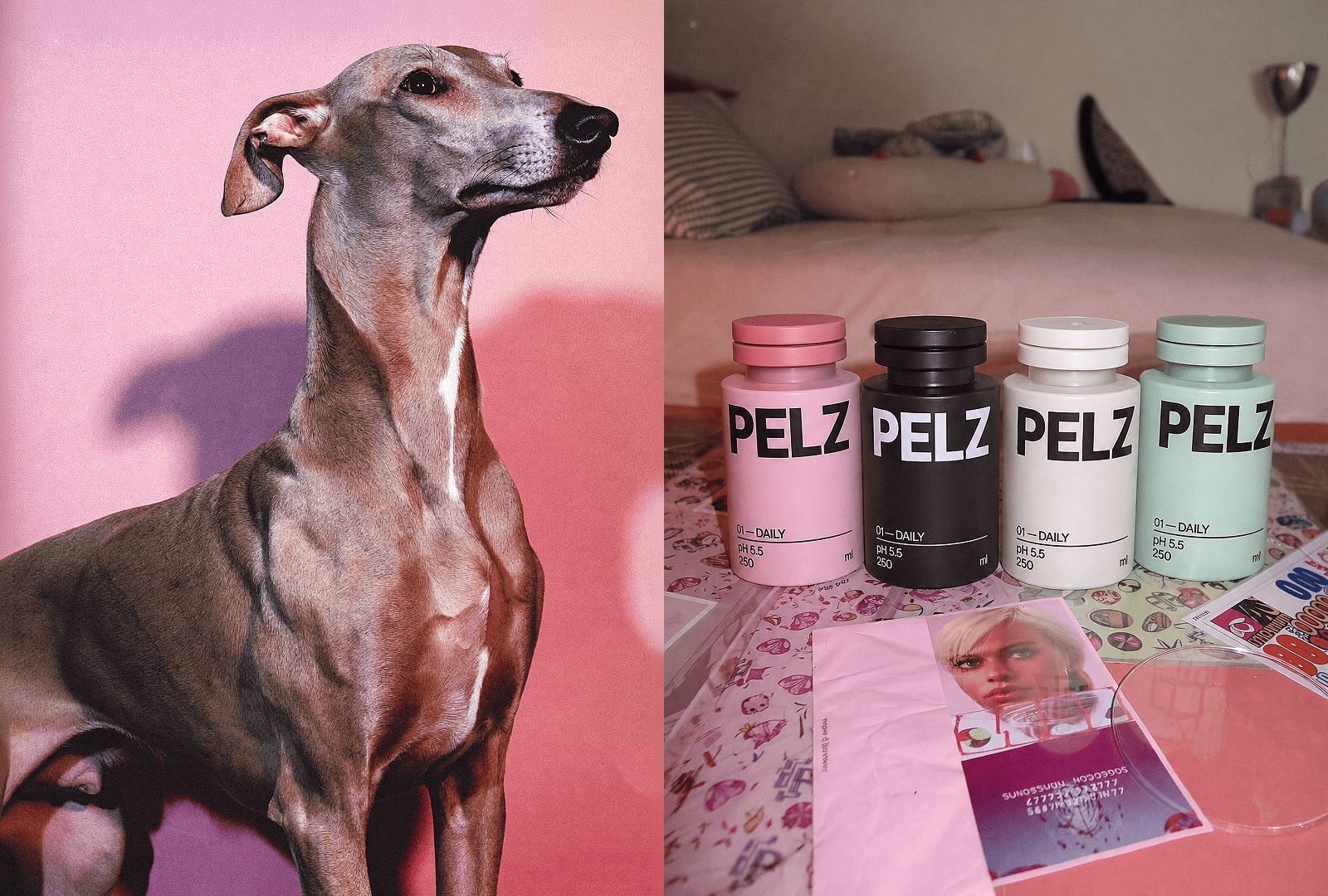
What keeps it from feeling cold is the color strategy. Pink, charcoal, white, and mint are not clinical colorways — they are drawn from lifestyle and wellness adjacencies, the same palette you might find in a considered skincare or apothecary line. Applied to a pet care product, they signal something specific: that the owner’s sensibility matters as much as the animal’s need. PELZ is, in this sense, as much about the person buying it as the pet receiving it.
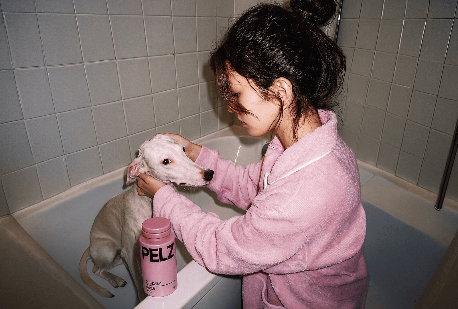
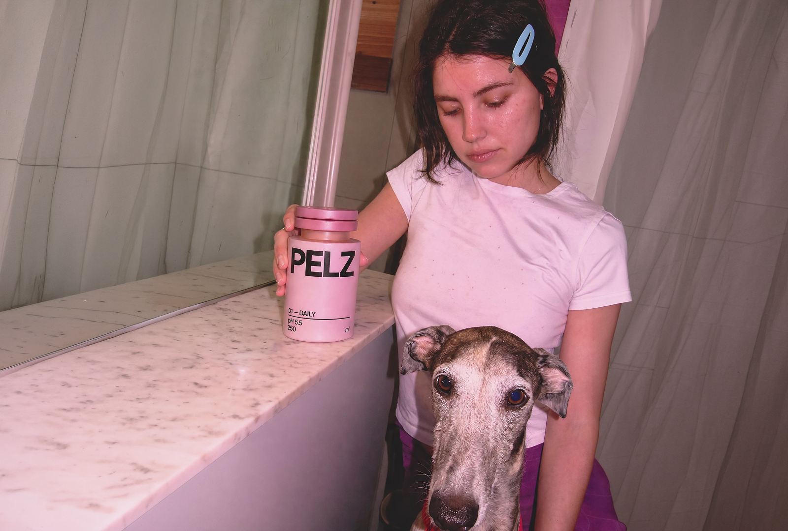
The form reinforces this. The squat, wide-shouldered bottle with its ridged cap reads more like a prestige grooming product than a typical pet supply. It would sit comfortably on a bathroom shelf, which is probably exactly the point.
 MID-AIR STUDIO
 Heramb Arora
 monther al omari
 Tríona O'Donoghue • Design
 Cocoon Prague
 alchimistestudioParis
 hugo zapata
 Bonsanco Creative Studio
 parawaradesign
 UPRISE
 Brand Society
 Que Cálido Studio®
 Richest Branding Pvt. Ltd.
 STRATEDGY
 Shapers Studio
 Platon Ivantsov
 WPA Pinfold
 giselepereiradesign
 ShalaSketches
 05Creation
 Voit Studio
 SSTO
SSTO