

ABOUT
Sauce! is a packaging concept inspired by the physical behavior of sauce itself — thick, elastic, fluid, and constantly in motion. Instead of functioning as a neutral container, the bottle becomes a direct continuation of the product’s texture and movement.
The central element of the project is the expressive S-shaped silhouette. Its form references the natural trajectory of sauce as it stretches, drips, twists, or folds while being poured or squeezed. The packaging captures this fleeting moment of motion and transforms it into a sculptural object.
The project explores how packaging can communicate sensory qualities not only through graphics, but through form itself. The bottle becomes a tactile and visual metaphor of viscosity, softness, and flow.
SOLUTION
Unlike conventional rigid bottles that separate form from content, Sauce! establishes a direct physical dialogue between the container and the product inside. The shape appears almost fluid despite being static, turning the package into a frozen motion study.
From different viewing angles, the packaging continuously changes its outline, reinforcing the idea of movement and elasticity.
RESULT
By reducing the idea of liquid motion into a simple sculptural gesture, an everyday food package is transformed into an expressive design object. Sauce! stands out on the shelf not through excessive decoration, but through its ability to embody the essence of the product itself — smooth, dynamic, and impossible to ignore.
Curator’s Insight:
What the designer’s description leaves implicit is worth making explicit: the S-curve silhouette is doing double duty as both form and retail communication. On shelf, most squeeze bottles compete through label graphics precisely because their shapes are identical…same ergonomic teardrop, same opaque plastic. Sauce! sidesteps that entirely by making the container itself the first graphic element the eye encounters. The label band becomes almost incidental, a confirmation of flavor rather than a hook.
There’s also a deliberate tension here between clarity and chaos. The typography and icons are loose and cartoonish, but the bottle form is tight… a controlled sculptural study, not an accident. That contrast prevents the design from tipping into novelty-item territory. The form earns seriousness; the surface gives it personality.
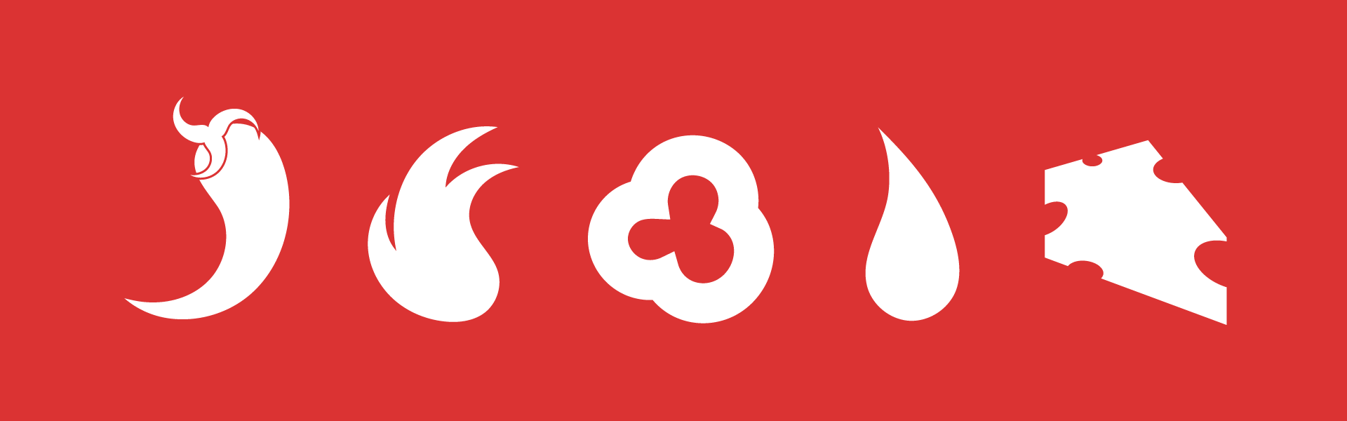
Worth noting too: transparent plastic was a deliberate structural choice. The product color is load-bearing. A cheese sauce in a chilli-red bottle, or a jalapeño sauce in an opaque white one, collapses the whole system.



 Amphiebrakhiy
 NEV
NEV Stefano Bracci
 Alina
Alina monther al omari
 Lizakjx
 JOAOMARCOSDESIGN
 alchimistestudioParis
 Harriet Neild
 octavio rojo
 宏洛图品牌设计HONGLT
 DESIGN CONCEPTS
 Alexander Skurihin
 Studio K95
 ARMBRAND
 Richa Rai
 houseoferas by Miti
 Agence des Coteaux
 Kushi Eaknath
 Ann Treasa
 Xiao Ning
 krrrrrllii
 babyage
 Deep
Deep