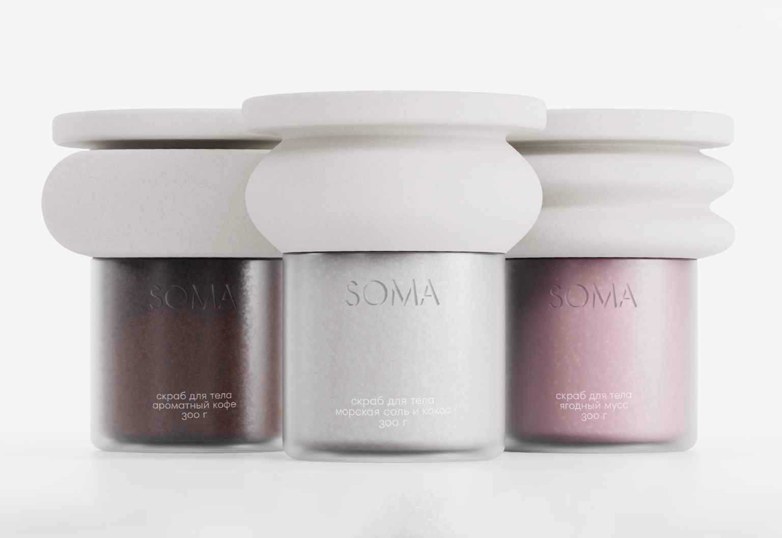

SOMA — Body Scrub Packaging Inspired by Ancient Architecture
SOMA is a body scrub created for deep skin exfoliation and self-care rituals. The name comes from the Greek word sōma(σῶμα), meaning “body,” emphasizing a mindful approach to body care rather than simply a cosmetic routine. The product transforms an everyday beauty ritual into a tactile and aesthetic experience inspired by classical culture.
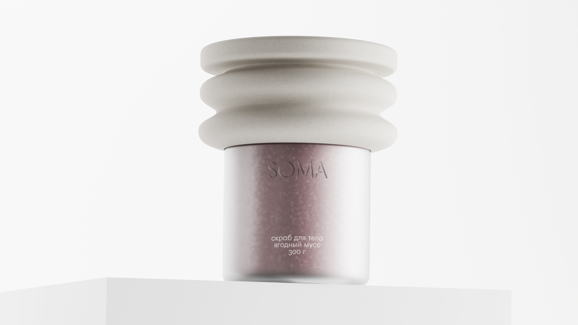
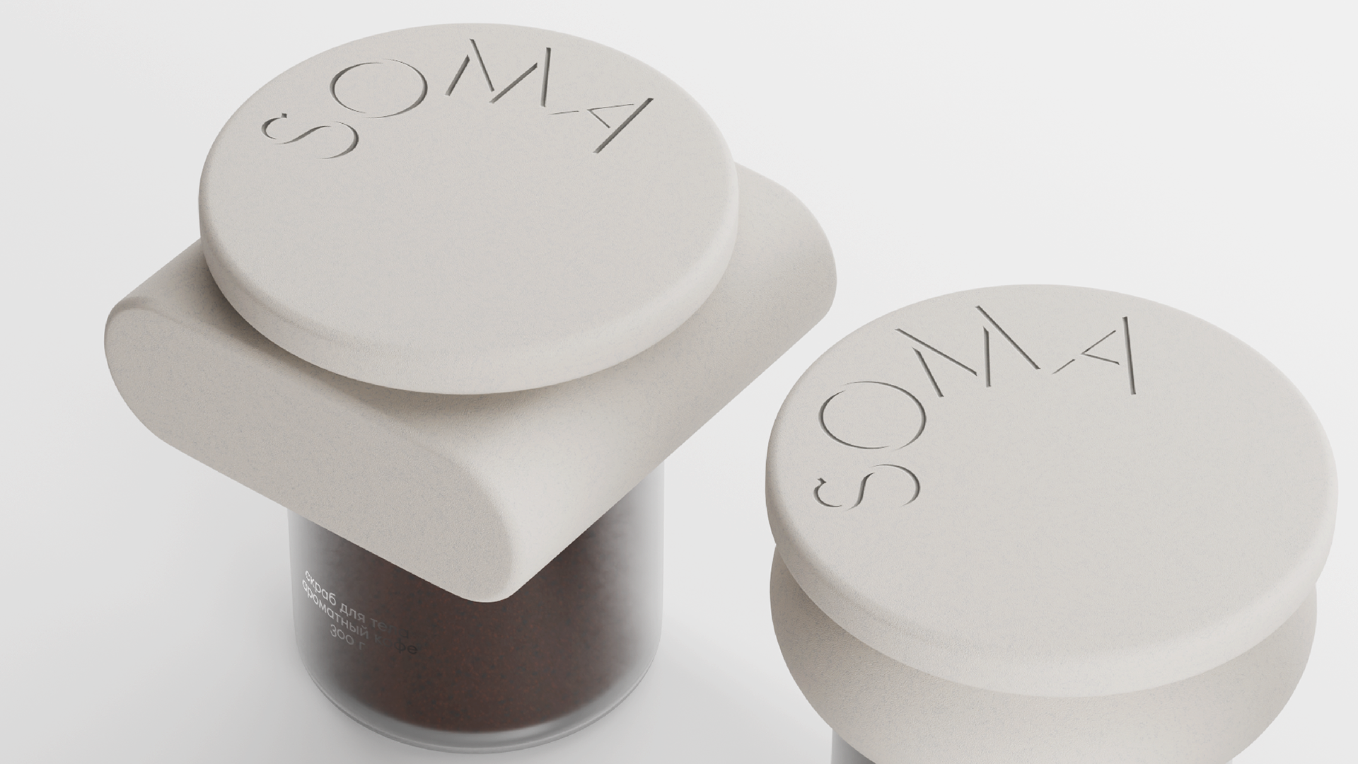
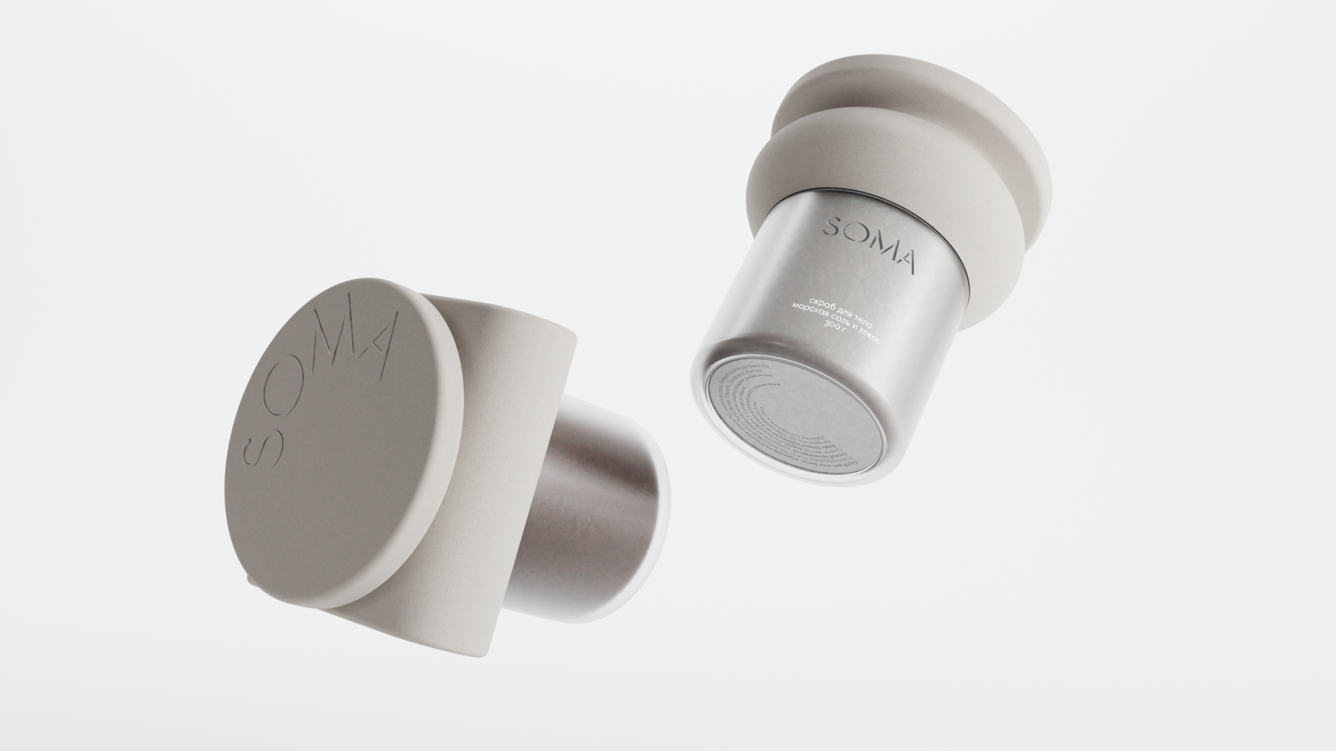
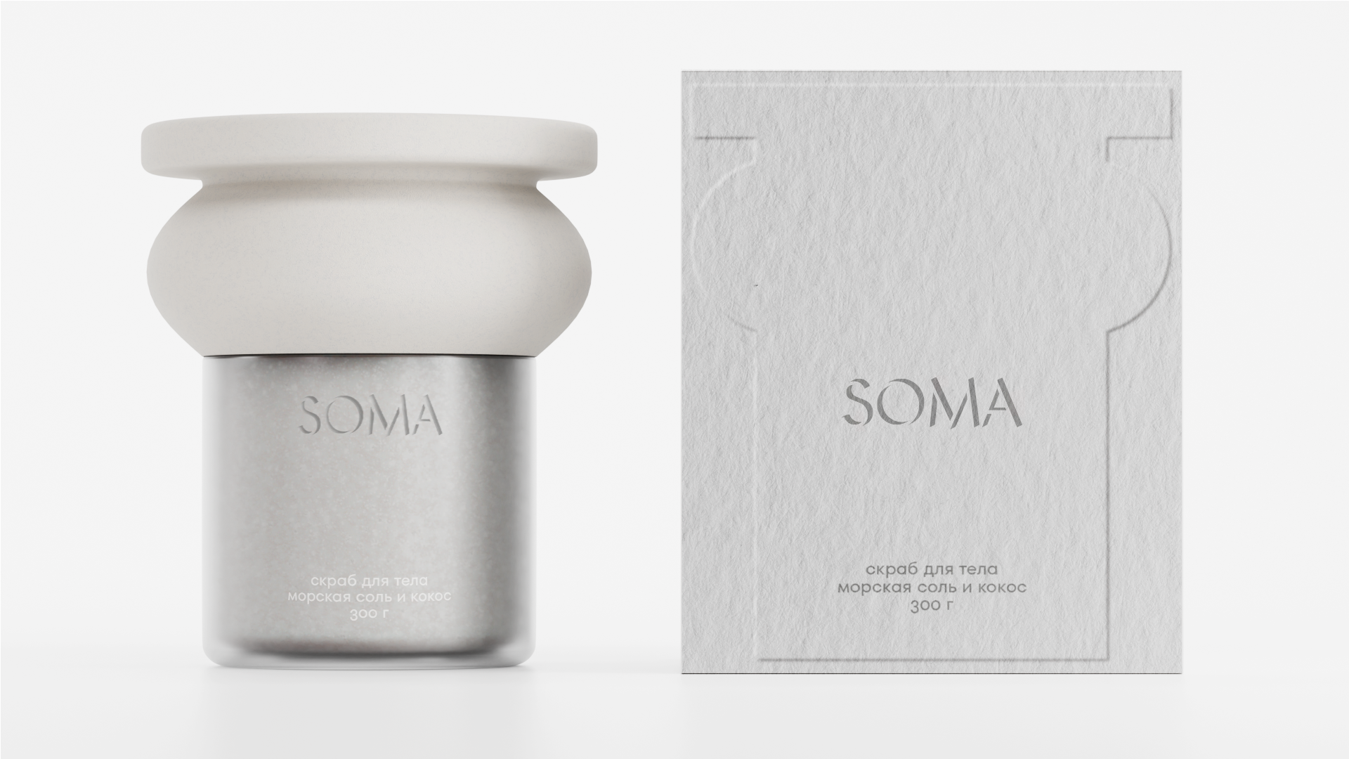
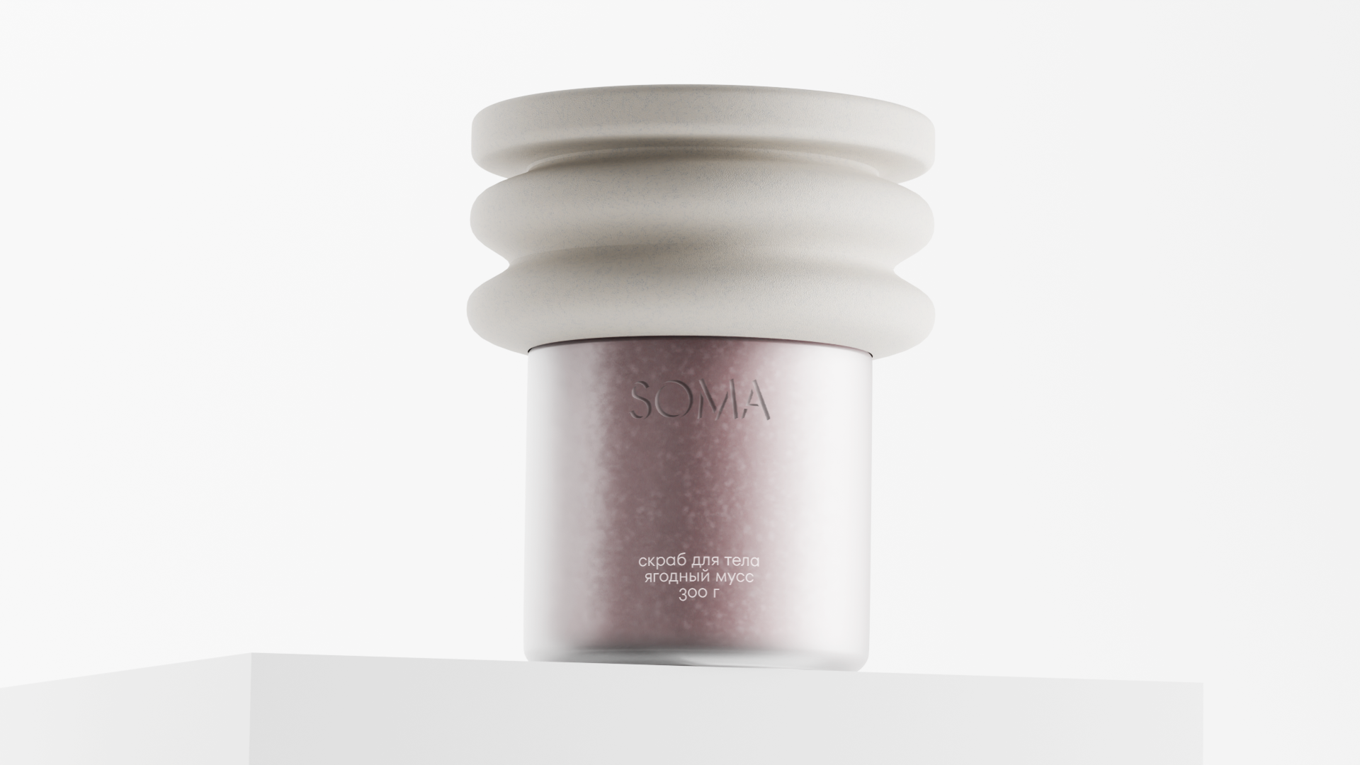
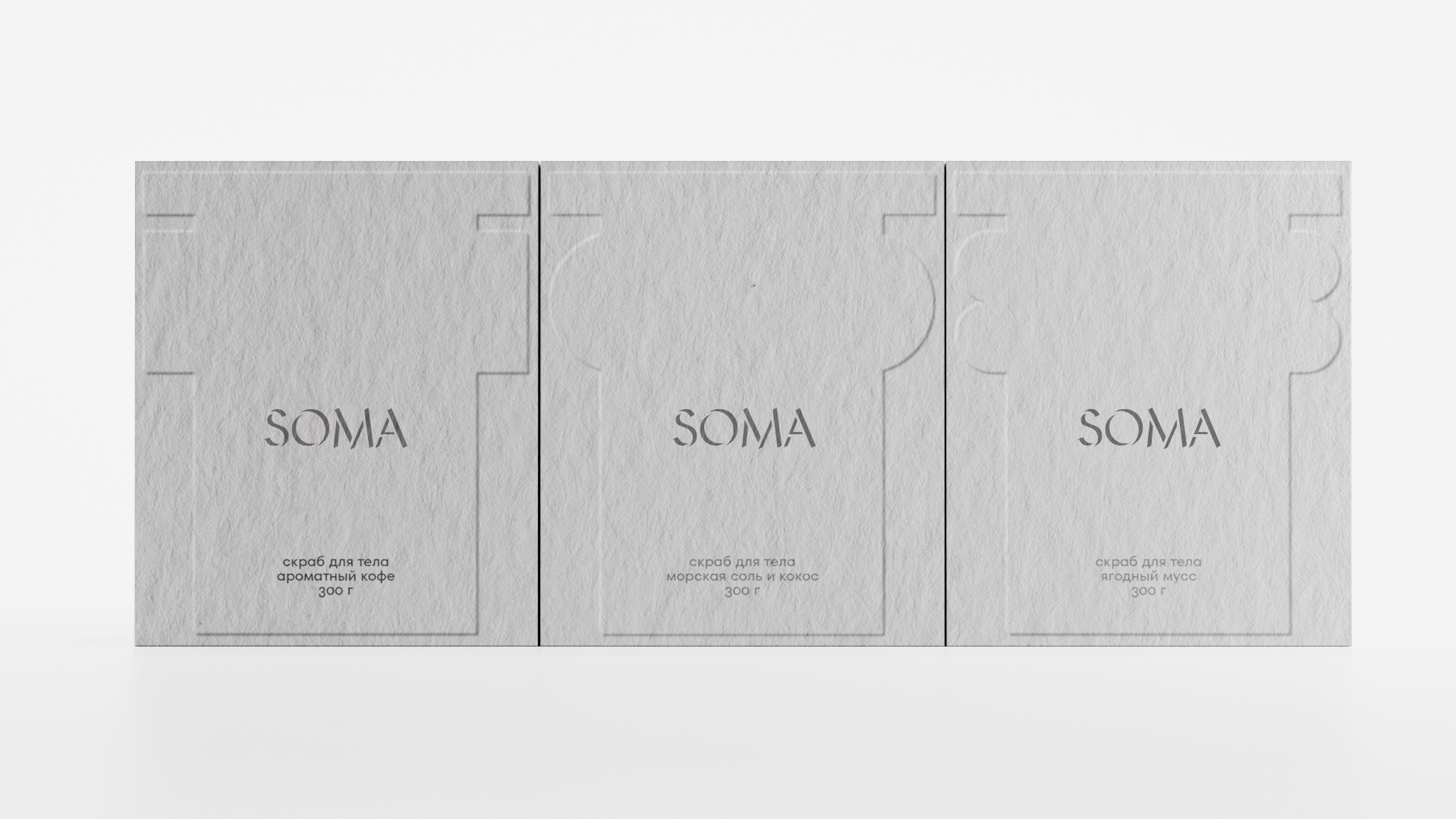
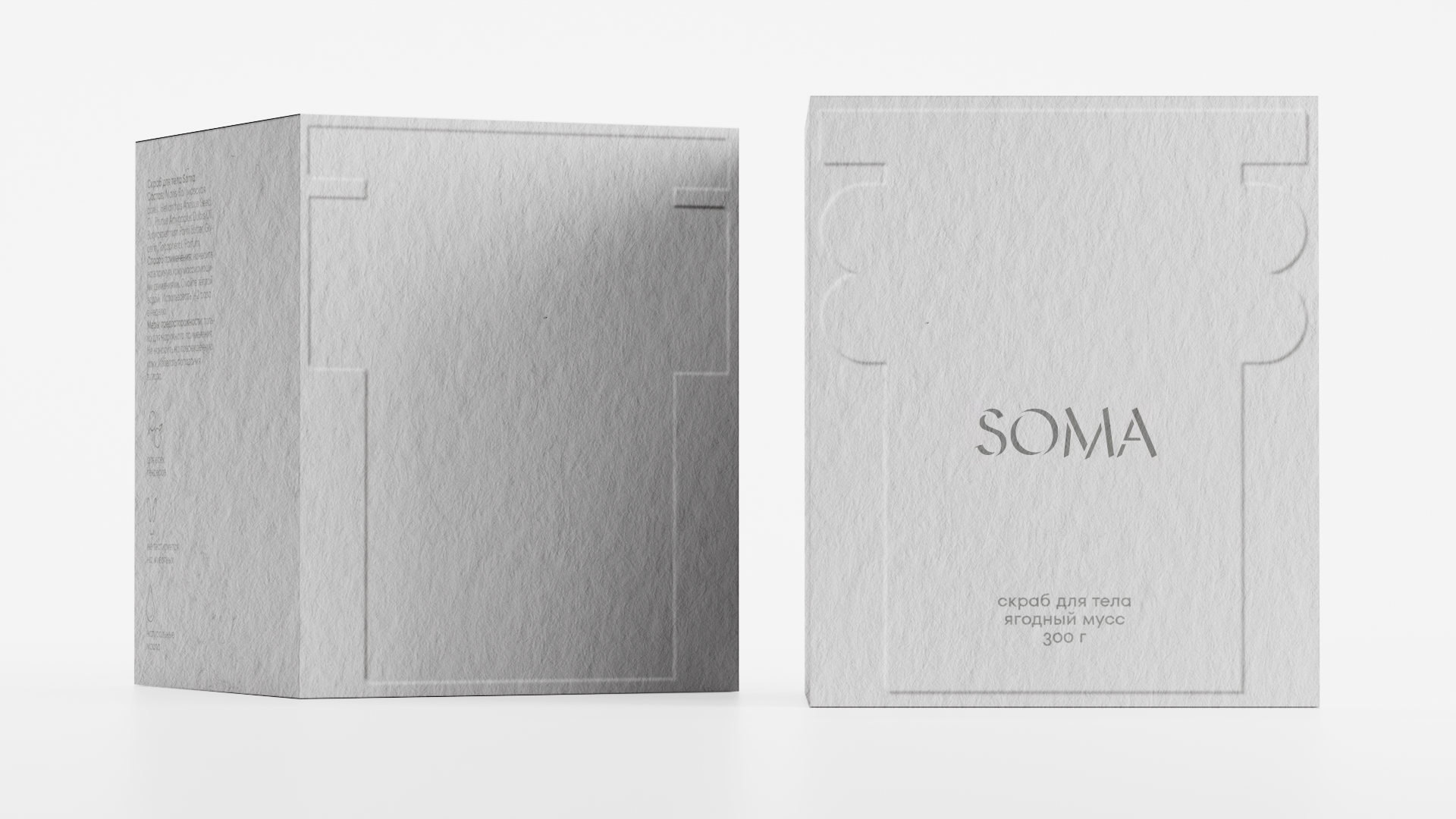
The packaging draws inspiration from the architectural language of Ancient Greece and Ancient Rome — the cultures where body care rituals and exfoliation have their historical roots. The concept interprets the human body as a sculptural form carved from stone. The jar combines soft, organic curves with the proportions of a classical column, while the embossed logo references ancient inscriptions engraved in marble. Together, these elements create an object that feels timeless, sculptural, and collectible. Rather than relying on decorative graphics, the design communicates through form, materiality, and texture.
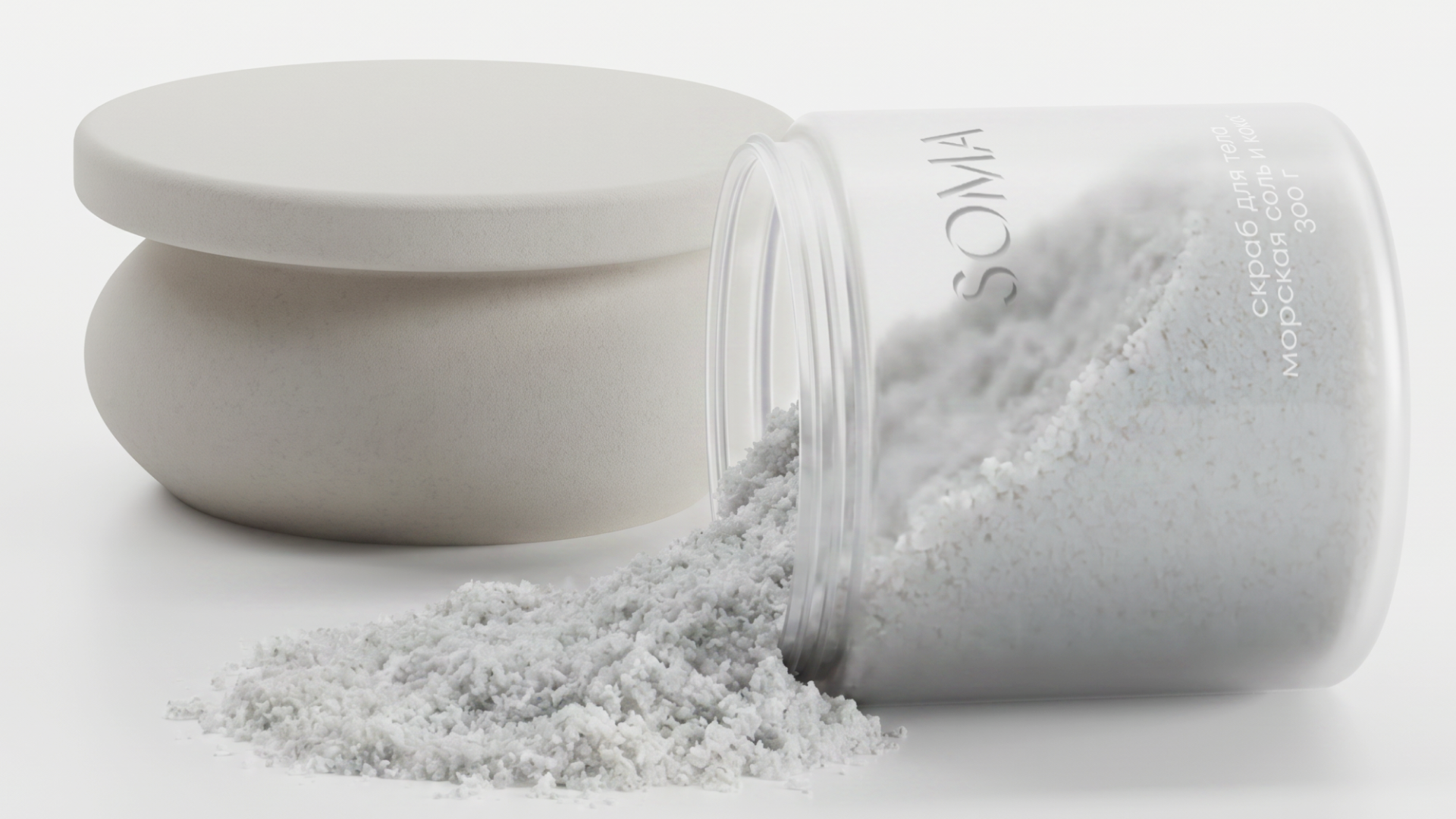
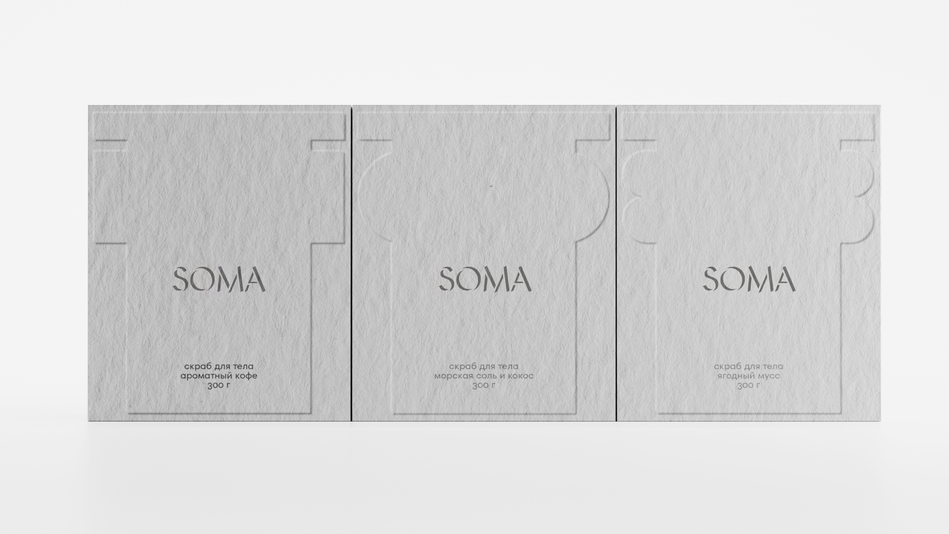
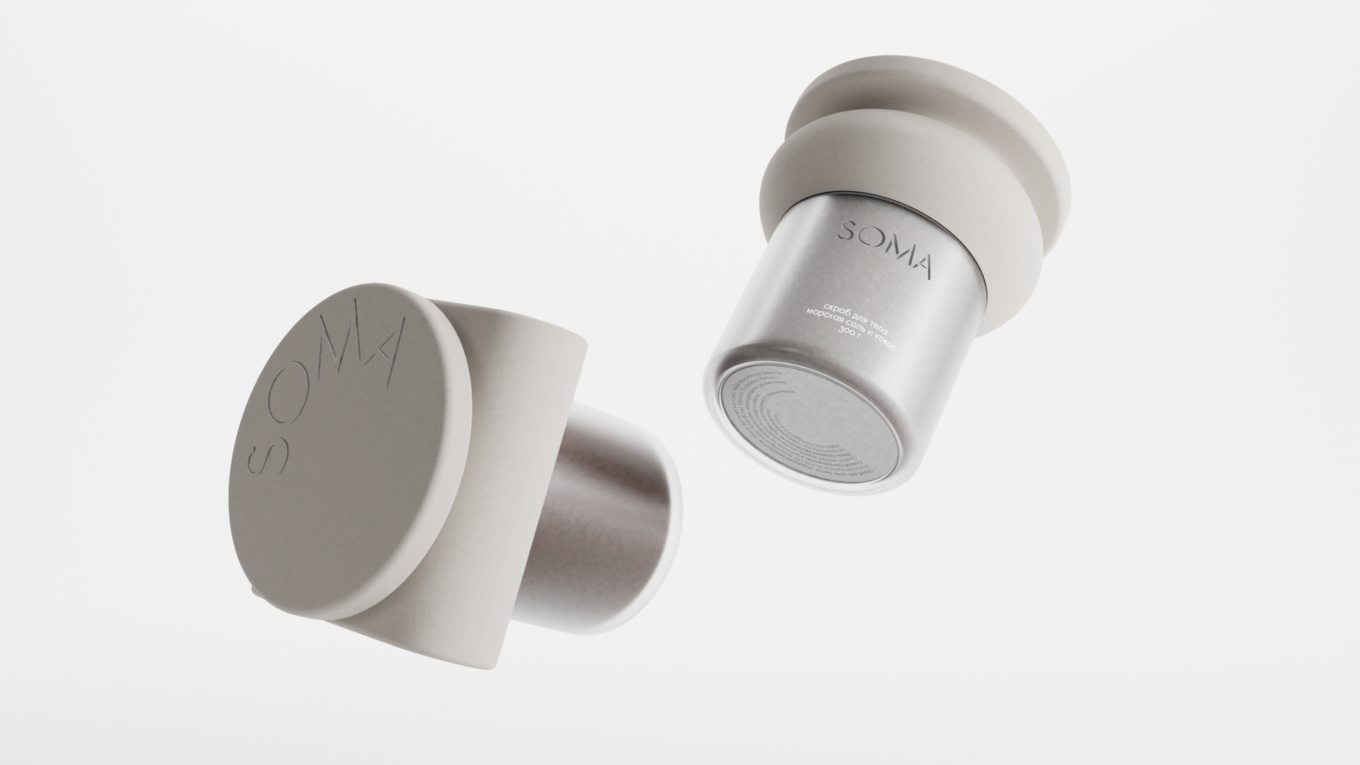
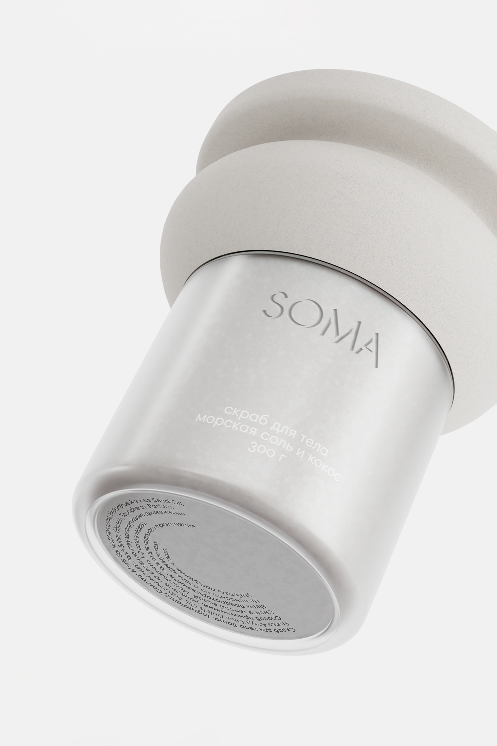
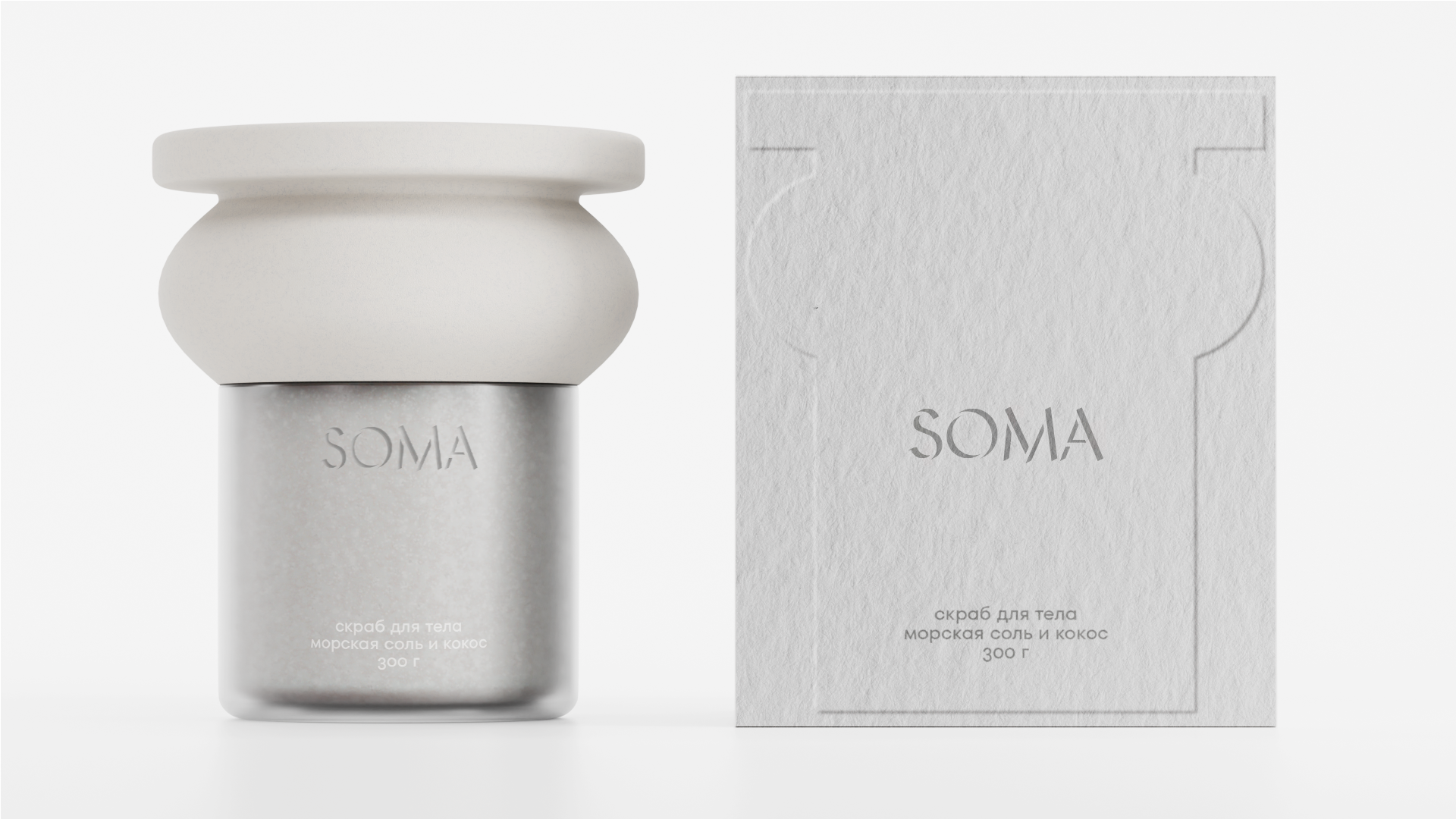
The packaging consists of a frosted translucent jar paired with a sculptural matte lid inspired by classical columns. Each fragrance is distinguished through the natural color of the product visible through the semi-transparent container, eliminating the need for excessive graphics. Minimal typography and embossed branding allow the architecture-inspired form to remain the focal point, creating a premium and gallery-like appearance.
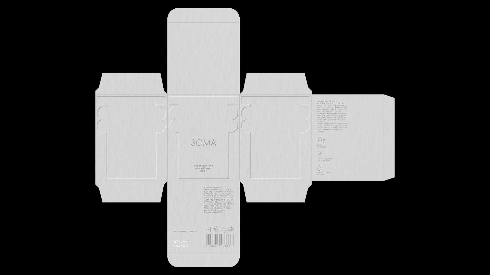
The project was developed using a form-first design approach. The packaging was modeled in 3D to refine proportions and achieve a balanced sculptural silhouette. Material studies focused on matte stone-like surfaces contrasted with translucent glass, while subtle embossing and restrained typography reinforce the minimalist aesthetic. The visual identity relies on shape, light, texture, and material instead of graphic decoration.
The concept translates architectural heritage into contemporary cosmetic packaging. Instead of decorating the surface with classical motifs, the packaging itself becomes the architecture. The lid echoes the rhythm of ancient columns, the logo resembles inscriptions carved into stone, and the entire object evokes the feeling of a museum artifact reinterpreted as a modern skincare product. The fragrance variants are differentiated naturally through the product color visible inside the jar, creating a clean and cohesive visual system.
SOMA demonstrates how structural design can become the primary storytelling element of a beauty brand. By combining classical references with minimalist aesthetics, the project creates a distinctive visual identity that stands apart from conventional cosmetic packaging and transforms a functional container into a sculptural design object.
Curator’s Insight
The challenge SOMA takes on is a common one in cosmetics: how to differentiate a product line without leaning on labels, patterns, or color-coded graphics. Most brands solve this with printed variant systems. SOMA solves it structurally, by making the container transparent enough that the product’s own pigment does the sorting.
What’s worth noting is the lid geometry. The stacked, tiered profile is not just aesthetic flourish, it references the entasis and capital proportions found in classical column orders, where a subtle swelling in the middle counteracts the optical illusion of concavity in a straight-sided column. Applying that same swelling logic to a jar lid gives it a weighted, load-bearing presence that a simple cylindrical cap would not have.
The embossing choice matters too. Engraved marble inscriptions rely on shadow and light raking across a surface to be legible, not ink. By embossing rather than printing the logo, SOMA borrows that same dependency on ambient light, which means the branding shifts and catches differently depending on how the product is displayed, rather than sitting flat and static.
The broader takeaway: when a design references a historical form language, the reference works best when it operates through the physical logic of that language (proportion, structural weight, how it interacts with light) rather than through surface motifs borrowed from it.







 Amphiebrakhiy
 Eva Chistyakova
 Puigdemont Roca
 marianaaworks
 bloomburo
 andreamarinnn
 Alina
Alina Saadmost
 Bruhken
 Maruf Nishat
 Richest Branding Pvt. Ltd.
 Sophiagdotcom
 saifullahmaslool
 Up-Brands
 Atiq Alam
 daniitenaa
 artworkbysofia
 monther al omari
 Valérie Colace
 Tianqii
 Anum
Anum anisameur
 tauqueer
 SOT B&D
 Palashcc
 Derrick Lin