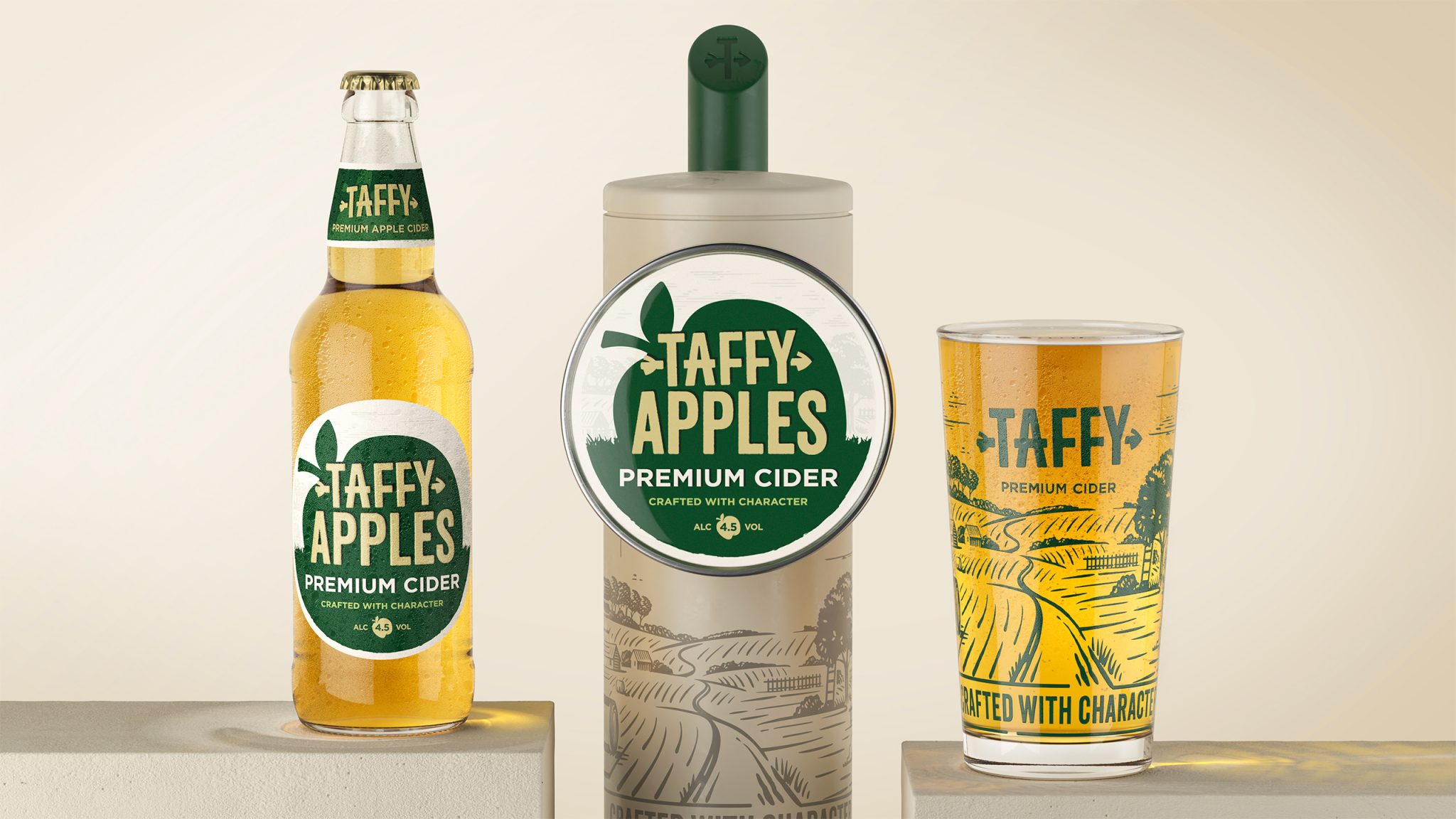

The bar can be a noisy place. To grow and cut-through, Taffy Cider needed a strategic redesign to elevate their products from classic to craft, add punch, drive up their price point and cohesively integrate two new products.
Context
Taffy Cider is a household name in South Wales. It’s a strong brand with excellent credentials and a long history tied into the tradition of apple-growing in the Celtic Marches. “Taffy” is an irreverent nickname for a Welshman, which lends the brand authenticity and a sense of place. The new visual identity had to balance this heritage with youthful vigour and impact, while also avoiding Welsh clichés.
Solution
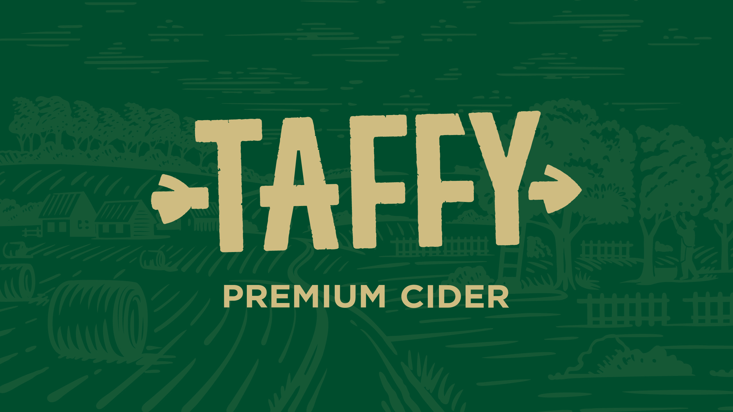
The Taffy Cider rebrand injected energy and youth back into the product’s visual identity, driving confidence and stand-out without losing Taffy’s heritage. The creative echoes the history of apple-growing in the Celtic Marches and brings it bang up to date. An outsize apple for a brand that’s big on flavour and ambition, and an arrow for crisp cut-through. The use of the arrow was also a pull through from the original apple icon from old designs. Retaining some of the visual brand equity has been important to ensure some continuity from the update. We did this by driving the arrow through the master brand
We also re-developed the product’s naming convention, elevating Taffy Cider to the master brand, with flavoured and signature sub-brands sitting below with in-line identities. Using this equity allowed us to promote the lesser known flavours in the range and strengthened the overall Taffy brand.
Result
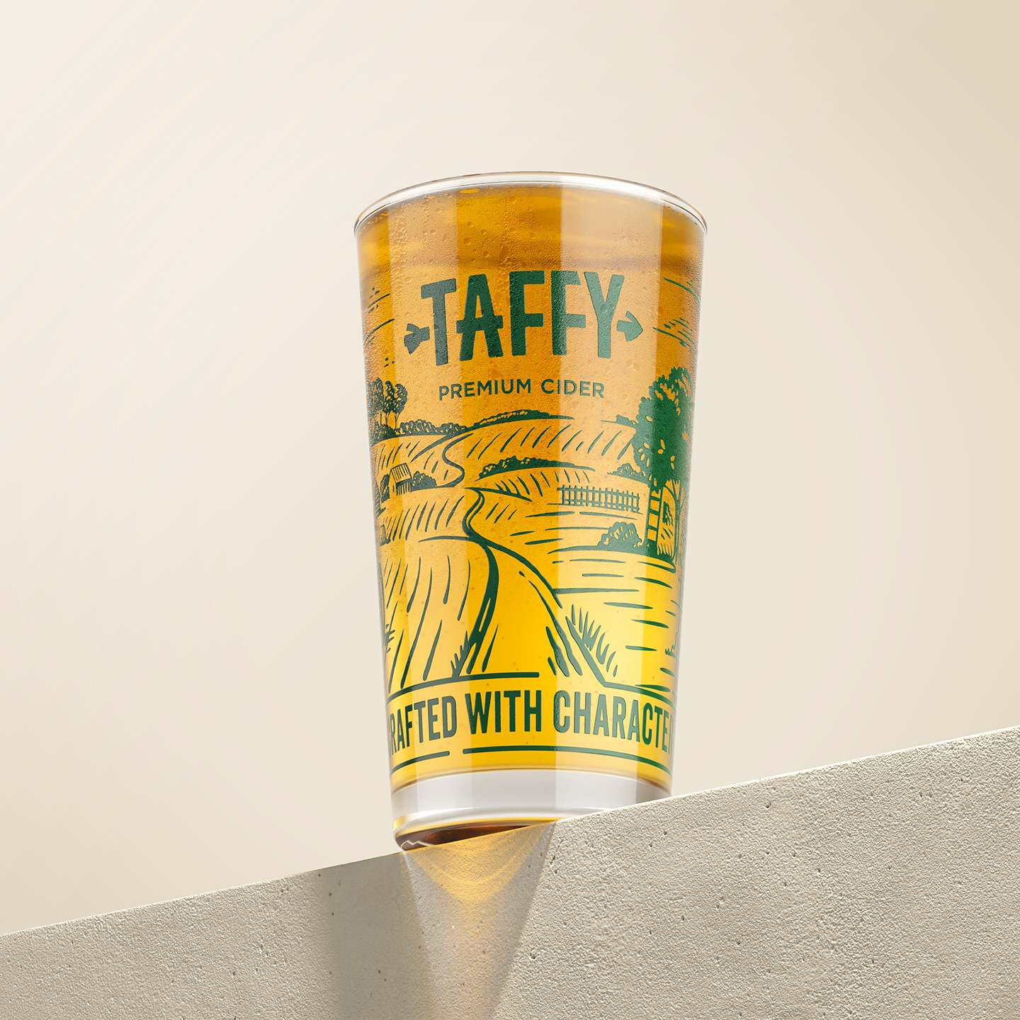
The redesign achieved punchy, playful premiumisation with brand cohesion across the range of four flavours in keg on bar and in bottle on shelf. The brand has been elevated providing a more modern and colourful approach ensuring good recall for consumers and early signs of the rebrand across Wales is providing positive uptake data.
A big thank you to Rhys, Chyrelle and all the team at Taffy Cider.



 Derrick Lin
 monther al omari
 43oz
43oz lilyz design23
 Modern Theory
 Eighteen Brand Studio
 Bhumika Singh
 MohamedMashaly
 Pixels Studio
 Gulya
Gulya UPRISE
 Lizaveta Kharitonyuk
 Bonsanco Creative Studio
 DesignRepublic
 GIRAFA STUDIO
 PiotrWisniewski
 Sophiagdotcom
 CreativeWise
 SoreThumbStudio®
 Modern World Studio
 Palashcc
 Valérie Colace