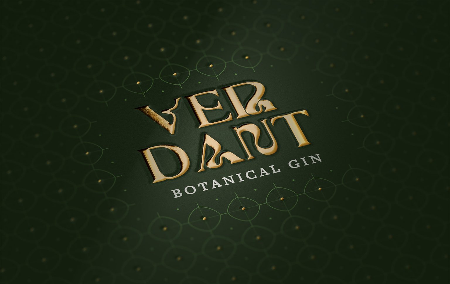

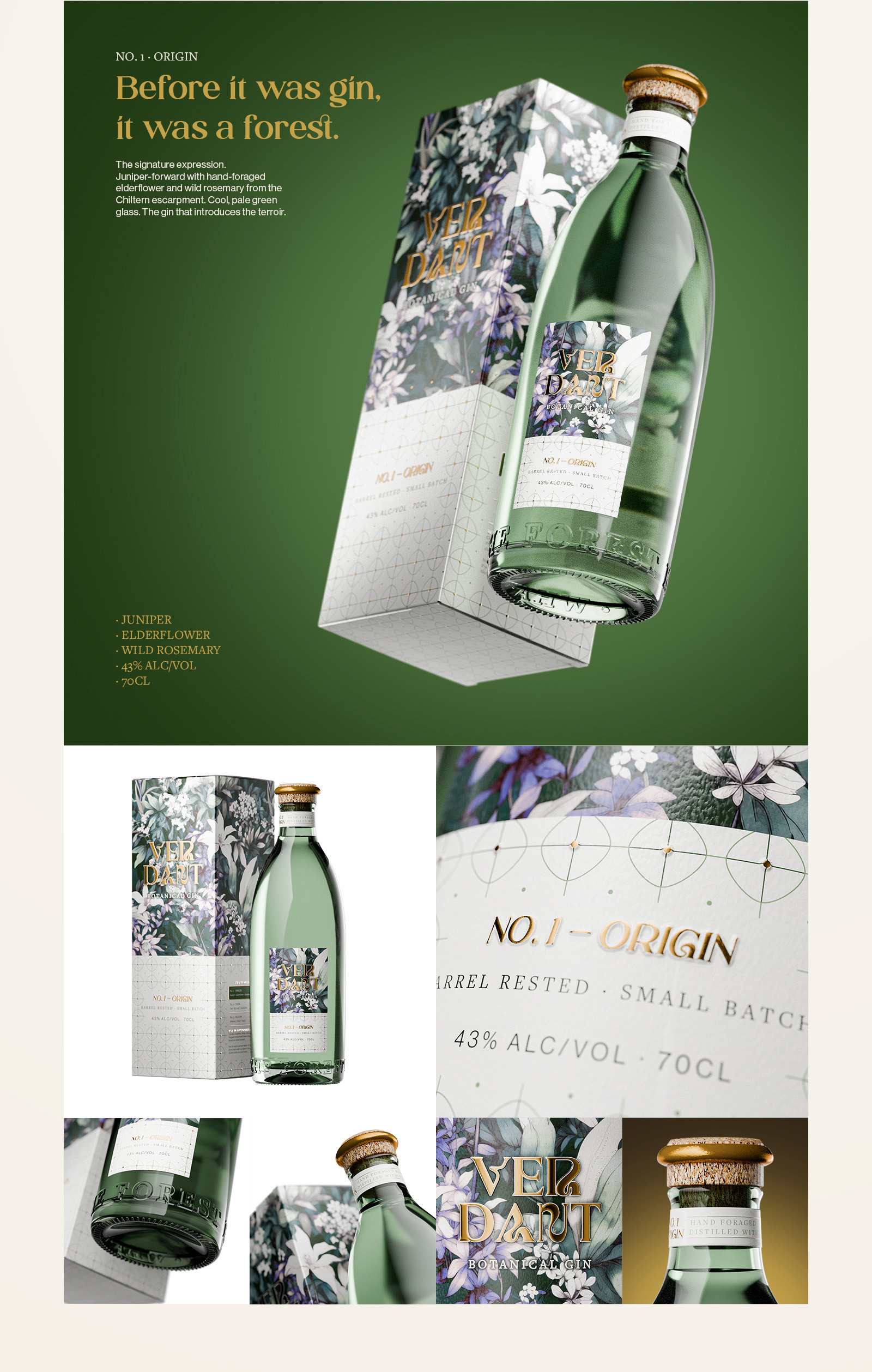
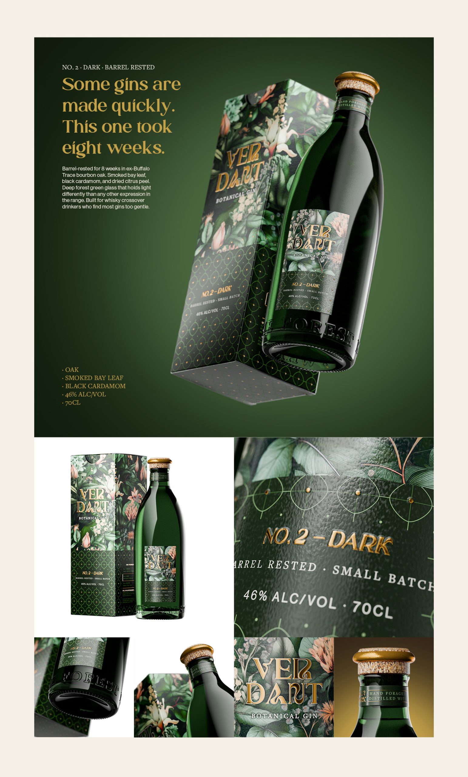
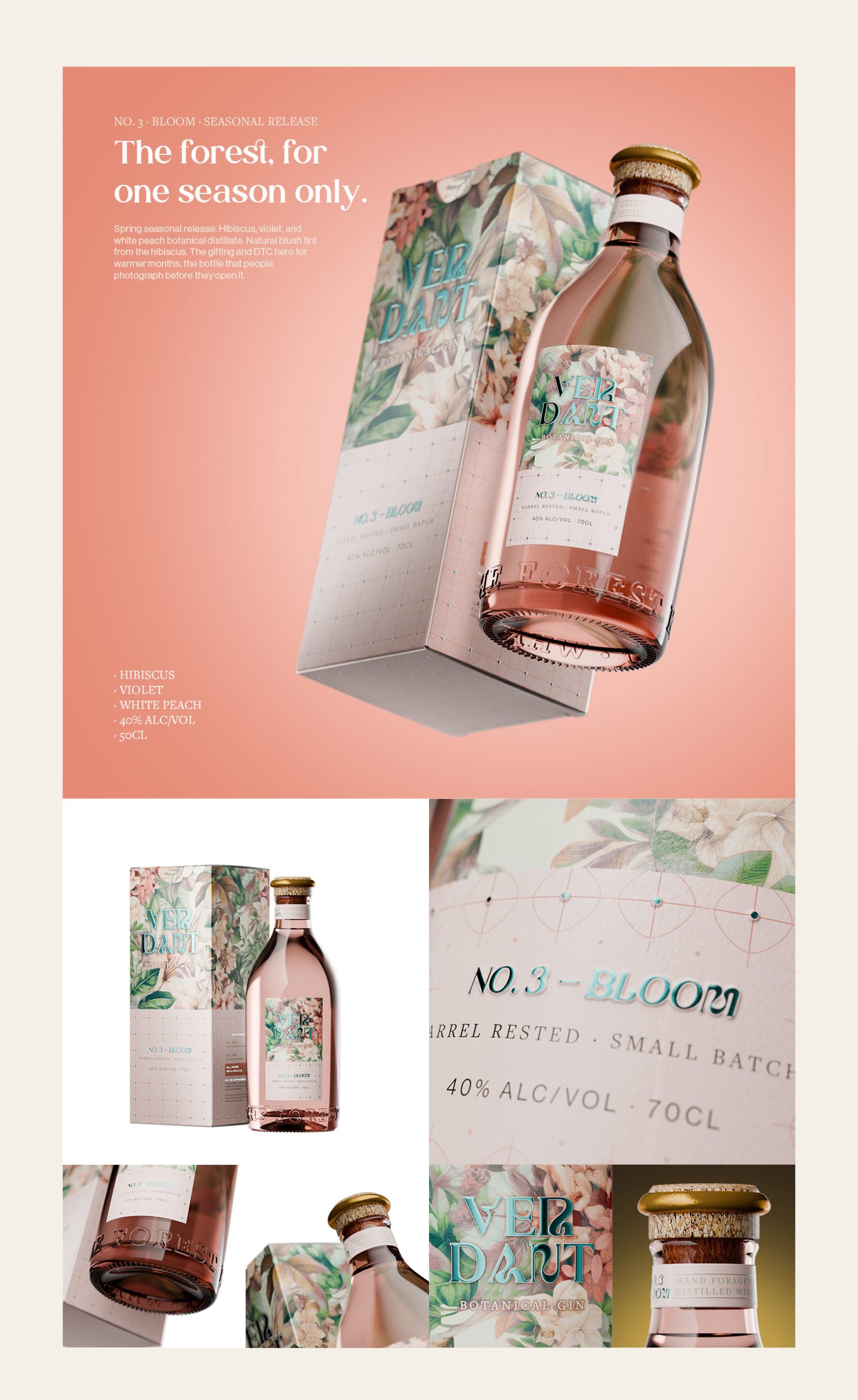
VERDANT is a premium botanical gin brand built around three expressions: Origin, Dark, and Bloom. Each expression needed its own distinct packaging identity while still feeling like part of one coherent family across the full range.
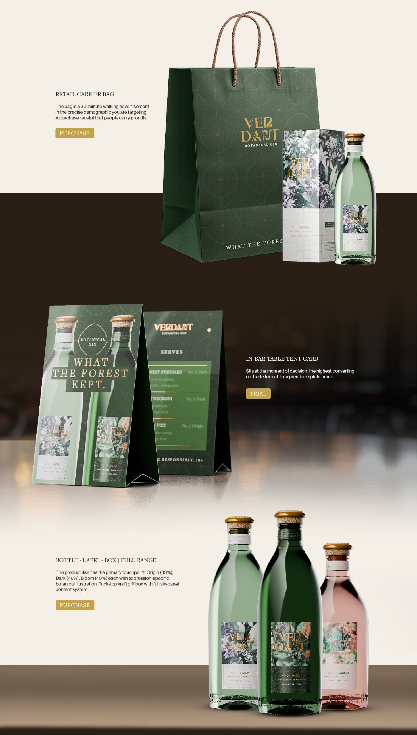
The central challenge was keeping the three expressions visually separate without breaking the system. The solution was the Verdant Lattice, a bespoke surface pattern that appears across all three labels as a shared structural element. Each label then carries its own botanical illustration, drawn specifically for that expression. A single organic wordmark in Cormorant Garamond with custom ligatures holds the range together across every format.
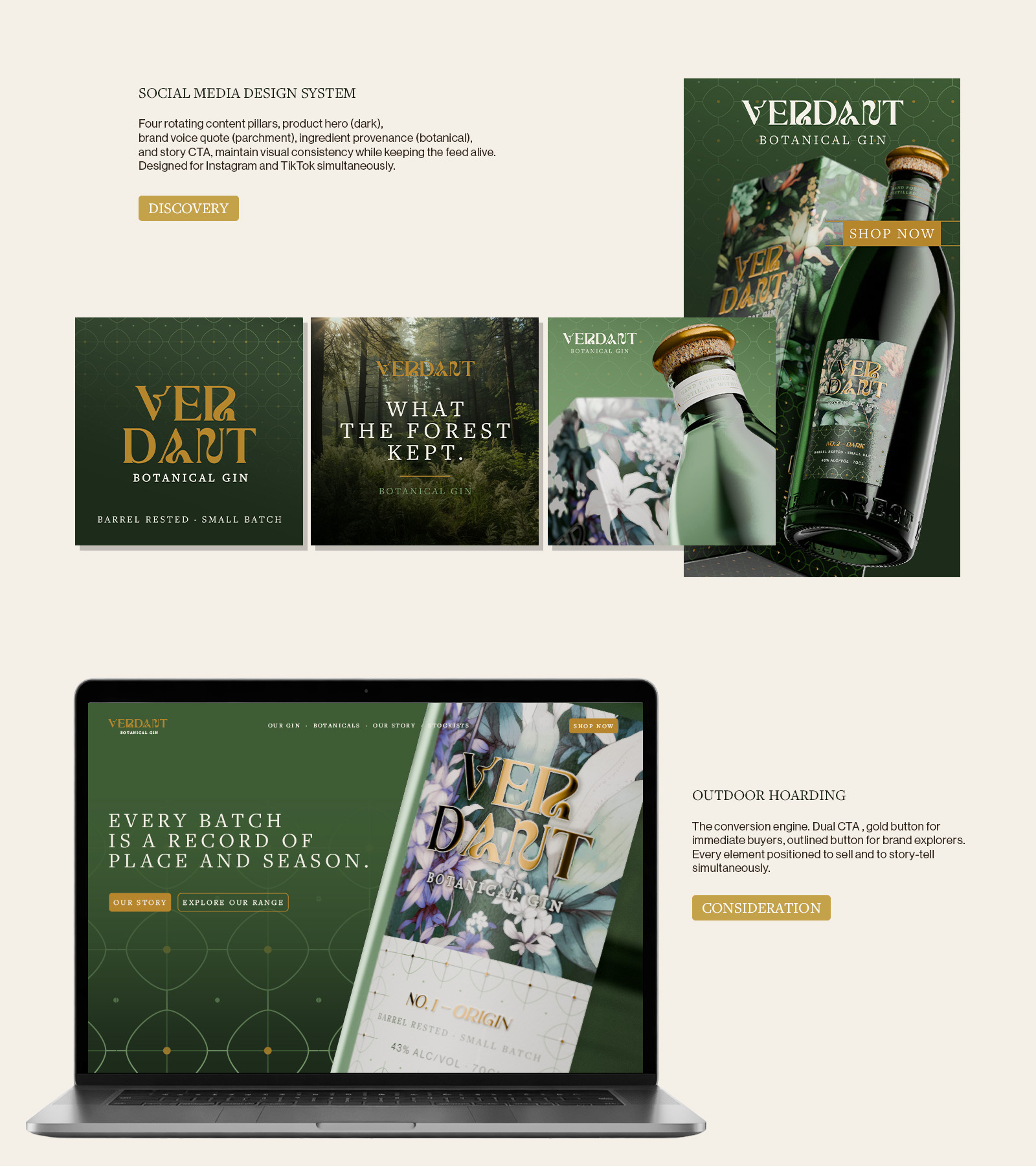
The colour system is built on four values: Deep Forest, Harvest Gold, Sage, and Parchment. These run consistently from the label through to the gift box, retail carrier bag, and in-bar collateral, so the brand reads the same whether it is on a back bar, a gift shelf, or a social post.
The gift box was developed for both single-bottle DTC fulfilment and gifting retail. It uses a magnetic closure with a foil-blocked wordmark on the lid and a tissue-wrapped interior. Full dieline production files, print-ready label artwork across all three expressions, and 3D renders aligned to the bottle manufacturer’s specifications were all delivered as part of the project.
View the full project on Behance:
Product 3D Visualization
Brand Identity system
Disciplines: Packaging Design, Label Design, Brand Identity, 3D Visualisation
Studio: Kolam Creatives, Vadodara, India
Website: kolamcreatives.com

 Biaa
Biaa Petitmoulin Studio
 White Bear Studio
 Eva Chistyakova
 monther al omari
 Atipus
 alchimistestudioParis
 oneandother
 bloomburo
 helocrene
 Shapers Studio
 Denver Design
 Aidearte
 andrew.huerta
 softmachine
 airobtq
 Buzz & Co.
 Ruby
Ruby themythographer
 IDNB Inc.
 viktorflr
 Zenpack
 Wessam Hussien