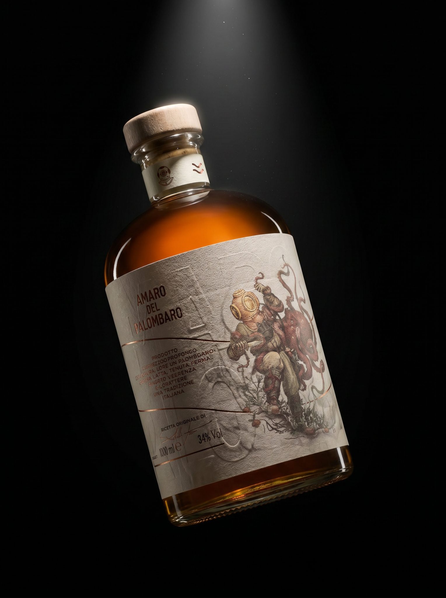

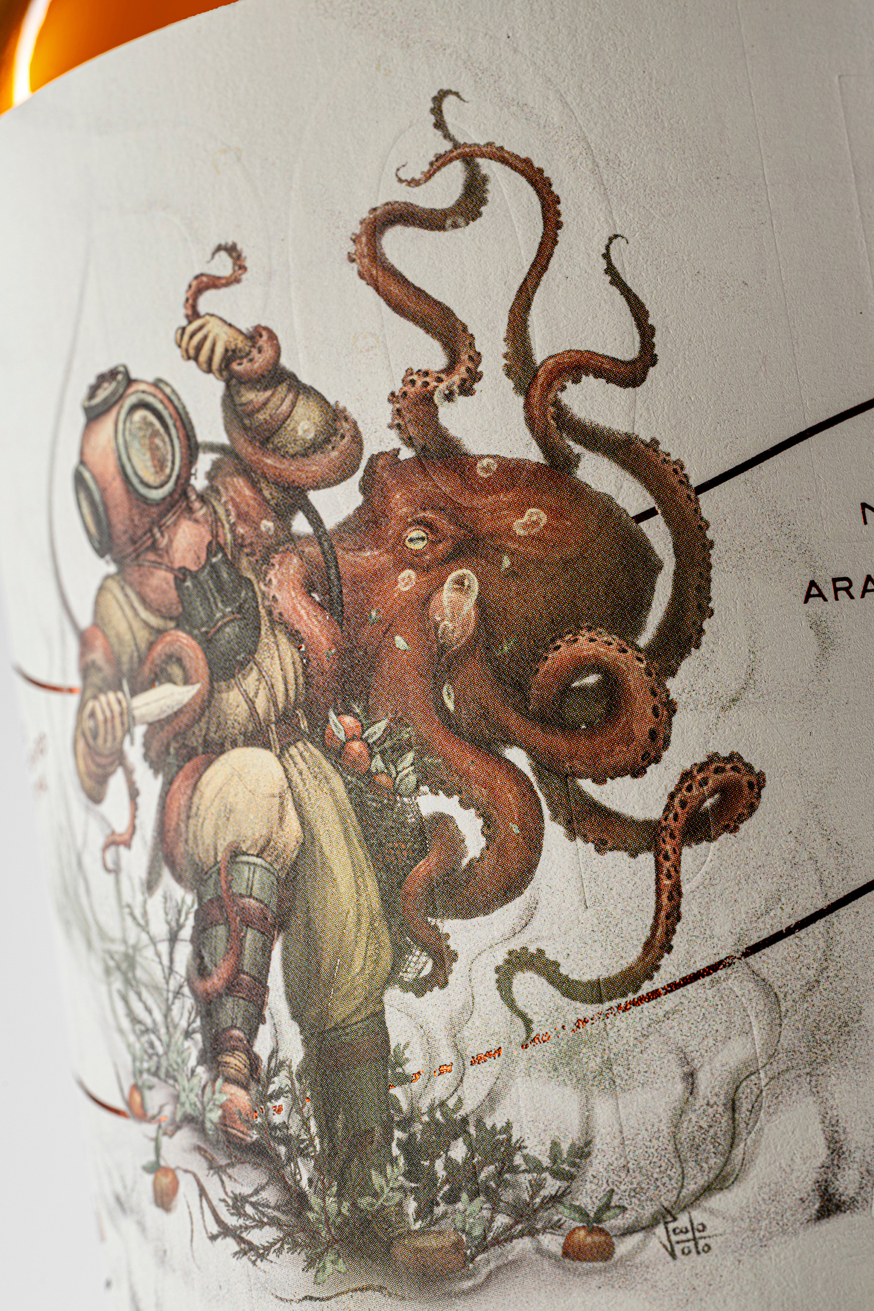
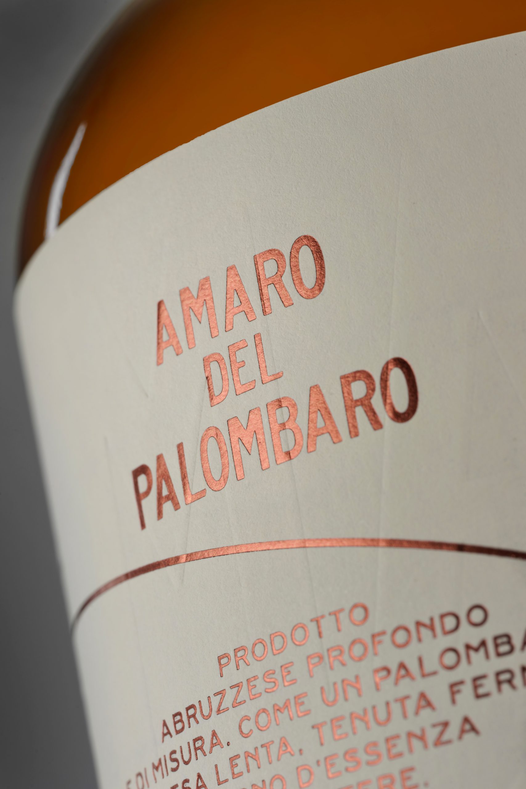
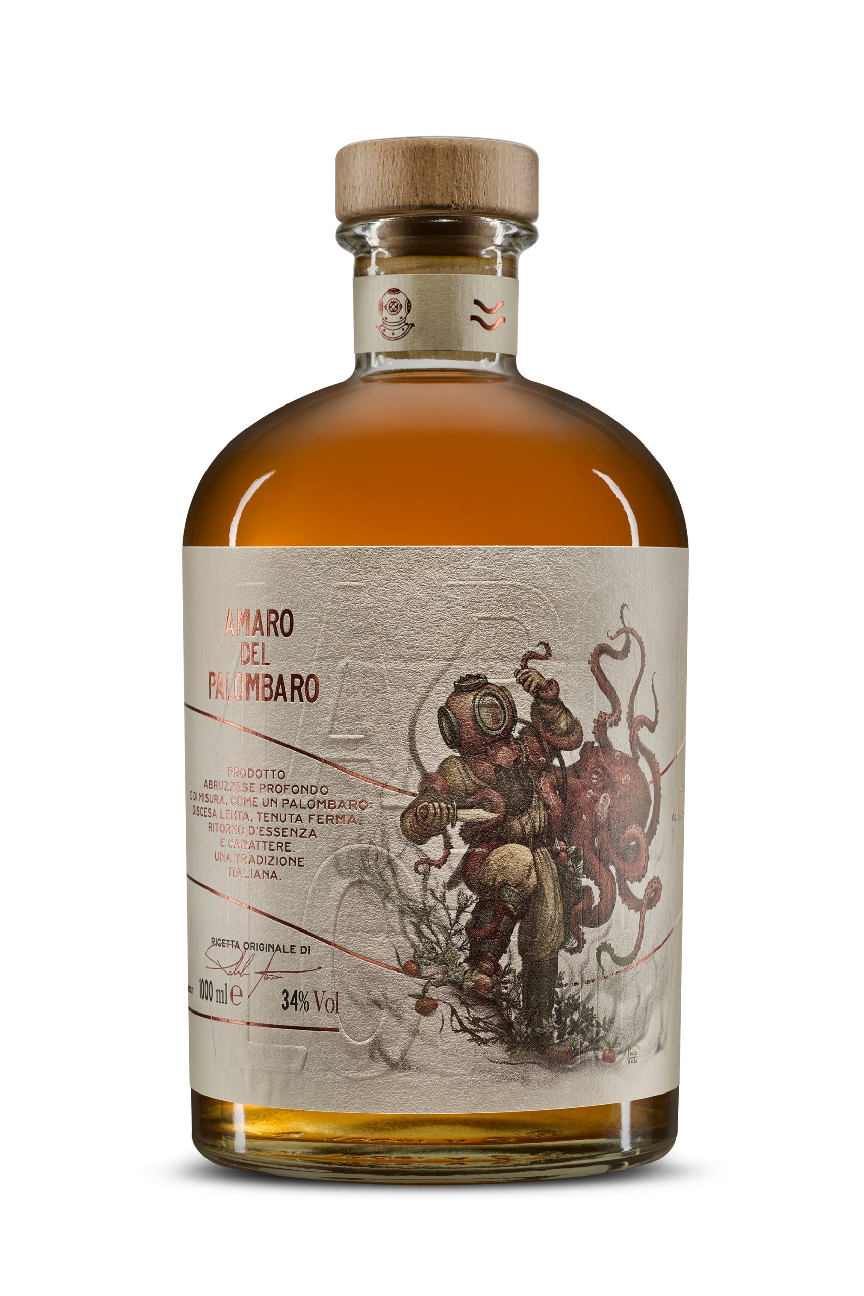
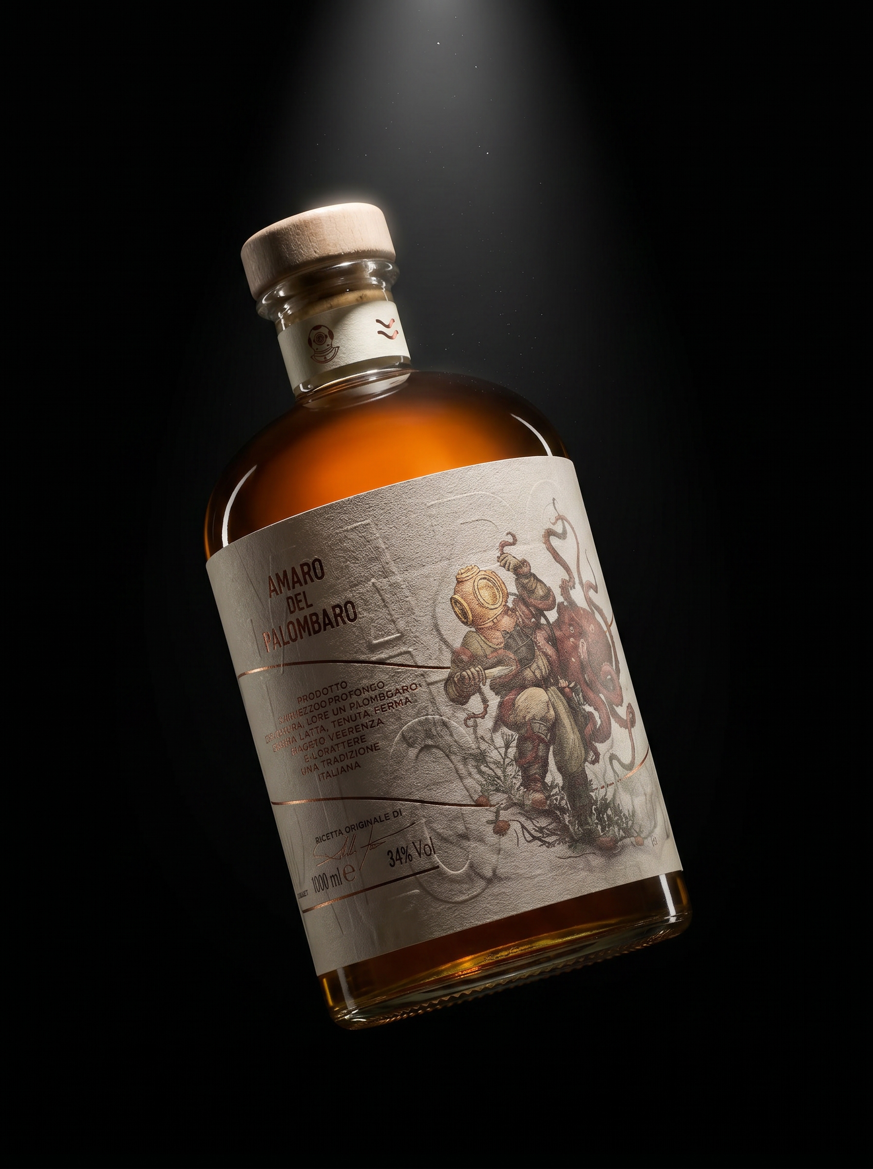
Amaro del Palombaro turns an Abruzzo legend into a collectible visual narrative. Enhanced with copper foil details and rich tactile textures, the label portrays a surreal fusion of a deep-sea diver and an octopus, symbolizing exploration, depth, and character. A distinctive packaging design that blends artistic illustration, local storytelling, and strong shelf impact.
Curator’s Insight
The illustration here is doing real narrative work, not just decorative. Placing a helmeted deep-sea diver at the center of the label gives the amaro a character, almost a mascot, without feeling branded in the commercial sense. The textured substrate and copper foil detailing reward close inspection in a way that flat-printed labels simply cannot. What holds it all together is restraint in the typography: the name sits quietly, letting the artwork carry the weight. For a category where heritage cues can easily tip into cliché, this one stays on the right side of the line.

 Derrick Lin
 Biaa
Biaa Petitmoulin Studio
 White Bear Studio
 Eva Chistyakova
 monther al omari
 Atipus
 alchimistestudioParis
 oneandother
 bloomburo
 helocrene
 Shapers Studio
 Denver Design
 Aidearte
 andrew.huerta
 softmachine
 airobtq
 Buzz & Co.
 Ruby
Ruby themythographer
 IDNB Inc.
 viktorflr
 Zenpack