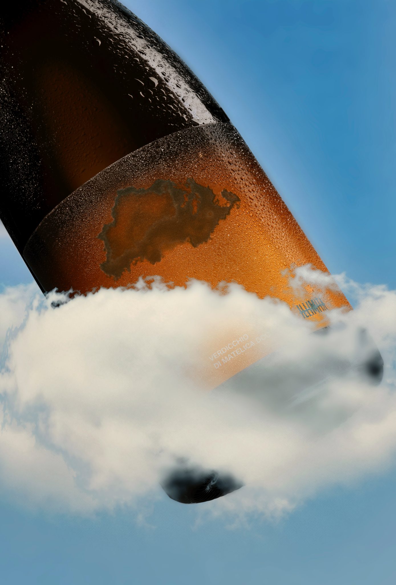

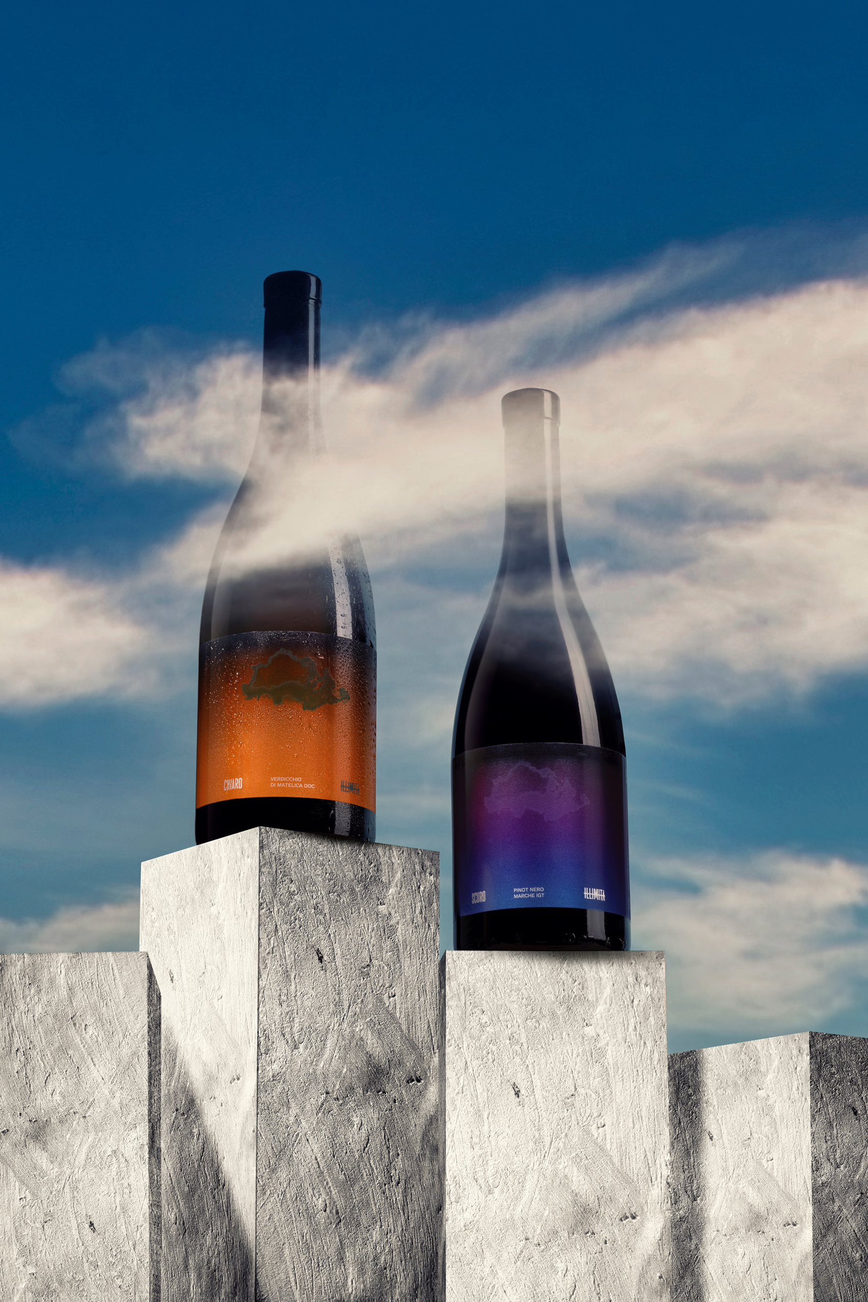
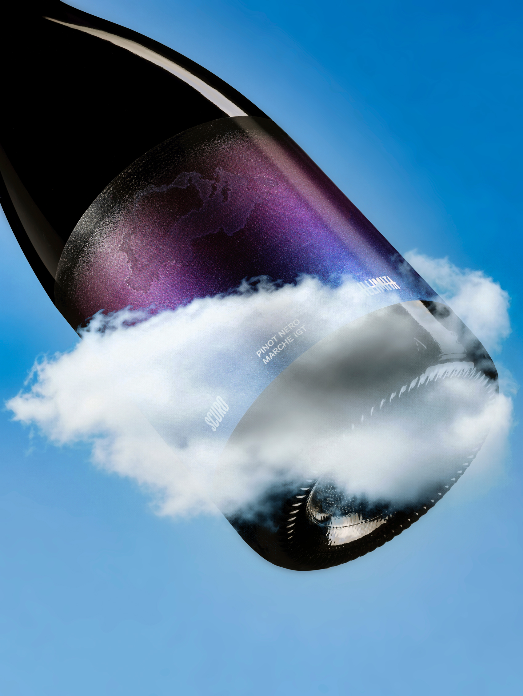
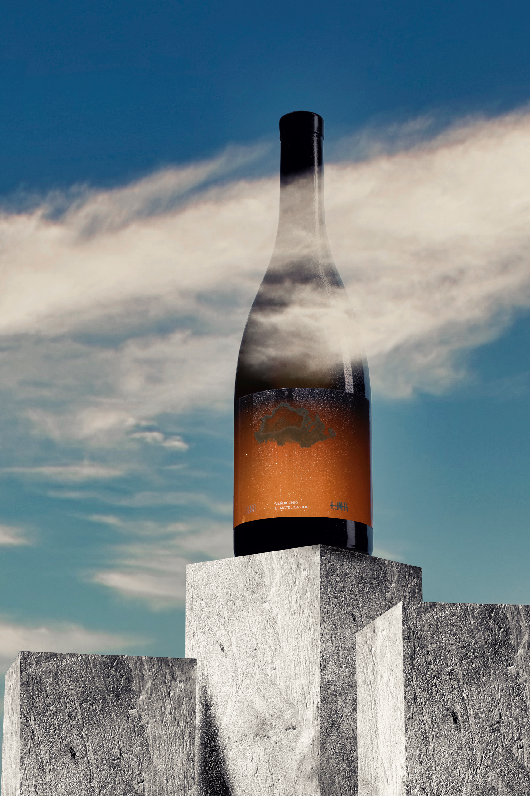
Chiaro and Scuro are two wines born in Matelica, in the heart of Italy’s Marche region: a white and a red that translate the philosophy of ILLIMITA into a changing label.
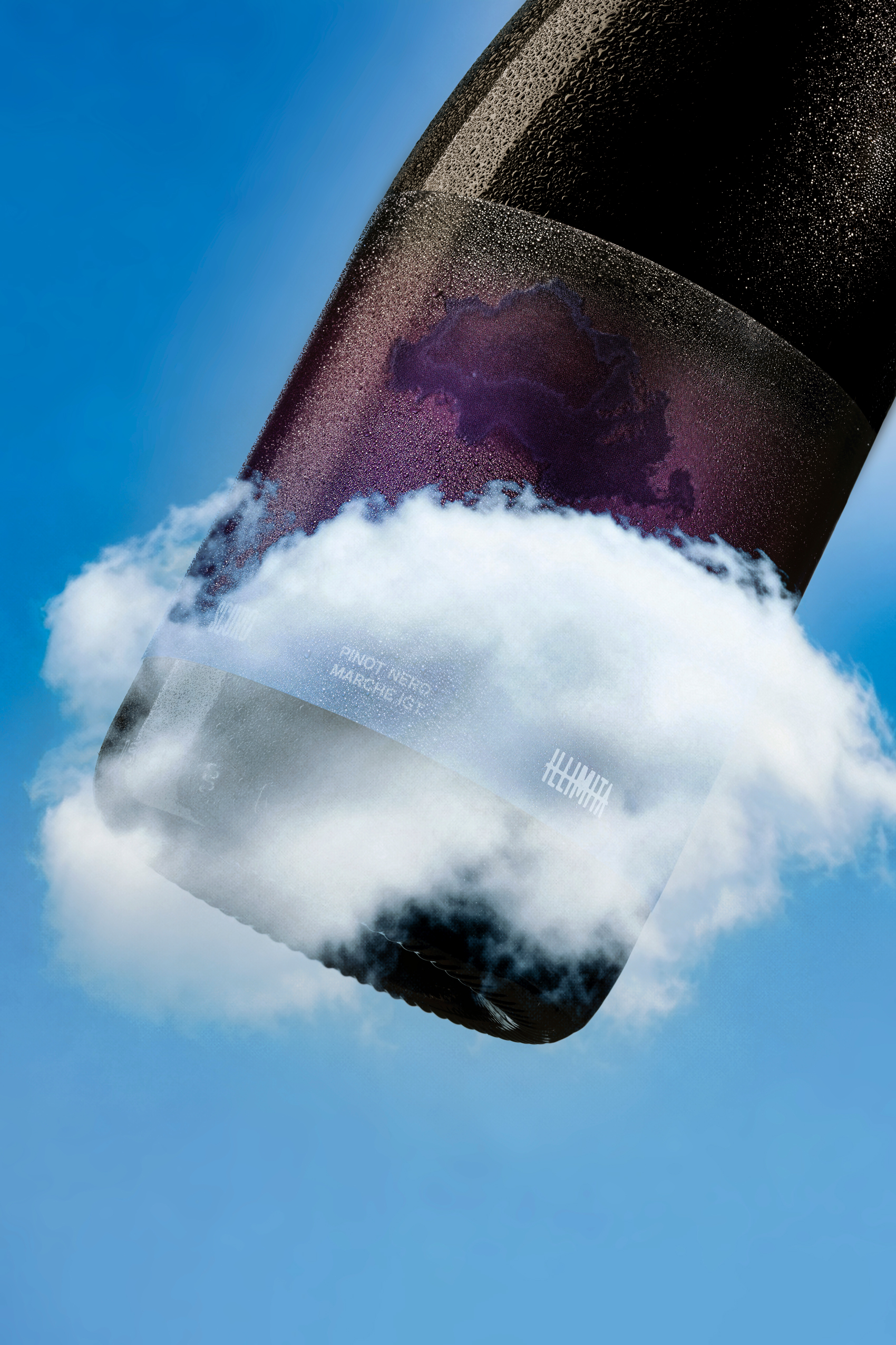
The cloud becomes a symbol of the limit to reach and overcome. At the ideal serving temperature it appears on the label, then gradually fades as the bottle warms. A simple, poetic interaction that connects the landscape, the wine and the identity of ILLIMITA in a constantly evolving visual experience.
Curator’s Insight
Most wine labels treat serving temperature as information printed on a sticker. This one turns it into something you watch happen.
The thermochromic cloud functions less like decoration and more like a countdown. As the bottle warms past its ideal drinking window, the mark blurs and disappears, building a kind of built-in expiry into the label that quietly paces how the wine is poured and enjoyed. Shaping the effect as a cloud rather than a bar, number, or thermometer icon matters here: it reads as weather rather than instruction, which keeps what could feel like a gimmick closer to atmosphere.
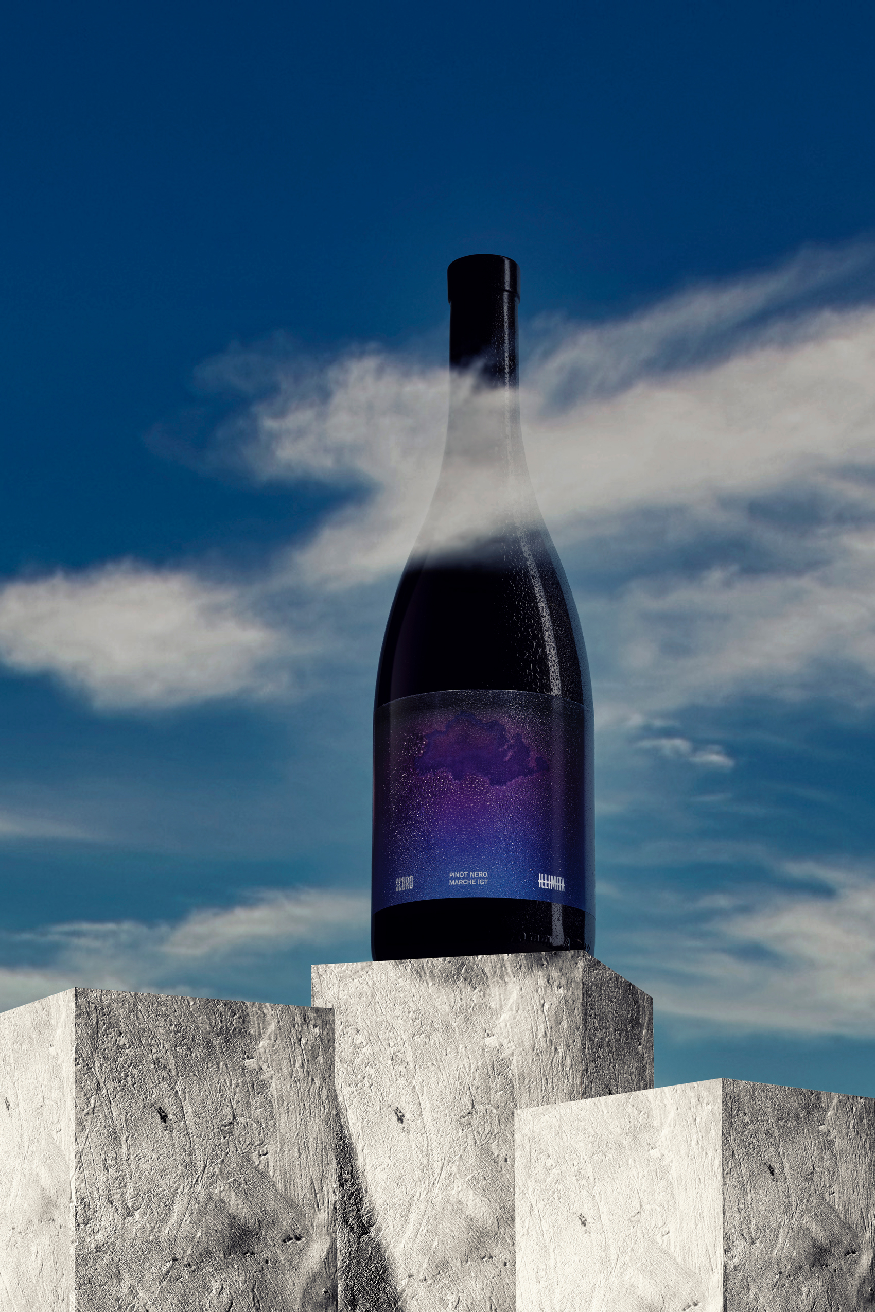
The campaign photography pushes the idea further. Shot against real sky, the bottles are framed so the label’s cloud mark sits at the exact point where the glass disappears into actual cloud cover, letting the thermochromic effect and the environment blur into one phenomenon. That’s the harder design problem to solve: most temperature-reactive inks stay confined to the label as a lab effect, useful but isolated from everything else the brand does. Here the effect is staged so it looks like it belongs to the world the bottle is photographed in, not just the bottle itself.


 hello ocean
 monther al omari
 the Labelmaker
 alamgirbrands
 kat bres
 Vantablack Studio
 GruppoSaida
 studiorevv
 grafisercreative
 Kate Reichel
 UPRISE
 Modern Theory
 By siddika
 MAISON D'IDÉE Prague
 Kinshuk Bainss
 Palashcc
 www.branding.uz
 Hutton Creative
 DESIGN CONCEPTS
 Tancybox
 habiba hatem
 Up-Brands
 sayadworks
 Kingdom & Sparrow
 furtgoods
 Si me preguntas