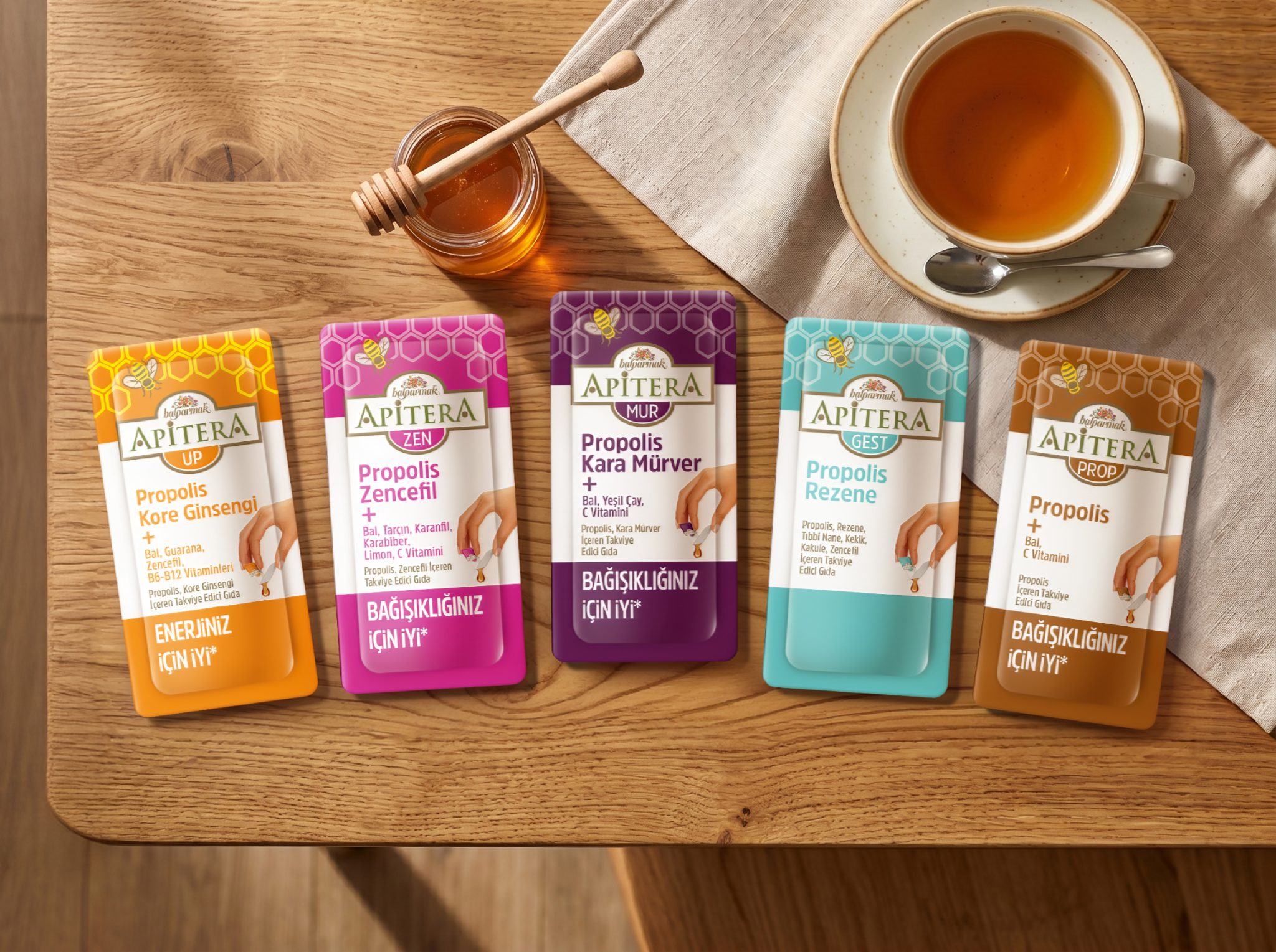

The packaging design for Balparmak’s Apitera product family introduces a unified visual system for the brand’s bee-based wellness range. Balparmak is a market-leading honey brand in Turkey and one of the largest honey packers in Europe. Its R&D center, Apilab, is the only dedicated honey and bee products laboratory in Turkey and among the four most comprehensive in Europe.
Originally launched in 2012, the Apitera brand is inspired by apitherapy, a complementary treatment approach using bee products such as honey, propolis, pollen, and royal jelly. Developed from this concept, the Balparmak Apitera range brings together these valuable natural bee products in a convenient and enjoyable form. The product family includes propolis lozenges and dietary supplement sachets designed for daily use.
The new packaging architecture strengthens Apitera’s position as a trusted wellness brand. A clean white base reinforces perceptions of purity, expertise, and clarity, while providing a structured canvas for functional claims and product differentiation.
Key visual elements, such as honeycomb textures and the signature bee illustration, emphasize the brand’s natural origin and bee-based formulation. These graphic cues act as a consistent identity layer across all SKUs, reinforcing recognition while maintaining category coherence. Across the lozenge range, ingredient illustrations highlight the product variants and communicate their natural content in a direct and approachable way.
For the sachet products, usability became a central design consideration. The single-serve format and its ease of opening and pouring are communicated through an illustrative hand gesture, directly referencing the act of consumption. This detail transforms functional behavior into a visual storytelling element, making user experience part of the packaging narrative.
Overall, the redesigned Apitera system establishes a more structured and scalable packaging architecture. By combining clarity, usability, and nature-inspired symbolism, the packaging strengthens Balparmak’s position within the growing wellness category.
Established in 2004, Orhan Irmak Tasarim is the leading branding and packaging design agency in Türkiye. To date, Orhan Irmak Tasarim has received nearly 100 awards in national and international design competitions on packaging design including Red dot, Pentawards, WorldStar and Design Turkey. The agency is a member of GLBA – Global Local Branding Alliance. In addition to its Istanbul office, GLBA also has offices in Berlin, New York, Moscow, Shanghai, Brisbane and Sao Paulo.


 United Creatives Studio
 Kingdom & Sparrow
 Anastasia Bakhmatskaya
 CreativeWise
 Great and Golden
 Ximena Ureta Design Studio.
 Sorted Branding
 Lisa Sirbaugh Creative
 vitoramockup
 YQIAN
YQIAN Navegante
 Anastasia Cherepanova | xtramez
 Polaris Designs
 pavlyai
 Milena Kocharyan
 monther al omari
 Mohamed sherif midoo
 DESIGN CONCEPTS
 mmdesign
 markcreativestudio
 Rosario Lo Iacono