

WOW is a donut brand inspired by the spontaneous reaction every great bite deserves. Built around the simple expression “wow,” the identity transforms the word itself into the core visual system.
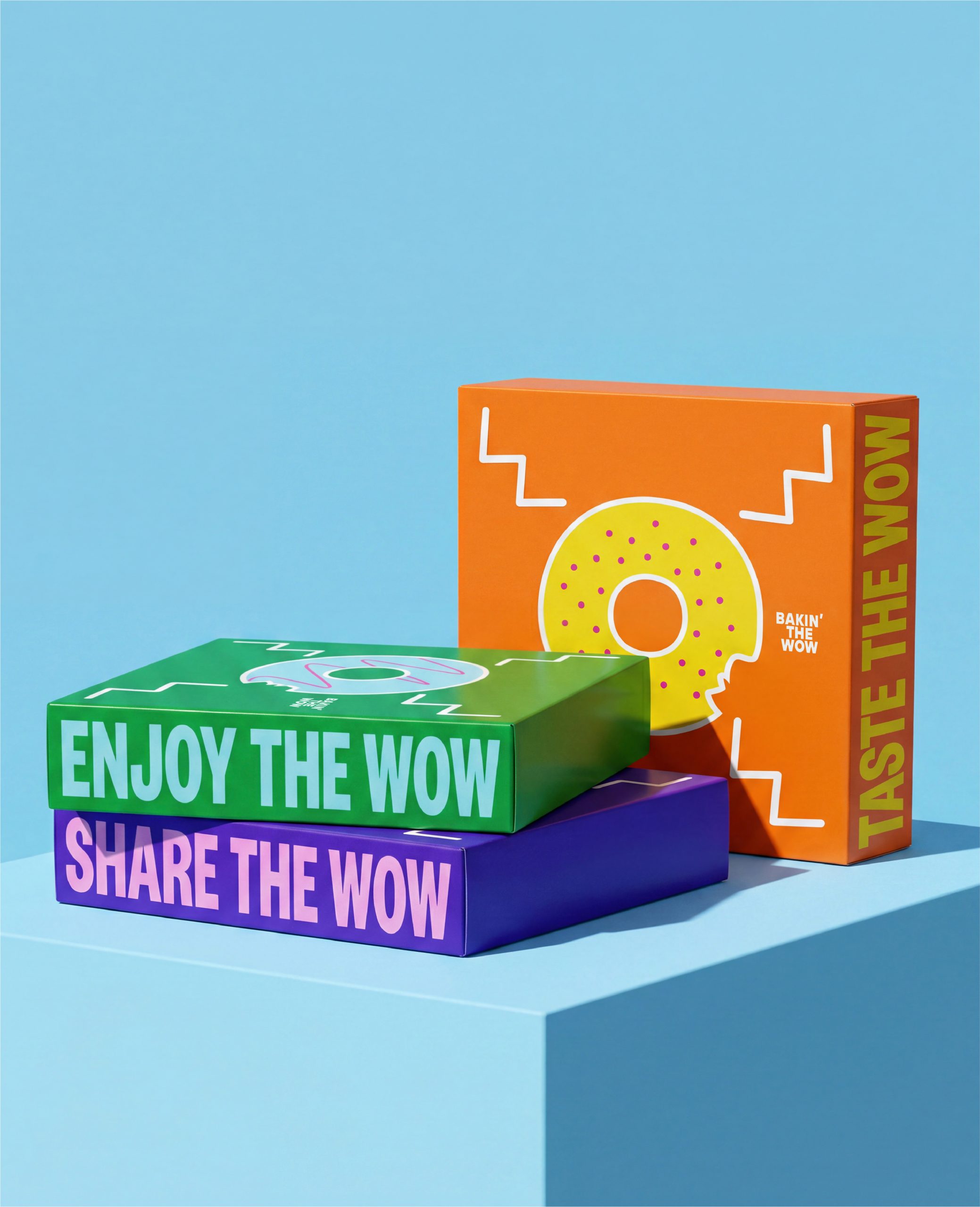
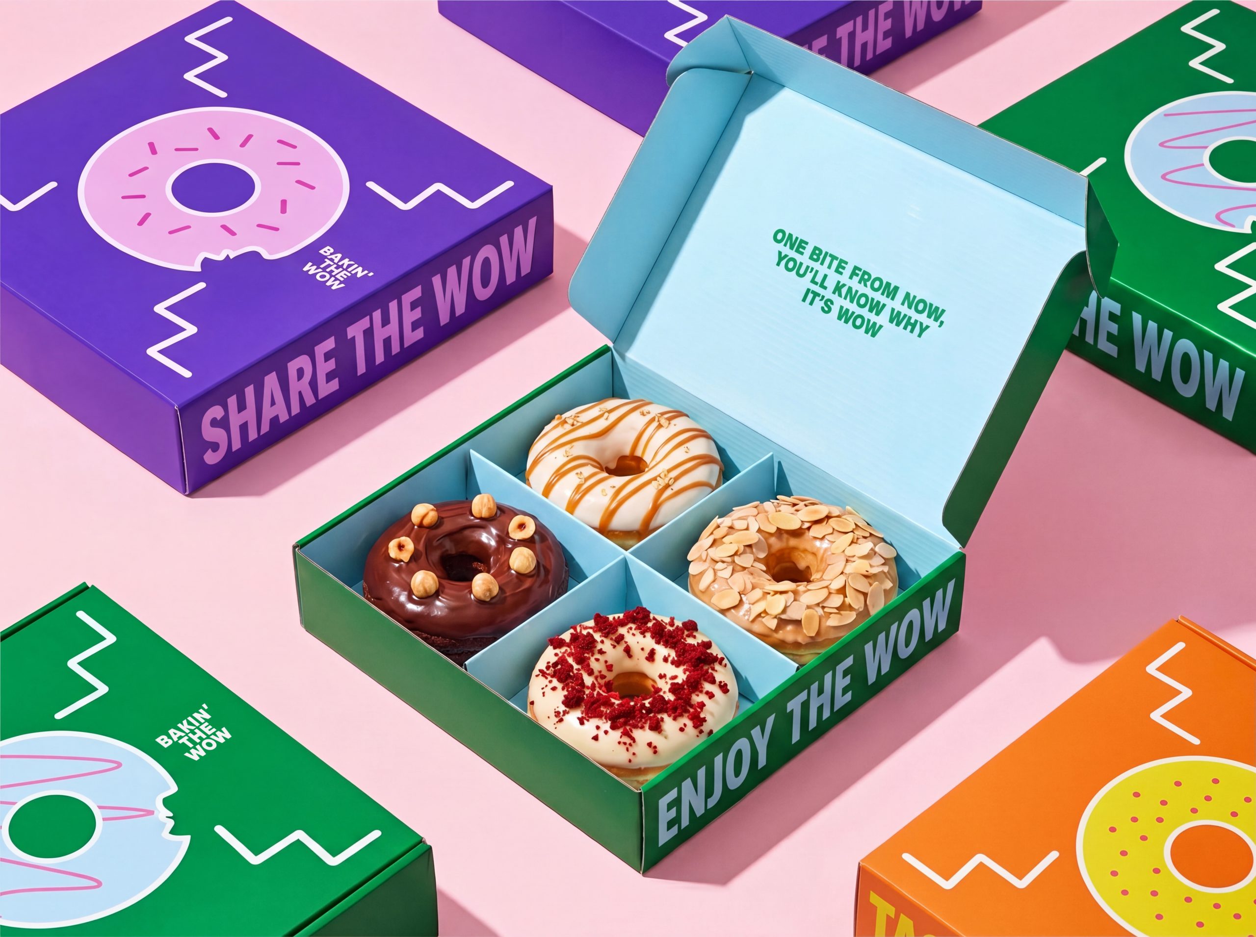
The packaging uses a donut as the letter O, surrounded by abstract W-shaped graphics that complete the word WOW across the box. This playful interaction turns the product into a recognizable brand asset while creating a bold and memorable visual presence.
Bright colors, expressive typography, and conversational messages such as “Taste the WOW,” “Enjoy the WOW,” and “Share the WOW” extend the concept throughout the packaging system. The result is a vibrant identity that celebrates the moment between the first bite and the first reaction: “WOW.”
Curator’s Insight:
What makes this work is the restraint behind all the noise. The concept is simple enough to explain in one sentence, but it plays out consistently across every surface, color, and message. The donut-as-letterform idea could have been a one-trick visual, but the supporting system, zigzag motifs, punchy copy, bright palette, gives it enough range to feel like a full identity rather than a single clever execution. It earns the energy it puts out.



 Hi estudio
 43oz
43oz monther al omari
 Rosario Lo Iacono
 alchimistestudioParis
 Ebbi
Ebbi Maruf Nishat
 Mind Brand
 宏洛图品牌设计HONGLT
 Iyioluwanbelarami
 sahildoesartt
 Denis Ulianov
 Garry Veda
 arutza
 Lucid mk2
 MaheswariMadhu
 sanjnasnair
 POSH FMCG BRANDING
 Modern Theory
 Shubhashish Roy
 Affogato Brand Design
 Backbar Studios
 hello ocean
 Luciana Gutierrez
 Valérie Colace